Second Shoot Contact Sheets

Below are the contact sheets of the photos I took from the town shoot.

Out of all of the photos, here are my favourites:

My photoshoot was very successful. I was able to take lots of useful photos that I could potentially use in my magazine. Although not planned in my PMA, I used a light box as a prop which I was able to spell out my magazine name. This worked well and added even more lighting to the photos. I could have used more props however I didn’t want my photos to be too busy or staged. I followed my PMA for the outfit plans which added lots of colour to the photos without being too cringe. The shutters and stair well were a great location as they added leading lines to the images, making them more interesting.

Article Idea Development

After taking inspiration from other magazine articles, I am now ready to construct my own.

Below is a document where I first looked at what articles of the similar genre include; identifying the language, questions and topics spoken about. I was then able to construct my paragraphs which I then put together at the bottom of the document.

Please click on the document to open it up.

“Production Meeting Agenda For 2nd Photo Shoot and Risk Assessment “

In preparation for my photo shoot next week for my music magazine, I have created a plan of where the location of the shoot is, when it is, who I am using as models, what they are going to wear and the props that I may use to portray a narrative in the photos. Below is this plan:

Please click on the document to open it.

From this shoot, I am hoping to get some quality shots to use inside my magazine that portray a narrative. I am planning on presenting what a pop star does behind closed doors. This will show my audience that although pop stars are extraordinarily talented, they also have their own private lives where they have other hobbies than music.

I have planned casual outfits for my models so that this narrative can be told. I may also use props such as a costa drink, mobile phone and a book to show that stars use everyday objects too. and to allow my audience to relate to what they are doing. I am going to find locations such as an interesting corner, a ledge or set of stairs where my model can be sat reading a book or just having some alone time.

Because the shoot is outside of school, below is a risk assessment that has been completed.


Language Analysis

To be able to include an article in my own music magazine, I looked at this example which I then decoded to find out the type of features I should include.

This article is about Wyclef Jean and is based on his 10 rules of life. It was published in a September 2017 edition of a magazine. The first page is very minimalist and presents a large image of the rapper the article is based on. It also includes on of his lyrics “What makes a perfect gentleman? Leave big tips, baby!”. This creates almost an ignorant tone however this tone juxtaposes when you read further and you discover that he has put in a lot of work and effort to get to where he is now. There is no presence of journalism and is written in first person from the musicians point of view. This is shown by the use of the word “I”.  This creates the feeling that he is talking to you as an audience which constructs an informal environment. This makes him seem relatable and approachable. Even though he is extraordinary, he is still human just like the rest of us. The article is structured into 10 sections, each with their own headings. Each paragraph is written on a unique life tip/rule that Wyclef believes is important to know in life.

In the article, Wyclef is presented as very informative but creates the feeling of having a conversation so that the mature topic becomes slightly less serious. Each heading is quite short and easy to understand, which means that if you didn’t have time to read the whole article, you would still understand the concept of it. For example in tip number 3, the title is “Music can save your life. Literally.”. This is hugely important advise and the word “Literally” being on its own emphasizes from the artist how much it means to him. This creates trust for us as an audience as we feel the advise is generally purposeful and useful. Wyclef is a rapper which usually comes with connotations of being quite rough and arrogant however in this article, it presents the other side to a rapper; being quite down to earth and human. This allows the audience to empathize and relate to him more which presents him as a positive role model for his fans to aspire to be.

From this article on Wyclef, you are not only educated on his rules for life (that you can use for yourself), but you are also educated on Wyclef himself. As an audience, you are able to learn more about his personality and way of life. You realize that he is also human and that he is a very genuine and down to earth person.


A New Improved Front Page

Up2Date draft 2 pdfBelow is my second draft for the front cover of my music magazine.

Please click on the image to see it clearer.

I have made many improvements; from both personal improvements and ones from my peers. They are listed below:

  • I have made the plug slightly larger to make it easier to read.
  • I have made the masthead larger and have added a pink two behind the yellow one to make it more interesting. (This has created a golden colour)
  • I have edited my main cover star photo so that it is black and white but has certain features that pop out. For example the doughnut is still in colour and I have made her top and earrings coloured to match the masthead. I have also made the image larger and have overlapped it slightly over the masthead. This allows even more attention to be drawn to her from my audience.
  • I have made the main cover line slightly bolder to stand out and have added a pink strip behind the white text to make it easier to read. I have also played with the doughnut from the main cover star photo to create the 0 in O2. This adds even more detail and excitement to interest my readers.
  • I have changed the bar code from the normal rectangle to a more interesting heart.
  • I have added a second cover line and have swapped them over to the right side of the front cover. This creates a more structured look and stops it from seeming messy. I also made the already existing cover line shorter and less complicated.
  • I have changed my pug by editing the text to be simpler and have added a second ring to make it less boring.
  • I have taken the insert off so that the cover doesn’t seem too crowded.
  • I have added a pale background so that it isn’t just plain white.
  • I have added small details such as yellow lines next to the cover lines (to link in with the masthead font) and a line under the masthead. These lines add extra detail which add excitement.

Draft of Front Page

Below is my first draft of the front cover of my pop music magazine.

Please click on the image to see it clearer.

There are different elements which I enjoy and others that I believe could be improved in my next draft.

Some features that I think are successful are:

  • The main cover line font: this is as it is clear and easy to read but still fun at the same time. For my second draft, I may increase the stroke to make it even more bold.
  • The plug: it is simple yet grabs the attention of the audience. It is top center and in a simplistic serif font which enables easy reading.
  • The masthead: it is very clear to read and has the issue date fitted neatly above. In my next draft, I may make it slightly bigger so that it can fit the entire width of my magazine.

Some of the features I believe are less successful are:

  • The main cover star: Although the actual photo is fun, I feel as though the image is slightly too boring and ‘normal’. In my next draft, I will try editing the image more. I could possibly try making it black and white with pops of colour.
  • The insert: I feel as though it isn’t placed right. It is adding unnecessary clutter to my magazine. For my next draft, I may not have an insert as not all magazines include them (such as Billboard).
  • The pug: this is too simple and doesn’t create interest. I will make this more interesting by adding more to it and possibly make the actual text inside more catchy.

The advise that I have received from my peers includes:

  • Make the main cover star larger: I will definitely do this and possibly overlap it slightly over the masthead.
  • Add another colour (possibly pink) to masthead to make it even more interesting: I will do this by adding pink to the number two. I will create this by adding a second two slightly in front or behind the yellow two.
  • Make the cover line less complicated: I will take out unnecessary words so that it is as short as possible but still getting the message across to the audience. Long pieces of text can bore readers so hopefully a short cover line will create interest. I may also add a second cover line so that one on its own doesn’t seem odd.

First Shoot Contact Sheet(s)

Below is the contact sheets with all of the photos I took of my model. As you can see, I used 4 different costumes with a few different props. I found that the neon yellow jumper and denim jacket costumes were the most successful in presenting the pop genre as the yellow jumper presented the fun and cheesy side and the denim jacket showed the more modern, relaxed side.

Out of all of the photos I took, below shows my favourites that could work well on the front of my music magazine. I chose these as they are very fun and have lots of character and movement to them. They also include props to make it even more interesting.

I used my production plan in my photo shoot in that I used all of the outfits organised and made sure that my commands to my model were following what I had planned. I did however change the props slightly. I still used the microphone however I used a doughnut and glasses instead of popcorn and candy floss. I found that the doughnut was quite fun to use as my model was able to do more with it (for example over her eye) than she would have been able to do with candy floss or popcorn. Overall, my favourite photo is the one with my model in the denim jacket outfit with the doughnut over her eye. This is due to it being so playful and interesting. Although she isn’t in the neon costume, it is still very colourful and follows the conventions of pop music.

So… I am ready to photograph my star.

Just to recap, my mission statement is:

“UP2DATE thrives in promoting pop music through the current trends to those with a passion in pop. Looking at the new artists, fashion, top hits, hot gossip and your favourite celebs, we aim to inform, entertain, and develop readers and keep you up to date and involved with the latest news.

Using Richard Dyer’s theory (the paradox of the star), I will need to try and present my star’s image as an extraordinary pop artist but also someone ordinary like my readers. This will intrigue my readers as although they are huge and famous, they can also relate to them.

From learning about Mise en Scene and Camera, I know that I will need to encode my magazine with lots of features that reflect the pop genre. These details will then be decoded by my readers. (My target audience which is Generation Z’s: teens and young adults) If I am successful in composing my magazine and star image, then hopefully my audience will be lead to purchasing my media.

Thinking about Mise en Scene:

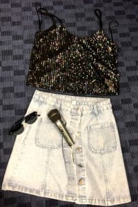
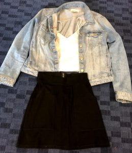
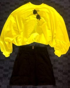
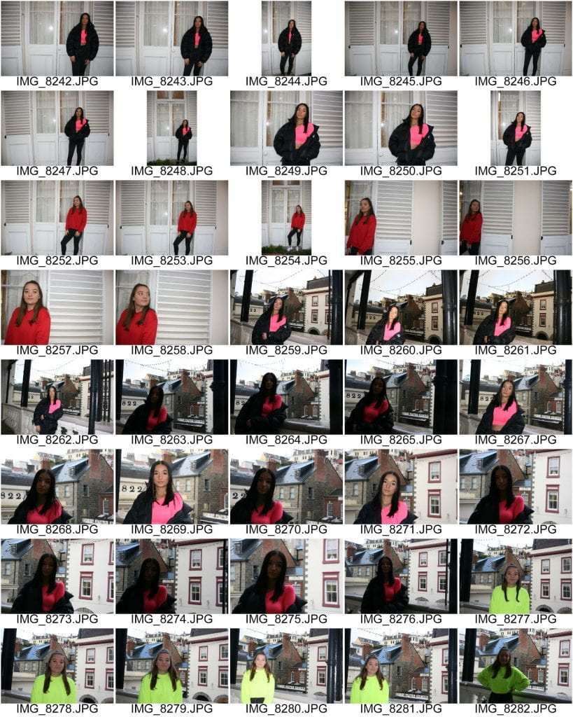
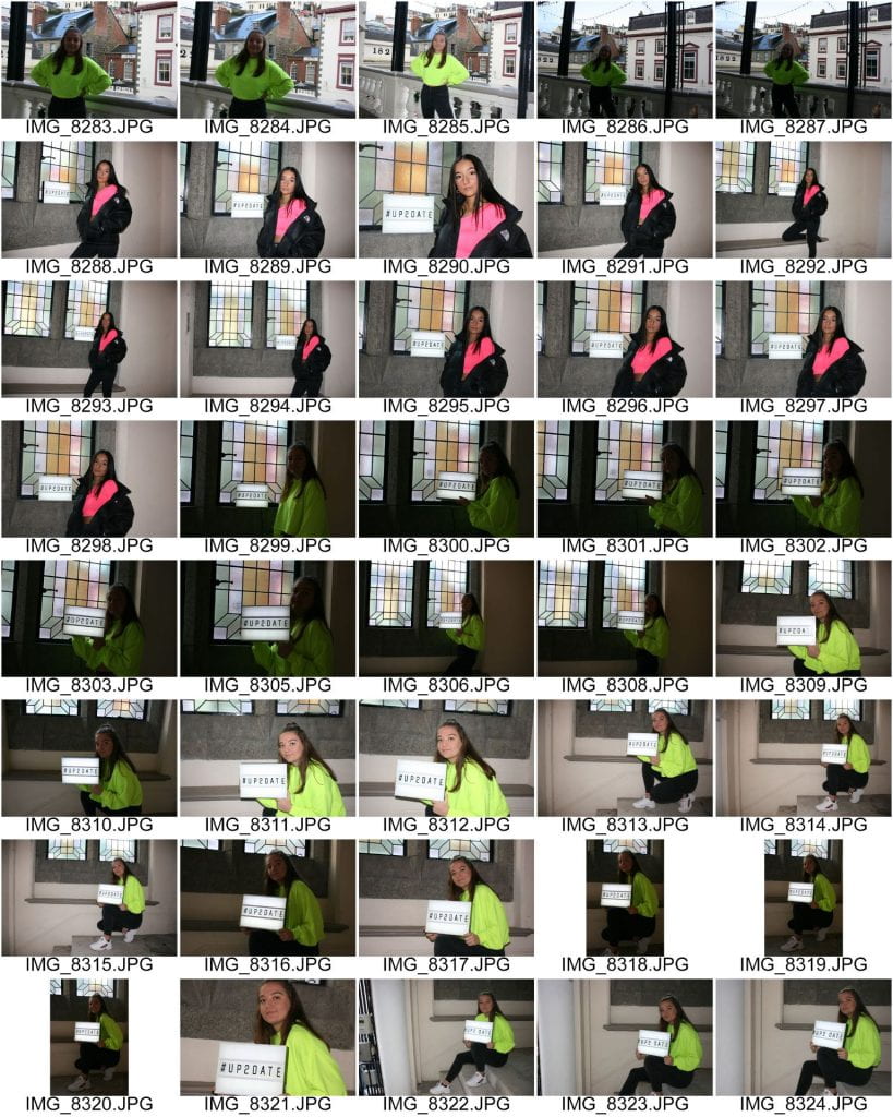
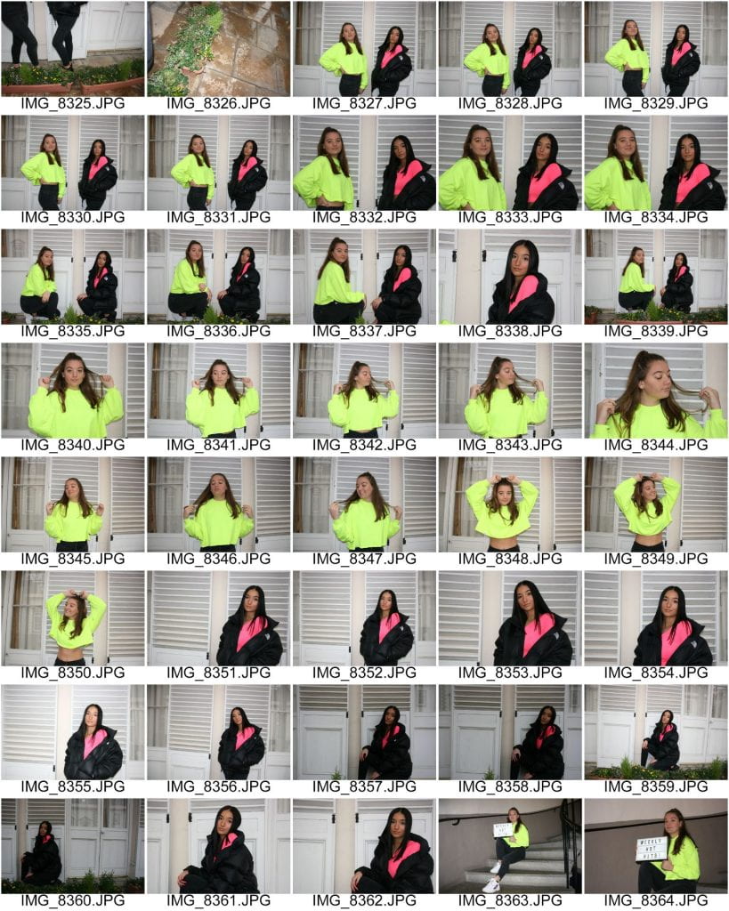
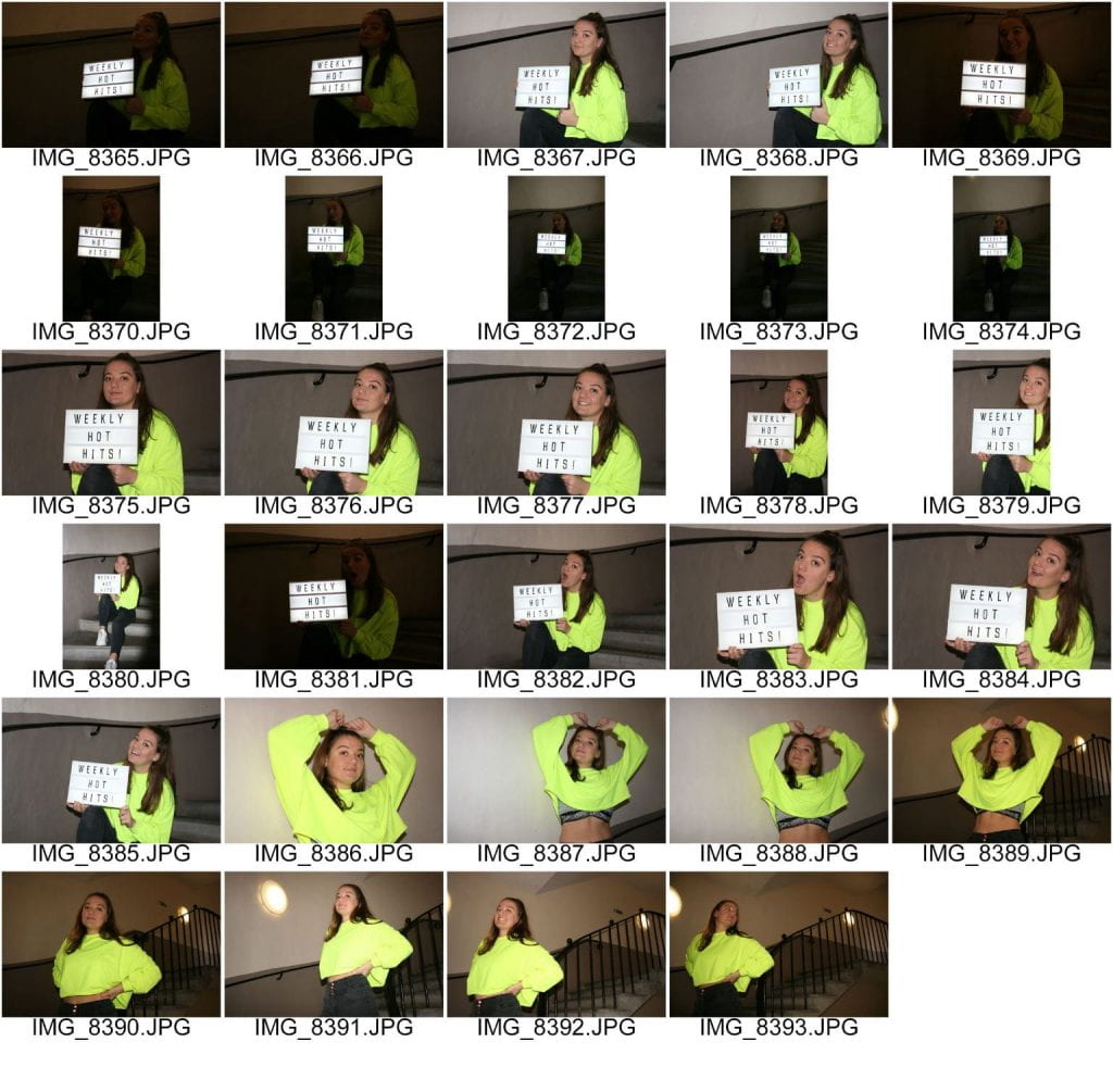
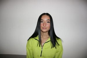
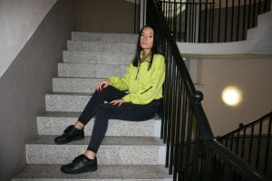
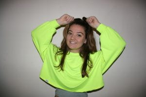
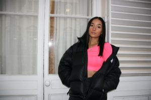
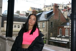
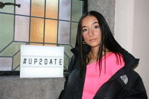
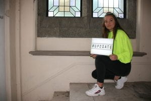
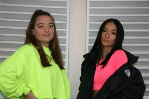
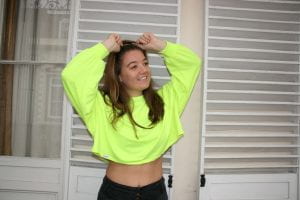
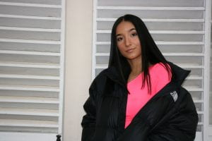
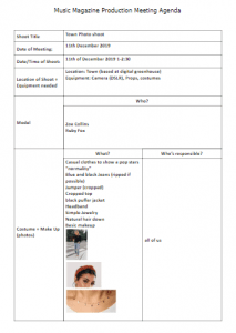
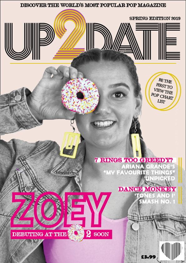
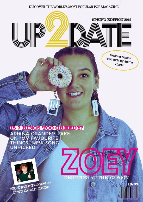
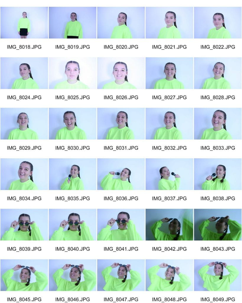
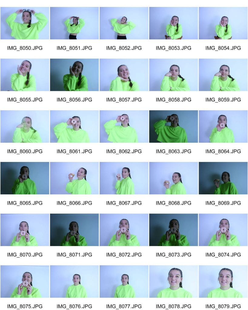
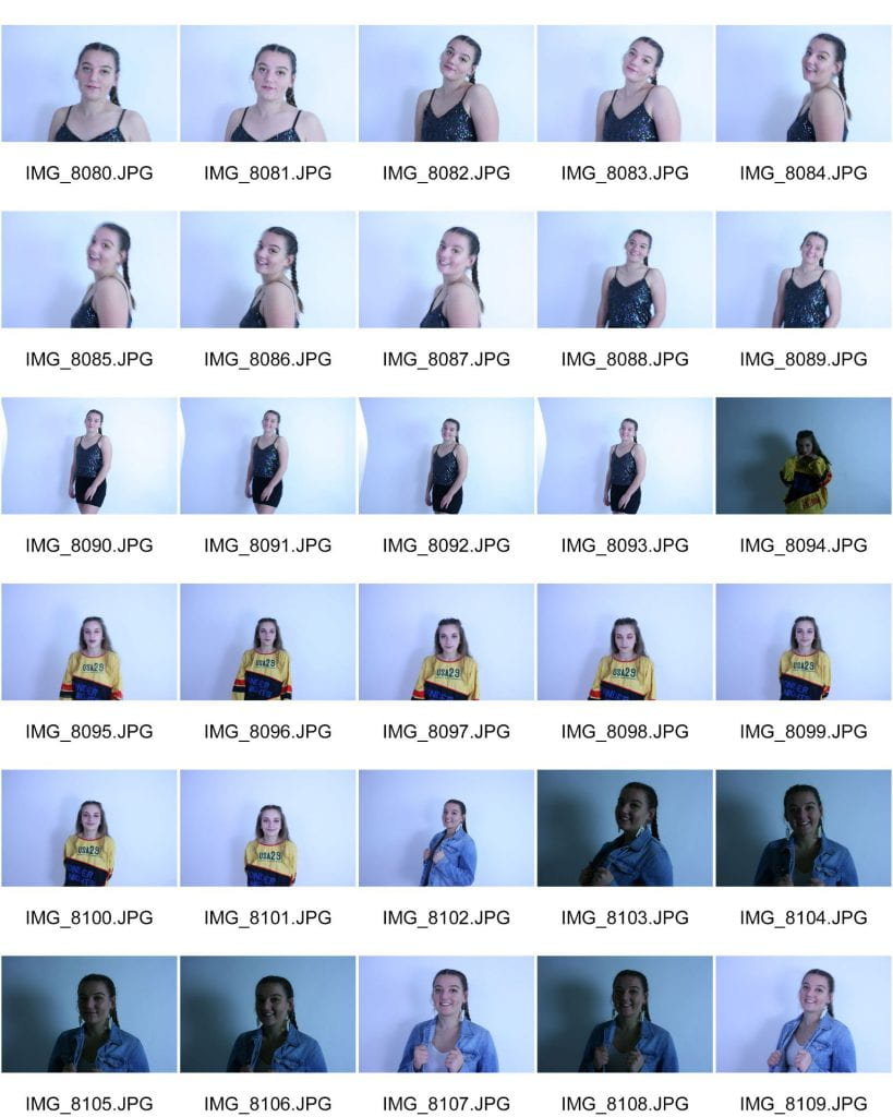
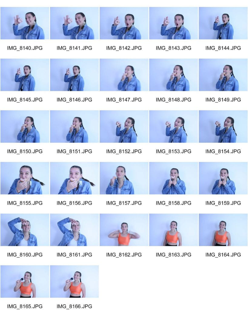
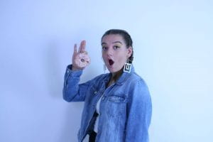
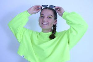
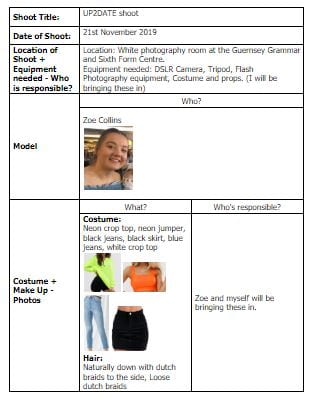
COSTUMES: I will need to use my plan to follow what my star should wear. I have planned two main costumes: one is very clearly pop as it includes neon and fun colours, and the other is slightly more modern and toned down. It is constructed with jeans and a white crop top. I will then style these outfits with many different props and accessories (such as popcorn, bracelets, a belt, etc) to make them more exciting and edgy. \

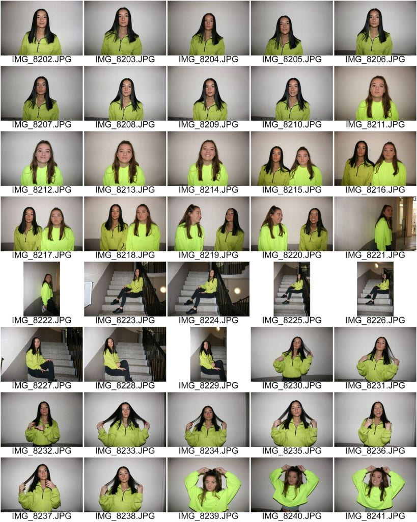
LIGHTING: From looking at other pop magazines and the genre of music, the lighting used is quite bright and fun. This means that when photographing my star, I will need to be very careful of shadows and how dark the photos come out. This week we learnt about flash photography so I may resort to this if the photos are too dark.

ACTING: This was also included in my plan for the shoot. I will get my model to act very relaxed and as though she is having a lot of fun. Pop music is very uplifting and nothing too overly serious or depressing. I will get her to laugh and smile. Pop music can also be quite sassy so as well as some fun shots, I will also get her to have a serious side where she isn’t frowning but also isn’t smiling. Poses I will get her to try are crouching down and standing to the side; looking over her shoulder to the camera.

MAKEUP AND HAIR: I am going to do my models make up so that it is kind of natural with a bit of glam. I will use metallic eye shadow with some bold mascara. I will also contour and highlight her face quite a bit to accentuate her features. (Modern pop music is not as extravagant and cringe as it used to be so I don’t want to go too over the top with the makeup) With the neon outfit, I may add some neon eye shadow to make it even more fun. For her hair, I am going to plait 2 dutch braids. With these, I will then pancake to make them even fuller and interesting. They will not be too tight and will include lose parts to shape her face. (If they were too tight, she would look as though she had no hair.)

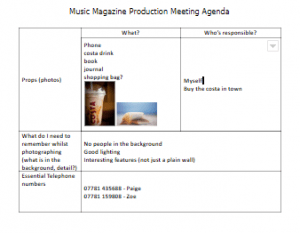
PROPS: I am not planning on using any props as I don’t want them just to be there for the sake of it. However I am still going to bring some candy floss, popcorn and confetti to try out in case the photos are surprisingly successful with them included.

SETTING: The actual photo shoot will be in the white studio. This means that I can then easily take out the background when editing the photos to be used. It also allows even more lighting for the photos, hopefully eliminating shadows. There is also a black studio however I decided not to use this as my models hair is brown and didn’t want her hair to blend in with the background.

As well as Mise en Scene, I will also need to think about the actual camera techniques. I could have great Mise en Scene but if the actual pictures were not taken well, it could ruin the narrative. With my DSLR camera, I will need to remember the 3 main features:

  • Aperture (F Stop)
  • Shutter Speed
  • ISO

If these are incorrect when taking the pictures, then my photos may come out unsuccessful and different to what I expected.

Below are the costumes I have planned out. There are two neon pop and two that are more relaxed and casual.


So what am I up against?

Below is a slide show with a voice over explaining what I am up against in the market and the features that they include. I have also added what I will include to make it unique compared to other magazines out there. This will allow my audience to be intrigued in my magazine, hopefully leading them to purchase it.