This week we were given the brief of creating a tour poster with our assigned genre, mine being heavy rock. To gather inspiration for my design I created a moodboard of some stereotypical rock album art and tour posters:
Moodboard of rock tour posters/album art
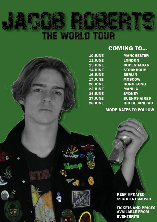
From this research I deduced that capital letters are almost exclusively used in the typeface, thus influencing me to use capitals in my tour poster. Lots of the covers include reds, greens, black and white and so I decided to use some of these for my colour scheme.
My Tour Poster
My Evaluation
Targets:
- Use vocabulary that connote a sense of urgency
- Add more specific information
- Cut photo out more precisely, without the white outline
- Choose colours which create more of an impact and contrast with the background; an example would be bright red