So… How did you integrate technologies (software, hardware and online) in this project?
In order to present my use of technologies in this project I’ve created an info-graphic with what technology I utilised in every section:

Loading…
So… How did your productions skills develop throughout this project?
This voicethread presents my advice to a future media student on what I’ve learnt in my first few months of studying media:
So… How does your product engage with audiences and how would it be distributed as a real media text?
To answer this question I’ve made a Screencastify explaining how my product will reach these aims:
So… How does your product use or challenge conventions and how does it represent social groups or issues?
To answer this question, I’ve produced an emaze presentation featuring how each component of my finished product uses/defies the conventions of its genre (a pop music magazine):

Adverts
To make a complete magazine, adverts are used to fill the pages. It was important to choose adverts which cater to my audience demographic in order to show products which would interest who is reading the magazine.


My audience demographic is young people who are up to date on the newest trends which is why I chose ASOS because it is a very popular online website for the most fashionable clothes for my audience’s age demographic (late teens and twenties). I chose my second advert as a new Starbucks drink because I mentioned some complex kind of coffee in my audience demographic’s dating profile, I also said that they were enrolled in university, implying these readers are very busy and are constantly on-the-go, which is why a takeaway coffee shop advert would interest them.
So… How’s is it going?
Since beginning this project I’ve learnt and developed loads of skills which I’ll be able to transfer into my everyday life and also into more media projects throughout the next two years. One skill in particular which will help in later media projects is learning the importance of folder management. Learning to be able to organise drafts, exports, PDFs and JPEGs is imperative to keeping all of my work in check because losing one of those files could be detrimental to my project because I would have to start it over again. It also helps to keep my computer drive organised and accessible so I can work on it efficiently.
Another skill I’ve developed through studying media is time management which is key to not running behind in my blog because there is so much content which needs to be prioritised correctly. For example, I’ve learnt to know what work needs to be done immediately and which blog posts can wait. Another instance when being time conscious is important is during a photo shoot, especially on location because you only have a set time slot with your model and setting to get the shots you need.
Overall, studying media is starting to help me develop and gain new skills which I’ll be able to use in later projects but that will also be helpful in everyday life too. In future, I hope to develop more computer skills like folder management and using Adobe which will help my projects run even more smoothly.
Complete Magazine Draft
First Draft
Below is my first complete draft of all my pages of my music magazine, I still need to add some advertisements to the empty pages and make some changes from my feedback from my teacher.
Screencastify of feedback:
From this feedback I’ve taken a couple targets for changes to each page:
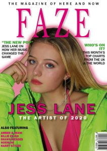
Front cover-
- make cover lines more enticing- reword
- add a pug/badges
- add a sense of playfulness
Contents page-
- put picture of Jess in a shape, take out the costume
- change page numbers
- add more lines/design to the headlines
- create a sense of unity between the 3 pictures at the bottom
Double page spread-
- photoshop out the flash
- continue story to the bottom of the page
- add something that makes you want to turn to the next page
Design Skills 2
Now that I’ve almost finished my magazine I’ve improved my design skills since my last post, this is due to needing to learn more in InDesign and PhotoShop to correct the last few errors in my magazine draft.
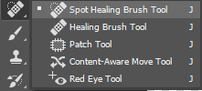
One tool which I’ve recently used a lot is the spot healing brush tool in PhotoShop which is really helpful for removing any spots or uneven patches on the model’s face by editing the vector graphics of the image. Making my model’s face more even and smooth helps to create the star image I’m aiming for because it gives the audience the impression that she is flawless, creating interest towards her and further giving her a celebrity quality of perfection. Although morally this level of perfection is sometimes not accepted, I feel that this editing is needed in order to create an image which readers will aspire to and find attractive.
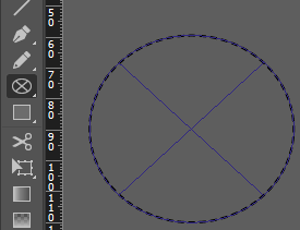 Another skill which I’ve learnt is using shapes and lines to create impact in InDesign. I felt that my contents page was a bit bland and received feedback to put my model into a shape, to do this I used the ellipse frame tool and found that it added a new convention to the page and made it a lot more interesting. Adding more elements like this also made my contents page show the fun and exciting element of my brand’s mission statement which was starting to get lost before this edit.
A New Improved Contents Page
First Draft

New Draft
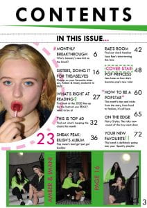
In my first draft I got a lot of feedback for things to change, mostly to do with making the whole page more cohesive and professional, for example adding more design elements/graphics. I also changed the shape of my image to cut out the costume because the mise-en-scene wasn’t right. Finally, the page numbers weren’t spaced apart enough for a full magazine so I had to change those too.
What is a Contents Page?
From looking at existing music magazines’ contents pages I’ve found some typical conventions that most contents pages have. These include:
- large ‘contents’ titles
- lists of catchy feature headlines with their corresponding page numbers (in page order)
- a quick description for each feature
- one main large image and usually a few more smaller ones
- only 2 colours other than black and white
- separate ‘regulars’ and ‘features’ sections
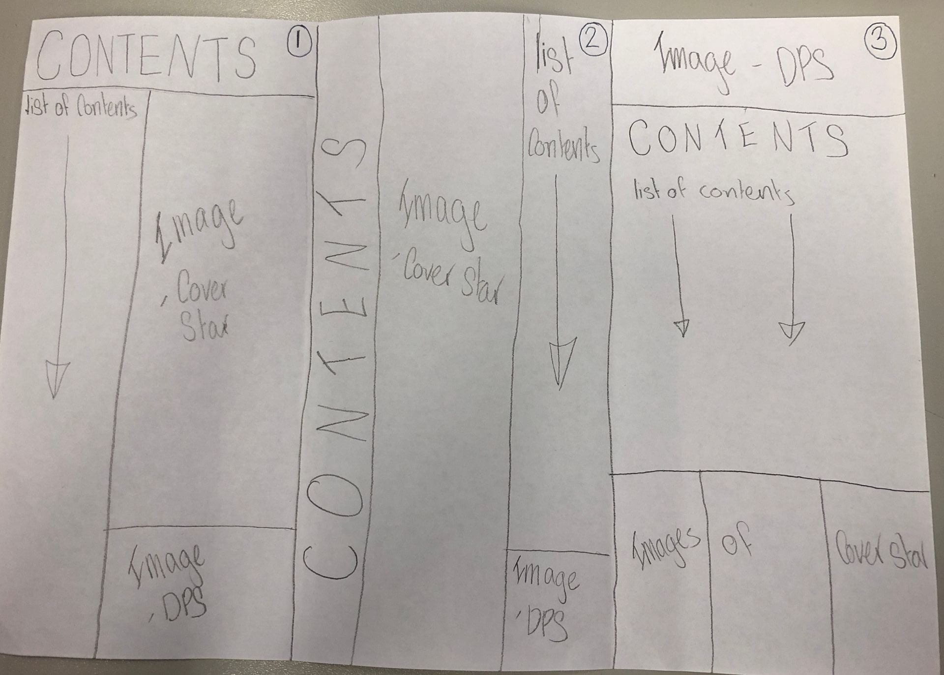
Keeping these conventions in mind I sketched three possible layouts for my contents page:
I also composed a list of possible headlines to use in my list of contents, including:
- MONTHLY BREAKTHROUGH
- THIS IS TOP 40
- WHAT’S RIGHT AT READING
- ON THE EDGE
- YOUR NEW FAVOURITE
In making these headlines I made sure to use some key words used in a lot of magazines to entice and draw in the reader. Using words like ‘you/your’ make the reader feel personally targeted by the content and also using words like ‘breakthrough’ and ‘exclusive’ entice the reader into turning the page to find out more. Other vocabulary like superlatives and alliteration can also be used to make a catchy name for a feature.
The purpose of a contents page is firstly, to give the reader a taste of what is going to be in the issue, but secondly it is to intrigue the reader so that they continue to read the rest of the magazine. This is why short descriptions of each article and grabbing headlines are two main conventions of a good contents page.