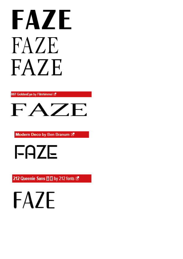
The masthead of a magazine is really important because it’s the first text that’s read, this means that in order for a magazine to be successful it needs to have a impactful masthead. However, it needs to also fit the magazine’s brand and genre. In order to do this I’ve made multiple mock-ups of my masthead to see what kind of typeface would fit my magazine the best.
I’ve concluded that I want a typeface with very sleek look and so I thought a serif font would be best because it adds a touch of elegant formality to an otherwise more informal genre. Because of this I decided that the second typeface on the list would be best because it’s reminiscent of ‘ELLE’ which is also seen as a elegant and stylish magazine however I experimented with different styles to make sure I’ve seen all my options.
Masthead drafts
Click here