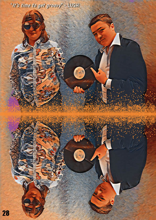
Here I have the second draft of my double page spread. I have made some adjustments from the last to try and improve it so I can get the best final pages I can. Here are some of the things I’ve changed:
- Changed the colour scheme to match the images
- Removed the background on the main page
- Altered the sizes of some of the text
- Changed the headline
- Put the interview questions in boxes
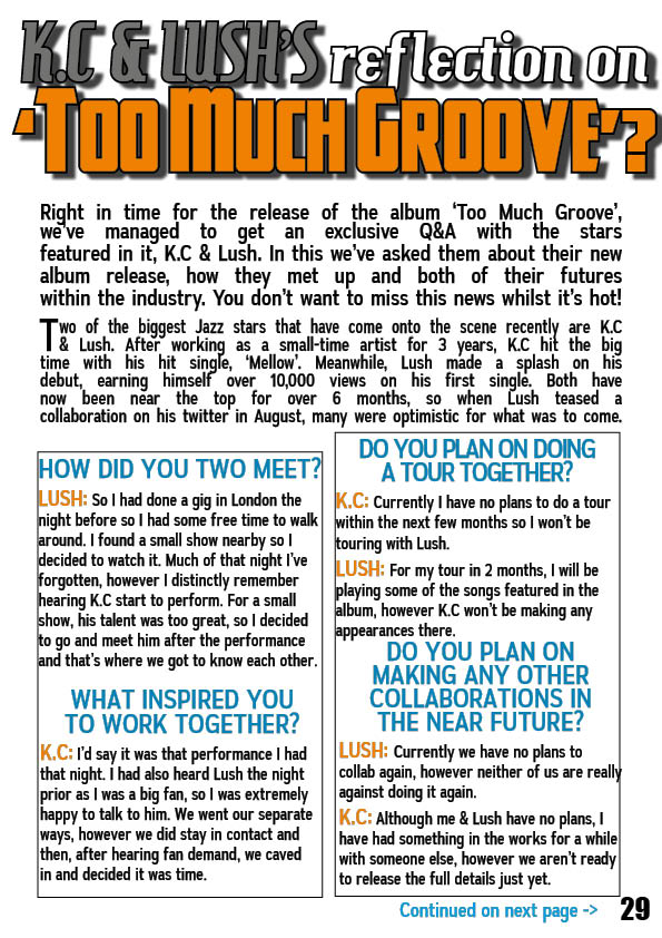
To improve on my third draft, I have taken some time to reflect what I can do next:
- Play around with the image more to see what you can get
- Make sure the text within the boxes all start at the same point as some of the text has a small gap whilst others are right next to the box
- Move the Headline to the left slightly as it’s shadow is slightly cut off
- Make the boxes the same size
- Try to make sure all the spaces are of the same size
- Try to come up with a catchier headline that includes the reference to the reflection on the image