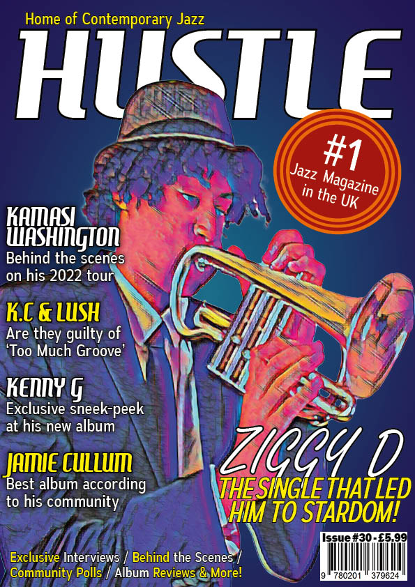
Here is my third draft for my magazines front cover. I have kept many things the same from draft 2 however there are a few differences. The main ones are:
- Added a Pug
- Added a reference to my DPS
- Moved the coverline text
- De-stretched the image
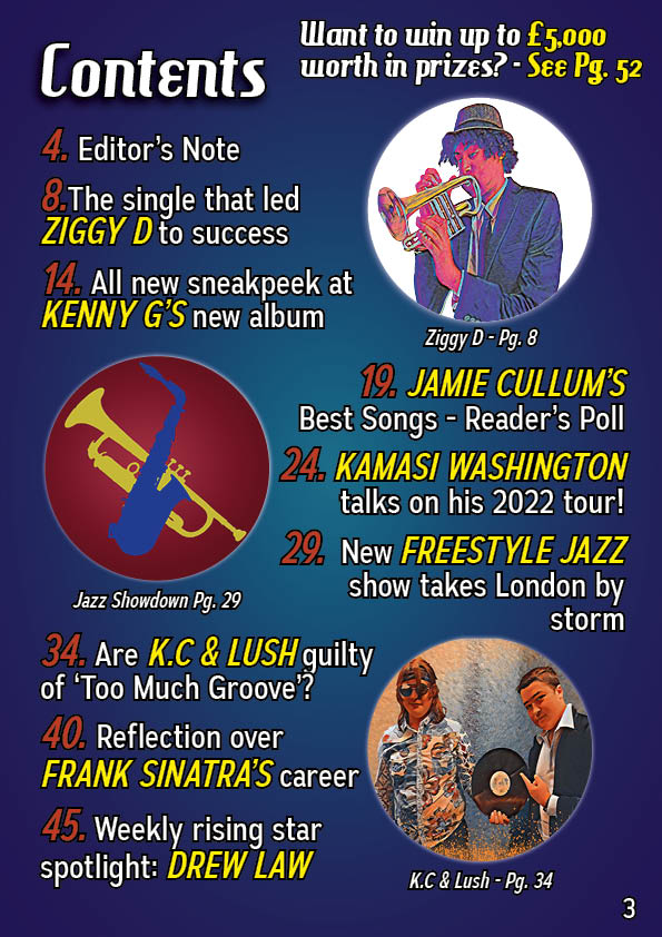
Up next is my contents page. This page has changed the most since draft 2. The main differences are listed below:
- Added a new picture for ‘Jazz Showdown’
- Added a headline for ‘Jazz Showdown’
- Changed the placing of certain text
- Changed the numbers of the pages
- Changed the colour of the page numbers
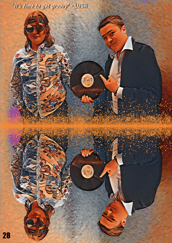
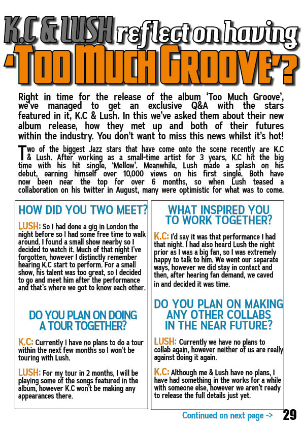
Finally there is my DPS. This one, like the front cover only had minor changes. These are
- Changed the headline
- Moved the headline slightly
- Re-arranged the text in the Q&A segment
- Adjusted the line spacing in the Q&A segment
- Adjusted the box sizes in the Q&A segment
Below is the screencastify showing me what to do:
For my front cover I will:
- Make Ziggy D bigger
- Switch around the text so it doesn’t clash with Ziggy’s face
- Move the Pug closer to the edge of the page
- Try to further destretch the image
- Add drop shadow to the masthead
- Play around with the names of the stars & their sizing
For my contents page I will:
- Change the font of all text & change the size of the smaller cover lines & the editor’s note
- Try to make the star images pop more through things such as drop shadow and bevel and emboss
- Change the background to try and make it work better with the page
For my DPS I will:
- Make ‘Too Much Groove’ bigger
- Make the Q&A’s questions smaller
- Make the Q&A text the same size as the rest of the article
- Move the standfirst down
- Give K.C a quote