Draft Feature Article

After listening to my article again, I have come up with a few ideas on how it could be improved.

  • Some of the stars answers seem quite unrealistic and fake.
  • The prediction doesn’t add much to the article, which makes it seem quite redundant.
  • Focus slightly less on the stars, and more on the music and genre.

Here is my improved version:

Q&A on the hottest new album right now

Right in time for the release of the album ‘Too Much Groove’, we’ve managed to get an exclusive Q&A with the stars featured in it, K.C & Lush. We’ve asked them about their new album release, how they met up and both of their futures within the industry. You don’t want to miss this news whilst it’s hot!

Two of the biggest Jazz stars that have come onto the scene recently are K.C & Lush. After working as a small-time artist for 3 years, K.C hit the big time with his hit single, ‘Mellow’. Meanwhile, Lush made a splash on his debut, earning himself over 10,000 views on his first single, ‘Fallin’ Down’. Both have now been near the top for over 6 months, so when Lush teased a collaboration on his twitter in August, many were optimistic for what was to come.

How did you two meet?

Lush: So I had done a gig in London the night before so I had some free time to walk around. I found a small show nearby so I decided to watch it. Much of that night I’ve forgotten, however I distinctly remember hearing K.C start to perform. For a small show, his talent was too great, so I decided to go and meet him after the performance and that’s where we got to know each other.

What inspired you to work together?

K.C: I’d say it was that performance I had that night. I had also heard Lush the night prior as I was a big fan, so I was extremely happy to talk to him. We went our separate ways, however we did stay in contact and then, after hearing fan demand, we caved in and decided it was time.

What got you hooked on jazz as a genre?

Lush: For me, I was always interested in music, even from an early age. I would always be listening to whatever I could get my hands on, but then one day I found a poster for a jazz club and I begged my parents to let me go. Eventually they accepted and that’s when I learned I was a jazz guy.

K.C: I didn’t listen to lots of music when I was younger, but I remember I was having a long car ride with my parents and some jazz music started playing on the radio. Something about how the music was played and presented clicked with me and then I started to listen to more and more until I found myself at the local music store once a week looking for new jazz albums to buy.

Where did the title ‘Too much groove’ come from?

Lush: It was my idea, as I thought that if we’re known as two of the grooviest dudes in the industry at the moment, we gotta let the audience know that.

K.C: When we were spitballing ideas, that was the first one that clicked well. The rest were extremely cheesy or seemed off. The example I remember the most was ‘groove criminal’.

What was your favourite song to work on within the album? 

K.C: I think that ‘All That’ was easily the best song recorded in the album as I think it sounds very smooth and that both me and Lush seamlessly play together in it.

Lush: Personally, I thought that ‘24/7 Funk’ was better as it was constantly riding highs of fun beats and good vibes. 

Any news on doing a tour together?

K.C: Currently I have no plans to do a tour within the next few months.

Lush: For my tour in 2 months, I will be playing some of the songs featured in the album, however K.C won’t be making any appearances there.

Do you plan on making any other collaborations?

Lush: Currently we have no plans to collab again, however neither of us are really against doing it again.

K.C: Although me & Lush have no plans, I have had something in the works for a while with someone else, however we aren’t ready to release the full details just yet.

The stars have both firmly stated that this is mainly a one-off occasion and that they’ll be working solo, however they have also stated that they are willing to leave the door open to more collaborations in the future, not only with the two of them, but also with other unspecified stars. We, at Hustle magazine believe that this will be the start of some exciting times within the Jazz community, as we are now able to speculate on who will be working with these two stars in the upcoming months.


Even if we don’t see these top stars join forces again, we are sure that this collaborative album will be a sure fire hit within the community. Make sure you don’t miss this album when it releases on December 15th.
Second Shoot Contact Sheets

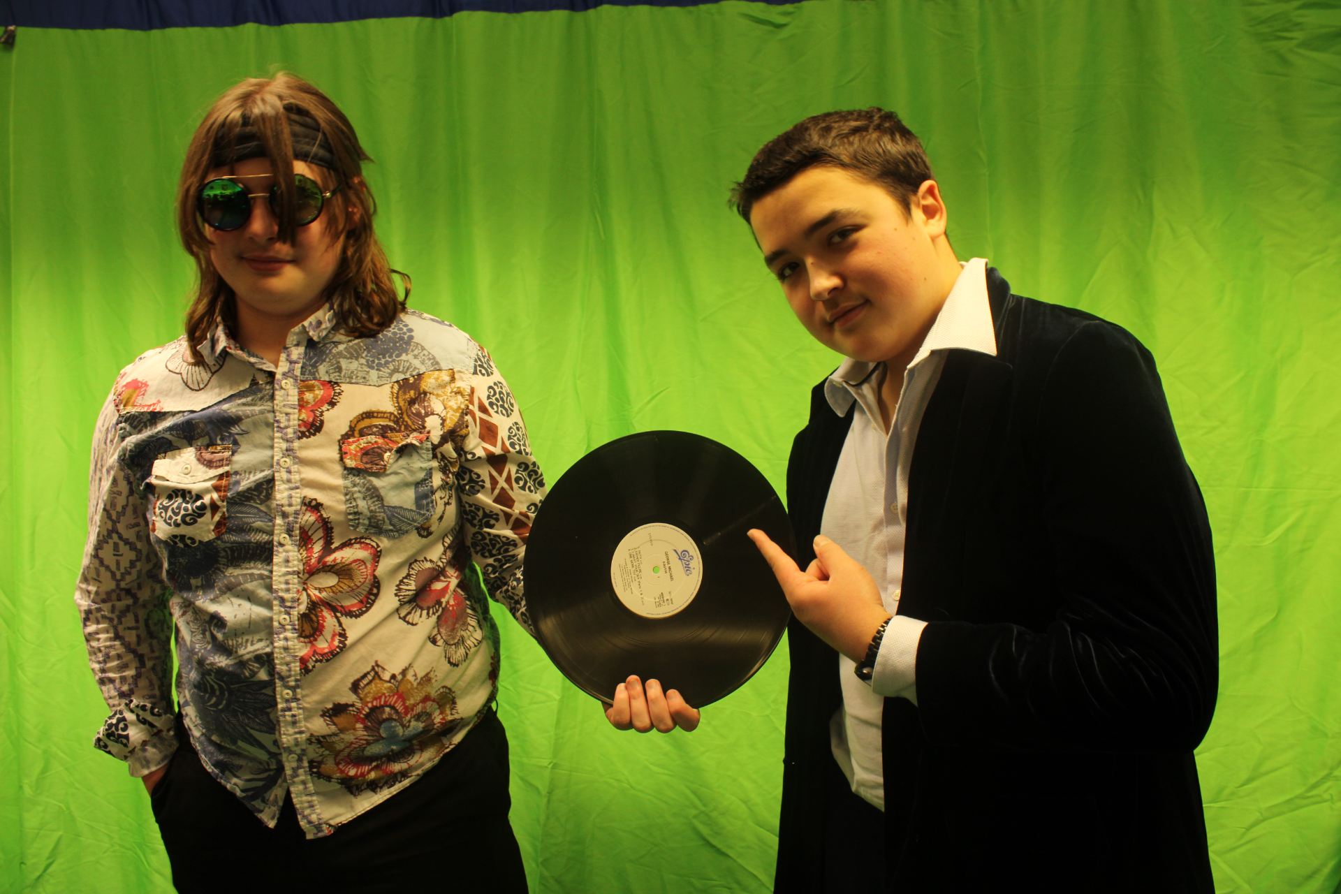
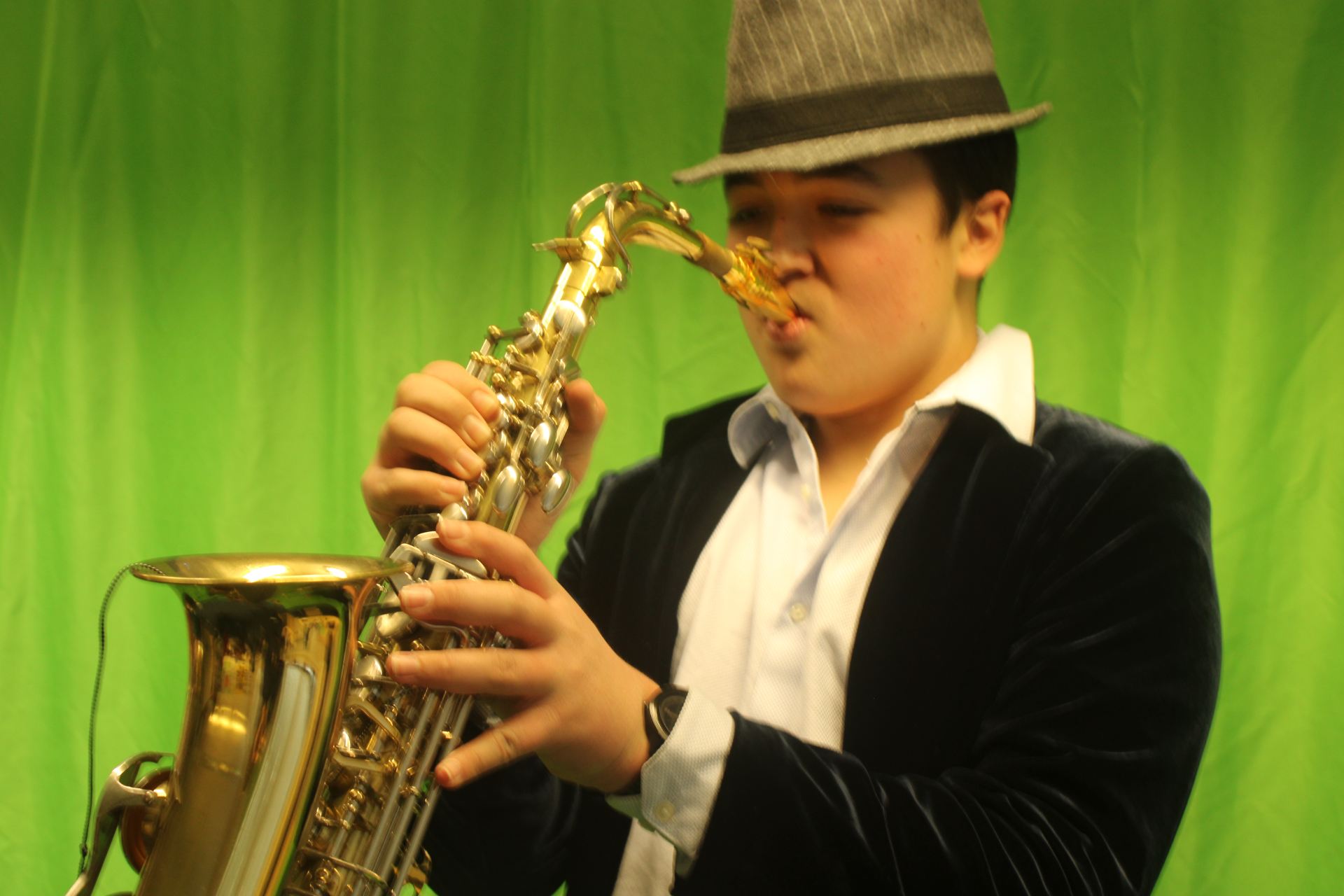
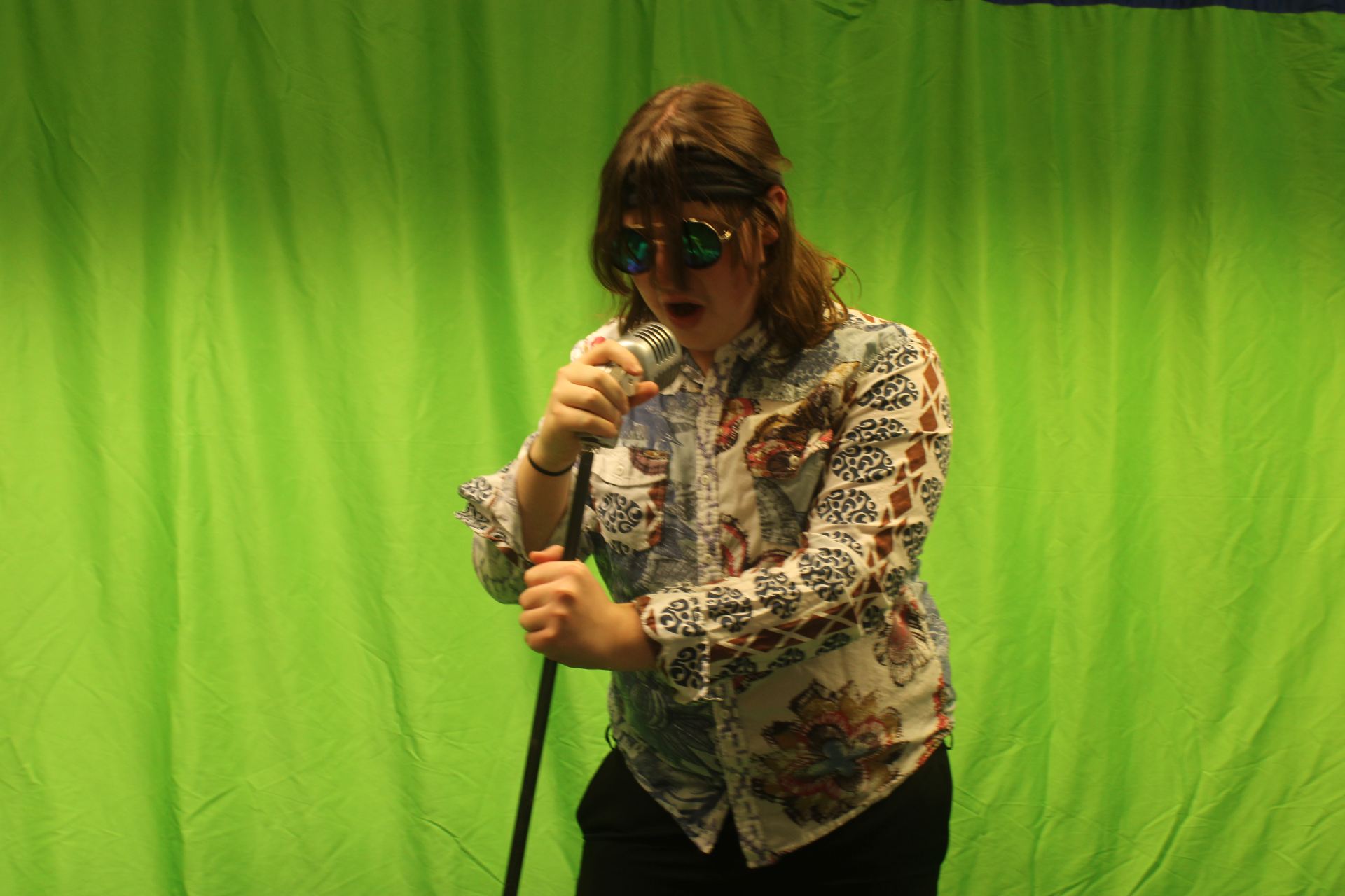
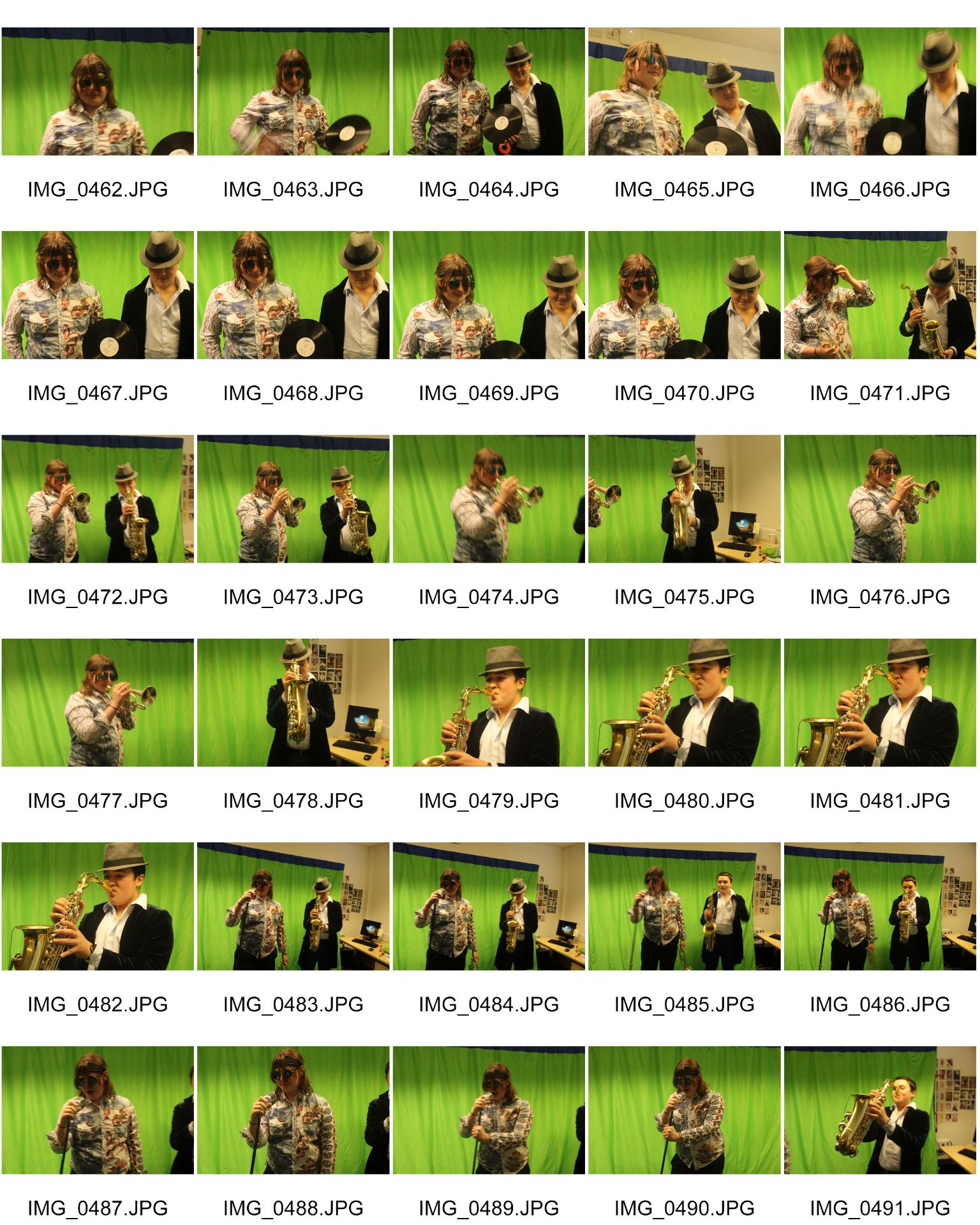
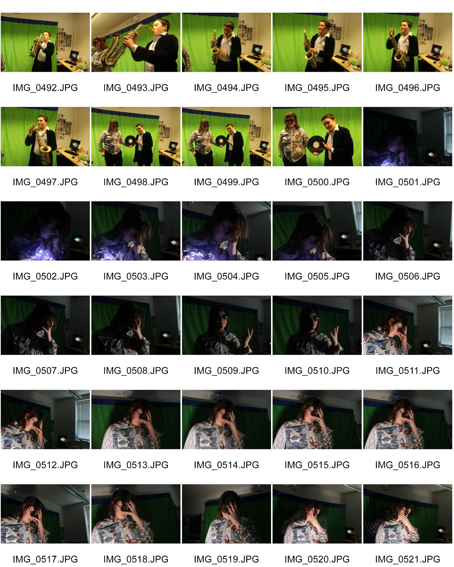
Personally, I think that this shoot went much better than my first, as I had more knowledge of what I was doing and how I could do it. One thing I think I made better was the quality of the photos, as my original shoot was mainly out of focus and blurry. Out of all of the shots that I took, I’ve put my favourites below.

Production Meeting Agenda for 2nd Photo Shoot

Here is the PMA for my second shoot. This PMA includes things such as the props, model and studio that I will be using to get my photos. This will aid my shoot as it will mean I will have more organisation and have my shoot planned in more detail.

In future I will remember to use PMA’s to help aid my production so as to try and go by a plan so as to have everything go as I want, rather than rushing to get things done quickly but poorly.

Language Analysis

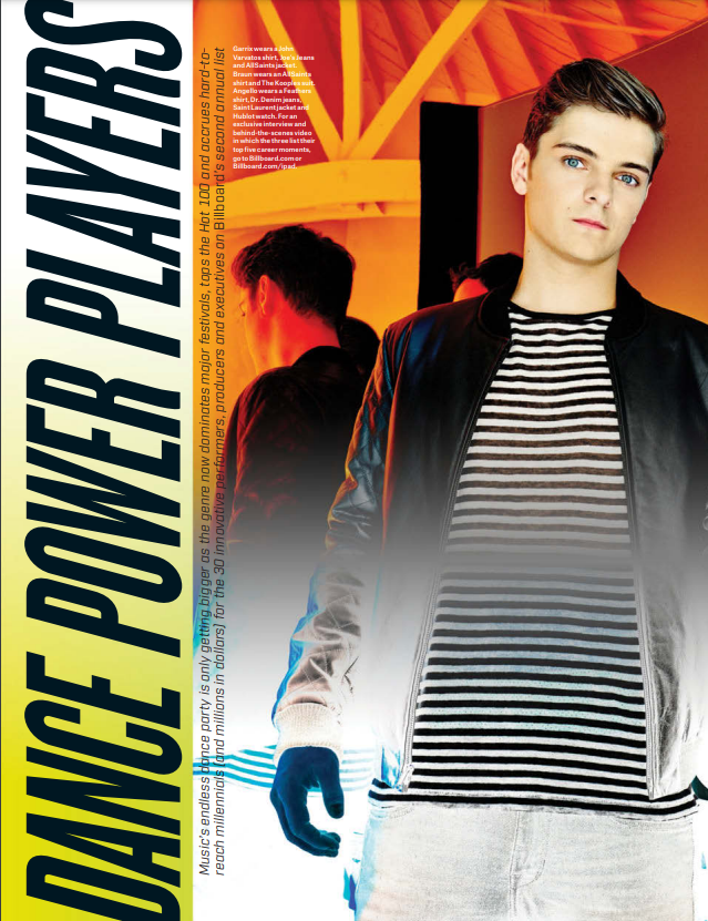
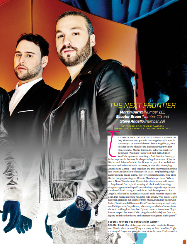
The magazine is Billboard (June 20th edition). The article is called the ‘Dance Power Players’ as it covers some top names within the EDM genre. The names of the three artists being covered are; Martin Garrix, Scooter Braun & Steve Angello. They are some of the top EDM artists in the world. The article mentions that they have met at a garden patio in Los Angeles on Memorial Day. This meetup was to establish their partnership as some of the top names in the world of EDM music and to discuss the future of EDM. The article is an interview with the stars as seen by the bottom paragraph where it is written from Garrix’s POV. The main bulk of the article that can be seen is an explanation, from the journalist, about who these people are and what they are doing. The journalist writes in a 3rd person perspective about the three artists which makes the introduction seem much more grounded and factual, rather than opinionated, as if we’re hearing the artists discuss everything from their own memory. The Journalist goes even further with this by describing things such as what the artists are wearing and how they’re acting. This style of writing means that there is no clear introduction or conclusion to the article. The journalist often writes about other artists within the industry and tries to mention the importance these three have had upon them. They use many grand and mature style adjectives within their writing in order to further emphasise the importance of these artists. Lots of these adjectives are also quite fun and modern which fits the more fun feel of the EDM genre. In conclusion, the journalist shows off how legendary these three artists are within the genre of EDM. They are portrayed as super stars and extremely influential within both the genre, as well as the industry as a whole. By doing this, the reader gets excited to hear more about them, which hooks the reader into reading more of the story about these men and what they have done to get themselves this far within the industry to become standouts within their genre of music.

In future this analysis will help me try to figure out the general language and conventions used when writing articles in order to emphasise the importance of the stars and to make what they’re talking about seem much more exciting and interesting, so my article can intrigue and hook readers according to the uses and gratifications theory.

Draft of Contents Page

Click to see PDF

Above I have put in a copy of my draft contents page that I have made. Soon I will take what I have learned from making this to then create a better one later on. To help me understand what I have done right and what I can improve upon, I’ve had mine peer assessed. After reading this peer assessment I have created five targets that need to be met in order for my contents page become better.

What type of shots have been used to create a variety of shot distances and how has the camera been used to communicate meaning?

N/A

What choice of Mise en scene is appropriate for the star image and genre?

N/A

How far is the font used readable and reflects the genre?

The Font itself is very readable and reflects the genre of Jazz quite well with its bold colors (yellow and orange) but it might be a tad too large.

What technical conventions of a Contents page are present and used effectively?  

The page has all its technical conventions that a regular content page would have; page numbers, what’s on those pages, main stars that are on those pages, etc. the page numbers are clear and easy to read and the pages the stars are on can easily be found underneath the images of the star.

How has Indesign been used to layout the page to convey a brand?

the overall layout could have been done a bit better with a better color match, black/grey with orange and yellow are very contrasting colors and they don’t compliment each other well. A better match could of been a dark navy blue and a greyish blue could of worked quite well or yellow and green, red and dark grey would have also been good with a yellow accent

 How well have the text and visuals been integrated together?

The text has either been placed next to the image or on top, but not much has been done with the integration.

Where has photoshop been used to manipulate the photos to enhance the star image or genre?

N/A

How is the language used appropriate for the genre and target audience?

Using words like new, now make the reader see that it is recent and important, drawing in their attention to the information

Clearly, strong, good, satisfactory, conventional, well good sense

Low B grade

Five Targets to improve in future:

  1. Rework colour scheme for both text and background.
  2. Try and incorporate photoshop more into the making of the page.
  3. Use design tools of Indesign to aid in the making of the page.
  4. Select more MES that is specific to the genre to use throughout the page.
  5. Use several different shots to create meaning through photos.

What is a contents page?

In order to try and engage my audience, I’ve decided to develop 5 catchy headlines to help genreate interest and desire.

  1. Amazing new jazz content
  2. For all kinds of jazz exclusives
  3. Incredible breakthrough in the jazz community
  4. Shocking new exclusives
  5. Ziggy D’s hottest new single

When creating magazines, you must take into account the graphic designs of the pages you create. One such page is the contents page. When designing a contents page you want it to be both aesthetically pleasing but also filled with content in order to help the reader navigate the magazine. If the page isn’t pleasing to look at, the reader will get bored however if the page doesn’t have enough information then the reader will get confused. If both of these things are avoided then it can help the magazine with it’s AIDA process and the uses and gratifications theory. Some of the information included should be things like page numbers, an index and the main cover lines of the magazines.

In future when creating my own contents page, I will reflect on the things I’ve learnt today in order to try and attract my target audience so they can read my magazine and enjoy it according to the uses and gratifications theory. I will also design mine in order to allow ease of access to my reader so their experience when reading my magazine is slick and seamless so it’s not a chore to get through.

Draft of Front Page and Self Assessment


When creating a magazine, you need to make sure that you apply the genres conventions to your own so you can appeal to your target audience. This will help it appeal to the uses and gratifications theory of entertainment, information, social interaction and personal identity. You also need to make sure that your cover will work alongside the AIDA process in order for your audience to gain interest in your magazine. I believe I have had some success with this however I do believe I have room to improve. In order to improve in future, I have created a to do list of  five targets that could help my cover better.

  1. When shooting your photos make sure you’re on the right camera setting in order to get the cleanest base image possible.
  2. Make sure that the colour scheme used is consistent as the orange at the bottom looks somewhat out of place among the rest of the cover.
  3. Try to experiment slightly more with the Masthead and cover lines colour as it can come across as slightly off.
  4. Feel free to take time playing around with photoshop in order to find something that works incredibly well. The main cover star seems slightly out of place in the image.
  5. Try to create or find a more interesting background that compliments both the text, but also the main cover stars image.

First Contact Sheet

During one of our lessons we were shown how to use dslr cameras to take photos, however I was ill and missed the lesson so I ended up doing my photoshoot without much knowledge of what to do other than take photos. This caused many of my photos to end up blurry and unfocused however some of my pictures ended up well. I have listed some of the images I liked the most below.

Masthead Designs


My finished Masthead design in the large, underlined one in the corner. It’s colour is a purple to orange gradiant and its font is Franklin Gothic Heavy. Originally I tried a few more out there masthead designs however I felt that they didn’t fit my genre and its conventions so I decided to look at and take inspiration from some other music magazines such as downbeat, jazzwise and jazztimes which all had more grounded, regular fonts that were still appealing in their simplicity. Once I decided to take this approach, I found some designs that appealed to me however the font that I thought was the best fit was Franklin Gothic Heavy. I then played with the colour, first trying static colours and then moving onto gradients. After guaging what others thought, the purple to orange design won unanimously.

In future when designing aspects for potential media I will try and take into account the genre and the general conventions associated with it so I can attract an audience that will understand and appreciate why I have designed it that way. I will also use the people around me to get second opinions on my designs so my brand image isn’t based off of my potentially biased opinion and so i can ensure the best quality product for my audience.


So what am I up against? The competition.

When creating my music magazine, I had to think about what many magazines weren’t offering in order to create a unique selling point (USP) for my magazine so it will stand out among the competition. Upon researching other blogs and magazines, I found that the audience interraction was fairly minimal and that they mainly focused on the stars and nothing else. I borrowed this foundation of interviews, articles and reviews on these artists and decided to try and include the audience for a fair part in it so that we will engage our target audience with the conventions of the genre whilst also using artists to catch the eye of their fans. This will helps us entertain, inform, reinforce the personal identities of and help out audience socially interact so we accomplish everything on the blumler and katz uses and gratifications theory.

In future I will work hard in order to understand my audience through extensive research so any future audience I have so my audience can enjoy preferred reading without any issues and so I can draw their interest through a USP that my competitiors don’t use.