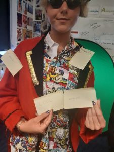
Before I began making my tour poster, I researched other punk tour posters in order to ensure that mine resembled the genre in terms of the conventional features as well as elements like colour palette and fonts. I also had to ensure that my image of the cover star portrays the genre as well, to do this I used Mis-En-Scene to make the poses, props, makeup and costumes to create an anarchic vibe.
Almost every example has black as the dominant colour as it’s bold and harsh which is what punk is all about. Another prominent colour is red- another colour representing anarchy and danger. Often, the Union Jack is used as a sarcastic political statement, another common design feature is magazine cutout-like fonts- a bit all over the place and chaotic, much like the chaotic layout. This concept gave me free rein to explore and use a lot of fonts. The typefaces vary in serif and sans serif but most outstandingly the fonts are decorative to be genre specific.
As for AIDA, the conventional attraction for a tour poster is usually a large image of the artist themselves but some punk bands have chosen to favor iconic symbols or graphics that represent the band or genre. Finally, each poster includes a variation of (if not, all) the following conventions…
- Artist name / names
- Tour title
- Tour dates
- Tour venues
- Artist image or graphic imagery
- Persuasive statements
- Where to buy tickets/ more info
- Prices
These help to interest the audience by boldly stating locations and dates so that they can stick in people’s minds. The artists is the main attraction and the desire and the call to action is the more information elements.
My Tour Poster & Reflection

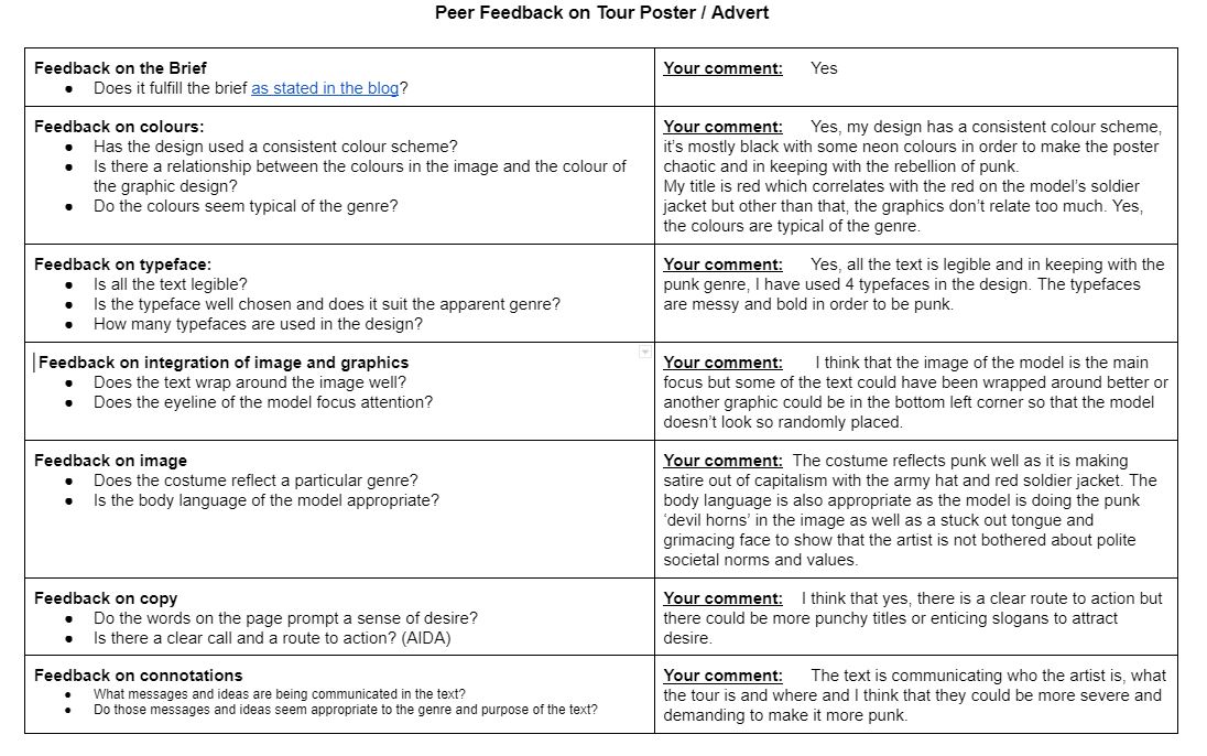
My poster is conventional because it has black as it’s prominent colour and I have turned up the contrast and saturation on the artist image in order to create the harsh chaotic connotations. It also includes all of the necessary conventional features such as tour dates and venues.
My poster is unique because I’ve used a bright purple which stands out but also differs from other punk posters. It attracts the audience via large titles, artist image and punk connoting colours.
I like the typefaces and text on my poster but I think I could’ve chosen the colours more carefully and spent more time editing the image and creating shadows on it as I had originally envisioned. I think going forward, I will pay more attention to the additional graphics associated with the genre.