Advanced Portfolio – Critical Reflection

Advanced Portfolio

Critical Reflection

Name: Cerys Collins


  • How do the elements of your production work together to create a sense of ‘branding’?
  • How did your research inform your products and the way they use or challenge conventions?
  • How do your products represent social groups or issues?
  • How do your products engage with the audience?


Music Video – Final Draft

Music Video – What would you do? – Tate McRae

Please watch in playback quality 1080p for the best results

Above is our final draft of the music video. Overall Jemima and I are very proud of what we have produced. We feel that we made an appropriate use of effects without over complicating the video or straying from the conventions of the pop genre. Also, we used a variety of shot distances to convey the narrative and create a memorable performance.

We payed particular attention to mise-en-scene taking care in the details of the wedding reception style performance scene and the setting of the church in the narrative. When editing, we made sure to edit to the beat as this is conventional for our genre and also ensure that in terms of proxemics, our star was the main focus of majority of scenes.

Of course the final product wasn’t going to come without its faults. Particularly we are frustrated that we didn’t pay enough attention to the continuity when filming the narrative – this wasn’t highlighted to us until we received peer feedback and once we noticed it we couldn’t miss it. In our final edit we tried our best to rearrange and cover clips so that it is less obvious but we simply didn’t have the shots to cover it up or fix it entirely but this will teach us to take care with this when filming in the future.

Another continuity error that has been pointed out to us is the wedding cake is smashed in some scenes and then not in some of the following but we were aware of this and feel that it isn’t an issue because it is simply a prop in the performance and when the actress is not smashing it, it is simply an element of the setting.

In totality, we created a music video that followed the conventions of a pop genre and used a creative narrative to produce a high quality music video


SMP Draft 2 – Screencastify Teacher Feedback

For our social media page, we have received feedback via Screencastify from our teacher.

From the feedback, we have learned that we made great use of social media page conventions such as guerilla marketing, portraying the star as ordinary (dyer) and extraordinary, posts advertising tour dates and the evolution of the album project.

It has also highlighted that our calls to action need to be clearer, therefore to improve we will edit captions and pay close attention to future story posts to draw more attraction to the links and methods of distribution for each of our products. Further, we could also use some cross media convergence such as a radio or TV interview. Cross media convergence drives engagement for the star as their content can be consumed in more ways than one.

Digipak – Final Draft Reflection

Please click to view Digipak PDF “Luna”

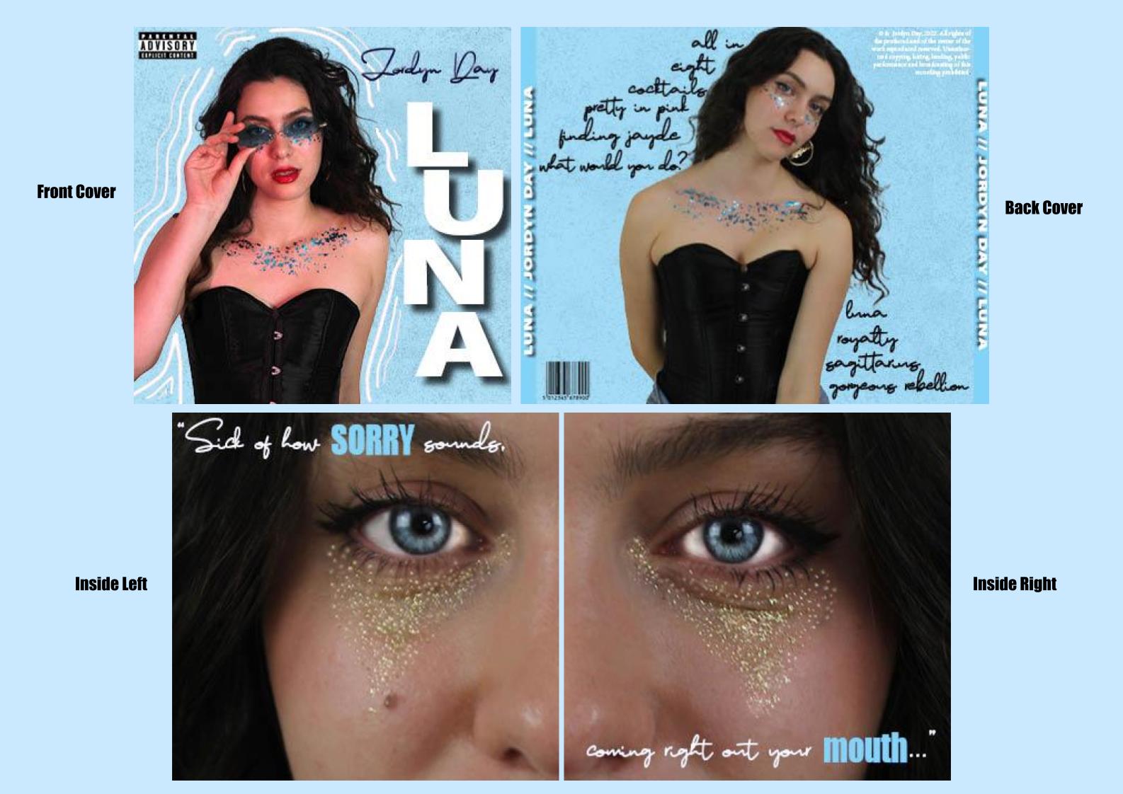
This is the very final version of our digipak – “Luna by Jordyn Day”.

Overall, we are very proud of our final product, it portrays the pop genre well whilst also challenging the conventions slightly by creating a slightly edgy star image. It is clear that this was done successfully based off of the survey results from draft 3. The improvement on this draft is the addition of a barcode on the back cover, a technical convention that we mistakenly missed out in draft 3.

In conclusion, I think that Jemima and I worked well in collaboration to create a digipak that we are both proud of and although it strays from our original mock up sketches and title, it stays true to the mission statement and should be interpreted by the audience as a female pop album

Digipak Draft 3

Below is the completed draft 3 of our digipak displayed as a physical prototype.

To ensure that we have created a product that follows the genre and accurately represents a female pop star we did a survey amongst our peers and asked them to choose which of the 7 genres the digipak connotes most.

The results show that the majority of people surveyed understand that the genre is pop, proving that our design follows the conventions of pop such as having a bright colour palette, minimal photo manipulation with focus on airbrushing the star and typefaces that are simple.

Our mission statement stands true as I feel we have created a positive role model for the next generation of young girls. The only difference is that we have changed the album title but it is still edgy and unique. Also, since creating the prototype we have noticed that we forgot the barcode – a technical convention of a digipak.

I have also embedded the PDF of this draft.

Draft 1 of SMP Self Assessment

Here is a a screenshot and link to our social media page:

It is important to reflect on the progress of the page so that we ensure that we are creating a consistent brand and using social media to effectively campaign the release of an album. To do this, I have filled in a self-assessment sheet, the full doccument is linked to the images below.

Assessing our social media page has allowed me to identify what we have done well and the ways that we can improve it. Upon reflection, I would like to create promotional content encouraging fans to purchase physical copies of the album as well as just streaming and maybe an interview.

Social Media Page – Marketing Timeline

To coincide with the digipak, we have also created an Instagram page for our star. This page will be used to create a positive star image, market the release of the album and music video and interact with the audience and fans.

Instagram is our platform of choice as we feel it is the most relevant for our target audience – female pop star’s have a core audience of young girls age 11-19 but generally pop is a genre for everyone. Our intended audience are on this platform, evidenced in research by Social Media Perth 43% of females are on Instagram, 72% of 13 – 17 year olds use Instagram and 73% of U.S. teens say Instagram is the best way for brands to reach them about new products or promotions.

We’ve created a brief timeline of posts which aim to create and interest and buzz around the album release. The social media campaign includes things like synergy to create links with brands that would appeal to the audience. Originally we went with R.E.M Beauty – inspired by our analysis of Ariana Grande’s SMP, but have since decided to go with a collaboration with Converse as we want a slightly edgier star image for our artist.

Other things include showing interest in charities and issues (our chosen issue being LGBTQ+ Rights), displaying the star as an ordinary person through relatable and personal content, content that the audience can gain social interaction from such as a Q&A, calls to action to stream the music and many other posts that build and promote the excitement of the digipak.

To appeal to Bulmer and Katz, we will use the SMP to inform and entertain our audience and provide a star who makes people feel they can gain a sense of personal identity from it.

Below is our SMP Timeline and log. The first and second slides show our rough plans but I think we could add a guerilla or viral marketing campaign, more calls to action, a prompt to buy physical copies, more information on the album and a tour or live event.

Draft 2 & Screencastify Feedback


Above is an embedded PDF of our draft 2, this draft includes the inside panes as well as the front and back. Some changes made from the last draft include a different background, change in typeface and manipulation of text graphics as well as the addition of the middle panes.

Feedback Screencastify from teacher:

Improvements for draft 3 –

  • change the ‘Jordyn Day’ font so that there aren’t too many fonts that its confusing/complicated, and move the positioning of the names.
  • make the inside covers more appealing, but lightening the eyes and excentuating the glitter
  • think about adding an effect on the inside front and back cover
  • spacing between “all in” and is not even compared with the spacing of the other song names
  • complete the spines

A personal improvement that I want implemented in the next draft is a more consistent brand that we can easily apply to the SMP but mostly a new background – from the Screencastify we know that we need to use effects on the front and back cover but i would like to use Adobe Photoshop also as I feel our background texture and colour doesn’t fit as well with the rest of the star image. I did a quick search and found this video that may give some useful ideas for the next draft.

The Screencastify feedback has allowed me to see my work through another perspective and identify what needs changing and how.

Digipak – Draft 1 & Evaluation


Please click to view PDF

Above is our first draft of the digipak front and back covers. As a draft 1, it has a lot that needs improving so I judged our work against the success criteria to highlight how it can be upgraded.

The slide below shows a careful analysis of our draft’s features against the success criteria but overall I feel we have learned that we need to create a more consistent brand across the music package, be more creative and aesthetic with text and image integration and finally enhance the star image to focus even more on ‘Jordyn Day’.

Identified targets for draft 2:

  • Tint the back cover image pink to be consistent with cover
  • Create a more memorable integration of text
  • Amplify the star name and album title texts
  • Improve the layout to be easier on the eye
  • Create a memorable brand through this package imagery and typefaces

Contact Sheets – Digipak Shoot & Evaluation

Jemima and I have completed our shoot for the digipak. We used our ideas collected on the PMA to get a variety of shots and angles giving us plenty of content for the front, back and inside as well as the social media page. We are intending to use the more casual outfit pictures and photoshop them to be appropriate for an SMP feed.

You may notice that the model featured in the contact sheets differs from the actress in our music video and whilst this is not ideal, our original actress wasn’t available. Conventionally in the pop genre, an artist’s album is all about themselves and their message so they tend to feature in all elements of the package including their own music videos however it is not completely out of character for pop star’s to outsource for their videos as long as the actress conveys the story in a relevant way. Our digipak star does appear in the video as the love interest towards the middle of the narrative, therefor I feel that this change in star is acceptable because she still features in her own work just perhaps in a more humble way.

We intend to have a scrapbook style branding for the album release – even her social feed could follow a scrapbook theme – so we used glitter in two of the looks to give that playful and crafty vibe. We chose 6 looks in total, some casual (but still cool) and some more dressy and outrageous to comply with Dyer’s theory of stars being both extraordinary and ordinary.

Overall I think that we got a good amount of sharp and fun shots to use across all elements of the digipak, we do have some slightly blurry and low lighting ones but I feel that the useable images outweigh these. I think that we were able to capture a variety of shot distances but heavily mid and close ups as these are conventional cover shots for pop and were able to use mise-en-scene and the camera to convey a star image that complies with Dyer’s theory of the extraordinary vs ordinary star with the casual vs glamorous outfits.