
Loading…


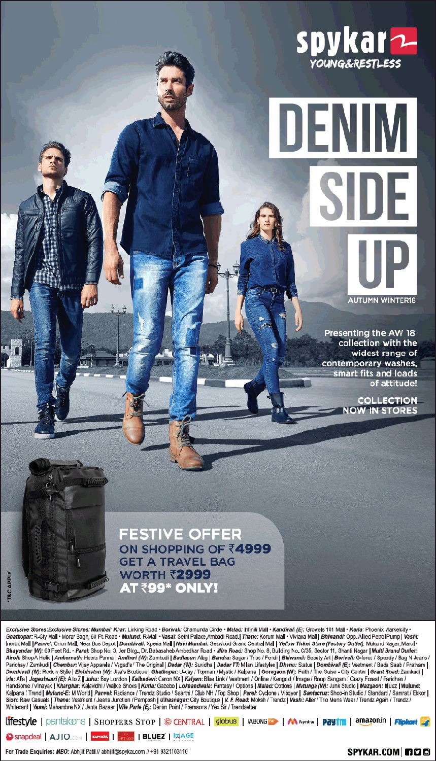
I appreciate that this isn’t going to be marked but for the purposes of presentation I have chosen to include adverts in my magazine. When my magazine is finished, it will be presented via the Flipsnack platform. So that this works better, I have collected some images that country fans might respond to and that will go well in the magazine. I think that a music advert will work well on the back page and another on the very first page before my contents page.
Doing this has helped me to understand y audience better and research what they will respond to. For a music advert, I will use either of the Taylor Swift promotions or the Carrie Underwood one as these are both female country legends which are perfect for my feminine issue of the magazine as well as country for the audience.
For the product advert, I thought denim, cowboy hats, boots, equine-related things, outdoor adventure to appeal to my audience. A lot of these ideas are from my research done on YouGov that explores what Dolly Parton fans also enjoy and engage with.
When searching for these my options were slightly limited as it must be A4 and have a high resolution to keep up quality imagery in the magazine.


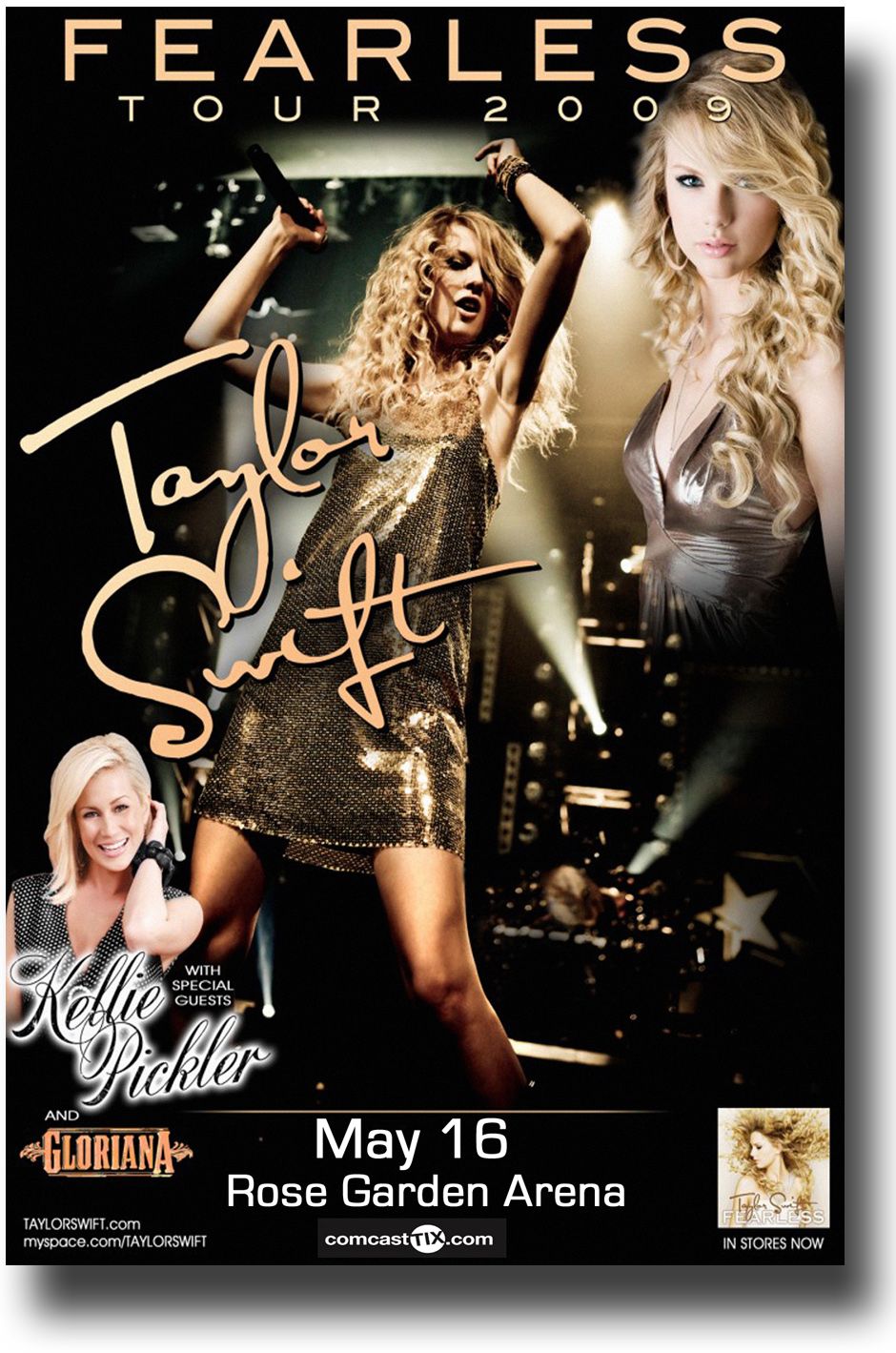


I think that for my music magazine I will use the Taylor Swift album promotion at the back because it will appeal to the audience as Taylor is a well known female country star, especially this particular album.
For the first page, I will use the Levi’s advert because I think that it’s eyecatching, memorable and that my audience will respond to it as country stereotypes dictate that fans of the genre wear denim.


What’s New?
What’s Next?– Screen Castify Feedback
Targets for Final Draft:

What’s New?
What’s next?
Evaluating my second draft has helped me to self criticise my work and see how aesthetics on the page work together.
This is the second draft of my contents page, I’ve changed it quite a lot…

What’s New?
What’s Next?
Although I do like some of the changes that I’ve made, after some feedback from peers and my teacher I might put the lines back in so that the page is more aesthetically pleasing as well as change the font of the text. Additionally, my colour scheme on this page is the same as my cover except the turquoise is the main colour whereas it is pink on the cover, I need to change this because they are too similar.
I think that creating this draft has helped me to further develop my Adobe InDesign skills and photoshop – I created the image at the top of the page. It has also helped me to learn the conventions of a contents page and how to incorporate them.

This is the second draft of my front page.
What’s New?
What’s Next?
This is my first draft of the double-page spread for my music magazine, I used Adobe Photoshop and InDesign to create this.

I like how my double-page spread has a simple two-tone colour theme- pink and turquoise, these colours contrast each other nicely as they are on opposite sides of the colour wheel. I like the image I’ve chosen and the way that I’ve cut it out and positioned the PNG to look as if the model is sitting on the coloured block. I also like the three columns of text on the left-hand page, I think this conveys that it is an article because columns are convenentional for this.
For improvements, I think that I need to put effort in to further communicate the style and genre by following the conventions such as having the page numbers in the corner. The star’s name also has to be moved because it will fall between the fold in the magazine, this could also give me the freedom and space to consider adding another image or just improving the layout of the spread in general. I would also like to manipulate the text, for example increasing the size of the word ‘BIG’.
Further, I want to change the text so that it has the conventional drop capitals. To make it easier to read, I am going to change my main text to a serif font, I also need to add text that indicates the reader to continue reading on the next page.
