Digipak – Final Draft Reflection

Please click to view Digipak PDF “Luna”

This is the very final version of our digipak – “Luna by Jordyn Day”.

Overall, we are very proud of our final product, it portrays the pop genre well whilst also challenging the conventions slightly by creating a slightly edgy star image. It is clear that this was done successfully based off of the survey results from draft 3. The improvement on this draft is the addition of a barcode on the back cover, a technical convention that we mistakenly missed out in draft 3.

In conclusion, I think that Jemima and I worked well in collaboration to create a digipak that we are both proud of and although it strays from our original mock up sketches and title, it stays true to the mission statement and should be interpreted by the audience as a female pop album

Digipak Draft 3

Below is the completed draft 3 of our digipak displayed as a physical prototype.

To ensure that we have created a product that follows the genre and accurately represents a female pop star we did a survey amongst our peers and asked them to choose which of the 7 genres the digipak connotes most.

The results show that the majority of people surveyed understand that the genre is pop, proving that our design follows the conventions of pop such as having a bright colour palette, minimal photo manipulation with focus on airbrushing the star and typefaces that are simple.

Our mission statement stands true as I feel we have created a positive role model for the next generation of young girls. The only difference is that we have changed the album title but it is still edgy and unique. Also, since creating the prototype we have noticed that we forgot the barcode – a technical convention of a digipak.

I have also embedded the PDF of this draft.

Draft 2 & Screencastify Feedback


Above is an embedded PDF of our draft 2, this draft includes the inside panes as well as the front and back. Some changes made from the last draft include a different background, change in typeface and manipulation of text graphics as well as the addition of the middle panes.

Feedback Screencastify from teacher:

Improvements for draft 3 –

  • change the ‘Jordyn Day’ font so that there aren’t too many fonts that its confusing/complicated, and move the positioning of the names.
  • make the inside covers more appealing, but lightening the eyes and excentuating the glitter
  • think about adding an effect on the inside front and back cover
  • spacing between “all in” and is not even compared with the spacing of the other song names
  • complete the spines

A personal improvement that I want implemented in the next draft is a more consistent brand that we can easily apply to the SMP but mostly a new background – from the Screencastify we know that we need to use effects on the front and back cover but i would like to use Adobe Photoshop also as I feel our background texture and colour doesn’t fit as well with the rest of the star image. I did a quick search and found this video that may give some useful ideas for the next draft.

The Screencastify feedback has allowed me to see my work through another perspective and identify what needs changing and how.

Digipak – Draft 1 & Evaluation


Please click to view PDF

Above is our first draft of the digipak front and back covers. As a draft 1, it has a lot that needs improving so I judged our work against the success criteria to highlight how it can be upgraded.

The slide below shows a careful analysis of our draft’s features against the success criteria but overall I feel we have learned that we need to create a more consistent brand across the music package, be more creative and aesthetic with text and image integration and finally enhance the star image to focus even more on ‘Jordyn Day’.

Identified targets for draft 2:

  • Tint the back cover image pink to be consistent with cover
  • Create a more memorable integration of text
  • Amplify the star name and album title texts
  • Improve the layout to be easier on the eye
  • Create a memorable brand through this package imagery and typefaces

Contact Sheets – Digipak Shoot & Evaluation

Jemima and I have completed our shoot for the digipak. We used our ideas collected on the PMA to get a variety of shots and angles giving us plenty of content for the front, back and inside as well as the social media page. We are intending to use the more casual outfit pictures and photoshop them to be appropriate for an SMP feed.

You may notice that the model featured in the contact sheets differs from the actress in our music video and whilst this is not ideal, our original actress wasn’t available. Conventionally in the pop genre, an artist’s album is all about themselves and their message so they tend to feature in all elements of the package including their own music videos however it is not completely out of character for pop star’s to outsource for their videos as long as the actress conveys the story in a relevant way. Our digipak star does appear in the video as the love interest towards the middle of the narrative, therefor I feel that this change in star is acceptable because she still features in her own work just perhaps in a more humble way.

We intend to have a scrapbook style branding for the album release – even her social feed could follow a scrapbook theme – so we used glitter in two of the looks to give that playful and crafty vibe. We chose 6 looks in total, some casual (but still cool) and some more dressy and outrageous to comply with Dyer’s theory of stars being both extraordinary and ordinary.

Overall I think that we got a good amount of sharp and fun shots to use across all elements of the digipak, we do have some slightly blurry and low lighting ones but I feel that the useable images outweigh these. I think that we were able to capture a variety of shot distances but heavily mid and close ups as these are conventional cover shots for pop and were able to use mise-en-scene and the camera to convey a star image that complies with Dyer’s theory of the extraordinary vs ordinary star with the casual vs glamorous outfits.

Digipak – Risk Assessment & Production Meeting Agenda

For our digipak, we will need images of our star for the covers as the pop genre typically centres the art and imagery around the artist themselves.

Conventionally, this would be the same artist as the performer in our music video (as this is for the same album) but our actress is hard to find time with so we are using her costar from the narrative to keep some continuity.

Below is our PMA – it outlines all of the planning and details needed for this photoshoot as well as ideas we might want to use.

Please click to view PDF

Secondly, it is essential that we evaluate the risks ahead of the shoot to ensure that everyone is safe and everything goes to plan.

Please click to view pdf

We will get our teacher to sign off on the assessment and then we will be fully prepared for the shoot.

Filling in these documents has taught me the importance of planning, health, and safety when doing a photoshoot for a digipak.

Digipak Mock-Up

Jemima and I did a mock-up version of our future digipak to explore our initial ideas and desires for the piece.

Our digipak mock up drawings

This has helped us to visualise our digipak and decide on the repertoire of elements that will make our imagery easy for the audience to decode.

For example, typically female pop stars have a star image of being cool and someone to look up to but also have that relatability that brings them down to earth. To implement this our star will be pictured on the cover as dramatic and dreamy which will be juxtaposed with the more goofy and relatable right inside image of her pulling a face that will be behind the CD.

Another element we wanted to input to follow the genre is a playful style – pop albums don’t have graphics that are unusual but they are typically easy to decode and simple. We’ve taken inspiration from Olivia Rodrigo’s “Sour Album” from which the visuals are based around magazine cut out letters, stickers and the colour purple. She has built her brand around these elements, especially the colour. We want to do something similar with ours and have a scrapbook type of narrative to the imagery as the album is all about being yourself whomever you are. I feel that a scrapbook conveys this because they’re often cut outs and insights into the persons life all glued into one book of expressive creativity. We will do this by using things like scrapbook imagery tape, photos, page texture, rips, glitter and more.

From our mock-up, we know that we need to use bright ‘girly’ colours and features to get the preferred reading of inspiring, creative and relatable.

Digipak Conventions Analysis


Digipaks are designed to be an element that supports the launch of a multimedia package.

Whilst exploring female pop digipaks, I was able to see that the technical conventions of a digipak include a barcode, the record label’s logo, a copyright declaration and sometimes a producer credit.

Another convention is to have a track list on the back, this is common in pop but may be missed in other genres as they focus on atypical imager and graphics so the visuals are more important than the track list.

A digipak has to follow the typical conventions like a blueprint so that the audience doesn’t reject the text – every genre has a repertoire of elements that are specific and recognisable to its intended audience and their interests. For female pop, these include a large image of the artist, the album title and sometimes the artist’s name.

Analysing front and back covers means that I’m now knowledgable in what type of things a female pop digipak would include and how vital it is that the audience denotes the elements so that they recognise the genre.

Knowing the conventions of a digipak is important because they demonstrate how media language is used to convey a genre, brand and star image in a way that the audience will understand and denote it in the way it was intended.

Jordyn Day – Look Book


Made with Padlet

To develop our research, Jemima and I used Padlet to compile a moodboard of images that represent our genre. It includes graphics, pop media texts and all things female pop. From this we have picked out our key descriptors – these are words that we will keep looking back to when we need inspiration in our digipak.

This has helped us to develop a brand because we are able to view female pop culture as a visual blueprint for our project. You can already see the themes of relatability, the style of quirky fashion and the types of imagery that is associated with female pop musicians.

We have identified that graphics in this genre use lots of bright colours and the audience’s preferred reading tends to be digital ad exciting. We will use this repertoire of elements to build our integrated advertising campaign so that our media texts convey the genre correctly.

Digipak – Mission Statement

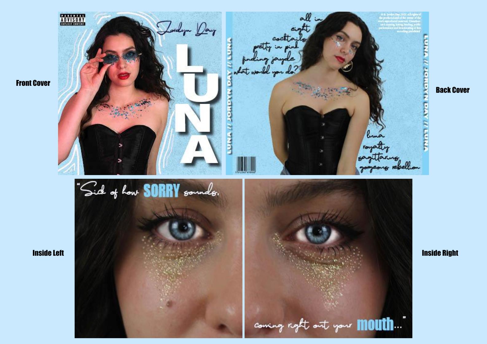
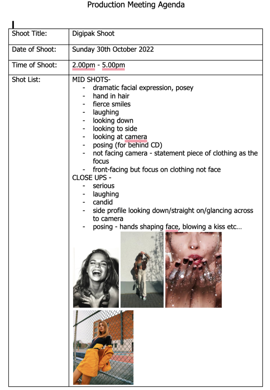
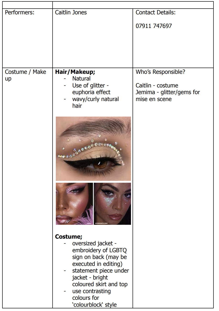
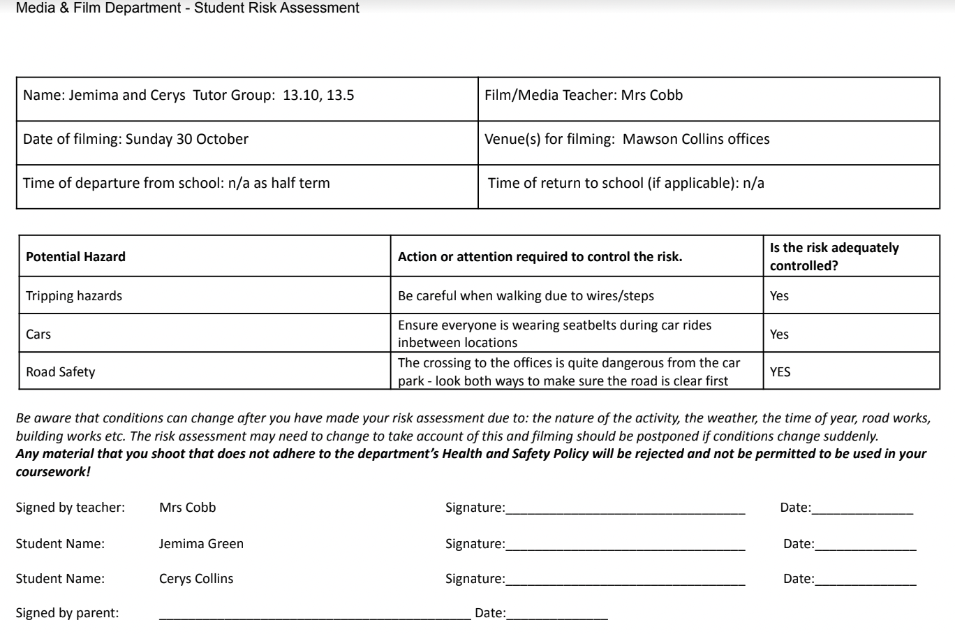
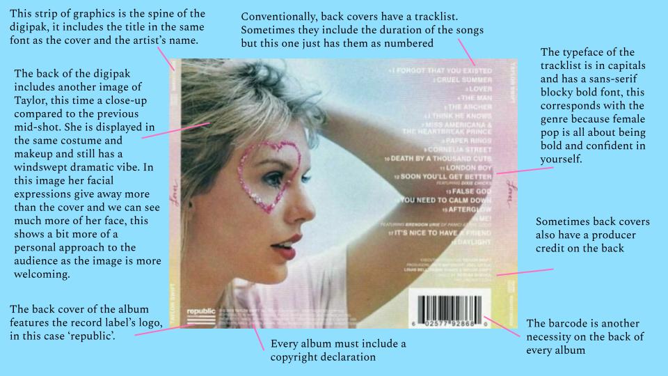
A digipak is the minor task in the brief to coincide with our major task – the music video. This means that we have to create an entire star image for our musician that is conventional to the genre, coherent with the music video and a campaign that uses integrated advertising and strong branding to gain an audience!

Jemima and I made the research presentation below to explore the ideas and inspirations from previous female pop stars;

During this research, we have learned that often women in the music industry portray a friendly and relatable presence and are very often role models for their young fans. Knowing the type of media diet our target audience has will make it easier to make decisions on what platforms or distribution channels we want to advertise with, for example, we know that our audience of young girls use multiple social media platforms and find a community from the love of music. If the audience interpret anything in the wrong way, they could reject the media text entirely and the campaign will fail. We will be able to target this in our calls to action.

Bulmer & Katz’ Uses and Gratifications theory states that audiences consume media texts to gain information, entertainment, personal identity and social interaction. In my research I found that pop stars use social medias to communicate with fans and provide a social interaction in addition to the entertainment they get from the music and other content.

We also developed a unique selling point – this is something that sets our female pop star aside from the competition whose content is aimed at the same audience. A USP helps maintain a strong star image.

Finally, we came up with a mission statement – this will ensure that we keep continuity when making our package as it sums up everything that our artist is about and stands for.