October 18

Evaluation of Shoot 2

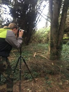
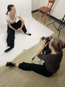
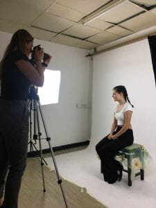
Overall, I think that our shoot went really well and we got some good and effective results. We managed to get some shots to use for theleft inside pane for our digipak, which we will invert and use on the right inside pane. We managed to get a variety of shots from different angles as well as covering all bases and getting high angles and lower angles. I like that we kept it simple and focused on nature as it is very conventional of our genre and is often seen in indie/folk album covers.

October 18

Contact Sheets from Shoot 2

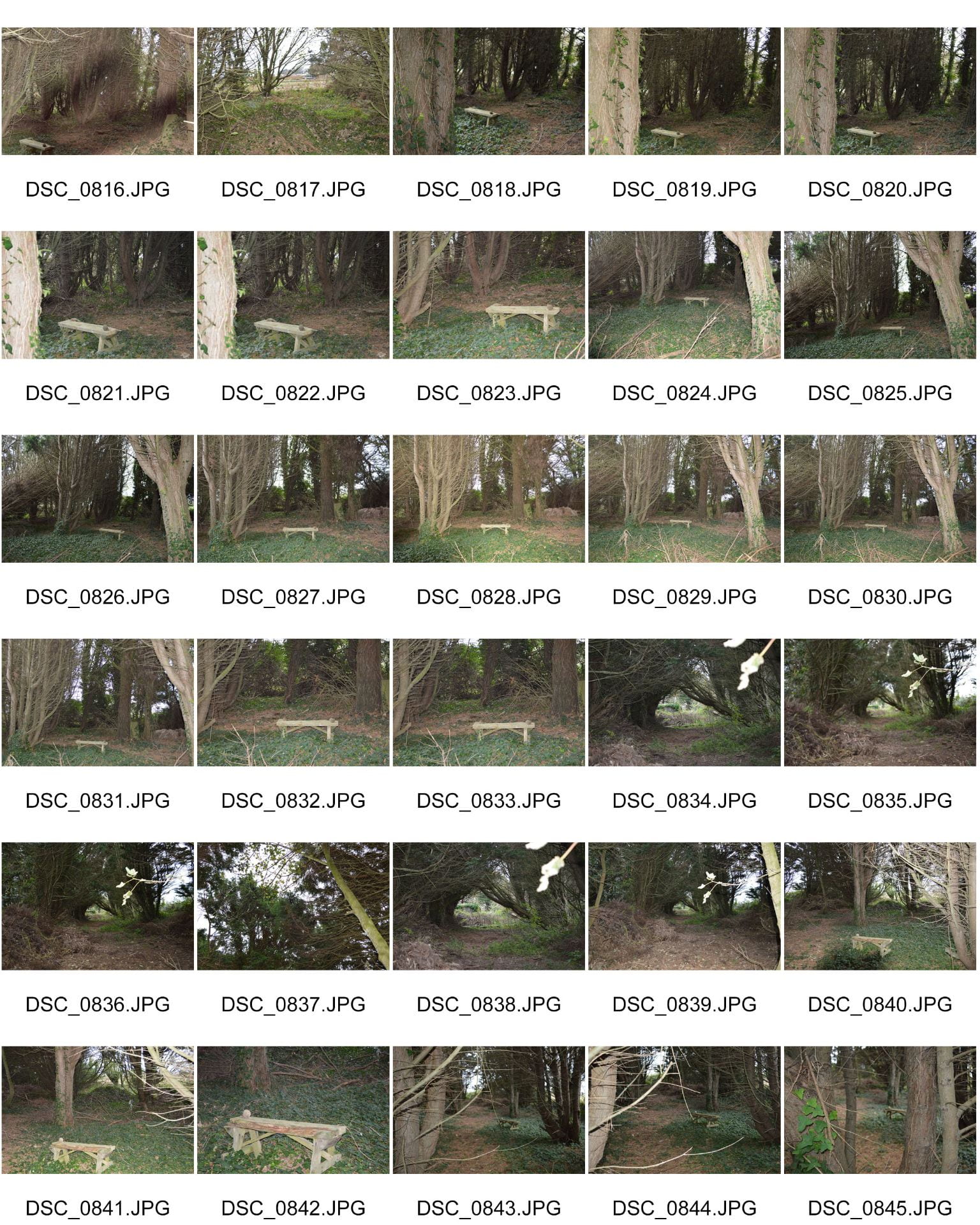
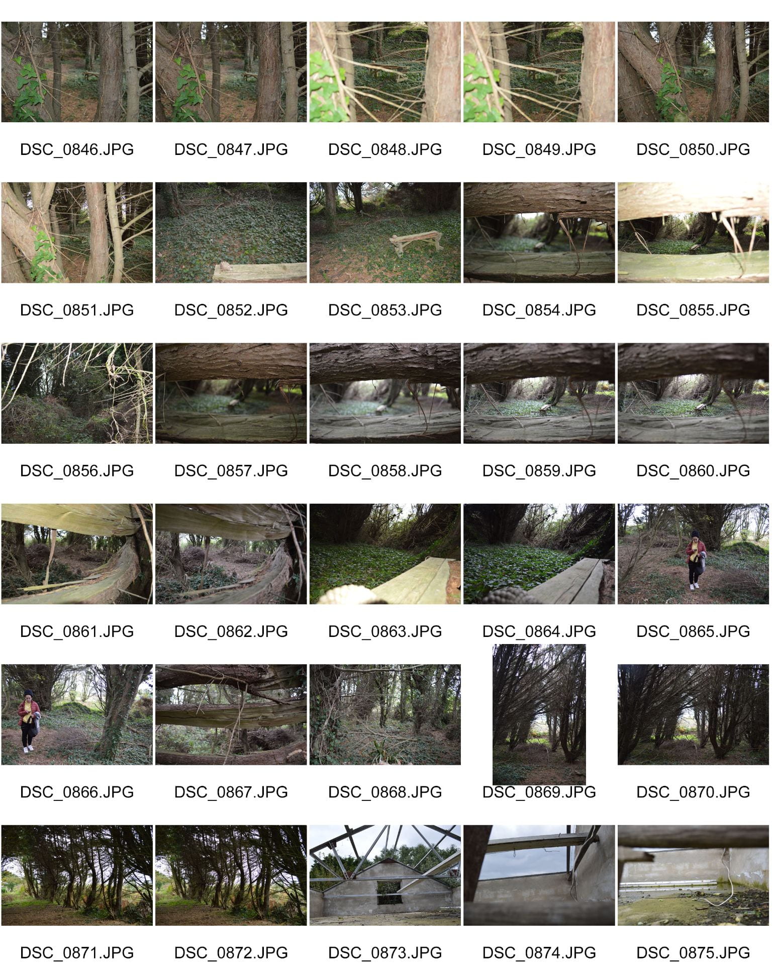
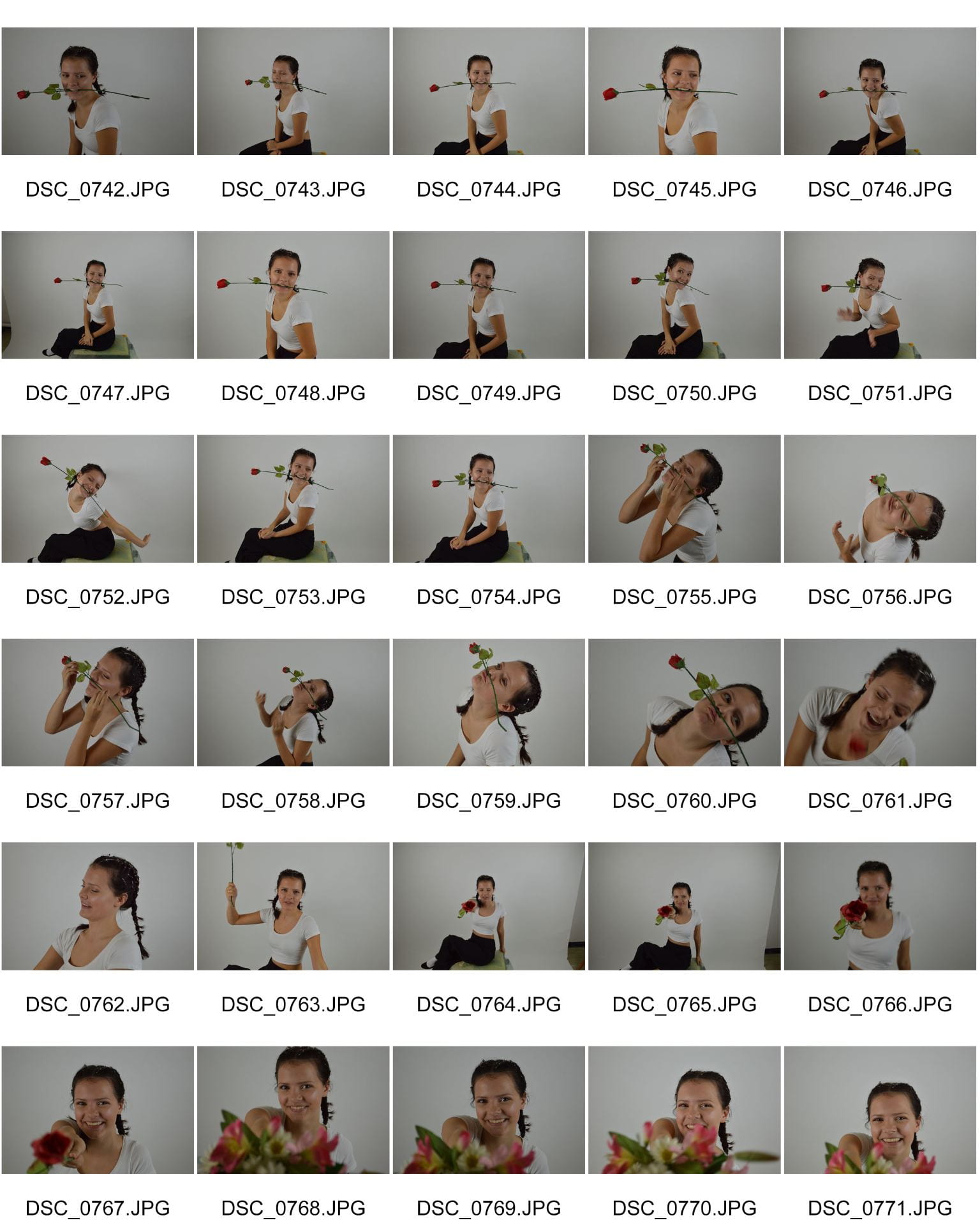
Here are our contact sheets from our second shoot. Our main focus to have in the shots was the bench which was symbolic of childhood and innocence which we felt fitted well with our star image. We tried to compose and fram the bench inbetween trees and in the centre of the frame as well as off centre. We got various angles and shots around the bench and behind trees to add interest in the shots. There were some shots that we really liked which may be used for our inside panes.

Here are some of my favourites and possible shots for our inside panes:

October 16

Production Meeting Agenda & Risk Assessment for 2nd digipak shoot

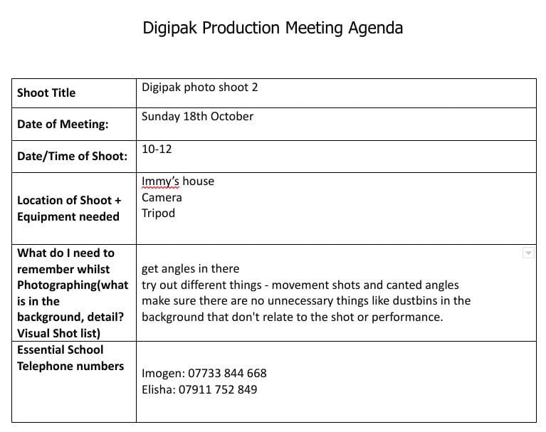
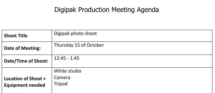
We needed to go on a second shoot in order to get the inside images for our digipak. We decided that in order to fulfil the conventions of our genre, we needed to include nature in our digipak. We decided to go for a woodland look and we took inspiration from one of dodie’s albums and have the original image on the left hand side and and invert the image on the right hand side. Here is our production meeting agenda and our risk assessment for the 18th October.

Production Meeting Agenda:

Risk Assessment:

October 16

Evaluation of Shoot 1

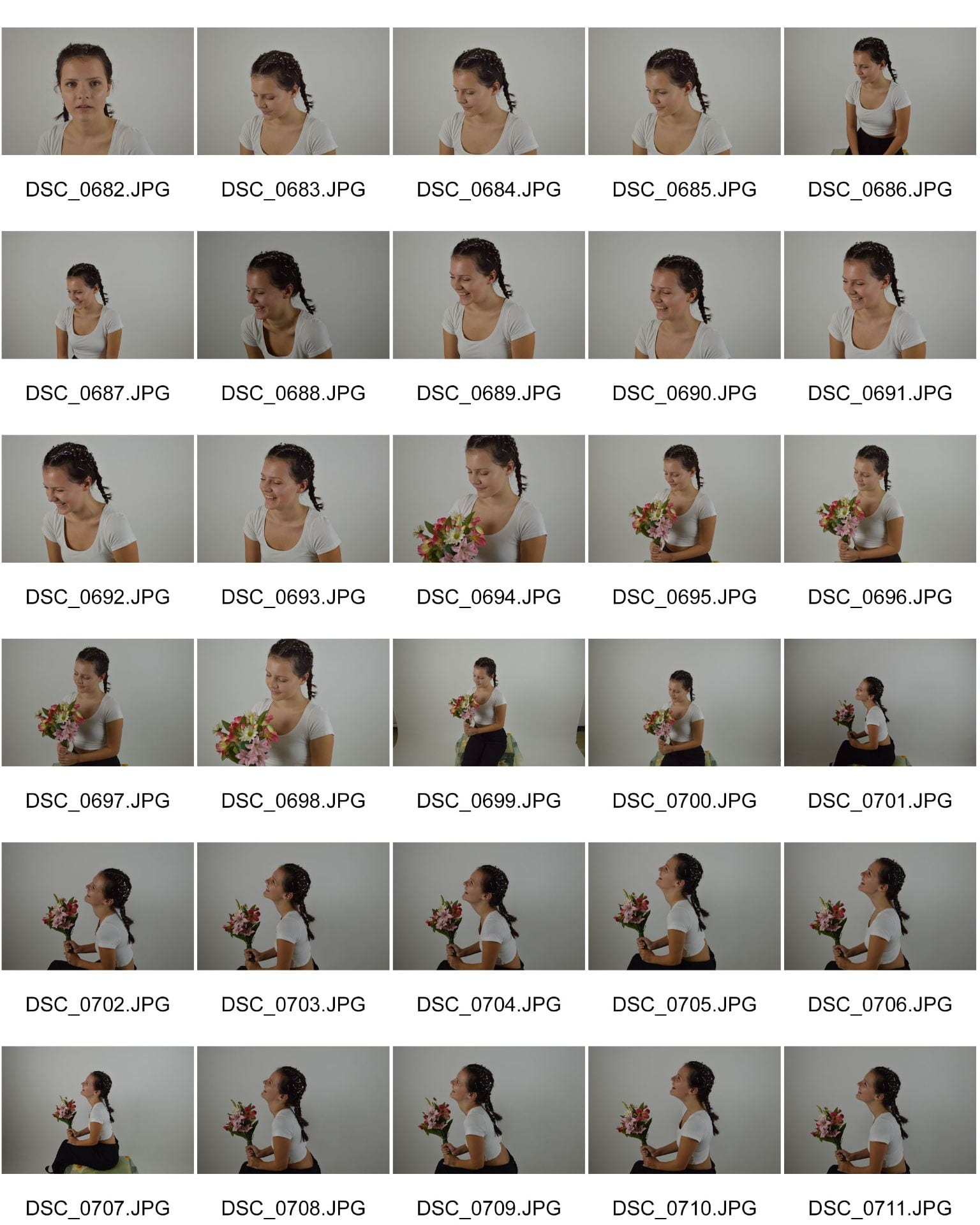
Overall, I think that our shoot went really well and Immy and I were really happy with the results. We managed to achieve the effect that we wanted in Eve’s hair and it looked even better than we imagined. We think we managed to get some shots to use for the front cover and back cover for our digipak. We managed to get lots of mid shots which are the shots conventionally used for our genre as well as covering all bases and getting high angles and lower angles and side profile shots. Our star was smiling the whole time in order to portray the happy nature of our star image and to reflect the music on the digipak. Our shoot could have been better however because we couldn’t really see the safety pins in Eve’s hair very well which was one of the main aspects of our outfit however the shots we got make up for it. I really liked the natural look that she had as it made her more ordinary and relatable for our audience, closing the distance between her and her fans.

October 14

Photoshoot Production Meeting & Risk Assessment for Shoot 1

Below is our production meeting agenda and risk assessment for our digipak photoshoot. It is important to have a PMA when doing a shoot so that everything is organized – you know exactly what you need and who is responsible for bringing it. It is also important to have a risk assessment to prevent or be aware of any risks at the location you are shooting at in case anything happens.

For this shoot, we aim to have successful shots that we are able to use in our digipak that convey our star as friendly, calm and relaxed whilst also reducing the distance between the star and her fans, making her more ‘ordinary’.

Production Meeting Agenda:

Click on image to view full document

Risk Assessment:

Click on image to view document

October 14

Music Video Draft 4

Here is our draft 4 of our music video.

Some things we changed are:

  • made our flashback more successful and obvious by using the swirl effect
  • added the echo effect on the walking for continuity
  • added some more close ups of arms closing and shoving the pastel girls
  • added some more of the pulse effect for consistancy on the beats of the music and the strong words
  • added the strobe/inverted effect in more places for consistancy
  • included a cross dissolve for the aerial shots of the flowers being added into the bath to make the flow better
  • added a darker effect on the goth emerging from the bath to imply she has ‘gone to the dark side’ and changed
  • included more split screens
  • added a tint onto the fist clenching to emphasize the ‘governments’ anger and to show something is going to go wrong
  • edited the dragging pace of edit to the beat of the music and the words in the lyrics

Comments from peers:

Overall, Zoe really enjoyed our music video and thought that it was effect. She understood our narrative and the message that we were trying to get across. However she also gave us some feedback to improve on which we will use as targets for our final draft:

  • experiment with the inverted strobe effect and change the colours so there is some colour added to the music video
  • when the goth section of the narrative comes in, experiment with changing the colour/tint on the performance videos to link with the rest of the video
  • the CU of the mouth shot – try and make it more clear what it is saying – maybe film it again and Eve move her mouth more
  • add a fade out at the end of the video as it doesn’t go completely to black after the rotating effect

Feedback from teacher:

  • opening shot of Elisha on ground is wobbly
  • some of the shots of Eve could be canted like they are later on. This will create some depth/dynamic
  • opening of girls could cut between long shot to close up of legs to long shot again and then the reverse mid shot
  • close ups – i.e. scale in for some of the team girl dancing in a line to create more pace
  • when Elisha doesn’t keep up – can we get more connection with her? close up or some effect around her to make her stand out even more?
  • all the girl dancing sections should have the echo effect
  • any close ups of the flowers in the bath to cut into?
  • cut between her struggle and close ups of the water sloshing more
  • at 2:21 she submerges for the first time but she is already in the bath?
  • effect at 2:23 could be used earlier on the Eve static shots?
  • the transition to the black bath could be more dramatic? cut to black or white screen so it is heralded more?
  • blowing the flowers – more of a diffused edge to the vignette/frame
  • dressed as goth – the colour needs to be darker with more fx to create that change
  • the glitch at 3:06 with her fists works well – could you use this on the other getting dressed as the goth shots?
  • like the lips multi-screen – perhaps use it somewhere else as it stands out a little bit at the moment
  • when she disrupts the dancers – we need some glitch, colour fx to create that aggression?
  • add some slow mo in the initial arrest?
  • slow down the spiral at the end so that we are left with it disappearing after the song has finished
October 12

Hand drawn mock up

We created a hand drawn mock up of the front and back covers and inside panels of our digipak. We want to encode a message in our digipak which the audience will decode, understand and speak to them on a personal level.

We included conventional elements of the indie/folk genre such as bold but pastel colours, mid shots and the use of nature in the image. It is important to use conventions but to also develop them to make them unique to stand out in the crowded market, whilst also ensuring that our target audience gets a preferred reading of our message.

Our hand drawn mock up

The colour palette we aim to use

October 11

Branding Moodboard

We used padlet to create a moodboard of inspiration for our digipak based on our genre, artist and other relevant artists. We included various things such as album covers, fonts, colour palettes, photoshoots and more. This has been really useful because we have been able to gather ideas for our own digipak whilst also helping us learn more about our target audience and our genre and understanding it’s demographics.

The elements we picked out, we feel are conventional to the indie/folk genre and we also feel would successfully encode the genre and the star image. It is clear that a brand image has a huge impact on a digipak and how successful it is. The repertoire of elements and the general conventions of an indie/folk digipak combined are also a massive part of what makes our star as the star image will be portrayed on the front of the album. Therefore, we will make up our brand image so the audience can decode it successfully.

Made with Padlet
October 5

Digipak Conventions Analysis

Above is my annotation of Emma Blackery’s ‘Villains’ digipak. I found it visually enticing and interesting to talk about because it didn’t feature a lot of conventional aspects of a digipak. It is important to remember that in order to sell a story through an image successfully you need to use interesting colours, fonts, designs, register, tone, framing and composition. I have done a mini textual analysis on how media language is used on a CD cover to convey an idea, genre, brand and image.

This task helped me to understand what was conventional and unconventional in terms of design aspects, typeface, star image and narrative. Some conventional aspects of a digipak are:

  • Image
    • Type
    • Symbolic Objects
    • The Star/Band
    • Effects
  • Copy
    • Album Title
    • Name of Band/ Star
    • Typeface
  • Colour Scheme
  • Bonus Tracks/ Features Sticker
  • Spine
  • Logos
    • Artists
    • Record Label
  • Copyright Information
  • Barcode

Now that I know the conventions of a digipak, this will help me for the production of my very own digipak as I will be able to access my target audience more successfully and interact and create an identity with them in order to make my product successful. It will also be a useful skill to have when I analyse text for more media essays.