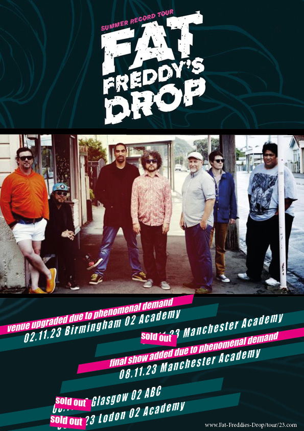

After my first two drafts and all my reflection work on each I finally tweaked each page to start to finish it up a bit. At this stage I am at a point where I feel like my drafts are coming together nicely and trying to change too much may overload and ruin it.
Here is my draft 3 of the complete magazine:


After looking at what I have changed overall for my draft 3’s I have noticed that I have been finding it harder to think about what I need to change or not. However this is a very good thing because I have gotten to the point where I am pretty happy with all my pages (especially my font page), so now I have to be very picky if I want my magazine to be as good as I can make it.
There was a lot of things that I wasn’t keen on in the magazine such as my image that was surrounded by text and my drop capital. I found that the second page was very boring and there was nothing on it so I needed to distribute things out better or add something.
Finally here is my second draft of my double page spread:

I think this pages look so much better than it did before and everything comes together so much nicer. I think now looking at this I am in a much more pleased mindset and feel like all that’s really left to do is add my article in and new title and see how it looks from there. It’s really just one of those things where after adding my article it could make me realize there are things I have to change and I don’t know for sure how much space it will take up either.
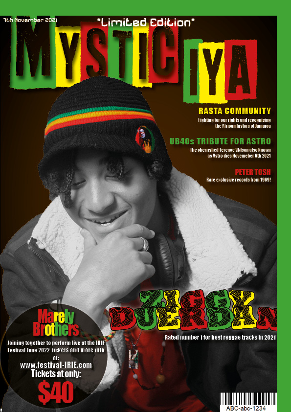
For my second draft of my cover page I went for a whole different look than my last as I thought my last cover page just looked to similar to my front cover draft and there was too much color which made it look a little too much especially because a content page has lots of information you want the page to be more simple.
Here is my second draft of my contents page:

I think that comparing my new draft to my old one I think I might be going a step in the right direction. It may not be as obvious it was a reggae magazine as it did before but it looks I think a lot more toned down and simple but effective. I was pretty happy about most things on this page but trying to take a step back just to notice that there are some things that do bug me and I do notice now that I might be confusing people with what genre of music this is for as maybe I have tried to stick to this color them too much but I think in a way its different and new.
For my second draft of my front page I reflected on my last draft on things I didn’t like about my magazine such as a certain font I was using and the sizing of my text.

I feel like there is too much going on in the page now that have have changed things about. I think I might have to decide on eliminating one of my fonts but make sure is looks clear no matter what size font. There is also too much color I think on my page so I think that I will either get rid of so many font colors or make my cover star black and white. For now I think the best thing to do is to not over crowd my page and keep it simple but effective.
I think analyzing my second draft was an extremely helping thing for me to do right now. I can tell my draft 2 was starting to head in the wrong direction and it has made me realize I have been trying to add to many things onto my page to make it look better when less is more and now I can try balance out my cover page and try bring attention to the things that are most important to get the buyer to want to buy it.
After doing lots of planning and work to work up towards our double page spread I finally made my very first draft. Here is my draft of my double page spread:

Overall I am not entirely pleased with my double page spread although this was very rushed and was the first draft so there is time for improvement. I think seeing what needs to be improved has given me some clear targets to work on in order to improve my magazine but of course there is still a lot more improvement that could be made and of course I still have to add my own article in as I have not managed to finish it and I have only used placeholder text.
For my second shoot I decided to go for two different looks for my model, one was a lot more natural and cultural as the head wrap resonates with what Jamaican women use for their braids. I feel like the first look may be best suited for my content page as my second shoot was a lot more of a statement and much more grand which will really capture readers attention on my double page spread.


I think that the costume of the brown toned dress and necklaces symbolizes that this artist is down to earth and does not put herself higher than anyone else she is showing a sign of stability and support and security and well as her letting herself go. I think including the green and yellow eyeshadow goes really nicely with the color scheme as well as the over done red blush that brings in that third Rasta color. I am really pleased with including the plant pot prop and the flowers in the models braids, unfortunately I was hoping to put more flowers in her hair. But I think the colors of the plants are really bursting with bright colors. The green leaves and burnt orange flowers blending in with the color scheme of the model really nicely. However I think the pinkish flowers kind of stand out the most and all though it doesn’t really resonate with Rasta colors or anything I think it helps to just show that femininity of the artist as it helps separates her from all the huge artists that are men such as Bob Marely, Peter Tosh, UB40 etc…
I think this shoot went well but there were a lot of things I wish had gone better such as having more time to do each look and the fact I was unable to do the second shoot in the studio so the lighting wasn’t great and gave us less time to get my model model ready but all though the look wasn’t completely finished for the second shoot and the lighting wasn’t as good as the studio I still am really happy with my shoot and I think for the future I will make sure to get the shoot that is most important done first so I can spend more time on it and get it out of the way.
For our second photoshoot we brainstormed what MES we would be including as well as who we would be using for our model and booking the studio out for a certain time. This was the agenda I made for our second shoot:
I think this was very helpful task for me to get me to start picturing how I want to dress my model and well as what cool props I could use and positions my model could potentially pose like. I think looking for videos to give me inspiration of how I could use props and what props could work well with my genre.
In order to plan our own article for our music magazine we selected a professional article that was based on a similar theme to what we wanted to write about and analyzed it to give us a thorough idea of the type of content we would include in our own work. I decided to base my article on a rising artist so I chose to analyze an article about a new band.
Here is the article I analyzed called ‘The Next Frontier’ from a Billboard Magazine:

In this article I managed to pull out key information on:
You can get a hint from the headline of the article ‘THE NEXT FRONTIER’, that this article is to do with a new emerging band. There is a drop capital at the start of the article which draws readers eyes towards the text which urges them to read. The stand first ‘Music’s endless dance party is only getting bigger as the genre now dominates major festivals, tops the Hot 100 and accrues hard-to reach millennials (and millions in dollars) for the 30 innovative performers, producers and executives on Billboard’s second annual list’ briefly summarizes the article without giving to much context so the reader feels inclined to read about more. The article also includes credits and some graphic features. The magazine is simple and not overcrowded but very colorful and includes a central image across the double page spread of the band to make it visual and clear of who this article is speaking about.
The article is written from the journalists point of view; it is not the band speaking. The journalist however does include quotes that the band members say but it is the journalists’ take on the band. It is written in third person to demonstrate an outsider’s point of view on the band which makes the information much more credible. The fact the journalist is saying all these remarkable things about the band makes readers believe and actually feel interested to check the band out. If the band was saying all these amazing things about themselves it may not be as genuine as they may choose to just boast about themselves to gain people’s attention but as the information is from an outsider’s perspective then it is more of a reliable and believable article.
‘Next’ pops out two readers as it makes them curious to find out what is next? Or rather who is the next best thing? ‘Bigger’ Indicates that whatever this article is talking about is better than something, as people associate bigger with a better version. ‘Fresh music’ Implies that this music is something that has never been heard before which grabs the reader’s full attention and most importantly their curiosity.
The register seems a little informal as we see in the quote ‘But Braun, as part of an ambitious foray into the dance-music business, is now also managing Angello and Garrix — and together, the three represent nothing less than a redefinition of success in EDM’ all though there are uses well spoken vocabulary, there are a lot of pauses within the text that make the text more casual and spontaneous. It reminds you of how a radio broadcaster would speak to keep the audience engaged and hyped which I think resonates with the genre of electronic dance music as it’s fun and boosts people’s spirit.
The quote, “was becoming so big I really couldn’t ignore it,” highlights that a manager who has worked with some top artists and is usually a picky guy, was even impressed with this band which makes the reader feel convinced that these artists are the new best thing and will want to listen to their music or learn more.
In conclusion the journalist represents this band as the new best thing around. The writer brings passion into his article as if the writer themselves are huge fans too which creates this ideology that everyone loves them so the reader feels inclined to hope on board and love them too or at least find out what they’re like. The journalist also communicates that they are not only ‘the new best thing’, but they are unique and different as their ‘fresh music’ is one of a kind, like nothing anyone has ever heard before and not to mention the unusual band members of different ages, backgrounds and so on – Garrix is the 19 year old who brings raw new talent, Angello is 32 who has already got a legendary reputation in the industry and lastly Braun (33 years old) who has worked with hugely famous artists and also has a huge reputation ties all three of them together with his managing skills and talent.
Throughout this process I have learnt a lot of new things that I feel would be useful to include into my article such as a stand first and headline to give the reader context on what the article is about and hopefully if I include the right words that pop out to a reader I can get the reader to be intrigued and hooked on my article. I learned that most articles include 5 what’s and a how to ensure the reader isn’t becoming lost in what they are reading and to be as informative as possible so the words really reach the audience.
For the build up to this task we spent lots of time learning about specific layouts, catchy headlines, fonts, conventional features – ex cetera – to lead us to begin to make our first draft of our magazine contents page.
Here is my first draft if my reggae magazines contents page:

A medium long shot is used on the contents page to captivate the audience. The costume and positioning of the model correlates to the genre that has been chosen. This demonstrates that there is a clear understanding of lighting and positioning which suits the genre well.
The star’s costume is very appropriate to the genre. The prop of the headphones adds clear communication to the audience that this magazine is reggae. The lack of eye contact well suits the name of your magazine also. The hat is well positioned and of good colours.
The font used is very original to your genre however it is a little hard to read. I like the content of the font. It adds a different layering to your contents page. It being white also attracts the audience towards that aspect of the page.
The headlines are effective and well worded to attract the attention of your target audience. Lots of techniques are used such as alliteration to intrigue the audience.
The layout of the page leaves a generous yet appropriate amount of space for headlines and body text and the space available has been maximised in order to create a product that is fulfilling but not overbearing which would drive the reader away.
The layout of the page is unique but works well. The contents on the right hand side is well thought through as the immediate attention is drawn to the headlines not the word “contents”
Reflecting back to your 10 contents page inspirations the colours are extremely relevant to the reggae genre. The white and black tones contrast well with your red, yellow and green colors. They are also well balanced and are not too overpowering.
Photoshop has been used to cut the model out and this has been done well. I think that photoshop has also been used to brighten up and accent some parts of the models costume such as his hat.
The language is appropriate for the genre as the target audience will easily understand the language being said. Jargon is used because the audience and only the audience, will understand the language.
Clearly, strong, good, satisfactory, conventional, well good sense.
After peer assessing my partners contents page and visa versa, it has helped me to compare how well I have met these criteria’s on my own contents page as well as making me realize how much I need to change a lot such as my layout a color theme. I also think this peer assessment has also allowed me to analyze my peers work to see what they have done especially well in and has in turn given me a lot of inspiration for mine such as using a more simple but effective color scheme and maybe changing my image and doing some extra editing on Photoshop to make my mage stand out better rather than just tweaking with the adjustments.