Mast Head Designs
Font Styles
In this post my masthead designs are located, the effect of fonts and size will change how the public views my magazine. The colours and fonts used for the masthead will have to match with the vibe the cover star gives to the audience. My magazine is called K STORM so the font that I chose for the masthead will have to reflect the same vibe that the name of the magazine gives, therefore having the desired reaction from the audience.
For most of my font experiments, I have mostly chosen bolder bigger fronts to grab the audience’s attention so that the masthead immediately draws them in and they want to read what the magazine is about. The bold font reflects the magazine name as the word STORM tends to be associated with loud, bold and dangerous events, this could then relate to how dangerously addictive the genre of k-pop is to the audience. In my font for the masthead I want the words to have sophistication and a smooth sleek look that interests the audience, It should stand out and be bold but not too much as it has to radiate maturity.
Chosen Masthead
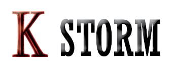
This is my chosen masthead as this one as it displays the sophistication and individuality I aimed for when designing my masthead, It is bold and stands out and the set letters in the word storm make it bright and big. The letter K is a different font which then gives a roundness to the masthead and reflects the diversity of K pop, the colours I have used are red and black which are both significant colours in Korea and then links to the importance of the K pop industry in Korea.
Other Ideas
