November 18

Production Meeting Agenda for 1st Photo Shoot

My overall aim for my first photoshoot is to photograph my cover star in a light that portrays him as attractive and arrogant as well as professional and mature to gain audience attention from young teen girls. The mise en scene in my magazine and the cover star will have a significant effect on the magazine and meta-narrative of my media, this magazine will need to be conventional for it to be successful.

I will then have another photoshoot for a female group inside the magazine, they will be displayed to juxtapose the cover star so that it gives a rounded image to the magazine and the k-pop genre. My aims for this photoshoot will be to portray the idols as fun and inviting for the second page with a bright vibe and colour scheme, the models will display a different vibe to the cover star giving a larger meta-narrative and a different story.

For both shoots I will use my Canon camera with lights and flash in the white room, this will give good lighting for my photos and make them look professional and clean-cut. There will not be many props other than a chair and rose for the first shoot and nothing for the second shoot as it will focus on the closeup shots and the connection with the audience members.


A breakdown of both photoshoots is below.


November 18

So what am I up against?

Below is a slide show showing magazines and other types of media in my magazine genre displaying how other companies and producers decide to portray the k-pop idols in the media, it is voiced over with a narration stating how I will design my magazine so that it is conventional and states the themes of k-pop. It includes what topics I will have in my magazine and how  I would like my cover star to be displayed to the media.

Many magazines focus on the genre of k-pop and are very successful at stating a story through the cover stars and contents, the companies make k-pop sound and look very inviting and exciting for audiences of a young age. Whilst some magazines have a mature touch to the theme others have colours of fun and freedom displaying exactly what a young teen wants in their life. There is an intense competition with magazines of the genre of k-pop and I need to make mine even more eye catching and attractive to call out to the correct audience.


November 8

Star Image – theirs and mine

Below is a Prezi presentation of the Korean boy band BTS, it covers how they are portrayed across media and in their music videos to give the audience set views on the band helping them gain positive popularity as they appear professional and friendly. The bands connections across the world and difference as they come from Korea has helped them gain even more popularity globally as many people of the new generations know who they are and what they do. Their record label has control over their media accounts therefore allowing them to promote their songs and products to a wide audience gaining more money and popularity as they only promote the band showing how successful this K-pop is in the world.

The paradox of the star which is a theory proposed by Richard Dyer tells us about the character of a celebrity and what they signify to an audience, how they are displayed in the media gives the audience an opinion of that celebrity through written articles and photos of the stars, this means they can produce a meta narrative of the stars giving them a story and a background. Celebrities and stars are deliberately constructed by media to represent a certain light, they are either extraordinary or ordinary and can be absent or present.

I will create a slide displaying what I would like my cover star to be involved with, what they will wear and what kind of theme I want to present with them, everything in the cover will tell the audience a story so it is vital to have everything on point to give the correct narrative.


Please click on image to see Prezi presentation


October 25

Communicating my Brand

Shown below I have completed a mood board for my magazine showing the colour swatches, layouts, Kpop bands, and many typefaces, this will help me with inspiration when I am stuck for ideas when I am creating my magazine. All these aspects on my mood board are vital to helping me create an effective magazine with the correct styles of fonts and colours, the images of current Kpop bands will help me decide on positions for my own models to really accentuate the mood of Korean pop.

Please click on image to see full mood board

October 22

My Audience Profile

Introduction

As I have decided to focus on Kpop for my music magazine I needed to research the genre to be able to target the correct demographic to help my magazine to be successful, along with this I needed to take into account Blumler and Katz’s gratification theory and the reception theory to help me target my correct audience and know what to include in the magazine. My magazine cover will need to grab the demographics’ attention so that they read it, to do so my cover will need to include all the specific aspects that the target audience will be attracted to. As a producer, I will have to encode the correct messages for my audience to decode and be fully satisfied with, I must also have interactive activities so that they get a piece of media worth the money.

For my Kpop magazine, I will need a focus on aspects such as fashion, makeup, and Korea as a country so that my target audience really gets to know the genre of music and wish to look further into it giving my magazine higher sales. My audience has to be able to recognize themselves within the magazine so that they connect with the contents and it should give them information about Kpop and Korea so they know what the magazine centres around, there should be other forms of entertainment in my magazine so it interests my audience even more. Lastly, my magazine should provide an escape for the demographic allowing them to get lost in the world of Kpop, the visual appearance of the cover should bring them in to read the contents, the colours, and fonts, as well as mise en scene, should reach out to the audience and catch their eye.

I know that my magazine will need to focus on specific Kpop bands along with the gossip and other elements that go along with that group to grab my demographics attention, those bands will have to look appealing and have interesting information around them so the audience feels they are getting media worth their money. My magazine will need to have the preferred reading involved in it for the audience so it looks more exciting and bolder to them allowing the connection between the magazine and target audience, the preferred reading will bring out a reaction from the audience and make the magazine successful and popular.


My Own Research


Audience Profiling


Reflection

By completing this task I have learned how vital it is to fully know who the target audience is so that I can create a piece of media with the right aspects directed right at them allowing my magazine to be as successful as it can be in the public. I know that researching the genre and what goes along with it is very useful when creating a large piece of media such as a magazine cover and it’s contents, referring to the reception theory I am aware of how significant it is too put the correct pieces of media on the magazine so that it is the preferred type of magazine to my target audience. I am looking forward to creating a magazine in the genre of Kpop and know how to design the cover and pages to fit perfectly in the preferred reaction of my target audience.

October 21

Branding Ideas + Mission Statement

My Music Magazine

For my music magazine cover, I have chosen to produce a piece of media in the genre of Kpop which is a type of Korean pop music, I have decided to focus on Kpop as it is a music genre that is not as familiar in the western world so, I wanted to do something different that not many people have listened to or been interested in. Therefore giving the audience an idea of the differences in Korean pop and culture.

Within this music magazine, I will make sure there are many activities for the audience to do to make sure they are interested and remain satisfied, these will be aspects such as tours, quizzes, deals, makeup, jewelry, fashion, fan merchandise, interviews, Kpop stars, articles, and adverts.

Magazine name: K STORM

Taking/taken the world by storm.

Your daily dose of vitamin K.


Artist Names:

Groups:

KISS, RIKKI, RXN, FIREBOMB, TGG

Solo Artists:

Rin, London Lee, Tyger, XOX, K KING,


Genre: Korean Pop


Wordcloud: An image displaying the ideology of Kpop.


Mission statement: The magazine K STORM aims to express and convey the unique genre of Kpop and open audiences’ eyes to a world of the unknown in a positive manner. It strives to present new and exciting themes within Kpop and constantly produce high-quality media for a wide range of demographics.


Image result for kpop magazinesImage result for kpop magazinesImage result for kpop magazinesImage result for kpop magazines

October 2

A Front Cover Analysed


I have analyzed two music magazine covers to further highlight that different audiences will be drawn to different types of covers.

A professionally made cover of a magazine needs to be effective towards the set demographic and be punctual so that it can be as successful as possible in the media. To reach out to the correct group of the audience the colours used in the cover need to look appealing to that audience, for young teenagers bright exciting colours such as red and yellow might be used to catch the eyes of that audience, whereas for an older mature audience calm colours like cream and black may be used to emit a calmer more collected feeling on the cover.

The typeface of the cover will always be bold and big to further gain audience attention, normally the masthead will be the boldest line as the audience need to know where this magazine has come from and who the producers of it are. The plug will promote the magazine emphasizing the joy the audience can get from purchasing it, the pug will also do this by telling the audience what is in the magazine and what information they will be able to get.

The mise en scene for the cover star is very important as they speak to the audience the magazine is aimed at, it has to be specific to the demographic and the psychographic of that genre. The target audience are those groups who are most likely to be interested in a specific genre and watch certain shows, the magazine then has to focus on pleasing that group of people to help the product to be as successful as possible.

The design and colours in that cover will convey the interests of that specific group, it will tell the audience whether or not they fit into that category, each different magazine cover reaches out to different members of the public expressing feeling that only certain psychographics will be interested in.

October 2

Audience Profiling

This magazine by Mixmag is focusing on electronic dance music which is a big interest for those born between 1982 and 1999, to reach out to the specific psychographic the magazine cover needs to have the correct layout and colour scheme to attract the eyes of that certain group of people. All of the aspects in this cover reach out to a female audience as the colour palette reflect femininity, the cover star being a dark man with a little dog really appeal to females as the star is conveyed to be seductive and powerful.

The element of the dog further draws females in as it gives an aspect of cuteness. The typeface is a bold font which helps gain attention along with the colour, the captions involve information that would interest females further such as deals to purchase products and special deals. Although this cover is very stereotypical of gender it is made very professionally as the producers know what reaction they want from the audience and what they want to convey with the cover, through the use of camera angles and mise en scene this magazine cover calls out to the psychographic of mostly females and draws their attention with the colour and layout of the cover.

It is vital to research the target audience so that the producers know how to design the cover of a magazine specifically aimed at a certain demographic and psychographic, this magazine cover reaches out to young to middle-aged females due to the typeface and cover star that holds a dog. By researching the specific audience the producers now know what type of client they are creating a magazine for so can focus on what that audience prefers and enjoys, they can relate the inserts and cover lines to what the audience is interested in.

KYC refers to the producers being able to know your client which is very important as the producers need to know who their target audience is to then help the magazine be as successful and as popular as it can be. They have to design the cover of the magazine to fit into the preferences of that specific audience so that the client is satisfied and happy with the product they have purchased.


September 30

Conventional design features of a magazine

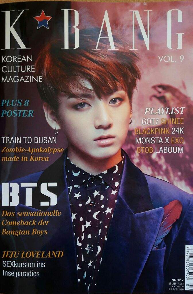
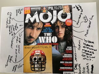
This is our interpretation of a magazine cover and how each ingredient in a magazine cover helps the cover to be powerful and have meaning, aspects such as colour add to the visual attraction of the cover. The two-shot of cover stars being two men help to gain audience attention as the colour of their eyes stand out and naturally draw attention to the cover, furthermore it is a mid-shot makes the cover more intense as they are looking right at the camera. The dark background contrasts nicely with the white typeface masthead further gaining audience attention, the red typeface stands out against the black background drawing eyes towards the cover.

The pug in the magazine tells the audience of the other articles in the magazine, it is in bold as it draws more attention making the audience want to read it. The way it is set out helps catch eyes, the plugs further help this as it is the bold typeface in the centre of the cover. The many inserts included in the cover tell the audience what they are buying and what other articles are in the magazine. There is a freebie located in the bottom left-hand corner further expressing that the money the audience pay for this magazine is worth it as they receive a CD of the music within the magazine.

Overall this is a powerful magazine cover as the main cover line stands out grabbing the audience attention and making them want to know what the magazine is giving them, the freebie CD further emphasizes the audience’s interest. The camera angles and shot along with mise en scene convey as a story of the two-shot and look inviting, the layout of this magazine is very well produced.

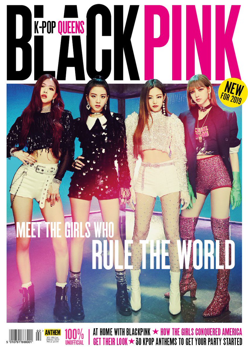
Within other music magazines, the same ingredients can be seen that assist the cover to look intriguing and attention-grabbing to the audience and certain demographic. The cover lines are smaller and are almost always located on the left-hand side of the cover as they are clearer to see as that is the way the magazines are presented, the mastheads are always presented in a typeface that stands out and looks bold and bright. Furthermore, the cover stars trend to look into the camera to give the cover an intense feeling as almost to single out members of the audience, the inserts in the cover give the audience a taste of what other articles are in the magazine.

The pug is normally a small box or circle that contains more information about what the magazine includes, the plug in the cover promotes the magazine and makes it look more appealing to the audience helping to sell the product. The main cover line is also in a bold typeface and stands out against the background, lastly the barcode, price, and date are always in the bottom right-hand corner giving the audience the information about purchasing the magazine, it tells the audience how recent the information within the magazine is and how much they are paying for the magazine. All these aspects in a magazine cover really help to sell the product and help it be successful in the media and with the audience.

All magazine covers include certain aspects, this includes:

Pug, plug, masthead, captions, main cover star, issue/date, cover lines, inserts, price, bar code and the main cover line. All these details help to sell the magazine to the audience and help it look attractive.

September 18

Print media that communicates meaning

In the image above I have annotated a music tour poster of the singer Birdy, I have detected the denotations and then added the connotations of each aspect in the poster. By analyzing the poster and picking out each communication idea such as costume, lighting, acting, props, makeup, and setting I have realized the importance of deliberate mise en scene set up to help tell a story.

By completing this task I now know how vital it is to focus on each communication idea to help tell a story in my media projects, each aspect is crucial in the design of media as it all comes together to present an effective product. The six communication ideas will affect my work and how it is presented to the audience whilst helping to show what demographic I aim to center my media products on.