Language Analysis

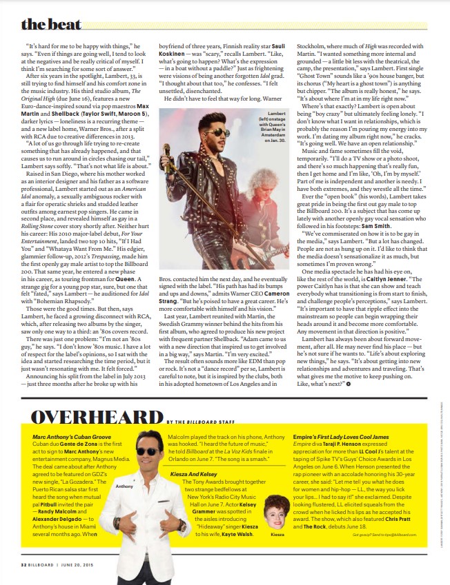
In a music magazine, there are many different types of articles that can be featured, all of which use different techniques and language, such as a standfirst and headline in order to encourage their target audience to read them whilst being informed and entertained. I have analysed the language and features of this 2015 billboard double page spread, on sing Adam Lambert. 

Please click on the image to see the PDF.

Language analysis 

We can tell that this Billboard 2015 article is an interview as the writer refers back to what the star says (he says, etc) and even uses direct quotes. On the first page there is an introductory paragraph introducing the interview on top of a cover page for the article, on the second page, follows the full interview, with writing all around an image of the star in the centre of the page. The piece concludes with a final direct quote, however I wouldn’t say that there was a clear conclusion. The interview has been written out in the 3rd person, with no presence of the journalist, we can recognise this by the fact they do not refer to themself once in the introduction or article. This represents a lack of personality to the article, it is focused purely on the star. The quotes used by the journalist help put into words the emotions of the star, it outlines exactly how they’re feeling and projects the meaning of the article. The language used for the headline of this interview implies that the star is facing a lot of change in his life, which may hook the reader. The star comes across as rather lonely and vulnerable at the beginning of the story, however towards the end of the interview he seems a lot happier. The quotes used may fulfill social interaction in this article as the target audience feels as though they are interacting with the star, the story told in this interview alongside the language used also acts to inform and entertain the reader. This interview’s stand first also includes more information and a quote to intrigue and encourage the reader to read on. The article tells the story of the star’s recent career and personal life changes and struggles. This intrigues the target audience and makes them feel a closer connection to the star and the magazine itself. 


1st Draft of Contents Page and Peer Assessment

This is the first draft for the contents page of my music magazine, I created it on Adobe Photoshop and InDesign. A contents page in magazine is very important in order to inform the audience on what is featured in the magazine, encouraging them to buy it.

Please click on the image to see the PDF

PEER ASSESMENT

What type of shots have been used to create a variety of shot distances and how has the camera been used to communicate meaning?

A long shot was used for the model, as her legs and upper body are visible.  The meaning communicated is that of a ‘bad b*tch.’

What choice of Mise en scene is appropriate for the star image and genre?

The choice of mise en scene is appropriate, as the model is dressed just like a popstar. The red clothing is very eye-catching and her body language makes  her look more confident. It’s almost as if she’s throwing herself forward.

How far is the font used readable and reflects the genre?

The font is very  readable, and is in three different colours. The red fits in with the models clothing, and the separate black and white text adds contrast. However the one hyphen on the page is very annoying.

What technical conventions of a Contents page are present and used effectively?

The word ‘contents’ is in large, and clearly clarifies  what it is. The magazine title is not on it however. The contents of the page are laid out very well, and lays out what will be inside the magazine. The background is nice and plain, which allows the text to be readable throughout the whole page. There is no issue number or date. There is one small image, but plenty of text. There are plenty of page numbers which tell the reader where they can find what they want to read.

How has Indesign been used to layout the page to convey a brand?

Indesign was used to include a lot of information.  It was also used to build a very nice colour pallet.  Also, red circles were inserted to add a little bit of extra information.

How well have the text and visuals been integrated together?

The text and visuals have been integrated together very nicely, as the colour pallet collides very nicely with the model.

Where has photoshop been used to manipulate the photos to enhance the star image or genre?

Photoshop has been used to cut out the image. Her skin looks very healthy and is glowing.

How is the language used appropriate for the genre and target audience?

Yes, as it is very girly and gossipy. Pop fans would fit in with the language.

Clearly, strong, good, satisfactory, conventional, well good sense  – B grade

My targets:

  1. Include my masthead somehow.
  2. Check for any hyphens and make sure writing fits properly.
  3. Include another image of a different model.
  4. Add some graphics and other colour

What is a Contents Page?

These are some headlines for my contents page, the language in these coverlines need to create interest and desire for my magazine.

  1. 7 recommended albums to buy this year
  2. Exclusive interview with Nila viljeon
  3. How to dress like your favourite artists
  4. The secrets into Jessie Js music producing
  5. New star Chloe Peel

A contents page is important for any magazine, as it acts as an index for the magazine, letting readers know what page number the article they want to read is on, as well as its coverline. The cover lines on the contents page need to have exciting topics and contain key words that will attract, inform, interest and entertain the reader. The layout and information in my magazine contents page must create a desire for my audience to continue reading. Once I have completed my research, I will then draft a contents page using that research and move onto actual production.

1st Draft of Front Page and Self Assessment

Please click on the image to see the PDF

This is my first draft of the front cover of my pop music magazine ‘pop women’ and my self evaluation of it. The aim of this magazine cover is to reflect the genre its meant to whilst entertaining and informing my target audience.

When creating the front cover for my magazine, I changed the masthead from what I was planning to do as I felt a longer title was better and replicated more of the brand I was going for. I think that the coverlines, design and content of my magazine can inform, entertain and even build personal identity. However in this draft I am missing a convention to fulfil the social interaction aspect. I believe that this front cover draft represents the pop genre I had in mind, and would appeal to my target audience.

Front Page Layouts

I would like my music magazine to have a similar layout to these magazines. I love how the masthead and the cover star are the main focus in the centre of the magazine. All of these magazine covers have a similar font which I think looks really slick and mature. I like the covers with a neutral colour palettes of the backgrounds, the grey or beige makes the model stand out. The simplicity of the cover lines and graphics makes these magazines very pleasing to the eye. I prefer it when the photo manipulation is behind the masthead so you can see the full magazine title. I am aiming for my music magazine to have a similar layout to all these magazines.

First Shoot Contact Sheets

During my photo shoot, I feel like I conveyed the star image well through my models body language. I think the mise en scene of these images make my photos portray the genre of my music magazine well. The lighting, costumes, body language and makeup highlight the brand I wanted for my model; an independent women.

I like all of these images as I feel they convey my star image and brand the best, my model looks powerful and confident, the photos have a business women feel. However some of these images may not work for a front cover and would be more suited for the contents page or double page.

Masthead Designs

Mastheads are important on the front cover of any magazine in order to make it memorable and recognisable to your audience. The font, colour and effects should reflect your music genre in order to imply to the readers what the genre of the magazine is.

I picked this last masthead as I felt it reflects my brand the most. I made the decision to change the title of my magazine from Pop Women to just POP! I like the shadows and effects on my text as it brings life to the basic font I picked. I picked this simple font and colour as I felt it looked more sleek and conveys my brand. All of these conventions of the font and text projects the genre of my music magazine as well as help it stand out to the audience.

Star Image – Theirs and Mine

In media, each music genre has a repertoire of elements in creating the perfect star image for the model, and therefore meeting the needs of the target audience. For this task, I researched other stars to figure out the star image I want my model to portray. I now know what conventions producers include in their media in order to make their star look inspirational and extraordinary, as well as relatable and ordinary. When I create my own music magazine I must focus on the denotations of my models cover and the connotations that they have to the target audience in order to portray the image I want my magazine and model to have.

My Audience Profile

In order to research who my target audience is, I used the website YouGov to research the audience demographics of three celebrities in the genre I want my magazine to be; pop.

These are the age statistics of the pop singer Beyoncé. 51% of Beyoncé’s audience are female whilst the other 49% are male. 92% of her audience also have the attitude ‘I would donate to a worthy cause.’ Over 50% of Beyoncé’s audience also enjoy the brand Disney+. Pop music is the media consumed by 51% of her audience.


This is the age statistic for pop singer Rihanna. The gender statistic for her audience is roughly 50/50. 63% of Rihanna’s audience have the attitude of ‘I’m creative in all I do.’ Over 45% of her audience also enjoy the beauty brand L’Oréal whilst Instagram is the media consumed by 52% of Rihanna’s audience.

These are the age statistics for the pop singer Doja Cat. 52% of her audience are female, whilst the other 48% are male. Over 78% of the audience have the attitude of ‘I primarily listen to music through streaming services.’ 65% of Doja Cats audience enjoy the brand Superdrug. Instagram is almost 60% of her audiences media consumption.

I have created a dating profile based off of the type of person I think would like to read my music magazine, I got this information by looking at the audience demographics and psychographics of three artists I would like to have in my pop magazine. I need to be aware as a producer what to encode in my music magazine in order to make it preferred reading for my target audience. The person reading my magazine must be my target audience in order to correctly decode the features of my magazine and be successfully entertained and educated.

When creating my own music magazine I now know who my target audience is, and the correct way to make my magazine there preferred reading and to fulfil uses and gratification by giving my audience features to benefit their social interaction and personal identity.