Final Digipak Draft

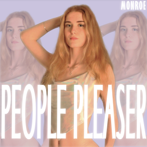
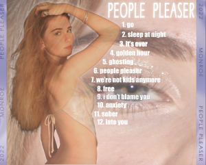
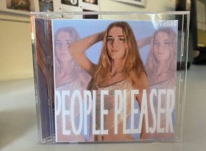
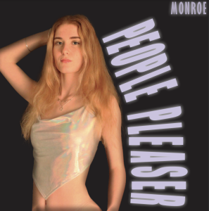
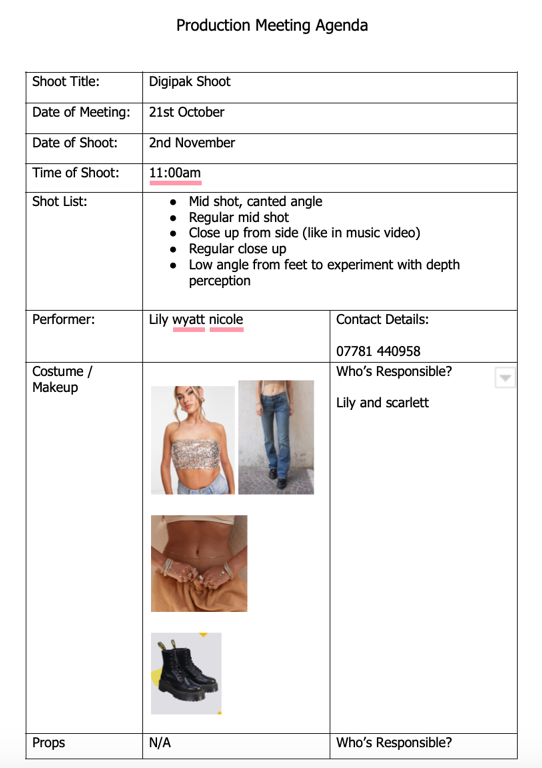
Final draft of my digipak: People Pleaser by Monroe
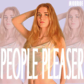
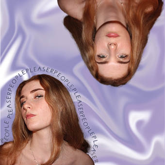
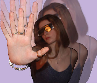
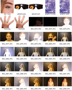
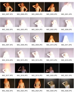
What has changed:

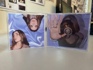
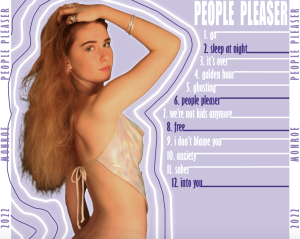
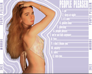
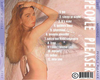
  • Any spacing issues have been fixed, leaving no spaces or overlays,
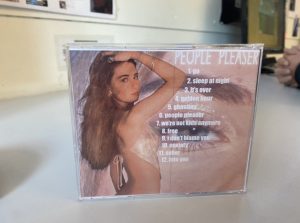
  • A barcode and copyright symbols have been added, ensuring our digipak looks realistic,
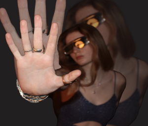
  • The photo of the models eye has been cropped so that her eye is the main focus of the image,
  • The title on the back cover has been moved to the side to make it slightly different and help out any awkward spacing issues with the model and the text.

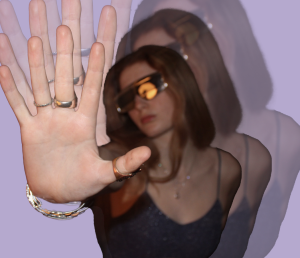
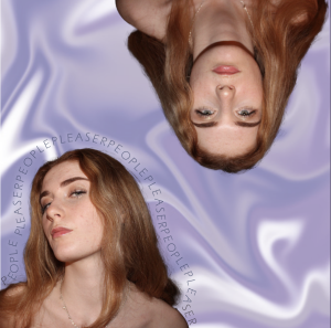
Overall the conventions of our digipak work together well to convey our star image and genre. The colour palette and vibe of the graphics and images are cohesive to our other products, portraying the stars whole brand across platforms. Technical conventions such as our choice in typeface and photo manipulation signifies to represent the brand and image we wish to convey to our audience, and also allows our star to be be the main focus of the digipak.

Draft 3 and CD

This is draft 3 of our digipak:

What went well:

  • The colour scheme is cohesive throughout all covers,
  • The layers and graphics are unique and match modern RnB conventions,
  • The typeface all goes well together and is clear to read,
  • All images images are placed correctly and fit well,

What to change:

  • Some spacing is to be changed on the spines,
  • Barcode and copyright symbols are to be added,
  • Slight changes to fonts and images such as sizing,
  • Consider removing back title,

Seeing our digipak in a genuine CD cover allowed us to analyse if and how each cover or spine worked, and if it was aesthetically pleasing.

Here is our audience feedback on what genre people thought our digipak was:

Although more people assumed our digipak was in the pop genre rather than RnB like we had planned, when we asked what genre the audience thought Rihanna or Beyonce was representative of the majority also said pop. This shows that typical female RnB design conventions can often be similar to or mistaken for pop, so it is inevitable for our digipak to have connotations of the pop genre.

Digipak Draft 2

This is draft 2 of our pop artists digipak:

Here is our teachers screencastify:

What went well:

  • The darker colours fit in more with typical RnB design conventions,
  • The text on the front cover is atypical and unique,
  • Has interesting graphics,

What to change:

  • The colours are not flattering against the models skin tone,
  • The inside cover is too crowded, while the back cover is more 2012 RnB, so both need to have changes made,
  • The model needs to be moved so that she doesnt look naked,


Digipak draft 1

This is draft one of our digipak:

The use of camera and photoshop to take and manipulate images and use a variety of shot distances is well executed. The mid shots of the model are adequately lit and framed. Photoshop has been used in a competant manner to cut out and layer images. The mise en scene is appropriate to the genre and star image. The overall brand and star image of the female artist is clear and the layout of the digipak is also conventional, however the relevent technical elements of the barcode and copyright are needed. DPT has been used well with a clear sense of layout and design. The typefaces are adequate to convey the genre and star image however the colour is a bit boring. I would grade this Digipak a C.

Evaluation of Shoot

Some good shots from our digipak shoot:

What went well:

  • Portrayed our star image and genre well,
  • We used a confident and comfortable model which is portrayed to our audience,
  • The black studio made her easy to cut out and emphasized the vibe,
  • We included depth and dimension,
  • The mise en scene of makeup and costume portrayed our star image well and met our plan,
  • The use of mid shots makes the digipak fit into others of the pop and rnb genre.


Things to improve:

  • Some of the backdrops may need to be edited in photoshop as not big enough and also not a true black,
  • Some of the photos were also unable to be used due to the lighting or quality.

Contact Sheets

These are our contact sheets from our digipak photo shoot:

The photos we use from these shots will be used as they are representative of our model’s star image and convey a powerful, strong, sultry narrative that we aim to illustrate through our digipak. The extra images can also be used on our social media page and will work well for promotions, behind-the-scenes content and sponsored posts.

Digipak Mockup

This is a mockup with ideas for our album cover, using conventions typically associated with the RnB genre, and artists we have taken inspiration from.

This is the colour palette we intend to use:

This task allowed us to think of what repertoire of elements we need to include in our digipak and album cover in order to portray the RnB genre of our artist as well as our star image. This must be developed well in order to appeal to our target audience.

Conventions Analysis

This is an analysis of a female RnB artist’s album cover and the typical conventions of covers from this genre:

Many elements used on an album can convey different things and help the artist represent their star image and genre to the genre.

This analysis allowed me to understand the conventional repertoire of elements of the RnB genre, and the blueprint for these types of album covers. Understanding what conventions of an artist’s album cover provides connotations of certain emotions, sexualities, and images can be very helpful when creating our own image. It is important to know what to include or not include in order to portray and infer our star image, therefore produce something the target audience will accept.

The Look Book

This is a mood board we made in order to gather inspiration for our Digipack and other content using the app Padlet.

This has helped us to gain more of an understanding of our artists’ genre, and the repertoire of elements that define the style and brand we are aiming to convey, it is important to understand what will be preferred reading and entertaining for the audience. This also allows us to create a coherent brand across other platforms and content such as our social media page.

These covers are the blueprint and inspiration for our artist and star image, we want her to be described as sexy, cool, independent, attractive and interesting.

Made with Padlet