My Tour Poster

The genre of all of these tour posters is rap, they all have extremely similar features. All of these posters have a black or dark colour palette, and most of them also have a pop of colour in either the image used or the typography.  The layout of all these posters is the same; there is an image of a rapper centered at the top of the page, while all the text and information is at the bottom. There is also usually a cool graphic in the text or image, that makes all these posters unique. The mise en scene of the images used for these posters connotes to the ‘hard’ and ‘intimidating’ rap genre.
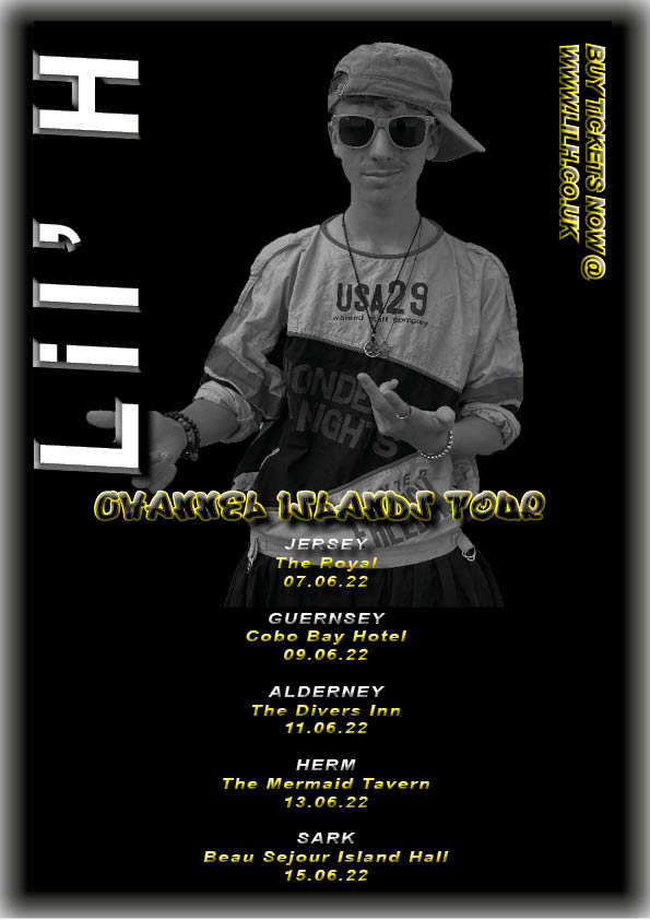
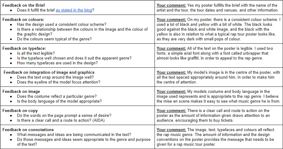
Please click this to see my tour poster.

This is my remake of a rap tour poster that I created using my own model on Adobe InDesign. The image in my tour poster is from my mise en scene blog post. This has taught me what to include and what tools to use when creating my own music media. I now know the best effects, typefaces and genres in order to create a good piece of media using both Photoshop and InDesign.
 

My Magazine Front Page Swede

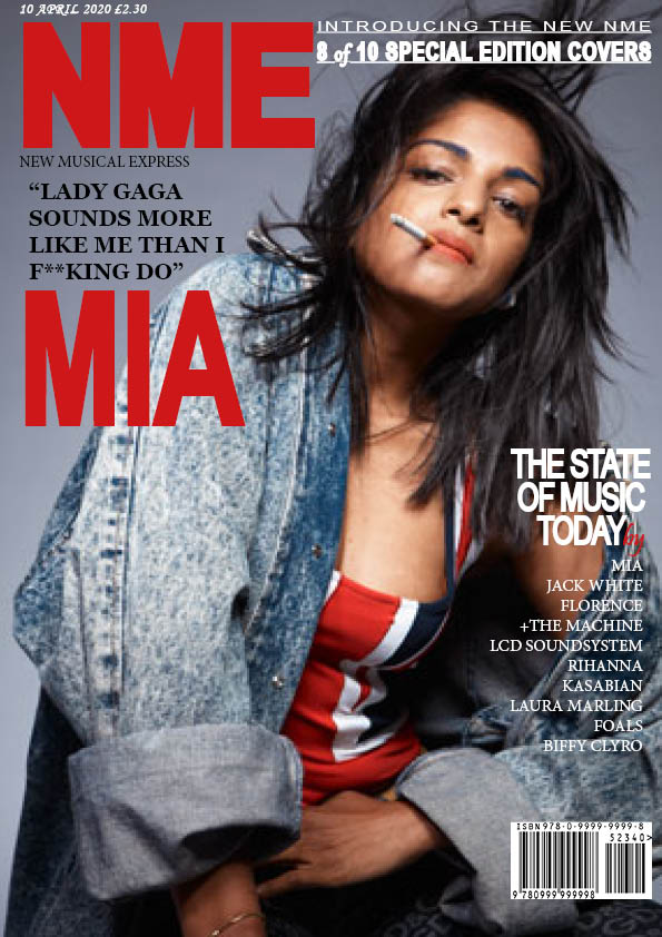
Please click on the image to see the PDF

This is a magazine front cover that I have recreated using Adobe InDesign. During these lessons of recreating this NME magazine cover, I learnt how to use all the features of InDesign in order to create the technical design conventions needed for a magazine cover such as a mast head and cover lines. In the process of using InDesign, I found placing and the positioning or sizing the image rather easy, however I struggled a lot with working out the proportions and sizes of the text, this is what I need to improve on. It was also hard to find the specific or similar fonts and typefaces. It was very important to get the sizing and colouring of the masthead correct, as this acts as a logo for the magazine. Overall I think I did well on recreating the layout of the magazine. Below is the original NME magazine cover that I attempted to recreate on InDesign.

When I create my own magazine, I now know the tools I need to use and how to use them in order to create a well designed and aesthetically pleasing front cover for my magazine.

I think that these two videos would’ve helped me with my struggles of the front covers text.

The Camera Talks

When using a camera, angles are very important in order to cover the narrative the producer wants. I used framing and camera distance in these photos to represent the emotions I wanted to portray. I also added denotations and their connotations to each photo, to highlight the narrative I was going for in each photo, and the technical camera term used. the composition in a photo is also very important, the composition in my photos was mainly in the middle of the photos.

In a media text, a close up photo can be used to convey a strong emotion, however so can a long shot. A high angle tends to make the subject of the photo look smaller and vulnerable, yet a low angle can make the model look bigger and more intimidating. A framing shot can be used to put emphasis on the photo subject, making the audience focus on it more.

When I take photos to create my own media, I will think carefully about the positioning of the camera, as it can change the connotation of the photo drastically. The use of a camera with mise en scene creates a powerful partnership, that I will be definitely be using in order to create my own successful media.

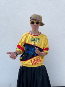
My image that uses mise-en-scene to communicate meaning

Mise en scene is used in media to communicate the connotations producers want to portray. In the rap genre, I found that what people wear, and their body language is the most important mise en scenes in this genre. Rappers are portrayed as cool, rebellious, laid back, masculine and urban, their body language and costumes outline this star image. I was allocated rap as a genre to research and portray through a model during a photo shoot.

I focused on my models costume and body language in order to convey the star image of the rap genre. This was my favourite photo from the shoot and I picked it due to the mise en scene of my models hand gestures, costume and body language, this makes it the most conventional to the genre. the models body language looked very relaxed and cool, this portrays him as laid back and urban, how the rap genre is represented.

The audience responded to my mise en scene part correctly, they described him as cool and laid back, which is how I wanted my model to be reflected. However he was also described as arrogant, which was not how I wanted him to be portrayed, but that word is often a convection of the rap genre. My representation of the genre was correct.

It is important when I make my own media that I put thought into all the mise en scene factors such as costumes, props, body language, setting, makeup and hair and lighting, in order to convey the star image I want my genre to have and express the conventions of that genre.

A Textual Analysis of a Tour Poster

The majority of aspects in media text have connotations to a deeper meaning, in order to provoke a feeling from the consumer. I deconstructed all of the denotations in this tour poster, in order to decode the narrative the artist is trying to portray. Aspects like all the colours, the photographs included, the font and other language can all signify different things, depending on how the prosumer wants their media text portrayed.

I now know how everything in media can connote to something else and the importance of this. When making my own media text in the future, I will think deeply into what every denotation represents, in order to induce the reaction I want from my audience and make a good piece of media. An image conveys an idea, which is why you must think deeply about the connotations you do or don’t want your media text to have.