Component 1
Question 2 – How does your product engage with audiences and how would it be distributed as a real media text?
This is a screencastify explaining my answer to this question:
Question 3 – How did your production skills develop throughout this project?
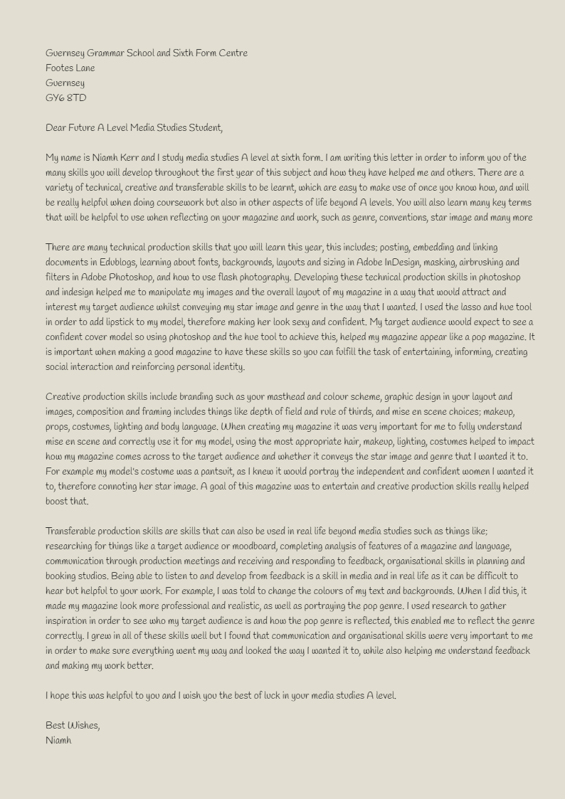
This is an MP3 and letter I have written to a future A-level media student, explains how my skills developed throughout the project:
Chosen Adverts
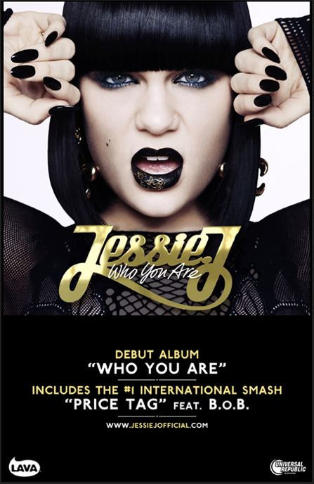

I would like to put these two adverts into my pop music magazine as I think that they would be suitable for my target audience and mission statement. My mission statement is ‘a magazine that believes in pop women and empowering women,’ my target audience is young and strong women who enjoy becoming reading about independent women. The first advert would appeal to my demographic and reflect my mission statement well as it features a young women who has just brought out a pop music album, looking rather fierce, this will encourage my magazines audience to want to buy and listen to her album. The second advert for my magazine would appeal to my target audience as they are predominantly people who may wear makeup, and it is a makeup brands advert.
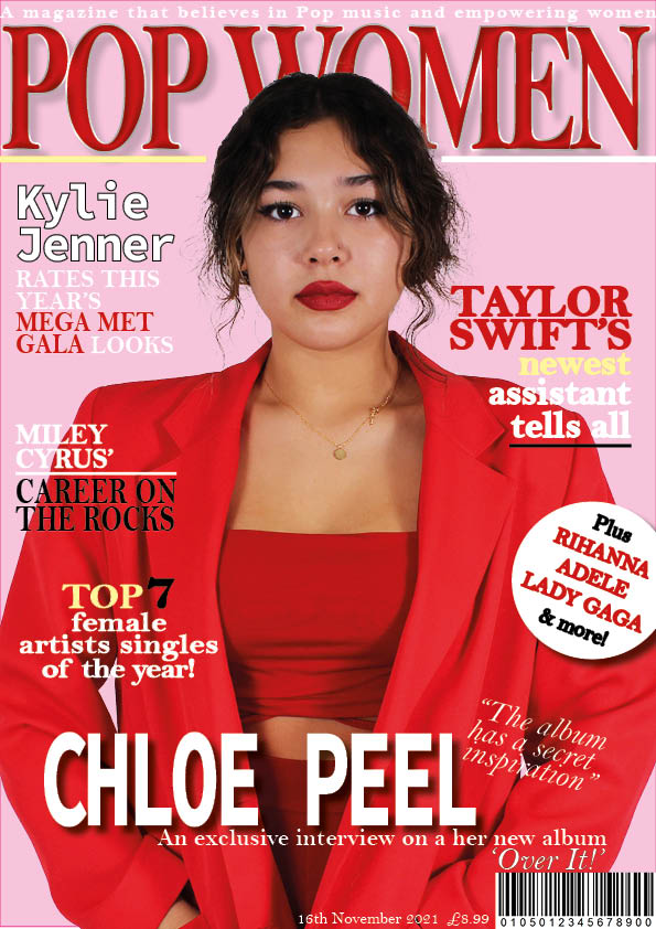
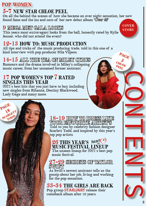
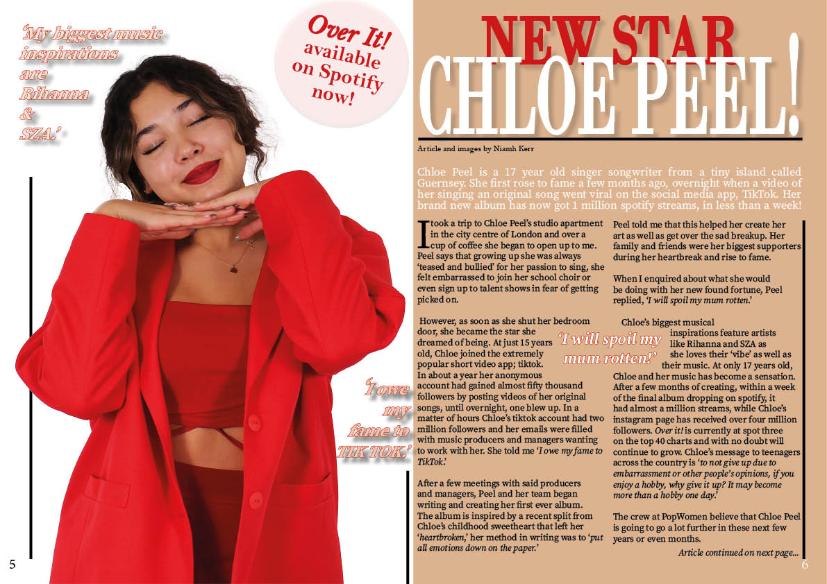
Final Draft 4
These are all three components for my finish music magazine.
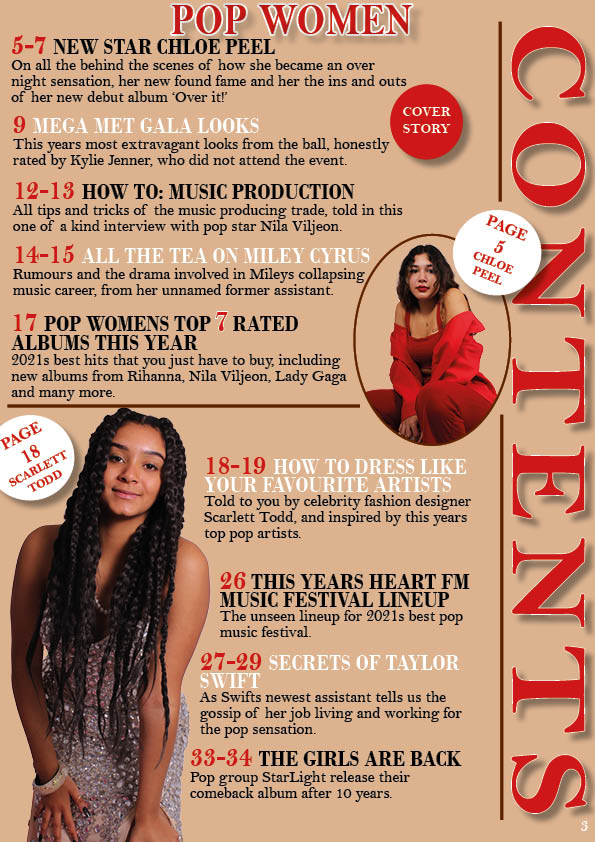
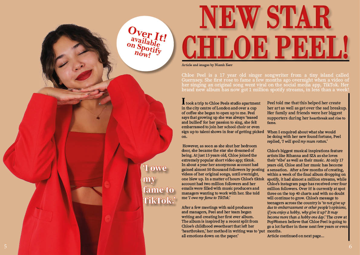
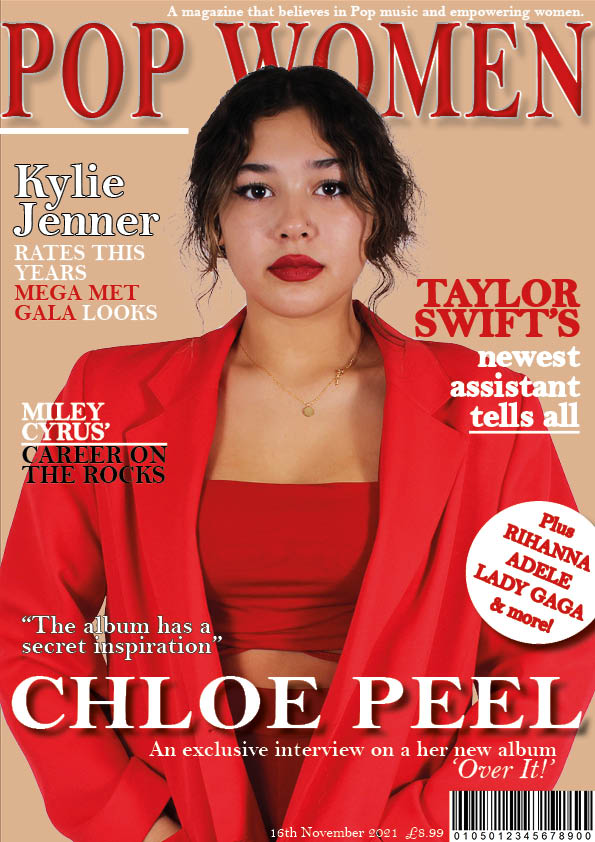
I have corrected the positioning of coverlines on my front cover, changed some fonts, changed the background colour, added in some more colours and added in another coverline. In my contents page I have changed the background colour, repositioned my masthead and contents title, and changed some fonts, added in any missed punctuation and included some logos for brands in my contents page. I added in more quotes and graphics, changed up the colour palette and sizing and colours of the article title to make it stand out more on my double page spread.
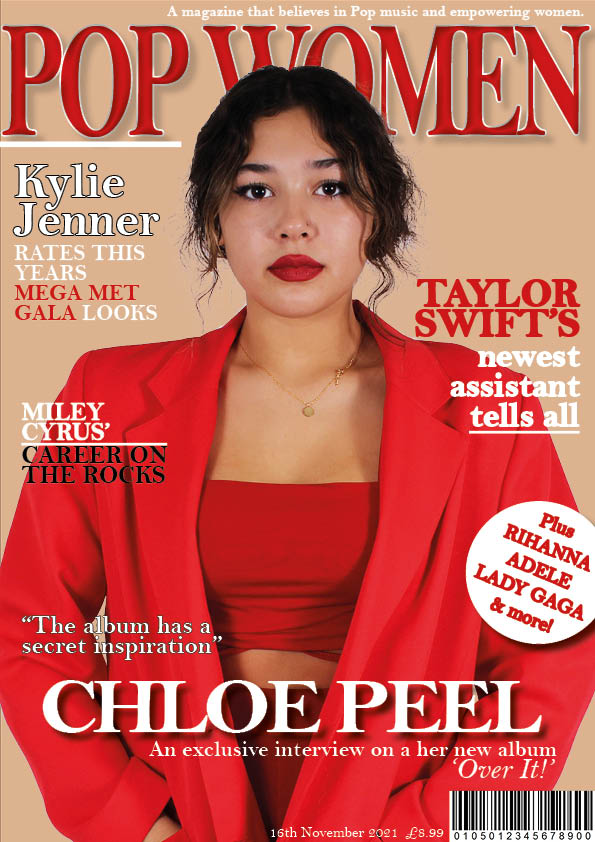
Complete Magazine Draft 3
This is the third draft of all parts of my pop music magazine.
In my front cover I have made the cover title smaller and made the masthead for my music magazine bigger so that it stands out more in comparison.
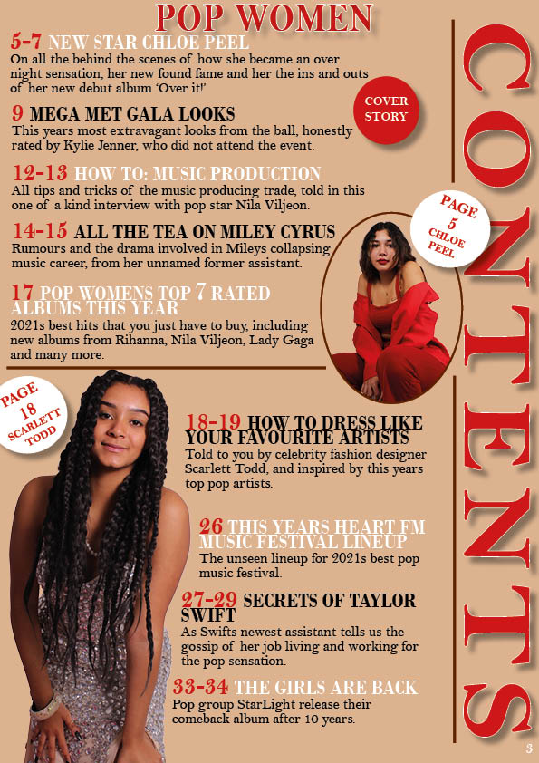
In my contents page I have made my magazine title bolder and have repositioned my coverline titles.
In my double page spread I have changed the colour of the first page and made my pug and quote text bigger.
This is my Screen Castify feedback from my third drafts.
My targets for my front cover from this feedback is to move my coverlines around and add another to fill the space, change the colours of some text, as well as make my masthead even bigger. For my contents page I must correct any punctuation and typos, and change the size and placement of my masthead. Finally for my double page spread I will add in another quote to fill the white space, move my article continued on the next page, and make my article title stand out more.
2nd Draft of Double Page Spread
This is the second draft of the double page spread of my music magazine.
I have made changes to my double page spread to make it look more professional and fit into my pop genre.
Changes I have made to my double page spread:
- Added graphics,
- Added an emphasized quote,
- Changed the colour of my standfirst,
- changed the positioning of my article and standfirst,
Things I still need to change:
- Make the writing in my pug bigger,
- Change the colour of my background,
2nd Draft of Contents Page
This is the second draft of the contents page of my pop music magazine.
I have made some changes to the contents page of my music magazine in order for it to look more professional and interesting.
Changes I have made to my contents page:
- Added another image of a different star,
- Added fitting graphics,
- Fixed my line spacing for all my coverlines and information,
- Added and deleted certain pugs,
- Added a white border onto my contents title,
- Added my masthead,
- Changed the positioning of the page number,
- Moved and added more coverlines,
Changes I still need to make:
- Change the placement of the coverline titles,
- Make my title more bold
2nd Draft of Front Page
This is the second draft of the front cover of my pop music magazine.
I have made a few changed to my music magazine front cover in order to make it look a lot more professional and convey the aesthetic I wanted it to.
The changes I have made to my front cover:
- Added a quote,
- Changed and fixed the line spacing for all my cover lines,
- Moved around the heading and information for my coverstar,
- edited the sizing and placement of my line graphics,
Changes I still need to make:
- Make the masthead bigger


