Here is the second draft of my double page spread:
Please click on the pages to open the document up.
I have improved it by:
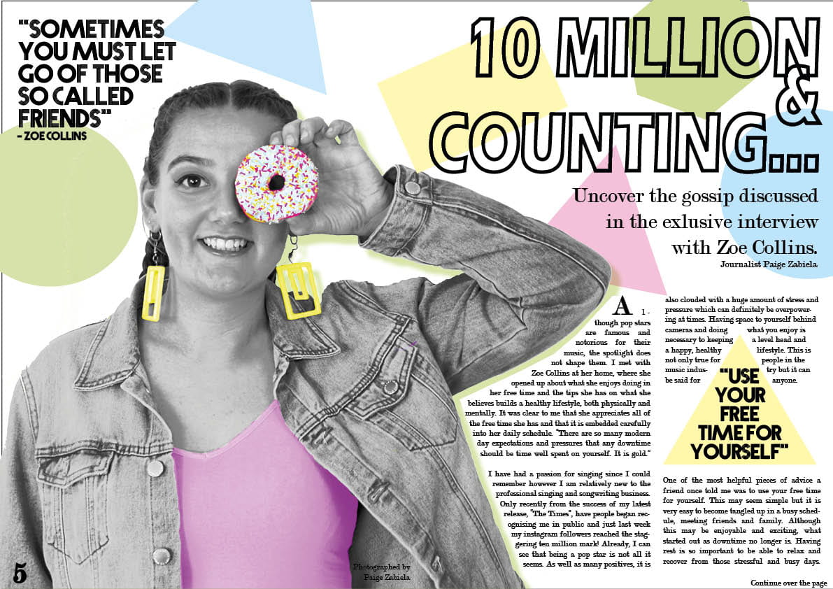
- I have changed the picture. This has got pops of colour which links to the shapes on the pages. This image is more interesting than the previous one as it has more character and is more fun. This also makes it relate more to the pop genre. This will hopefully grab my audience into reading the article. I have also added a drop shadow to it to give it a 3 dimensional appearance. This makes it seem more realistic and less flat and boring.
- I have added more shapes (to the first page) which enables the pages to flow and link together.
- I have made the title more compact which makes it more unique. The “&” overlaps slightly to make it more interesting.
- I have made the quote bigger which will hopefully hook the reader when glancing at the page.
- I have added a stand first which is large and eye catching. It isn’t too long which will hopefully draw the reader into reading the article.
All of these improvements have composed together to enable the genre of pop to be expressed. This will hopefully allow my audience to want to read the article and will interest and educate them.
Although I have improved my double page spread, there are still small adjustments that I will make. For example, the line spacing of the stand first will be reduced as it is quite separate. This will just make it seem more clean and put together. I am also undecided whether the & sign should overlap on the title so that may get changed.