Adverts

Adverts are usually found in magazines. They will be fitted to interest the specific audience that is reading the magazine. My magazine is targeted at Generation Z’s, so I have found adverts that will interest them. Below are two of my favourites and the reasons why I have chosen to use them.


This poster advertises coke but also brings in the theme of music. I specifically chose this poster as Coke is one of the most iconic and recognizable logos. My audience will instantly notice and be interested in what is being advertised. I also chose this advert as my magazine is based on music so it can fit in. The advert is very fun and creative which links in with the style of pop music. It is colourful and busy, making the reader intrigued in what it is about.
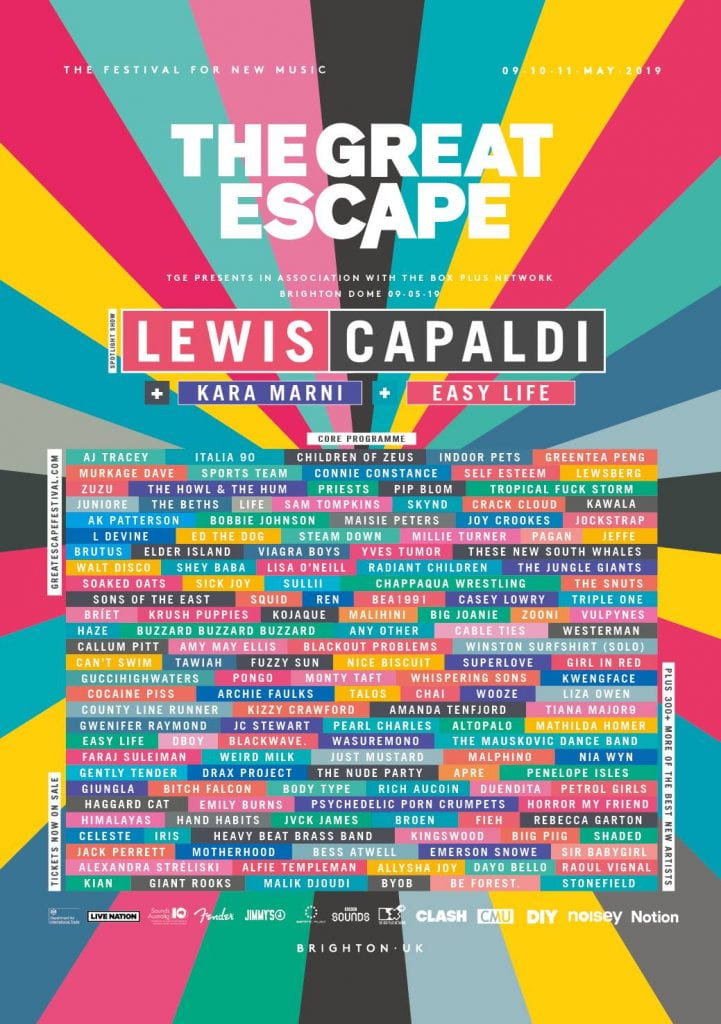


This poster has been chosen as it is all about a music festival. My audience is reading my magazine to discover more about music and so this advert gives them even more information. It is very bright and colourful to attract and please their eyes and includes the very  famous and successful pop star; “Lewis Capaldi”. This will intrigue my audience even more as it will be someone they love and listen to.


A New Improved Complete Magazine Draft

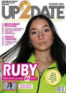
After receiving suggested improvements to make, I then did them. Below are the new and improved drafts of my magazine pages and the things which I changed.

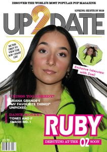
FRONT COVER:

  • I moved the masthead up. This then covered the plug so I then moved it to the top left corner. Lifting the masthead up enabled me to then make the cover image slightly larger.
  • I took the word “edition” out of “spring edition 2019” as less is more. I then increased the text size which enables the wording to be even more bold and easy to read.
  • I improved the cover lines quite a bit. I changed the colour of the font to pink so it could be read and I moved them up and into some empty space. This has enabled my audience to clearly read the information as the image is not making it hard to read anymore. This will hopefully entice them even more into picking up one of my magazines.
  • I have flipped my cover image, increased the size slightly and moved it to the right. This enabled space for my cover lines to go.
  • I moved the headline “Ruby” to the left and taken the bar code to the right. I did this due to the headline looking slightly odd on the left as all the other text was on the right. This improves the aesthetics of the magazine, hopefully pleasing my audiences eyes to pick a copy up.
  • I improved my pug by adding the repeating pink lines and giving it a background colour. I have also made it larger so that it can grab the reader and interest them.
  • I have changed my insert by making the colour of her jumper blue in photoshop. This has made it stand out from the cover image as they were originally wearing very similar colours. I have also made it into the shape of a rectangle with a second outline of a rectangle to follow the repeating lines effect. I have also taken the word “interview” out of the caption as less words to read is more enticing.

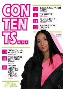
CONTENTS:

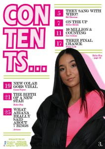
  • I have moved the entire page up slightly to take out the empty space across the top.
  • I have made my image slightly larger to catch the attention of readers even more.
  • I have added the social media icons to add more fun and images to look at. The icons are also notorious so readers will be drawn to go to our magazines pages.

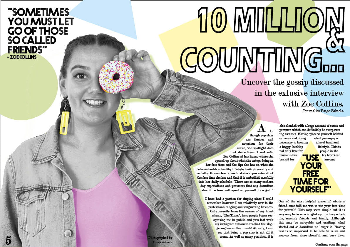
DOUBLE PAGE SPREAD:

  • I have added the donut to form the zero in ten. This adds lots of fun and excitement which fits in with feeling of pop.
  • I have increased the opacity of the colours of the shapes to make them brighter. This makes the colours fit better with my colour scheme and makes the page less dull.
  • I have added a yellow triangle behind the quote in the top left corner. This makes it link with the quote of the right hand page. It also allows the quote to pop, making it easier and more exciting to read.

The final adjustments that I will need to make to my magazine pages are:

  • Add some bevel and emboss to the caption on the front cover.
  • Add some gold/yellow on the contents page to link to the front cover.
  • Make Ruby’s caption larger.
  • Take the dots after the page numbers away.
  • Spelling of “exclusive” on the double page spread.

Complete Magazine Draft

Below is the complete set of drafts of my front cover, contents page and double page spread.

I then received feedback on the magazine:

From the feedback given I can tell that what is successful is:

  • The masthead name and font
  • The details such as the lines (also that they are repeated throughout my pages)
  • The contents page title and page numbers and headings
  • Social media links
  • The colours in the image on the double page spread pop out from the black and white.

The parts that can be improved include:

  • Spacing of text: the mast head can be raised up as it starts quite low, the headlines can be lowered to make reading them easier, make the drop capital word on one line and bring the stand first lines of text closer together.
  • The pug can be improved on. I need to more is up slightly and possible add colour to the caption with it. I could possible use the two rings (like on the LHS) around the image which needs to be changed as both artists are wearing the same colour on the front. (maybe use a photo from my phone)
  • I could make the cover image pop even more by brightening it up in photoshop.
  • Possibly make Ruby even bigger on the contents page.
  • Make sure the page numbers used in the bottom corner are the same (one has a dot after it and the other does not.
  • I could add the social media icons.
  • I could use the doughnut and use it for the O’s in the title to add even more fun.
  • Make sure the green on the double page spread matches the one used throughout.
  • I could mirror the triangle with the quote in on the top left corner.
  • Make less space at the top of the contents page either by raising everything up or adding a banner of some sort.

A New Improved Contents Page

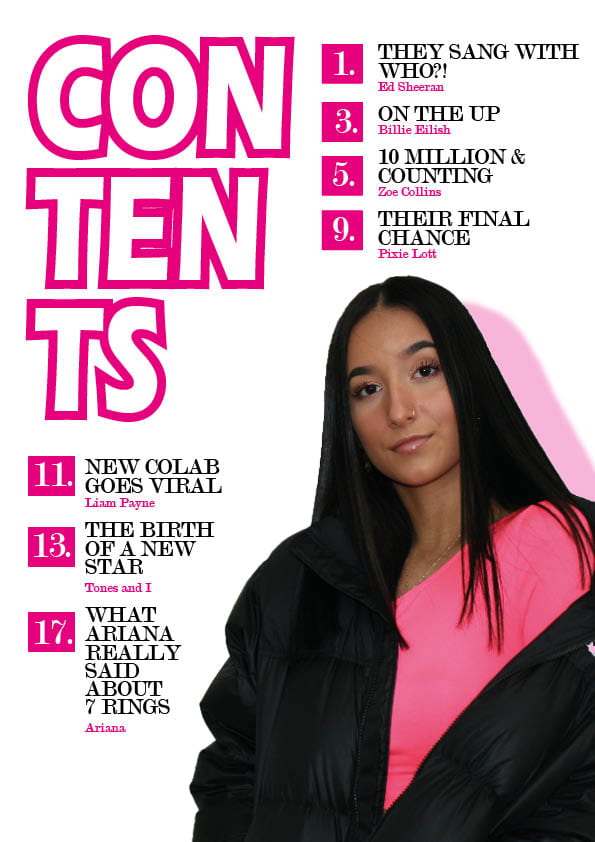
After receiving feedback on the first draft of my contents page, I was then ready to apply those suggested improvements. Below is my improved version and what I did to get to it from draft one.

Please click on the page to open it as a pdf.

The improvements that I made:

  • I filled the “contents” title in with a lighter pink so that there was less white on the page. This has added interest for the reader.
  • I have added an ellipsis after “contents” which draws the reader into looking further. It draws them in.
  • I have taken the dots after the numbers to allow them all to be centered and look more clean.
  • I have added a page number for the contents page in the bottom right hand corner.
  • I have made the image slightly larger and added a caption of who it is and what page you can find her on.
  • I have added green detail lines which link to the front cover. The green also adds an additional colour to break up all of the pink used. The green also fits in with the colour scheme. This additional detail creates more interest on the page as it becomes less plain and simplistic. It also reduces the amount of empty space with out the use of boring text.
  • I have added the social media links for the magazine. This enable the audience to connect with UP2DATE even more, creating more ways of social interaction, entertainment and social interaction (covering Blumler and Katz “uses and gratification” theory). I made this text smaller than the headlines as it is less important and have made it green so it links in but doesn’t stand out too much. It is at the bottom as this is the last place the readers eyes will go.

I then spoke to my peer about my contents page and how it works within my magazine.

This conversation was quite positive. I need to make sure that I continue making links throughout my pages, including colour schemes, fonts and details and that I am making it as interesting as possible for my audience.

Draft of Content Page

Now I had looked at the conventions of a contents page and the type of catchy headlines used, I was now ready to begin drafting mine for my magazine. Below is my draft one and the improvements which I can make to it.

Please click on the page to open it up as a pdf.

What works?

  • The large heading clearly shows what this page of my magazine is. It is also quite unique and interesting as it runs across three lines.
  • The colour pink runs throughout and fits in with the colour scheme of my magazine.
  • The image used is large and interesting. It catches the readers eye.
  • The headlines are catchy and are clearly labeled with page numbers.
  • The entire page is quite minimalist which avoids any confusion or boredom from too much text.

What doesn’t work?

  • There may be too much pink making it a little plain.
  • There is only one image.
  • The number of articles are uneven. If I add an eighth, there will be four on the top and four on the bottom.

So what are the improvements to be made?

  • I need to add a page number to the bottom right corner.
  • I can add another headline to fill the gap in the bottom left corner.
  • I could add something interesting in the background to add more detail to interest the reader.
  • I could add another image or two to intrigue the reader even more into reading the articles.
  • I could add/change the colour of the title “contents” so there is more difference and less of the same colour.

What is a Contents Page?

I have looked at examples of contents pages but what is it?

Well a contents page is basically a menu of what is included inside of a magazine. The technical conventions are:

  • The contents title
  • Page numbers
  • Catchy headlines to draw in your reader
  • Interesting and relevant photos
  • Colour scheme that follows the rest of the magazine
  • it should be one page found on the right hand side on the fist page

Looking at examples, the most successful were those with lots of images and enough (but not too much) text.

Below is some examples of ideas of layouts that I might try out. My favourite is the second one as although it contains the conventions, it is unique and interesting. I have also got some examples of catchy heading that will work in my magazine. My favourite is “They sang with who!?” as it is very mysterious and makes you want to read on.

Contents Page Ideas

Now that I have basically finished the front cover and double page spread, I am now ready to start my contents page. To get some ideas of what I could do, I looked at some examples. This is shown below.

From the examples, I can see that the most successful ones have:

  • Images of the relevant stars to grab readers. The images also make the pages more interesting to look at.
  • Clear page numbers so that the audience knows exactly where to look for something.
  • Pops of colour that makes the page aesthetically pleasing but also links in with the theme and genre of pop.
  • A clear layout. Although I like the “we love pop” contents, it is almost too busy. I don’t know where to look. However it is very fun and links in with the genre well. The contents in the top right is quite unique and interesting however it could be difficult to interpret and it does not link in with my genre of pop.
  • Most contents pages are one page however there is one with two. This could be due to the magazine being larger but it does allow the information to be more clear. I think I will do one page though as the amount of information is almost overwhelming.

Front Cover Updated

After my second shoot, I realized that the image I had used on my front cover was not eye catching enough and did not grab the audience as much as I hoped it would. I think this was due to it being black and white however the image in colour was not quality enough.  (I have used the black and white picture for my double page spread as I still really liked the image.) I have changed my main cover star which means that I had to play around slightly with some of the other features but overall I believe it has been improved for the better. I have also added a plug which links to my double page spread. This will hopefully interest my audience even more into picking up and buying my magazine.

Please click on the cover to open it up as a document.

A New Improved DPS

Here is the second draft of my double page spread:

Please click on the pages to open the document up.

I have improved it by:

  • I have changed the picture. This has got pops of colour which links to the shapes on the pages. This image is more interesting than the previous one as it has more character and is more fun. This also makes it relate more to the pop genre. This will hopefully grab my audience into reading the article. I have also added a drop shadow to it to give it a 3 dimensional appearance. This makes it seem more realistic and less flat and boring.
  • I have added more shapes (to the first page) which enables the pages to flow and link together.
  • I have made the title more compact which makes it more unique. The “&” overlaps slightly to make it more interesting.
  • I have made the quote bigger which will hopefully hook the reader when glancing at the page.
  • I have added a stand first which is large and eye catching. It isn’t too long which will hopefully draw the reader into reading the article.

All of these improvements have composed together to enable the genre of pop to be expressed. This will hopefully allow my audience to want to read the article and will interest and educate them.

Although I have improved my double page spread, there are still small adjustments that I will make. For example, the line spacing of the stand first will be reduced as it is quite separate. This will just make it seem more clean and put together. I am also undecided whether the & sign should overlap on the title so that may get changed.

Feedback & Reflection on Draft DPS

After composing the first draft of my double page spread, I then received feedback on how I could improve it. below is the improvements given from my peers and teacher.

  • Compact the title (so the lines are closer together) so that there is more room for the drop capital to be big enough.
  • Change the Image to one from my first shoot as the model is the same on the front cover and double page spread. (as I have updated my front cover)
  • Make the quote even bigger to make it stand out
  • Add more shapes to make the two pages link together
  • Add a by line

From receiving this feedback, I am going to use it to improve my magazine double page spread. Due to changing my front cover, I am going to use the photo that was originally used on it in my double page spread. This image will be black and white with pops of colour. This colour will then match the shapes placed in the background; linking my image and page together. Using the improvements above, I will hopefully be able to attract my audience into reading my article; which will then hopefully accomplish Blumler and Katz’s “uses and gratification theory”.