")
Jan
2016
Digipak and Advert – Draft 2 – Feedback – Targets
Print Production Draft 2:
After taking into consideration the feedback we revived for our first drafts, we immediately set out to implementing these suggestions into our print productions. In summary, we did not make any major changes to either the digipak or the advert. The reason for the lack of significant change being that the feedback validated our existing ideas for the digipak and advert.
Digipak Draft 2:
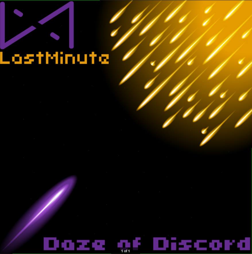
Front Cover:
Inside Left:

Inside Right:

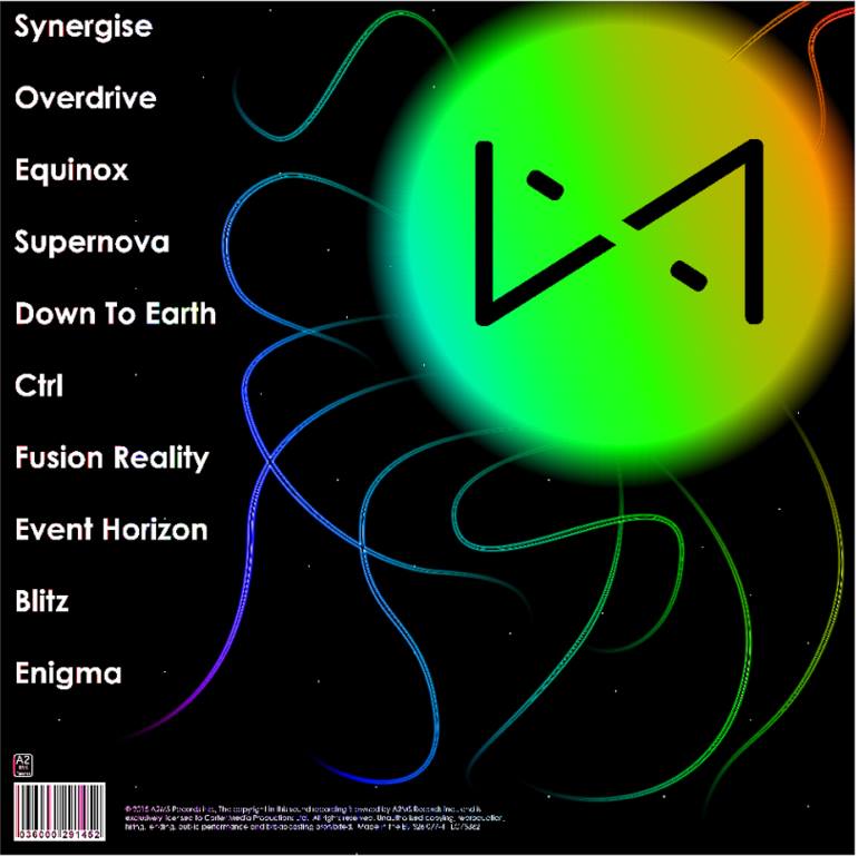
Back Cover:
Digipak Draft 2 Verbal Feedback:
I asked Anthony Lawn, a media studies student, what he thought of our second digipak draft. See below for Anthony’s feedback.
In summary, here is Anthony’s feedback, his likes and his suggestions.
Likes:
- The use of colour represents the electronic genre effectively
- Likes the narrative idea of the front cover being a representation of 1 vs 100 (the idea that you have to overcome difficulties)
Suggestions:
- Change the name of the album to be more conventional to the electronic genre
Digipak Draft 2 Peer Assessment Sheet:
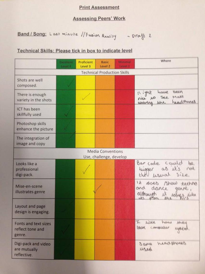
Katie De Carteret, also a media studies student, filled out a peer assessment sheet of our digipak and we documented the feedback she provided. Click on the image below to view the peer assessment.
Katie’s peer assessment.
In summary, here is Katie’s feedback, her likes and some other comments.
Likes:
- Good implementation of Photoshop skills
- Well composed shots
- Digipak and music video combine together well and reflect each other
- The use of font effectively reflects the genre
- The layout of the images are effective
Katie also commented that:
- The size of the bar code could be increased
- The cover looks more representative of an older version of the electronic genre
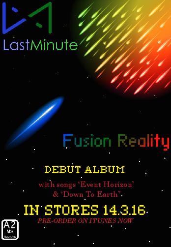
Advert Draft 2:
Advert Draft 2 Feedback:
We asked 3 people if they had any notes or suggestions about the second draft of our advert. I vine’d their responses and below are the video files of their likes and suggestions.
Vine 1: Feedback from Tom Porter
Vine 2: Feedback from Max Simpson Cohen
Vine 3: Feedback from James Newton
The following is a summary of the likes and suggestions from the feedback.
Likes:
- The colour is used effectively in the advert
- the themes of the song (Down To Earth) have been effectively embedded into the advert
- The logo is very effective
Suggestions:
- The font could be improved (no alternative font was suggested)
- The text at the bottom of the advert could be improved
Overall:
I am very pleased with the feedback I have received, mainly because all 4 people I interviewed thought that the print production was fundamentally good and only had minor suggested changes. The main suggestions that we will apply to our product will be the changing of the album name and the alteration of the text in the advert. The advice to change the name of the album was particularly helpful as my group and I were not wholly convinced about the album name prior to interviewing people for feedback. The feedback confirmed the idea that the album name was not conventional enough to the electronic genre.