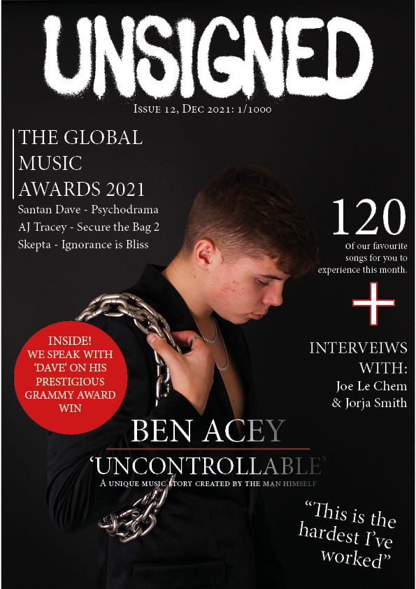
Here you will be able to view my second draft of the magazine front cover. I have used the same image and tried to make him the centre of attention, I Have tried to add a few things so that the audience can Clearly identify who the main cover star is, I have done this by adding the artist name at the bottom in big writing and telling the audience a little bit about him, almost a teaser.
- I have added some glimpse of red to correlate with the rest of my magazine
- I have added my stars name in big writing at the bottom so that the audience can clearly identify
- I have also added a quote to make the cover look like a true professional magazine cover.
By doing this I hope that it will correlate well with the rest of the magazine and attract attention from the audience. By adding a quote I hope that it will give the magazine a more profession feel and give the audience and insight of what’s to come.
What’s next?
- placing of the text inside the pug
- add something else red to compete with the pug as it is really big
- make him much bigger.
- sharpen the chain so that they stand out
- add some colour to some of the coverlines?
- put the quote nearer him. to anchore the main cover image
- typo interviews
- try bevel or some FX on the masthead
- don’t centre the masthead – – align to the left and then you have room top right for something else?
- barcode