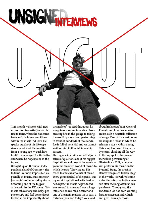
In my second draft I tried to use a bit more colour and added a red x to apply the theme to my artists pictures and the album name ‘Uncut’. I’ve added my article in to give it the complete feel of the Double Page Spread, I also lightly photoshopped my images to make them sharper and brighter making the viewing quality better and easier to see the model.
- I have photoshopped both images
- Added in my Article
- Added some more colour with a large red ‘X’ that’s relevant to my genre
I’m hoping that by doing this it will attract more attention from the audience and make my DPS stand out.
What’s next?
- page numbers
- byline?
- standfirst in bigger, bolder font
- drop capital for the start of the article
- are the columns the same width?
- perhaps justify the copy to right and left?
- paragraphs
- swap size round unsigned and interviews?
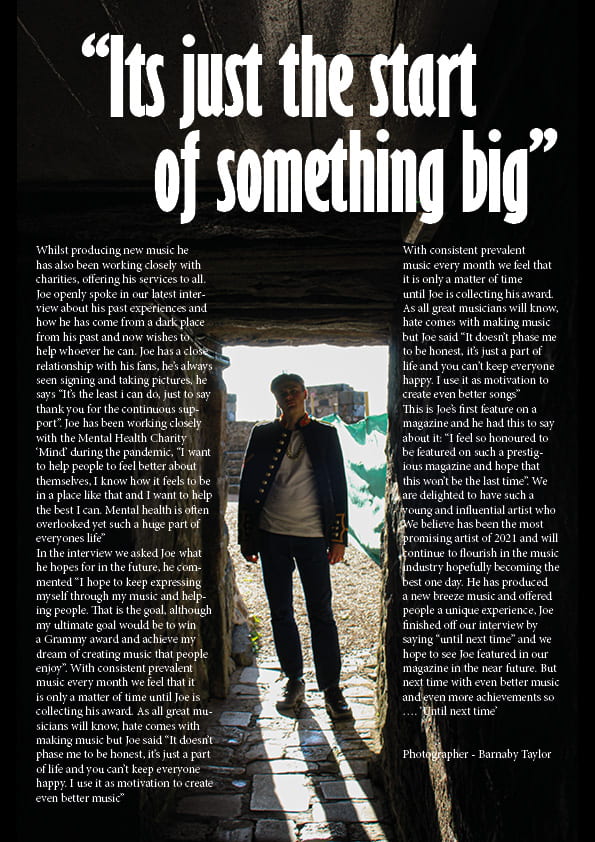
- caption the inset on right hand page
- is Uncut the artist….perhaps add something else in to tempt the reader to read on