December 12

Design Skills 1

Design Skills

I have gained many skills from designing my front cover page in both Adobe InDesign and photoshop. With each aspect of the cover magazine, I have encoded meanings into the colour scheme, fonts and words on the cover page to draw my specific demographic into reading the KSTORM magazine.


What have I learned?

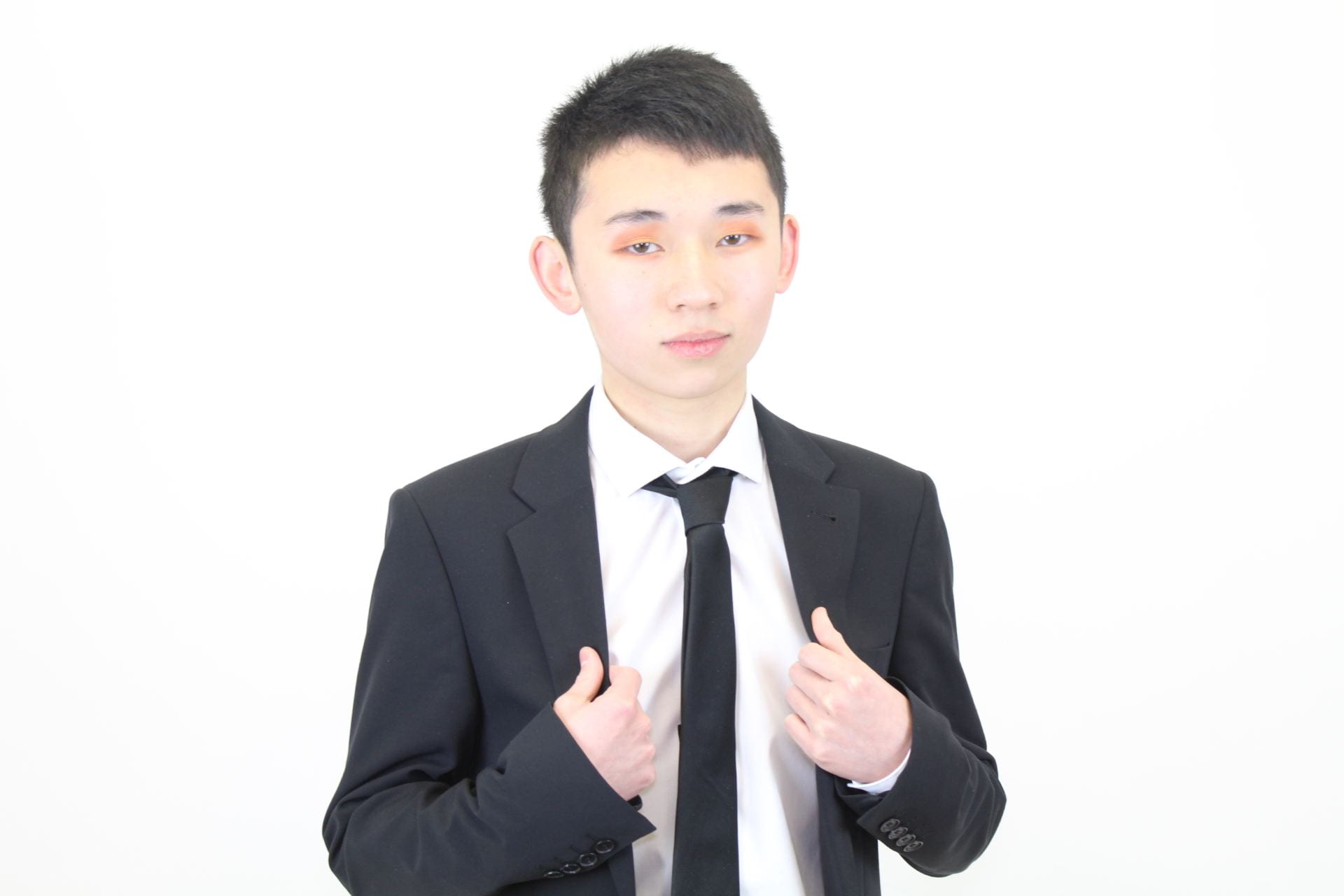
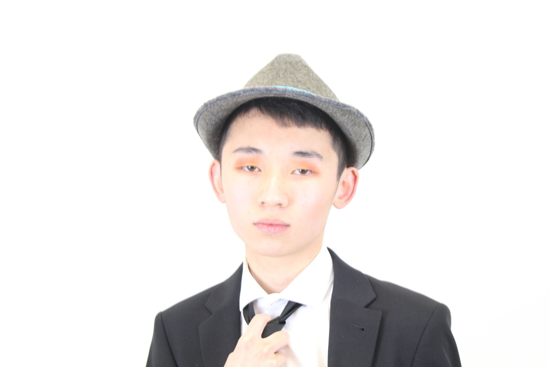
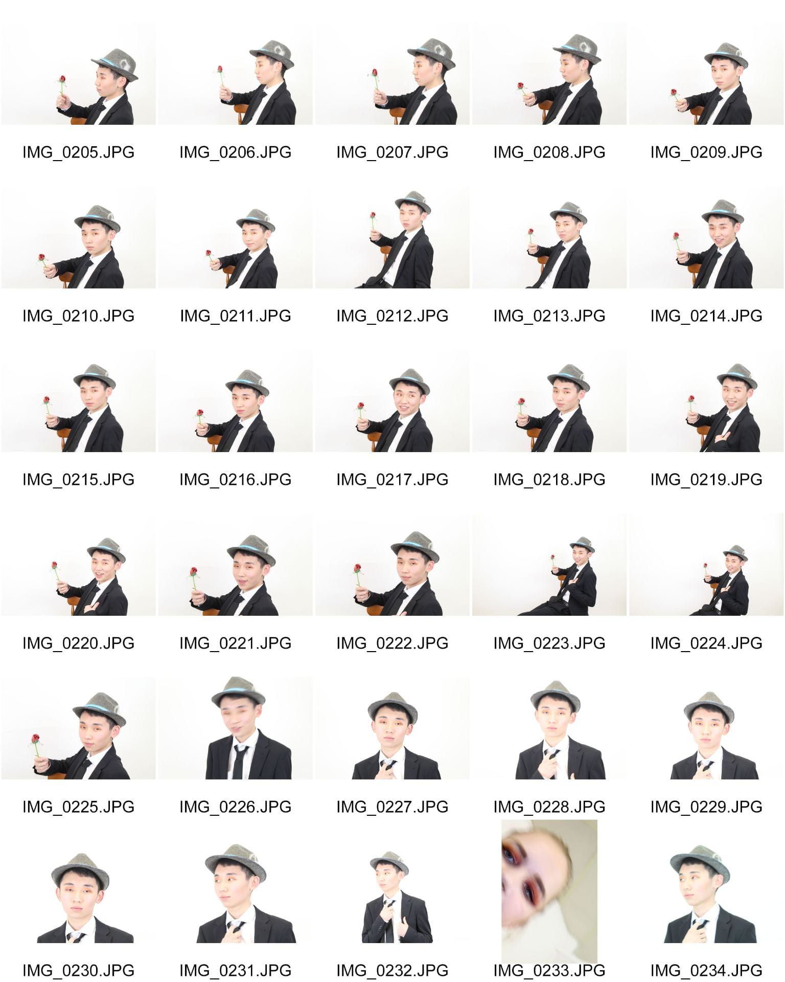
For taking my photos I have learned that to have lights in the photo room gives a brighter look to the photos and helps the camera lens to focus, the flash on the camera gives a very high-quality photo of the model or object as it zooms in on all the smaller aspects of that thing. Without the flash from the camera, the images result in having softer looks that are much less harsh than the ones with the use of flash.

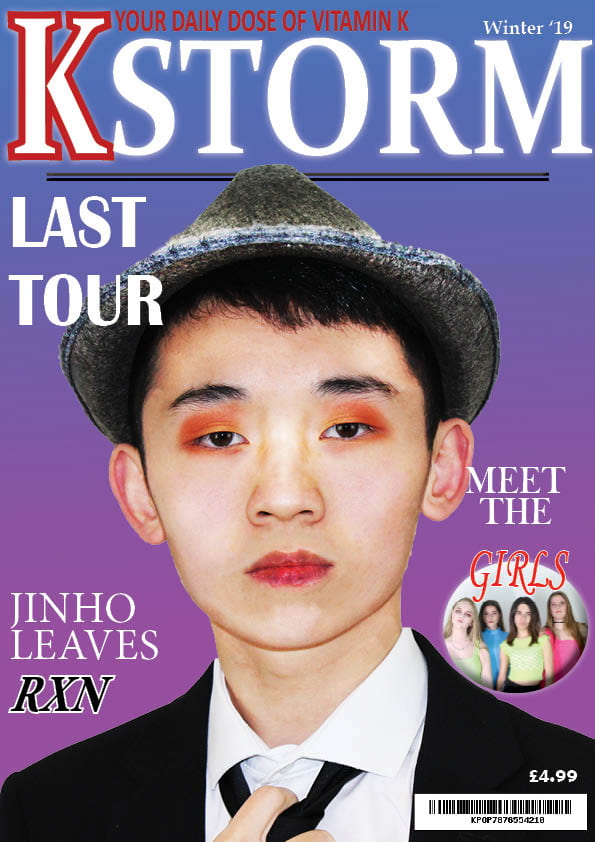
From photoshop I have learned a range of different techniques on how to make an image look better and sharper, I know how to edit and photoshop a model to make them look even more media-worthy for the public to see. For the editing of my cover star, I used the burn tool to darken some areas of the face to help define the jaw or neck so the sharpened areas of the face stood out more. I then used the dodge tool to lighten up any areas that looked to dark are portrayed the wrong message of that star to the audience, and give a lighter skin tone to make the model appear more Korean. One of the tools I used a lot was the spot healing brush to remove any spots from the model to make them look even more perfect for the front cover as idols are in the media. I can cut images out of their backgrounds by using the quick selection tool, to have them as single images to then place onto another background of my choice which I did for the cover that ended up being very effective and standing out, I can make these backgrounds in photoshop so that I have the correct colour scheme for the photos so that it can encode a message to the audience. This created a conventional neon aesthetic to the cover that Kpop normally conveys to the audience to make it look more exciting and inviting.

In Adobe InDesign, I used many types of fonts and colours to create effective titles and cover lines on the front page to interest audiences. I have learned how to make fonts and techniques in InDesign look as effective as possible, I also put in a plug of KDREAM in the corner of the cover and used the shaping in In Design change the shape of the photo to a circle so that it stood out more and looked more interesting as Kpop is very exciting and different from other genres. On this plug, I put an outer glow to further highlight it to audiences, I then snip tooled in a bar code for the magazine by creating one online InDesign has kept it looking clear and sharp. I have learned that less is more and not everything needs to stand as much as other aspects of the magazine.

In the future, I intend to use these techniques from both Photoshop and In Design for other projects to make images look better and cleaner. I think I have done well in using the online tools to help make my images better and more professional, I will improve my skills in the future to result in better-looking photos for my media.


What went well?

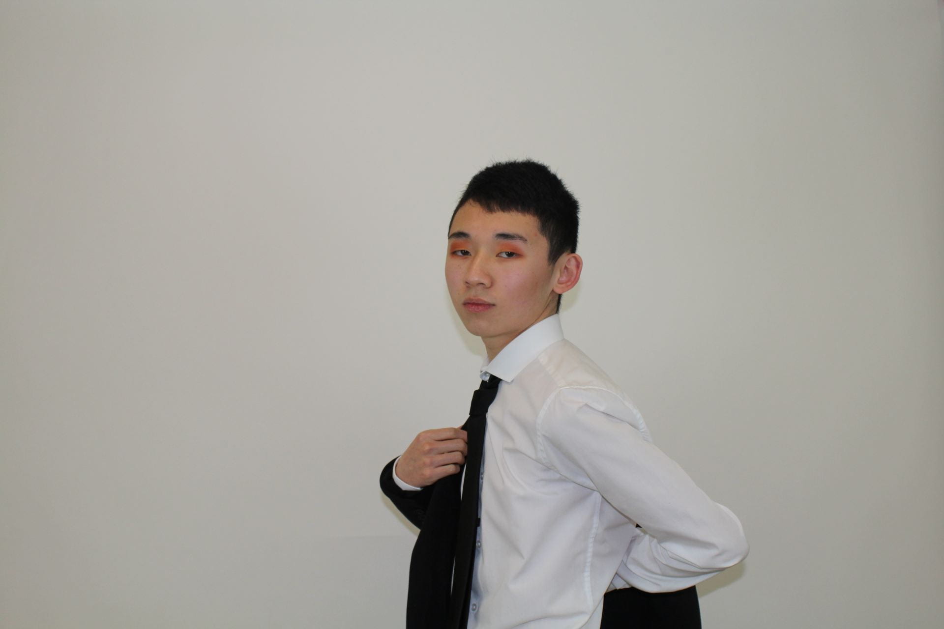
The photos I have taken so far have all been very successful and all convey a narrative and story to the audience, the angles and distances of the camera each give a certain amount of intensity to the models and narrative. For the single male model photos of Jinho, many of them were close up as I wanted him to be conveyed as slightly arrogant and intense to the audience so that the specific demographic, teen girls felt he was looking right at them. The group photos of the girl group KDREAM were mostly mid shots as I had to get the whole group into the shot, some were close up but I liked the ones with the front angle and mid-shot lens. This made the group appear very exciting to audiences and convey the narrative of something new and enticing, lastly, the two director shots were also mid shots and close-ups to show how important they are as directors and their significance in the kpop industry and to many of the idols and groups themselves. There were low angles within the shots to convey the dominance and power of these two men, but also some front angle shots to soften the narrative of them as I wanted them to be viewed as kind and mature to the audience.

In Photoshop, I first struggled with the many effects that were usable to my images but I quickly understood how everything worked and ended up professionally editing many photos for my magazine which were successful. I edited a lot on the cover star because it was such a close-up image it had to be perfect for the front page to interest the target audience, the plug of KDREAM did not need too much editing as the image was not as close up as the cover star image and due to the image is a small plug in the magazine. I intend to use more of KDREAM in the double-page spread of the directors to help tell the story to the audience, the images each tell effective stories themselves with the help of photoshop to help emphasize those stories to the readers and audience.

I was very successful In InDesign as I kept reinforcing the narrative of the magazine in all the fonts and colours. I kept the colour scheme simple in the cover so that there is a larger focus on the pugs and plugs and main cover star, the name of the magazine KSTORM is very effective as it is not too busy but stands out enough to be clear and noticed by audiences. The K of the KSTORM is slightly different from the rest of the name as I wanted it to stand out further so that is is the letter that sticks in whoever’s mind looks at the magazine, I decided to colour it white with some bright red strike to entice audiences in as red is a vibrant colour. The whole KSTORM has an outer glow that effectively stands out against the transitioning colours in the background that I made in Photoshop, giving fun and sophisticated looks to the magazine. I used a limited number of fonts on the cover of the magazine as it keeps the magazine simple for readers to look at and it is not overwhelming either. The magazine cover is busy but not overwhelming, I needed that balance to successfully create a magazine cover with the narrative that calls to young teen girls.


Even better if?

I need to work quickly when designing and editing my material for my content as the stories and narratives need to be clear in the image, I then need to experiment with more techniques on photoshop and InDesign to be able to perhaps result in a more effective piece.


Encoding in the cover

In every aspect of the magazine, I encoded a message into that specific aspect to help the audience of teen girls when reading this magazine. I wanted my magazine to be seen as professional and mature but also have the fun exciting touch that kpop has, It needed to be straight forward so that the audience gets what the want from the magazine images and cover.

In the name of the magazine KSTORM I wanted the excitement to be there immediately in the magazine so the letters are all in capitals to make it sound urgent and important, the storm in the name reflects on how the magazine is taking the world by storm and is very dangerous as you can become addicted to kpop fast, you must be aware of it. The danger of the KSTORM is what interests young girls as they want to be free and live on the edge as young teenagers reading the magazine. The red in the letter K gives more urgency and energy that the magazine wants to display, the font is straight forward and bold and very readable to anyone.

The fonts in the cover each portray different meanings to whatever story or event they are connected with, the colours of white black and red are all very contrasting showing how each story within the magazine is different and gives the audience different information about the world of kpop. These colours further stand out on the background of purple into blue giving it a bigger and brighter pop about the cover, the colours of the words and background contrast so nicely that they actually fit very well together to create a very impressive front cover.

This magazine needed to show the energy around kpop and what the genre of music is truly like, the sophistication and maturity in the magazine is displayed by the fonts and cover star whilst the danger of the addiction to kpop is seen through the colours. This magazine is a powerful portrayal of how compelling kpop is as a genre of music and how it really can take the world by storm.


Screenshots of tools

Photoshop

Quick selection tool to cut out the models and parts of the image i want and do not want.

Spot healing brush tool so that I could remove any blemishes from the models to give a cleaner image.

And finally, the dodge tool to lighten up areas in an image to make it look brighter.


InDesign

The text box tool to be able to add text and words to the magazine, and edit the words within the box.

The fx tool to add effects like outer glow and outer shadow to the words.

Finally the tool that I used to change the height of the words to make them look more effective in the magazine.

December 9

Language Analysis

Language Analysis

Below is the language analysis from three articles in a kpop magazine, I have chosen to analyze three as they were all very small and short so I wanted to look at three to see how contrasted each other in the magazine to give different displays of the media stars.

The images of each article are located below the analysis.


Please click on image to see full Language Analysis


December 6

“Production Meeting Agenda For 2nd Photo Shoot and Risk Assessment “

Production Meeting Agenda

Below is my production meeting agenda for the second shoot, it discusses the lighting, costume and other aspects of mise en scene. It states what my aims are for the photoshoot and how I want my models to be portrayed to the audience. I have then added photos of clothing ideas and props that I would like to use in my shoots to tell the story to the audience, and lastly the risk assessment for the on-location shoot.


December 6

A New Improved Front Page

Cover Draft 2

This is my second draft of the front cover page which is clearly more effective than the first one. I have made many improvements from the first draft, including adding a deeper story to the cover.

  • Added in Korean words that say cool and crazy to show the origins of the genre.
  • Korean fashion week as Kpop idols have to constantly look presentable and well dressed.
  • Jinho’s signature along the article about him adds a story.
  • A quote from his interview to further interest audiences into what the magazine includes.


Impact

I hope that these changes make the cover look much more effective and display the genre of Kpop to an audience of young teen girls in bright light so that the genre can become even more popular globally than it already is through the use of my magazine. The business of the plugs and pugs around the main cover star will interest audiences to notice that there is a lot included in the magazine and it is worth the money, the changes in the magazine will have a dramatic impact on how the cover is seen on the market and in the eyes of the audience.


Targets

  • Add another story on the cover page from the location shoot.
  • Photoshop the cover stars lips.
  • reinforce to the audience how powerful and unique the kpop genre is.
  • Add in the SharpShoot logo and a caption


December 4

Draft of Front Page

Cover Draft

Below is a draft of the front cover page of my magazine, the result of the first draft has been successful as I have achieved the sophistication and colour I aimed for when planning the cover page. The fonts are very bold and effective and the images on the cover stand out and are eye-catching to an audience of young teen girls to look and purchase this magazine. The effects on the fonts and images highlight the magazine and emphasize a dramatic aspect of it adding a sense of difference and uniqueness. I have changed the font and colours of the magazine name as it looks bolder and better to the audience and has a bright pop to it that I like and think is significantly more effective than the original one.


Peer Feedback

  • Add in a quote from an interview and place it somewhere on the cover page.
  • Put information about what is in the magazine, such as put page references.
  • Photoshop the lips so that they look less red.
  • Korean words and phrases.


Targets

Some targets I have to improve my magazine cover include:

To further Photoshop the lips of the main cover star as they do not look as smooth and gentle as they could be.

The next aim is to add some Korean words and phrases onto the cover to really express where the genre of music comes from and so that it looks different in the market and catches more attention.

The final aspect I want to add is more plugs and captions so that it looks more busy and exciting to the audience and worth purchasing.


November 25

First Shoot Contact Sheet(s)

Aims

From my production meeting aims, I have successfully met many of my aims as the expression and mise en scene in the shoot resulted in the model looking arrogant and mature as aimed for in my last post, the black suit accentuates the sophistication and gives him a domineering aura that would interest young teenage girls to the cover of my magazine.

At the start of the shoot, I used a light on the top of my camera to give a brighter more gentle light as seen in some of the photos below that really made the images look professional. In the other photos, I used the flash of the camera which then resulted in higher quality photos with sharper lighting and more in-depth detail giving a narrative to the images and highlighting the mise en scene and eyeshadow which I liked.

In some of the other images, I tried experimenting with the coloured plastic over the camera lens which resulted in some interesting shots with the lighting and mise en scene, the different colours gave a deeper narrative to the photo and altered the lighting. However, I decided I did not like these photos as much as the in-depth ones taken with the flash as I really think that they give the stronger narrative and display the correct emotions towards the demographic.


Photos

Below are images from my first photo shoot for the cover photo, I think this photo shoot was very successful as I achieved photos of very high quality and professionalism. In total I took around 200 photos which is a good amount of photos to choose from for the front cover, I managed to find around five photos that I thought would be ideal for a front cover star that conveys the correct themes and feelings I want to express to the audience to get the right reactions.


My five images that could be the cover photo are below.


Below are the contact sheets of photos from my photo shoot.

November 18

Mast Head Designs

Font Styles

In this post my masthead designs are located, the effect of fonts and size will change how the public views my magazine. The colours and fonts used for the masthead will have to match with the vibe the cover star gives to the audience. My magazine is called K STORM so the font that I chose for the masthead will have to reflect the same vibe that the name of the magazine gives, therefore having the desired reaction from the audience.

For most of my font experiments, I have mostly chosen bolder bigger fronts to grab the audience’s attention so that the masthead immediately draws them in and they want to read what the magazine is about. The bold font reflects the magazine name as the word STORM tends to be associated with loud, bold and dangerous events, this could then relate to how dangerously addictive the genre of k-pop is to the audience. In my font for the masthead I want the words to have sophistication and a smooth sleek look that interests the audience, It should stand out and be bold but not too much as it has to radiate maturity.


Chosen Masthead

This is my chosen masthead as this one as it displays the sophistication and individuality I aimed for when designing my masthead, It is bold and stands out and the set letters in the word storm make it bright and big. The letter K is a different font which then gives a roundness to the masthead and reflects the diversity of K pop, the colours I have used are red and black which are both significant colours in Korea and then links to the importance of the K pop industry in Korea.


Other Ideas


November 18

So… I am ready to photograph my star.

Mission statement: The magazine K STORM aims to express and convey the unique genre of K-pop and open audiences’ eyes to a world of the unknown in a positive manner. It strives to present new and exciting themes within K-pop and constantly produce high-quality media for a wide range of demographics.


Brand values

My brand values include the quality of the images and the content within the magazine as it has to call out to the audience and be as effective as it can be, my magazine will need to have the correct themes and colours to reach the correct demographic that my magazine is designed for therefore being conventional and relating to what the audience is used too. To reflect the theme and genre of k-pop in the magazine the mise en scene and colour palette will be vital to display the Korean style of music, my magazine will be high quality in both images and articles to grab audience attention and become popular in the market.

My magazine will need to have the visual effects and boldness that Korean media such as music videos is so well known for globally, and feature the articles that are so important in this type of media such as dating and mental health and what it’s like to be part of the k-pop industry and how truly intense it can be for rising stars. To make the brand value better and stronger I will add aspects such as quizzes and games in the magazine so that the audience has the chance to interact with the magazine, some fashion ideas included in the magazine will interest people more into the Korean style and new cultures and lifestyles.


Communicating ideas

I have learned many things from the camera and mise en scene from the past weeks of working on my music magazine, to communicate these ideas I will use specific colours and patterns in the mise en scene and use certain camera angles to portray a narrative and show different emotions in the cover stars. Combined together the mise en scene and camera angles are very effective for media and it is vital to have the aspects punctual and clean so that the right message is conveyed to the audience, my magazine will display the themes of young wild and free with a touch maturity and professionalism so that a wider audience gains interest in it through the communicated ideas.


Camera

By learning how to professionally use a camera to achieve high-quality images and knowing about the different camera angles as well as the lighting I will be able to get high-quality photos for my magazine so that it looks professional and well thought out. All the certain angles used in a shot display different feelings to the audience, whilst an extreme close up shot is intense and emits powerful feelings a mid-shot will soften that intensity and make the image look more inviting. The angle of the shot also matter as well as they give the cover star status in the narrative, In my own magazine photoshoot, I will use a wide range of camera angles and positions that give the audience different auras so that I can pick my favourite one that creates the right vibe for the magazine cover.


Mise en scene

The mise en scene is a large part of K-pop and is very vital in the media to portray the groups and idols in certain lights, the costume, lighting, acting, makeup and setting are all as equally important to show the audience what kind of celebrity they are. My stars are going to be displayed to the media in juxtaposing ways whether they are on the front cover or the contents page, this will give a broader shape to the magazine and interest people more in the world of k-pop. I want the difference of the unique genre to be viewed as positive in the magazine as audiences sometimes fear new things, but as my magazine will be conventional it should have that aspect of familiarity to reach out to audiences and demographics. In Korea, the makeup and hair and fashion are very different from the western world so I want to clearly display that difference through the mise en scene so my magazine really stands out in the market, every single facial expression and accessory onset will display a chosen narrative to an audience.


Star image and decoding

In all magazines including mine, the star image is vital to reflect the magazine genre and vibe it wants to display to the audience, the star image is how the cover star is portrayed through mise en scene and setting as slight differences will result in the portrayal of that star to be wrong or misleading to what the producer is actually trying to convey. These stars will need to have set characteristics to show to the audience, aspects such as being ordinary or extraordinary will need to be shown to the audience so that they recognise that this person is a celebrity, the stars will need to be shown as absent or present in the audiences lives with shows and tours that allow audiences to interact with the stars. Each star image is different whether it is a band or group or as individuals, every point of mise en scene is vital for the correct narrative of the magazine.

The audience has to be able to decode the articles and images in the magazine, so my magazine will need thee right use of language that reaches out to my specific psychographics in the audience. As a producer whatever I encode has to be able to bee decoded by the audience so that it interests them, decoding is seen in aspects such as colours, fronts, images and writing. If the target audience cannot decode the magazine contents then the product will not b very successful in the media so that is why it is very important to know your client.


Image result for kpop magazine Image result for kpop magazineImage result for kpop magazineImage result for kpop magazine

November 18

Production Meeting Agenda for 1st Photo Shoot

My overall aim for my first photoshoot is to photograph my cover star in a light that portrays him as attractive and arrogant as well as professional and mature to gain audience attention from young teen girls. The mise en scene in my magazine and the cover star will have a significant effect on the magazine and meta-narrative of my media, this magazine will need to be conventional for it to be successful.

I will then have another photoshoot for a female group inside the magazine, they will be displayed to juxtapose the cover star so that it gives a rounded image to the magazine and the k-pop genre. My aims for this photoshoot will be to portray the idols as fun and inviting for the second page with a bright vibe and colour scheme, the models will display a different vibe to the cover star giving a larger meta-narrative and a different story.

For both shoots I will use my Canon camera with lights and flash in the white room, this will give good lighting for my photos and make them look professional and clean-cut. There will not be many props other than a chair and rose for the first shoot and nothing for the second shoot as it will focus on the closeup shots and the connection with the audience members.


A breakdown of both photoshoots is below.


November 18

So what am I up against?

Below is a slide show showing magazines and other types of media in my magazine genre displaying how other companies and producers decide to portray the k-pop idols in the media, it is voiced over with a narration stating how I will design my magazine so that it is conventional and states the themes of k-pop. It includes what topics I will have in my magazine and how  I would like my cover star to be displayed to the media.

Many magazines focus on the genre of k-pop and are very successful at stating a story through the cover stars and contents, the companies make k-pop sound and look very inviting and exciting for audiences of a young age. Whilst some magazines have a mature touch to the theme others have colours of fun and freedom displaying exactly what a young teen wants in their life. There is an intense competition with magazines of the genre of k-pop and I need to make mine even more eye catching and attractive to call out to the correct audience.