Below is a Prezi presentation of the Korean boy band BTS, it covers how they are portrayed across media and in their music videos to give the audience set views on the band helping them gain positive popularity as they appear professional and friendly. The bands connections across the world and difference as they come from Korea has helped them gain even more popularity globally as many people of the new generations know who they are and what they do. Their record label has control over their media accounts therefore allowing them to promote their songs and products to a wide audience gaining more money and popularity as they only promote the band showing how successful this K-pop is in the world.
The paradox of the star which is a theory proposed by Richard Dyer tells us about the character of a celebrity and what they signify to an audience, how they are displayed in the media gives the audience an opinion of that celebrity through written articles and photos of the stars, this means they can produce a meta narrative of the stars giving them a story and a background. Celebrities and stars are deliberately constructed by media to represent a certain light, they are either extraordinary or ordinary and can be absent or present.
I will create a slide displaying what I would like my cover star to be involved with, what they will wear and what kind of theme I want to present with them, everything in the cover will tell the audience a story so it is vital to have everything on point to give the correct narrative.
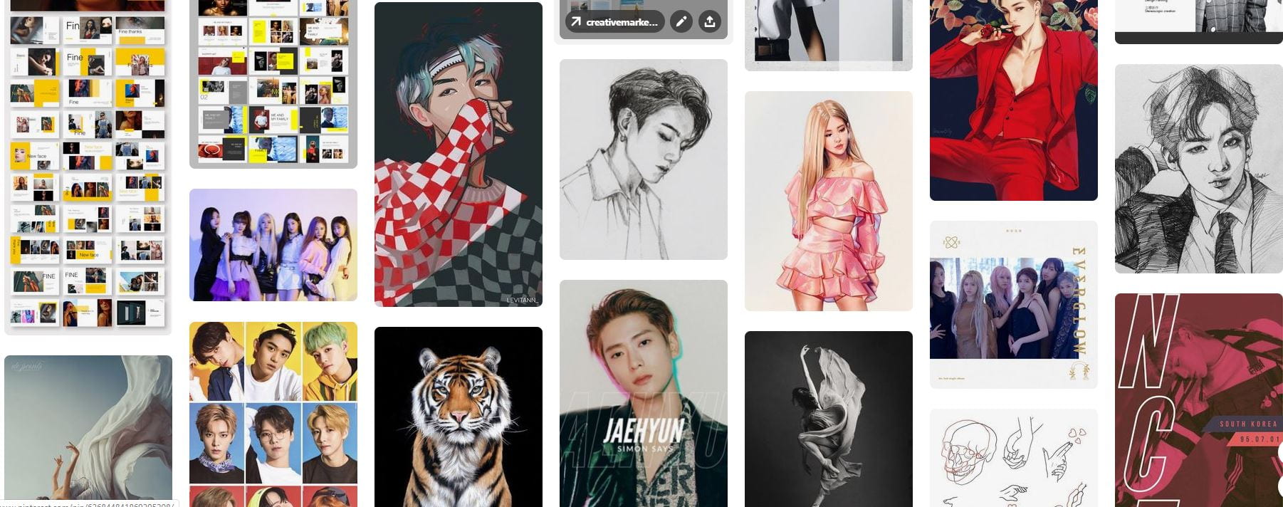
Shown below I have completed a mood board for my magazine showing the colour swatches, layouts, Kpop bands, and many typefaces, this will help me with inspiration when I am stuck for ideas when I am creating my magazine. All these aspects on my mood board are vital to helping me create an effective magazine with the correct styles of fonts and colours, the images of current Kpop bands will help me decide on positions for my own models to really accentuate the mood of Korean pop.
As I have decided to focus on Kpop for my music magazine I needed to research the genre to be able to target the correct demographic to help my magazine to be successful, along with this I needed to take into account Blumler and Katz’s gratification theory and the reception theory to help me target my correct audience and know what to include in the magazine. My magazine cover will need to grab the demographics’ attention so that they read it, to do so my cover will need to include all the specific aspects that the target audience will be attracted to. As a producer, I will have to encode the correct messages for my audience to decode and be fully satisfied with, I must also have interactive activities so that they get a piece of media worth the money.
For my Kpop magazine, I will need a focus on aspects such as fashion, makeup, and Korea as a country so that my target audience really gets to know the genre of music and wish to look further into it giving my magazine higher sales. My audience has to be able to recognize themselves within the magazine so that they connect with the contents and it should give them information about Kpop and Korea so they know what the magazine centres around, there should be other forms of entertainment in my magazine so it interests my audience even more. Lastly, my magazine should provide an escape for the demographic allowing them to get lost in the world of Kpop, the visual appearance of the cover should bring them in to read the contents, the colours, and fonts, as well as mise en scene, should reach out to the audience and catch their eye.
I know that my magazine will need to focus on specific Kpop bands along with the gossip and other elements that go along with that group to grab my demographics attention, those bands will have to look appealing and have interesting information around them so the audience feels they are getting media worth their money. My magazine will need to have the preferred reading involved in it for the audience so it looks more exciting and bolder to them allowing the connection between the magazine and target audience, the preferred reading will bring out a reaction from the audience and make the magazine successful and popular.
My Own Research
Audience Profiling
Reflection
By completing this task I have learned how vital it is to fully know who the target audience is so that I can create a piece of media with the right aspects directed right at them allowing my magazine to be as successful as it can be in the public. I know that researching the genre and what goes along with it is very useful when creating a large piece of media such as a magazine cover and it’s contents, referring to the reception theory I am aware of how significant it is too put the correct pieces of media on the magazine so that it is the preferred type of magazine to my target audience. I am looking forward to creating a magazine in the genre of Kpop and know how to design the cover and pages to fit perfectly in the preferred reaction of my target audience.
For my music magazine cover, I have chosen to produce a piece of media in the genre of Kpop which is a type of Korean pop music, I have decided to focus on Kpop as it is a music genre that is not as familiar in the western world so, I wanted to do something different that not many people have listened to or been interested in. Therefore giving the audience an idea of the differences in Korean pop and culture.
Within this music magazine, I will make sure there are many activities for the audience to do to make sure they are interested and remain satisfied, these will be aspects such as tours, quizzes, deals, makeup, jewelry, fashion, fan merchandise, interviews, Kpop stars, articles, and adverts.
Magazine name: K STORM
Taking/taken the world by storm.
Your daily dose of vitamin K.
Artist Names:
Groups:
KISS, RIKKI, RXN, FIREBOMB, TGG
Solo Artists:
Rin, London Lee, Tyger, XOX, K KING,
Genre: Korean Pop
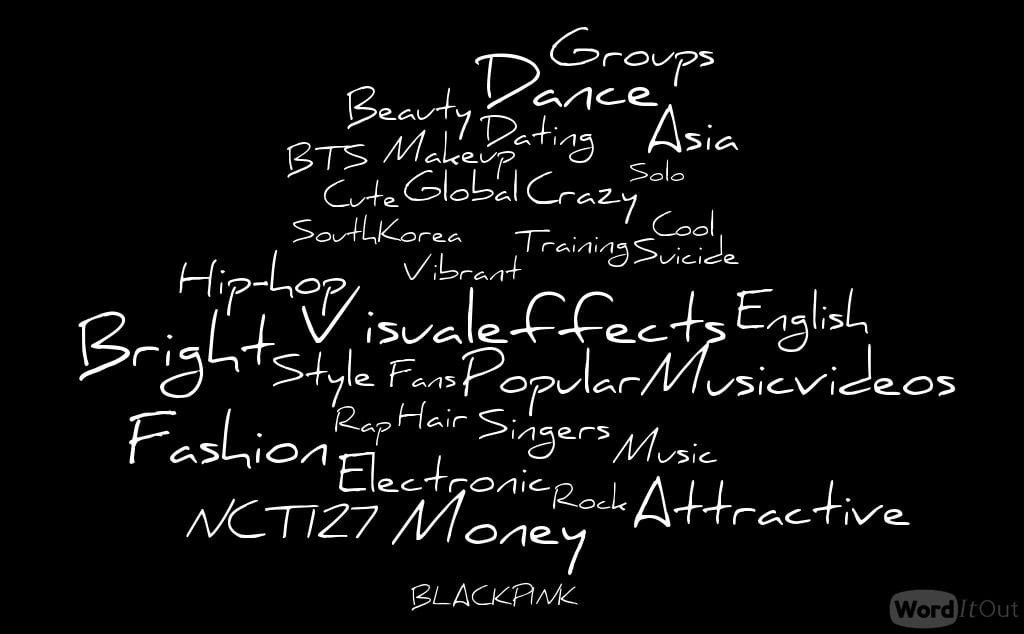
Wordcloud: An image displaying the ideology of Kpop.
Mission statement: The magazine K STORM aims to express and convey the unique genre of Kpop and open audiences’ eyes to a world of the unknown in a positive manner. It strives to present new and exciting themes within Kpop and constantly produce high-quality media for a wide range of demographics.
When I come to make my own music magazine I will need to focus on the mise en scene, CLAMPS in the magazine cover and the AIDA, along with this the colour pallet and target audience will need to be considered to make this piece of media successful. The type of layout I decide on will be vital in this process as well as the font types as they will have to relate to the genre of magazine cover I create, the mise en scene includes aspects such as costume, lighting, and makeup. What I decide to do considering my models for the magazine cover will vary depending on the genre as there could be strong makeup or lighting or it could be minimalistic, the mise en scene for every piece of media is very important as it displays the theme to a certain demographic.
Camera Angles
The camera angles should also be taken into serious consideration as different camera angles can display juxtaposing emotions and reinforce certain attitudes the cover star has or what the magazine cover shows the audience. I need to be able to think in the mind of a professional producer and decide which angles will be the most effective for the genre of the magazine I am designing, whilst close up angles will give a sense of intimidation and midshot angle will be less intense. As a producer, I will have to decide on an effective camera angles so that my magazine cover can be as successful as it can be in the industry.
Mise En Scene
The mise en scene in my magazine cover will also be vital as I will need to have every aspect of this faultless to really accentuate my genre of music in the cover, through the uses of such aspects like costume, acting, and setting I will be able to convey the moods in the magazine and pass that onto the audience. The position of the cover star will be vital to this cover as well as the posture and angle they take on will add mood to the cover and present certain themes and ideas, their costume will tell a story about this cover star on my magazine front and show what genre they come from.
The lighting whether it be dark or light will express to the certain demographic how they should react to the cover, along with this the makeup and hair on the cover star will further portray a narrative in the cover, the hairs colour and style will show people what genre they come from and the makeup will reinforce how dramatic and loud the certain genre of music is, the makeup whether it be soft or bold to each show contrasting moods will affect the reaction from the audience. In addition, the props will be important to show the themes within the cover as each of them that is used will need to have a purpose on set, they will need to add to the narrative. Lastly, the setting will be major as it will show the audience where the scene is set giving the cover a full narrative and story, I will decide on whether I would prefer a background of scenery or a background of colours both solid colours or multiple colours.
Layout And Typography
The layout of the magazine is once again very important to catch the audiences attention as too much information on the front cover can overwhelm a person but too little can lead to them being uninterested, I will need to have the perfect balance of both negative and positive space on the magazine cover. Along with this information, I also know that I would like my cover to be conventional which means both different yet the same, I want my cover to be familiar to the audience and grab their attention as something new and exciting therefor inviting them in to purchase the magazine. Each caption, plug, and sections of information will have to be in their right position on my cover and the right sizes of importance to help grab and hold audience attention.
The typography of my magazine cover will have to be legible along with being bold and sharp to gain audience attraction, for the best results I will use minimal fonts but edit those fonts to make them appear more inviting and exciting to my demographic and psychographic to then get the best results from my magazine cover.
AIDA And B&K
The AIDA that is vital to be included in a magazine cover will need to be focused on as that is what makes people purchase a piece of media. I will first need to gain my audience’s attention through the magazine layout, they will be interested in the plugs and pugs of information I will have located on my cover. Hopefully, this audience will gain a desire to find out more about what is it the magazine and purchase a copy therefor making this successful media, however, they will need to know how to buy a copy of the magazine so I will need to put prices on the covers along with bar codes. B and K includes ideas, news, gossip, and fashion these points will help me to be more accurate with the genre of the magazine I am designing as it will give me more information on what is included in that certain genre of music.
Focusing forward
Focusing forward to designing this magazine cover I will take into account all I have learned in the past weeks to create a successful piece of media for a selected demographic, through the connected use of camera angles, mise en scene, and cover layout I will create a mood for the magazine cover and let it tell a story and have a narrative within it to make it exciting the audience and make them want to buy it. The information that I have learned in my media lessons will really help me design a magazine cover to the best quality I am capable of and interest audiences and the selected psychographic.
My music genre for my tour poster will be folk, the image above displays a range of different tour poster covers and CD covers that focus on the genre of folk. They are all generic poster covers so they share many qualities that make them into folk genre images, as you can see none of them use extremely bright colours, they are all soft and calm colours to reflect how folk music connects with nature. Furthermore, these colours are very earthy colours as they are browns, yellows and blues which all correlate to nature.
I will use these examples to inspire and help me create an effective tour poster in the genre of folk, all the aspects are vital for an effective piece of media so I need to include the most appealing features to reach out to the desired demographic. I want my tour poster to be ‘the same but different’ so conventional to grab audience attention and is unique therefore looks like no other tour poster for folk, I will need to focus on AIDA and knowing your client so that the colours I use as well as fonts stand out to the target audience.
Folk Tour Poster
Please click on the image to see a clearer PDF image.
This is the final product of my folk tour poster which I am overall delighted with as it is inviting and conventional, the layout, fonts and colours relate to the genre of folk. The chosen colours of blue and yellow will remind the audience of nature as they represent the sky and the sun giving a bright aura to the poster, they show how folk music relates to the beauty of nature. The position of the model accentuates the interest of the audience as she is looking directly at the camera inviting the audience in, the flow of the shawl gives the sense of wind in the poster interesting people even more.
I am very happy with the outcome of this poster as it is the first piece of media I have created I think it does give a clear sense of folk through the colour scheme and fonts, I have taken notice to “know your client” and have focused on how to please the psychographic of folk music.
Furthermore, I have completed all the aspects of AIDA which all help my poster to stand out. The poster grabs audience attention through the bright colours and a large image of the model, the chosen fonts also lead peoples’ eyes to the poster, it interests people as the colours once again stand out. These qualities then lead to desire in the demographic as they know where the singer is performing and what dates she is singing, the involvement of the site to buy tickets gives the action the audience need to complete to go to one of her concerts and listen to folk music by Aria West.
To improve my understanding of these editing apps I would play around with them more so I can identify what tool to use or what photoshop aspect to include, the more I use these apps the better I will get at editing my photos to create effective pieces of media.
This is my tour poster assessment, please click on the name to find the chart.
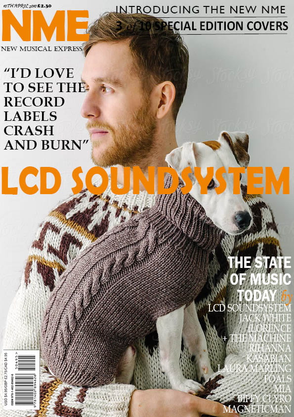
This is the original magazine cover I decided to replicate in Adobe Indesign CC 2018.
Please click on the image to see a clearer image.
Reflection
I am pleased with how my cover turned out in Adobe InDesign and hope to be this successful in creating my own media cover alone. We did this task so that we could practice using an editing tool, in this case, it was Adobe InDesign CC 2018 as well as get used to looking and analyzing magazine covers so that we can create media that is as effective as professional covers and other media.
Within the covers, we see a range of different aspects that build together to create a successful type of media for a certain psychographic, by mimicking this cover I have further realized how important it is to take the mise en scene into account. The typeface it vital to display a mood to the audience, and the cover stars position on the cover affects how people read the front of the magazine and what type of moods it displays to them.
Successes
I have learned a range of different techniques to use in Adobe InDesign when I am creating my own cover and will use as many of them as I can to help make my cover more effective, I have enjoyed designing this cover to fit the original as best I could and have gained a wide range of skills to use in the future.
Some parts of my cover are much better than others and look visually more appealing, other areas of the cover do not look as similar to the original as I would like. I definitely feel like adding in some of the aspects from the original cover was more challenging than other parts, sometimes because it did not look similar or because the cover star blended into some of the typeface.
Three aspects I thought were the most successful include the layout as mine matches the original and it looks effective, I have matched the correct writing to the original so it appears professional and alike to the original cover. The fonts used in the cover radiate energy and power from the cover and I matched this by finding typefaces very similar to the normal cover.
Another strength would be being able to understand how the software works relatively quickly and being able to know what I wanted in the cover, this helped as I managed to execute the typefaces and colours accurately to the original.
The last aspect which was completed well was the typefaces as I managed to get each written part in the correct font or a font very close to the original, I found doing this part was quite stressful as it took me a while to find the correct font to the original. Overall I found that imitating another magazine cover was both difficult at the start but rewarding to see the completed product as it looks professional.
Struggles
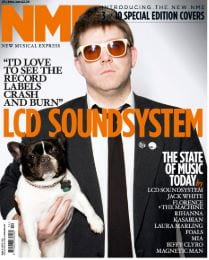
Along with aspects that were successful there were also parts that were much harder to put into my cover, the first thing wad my cover star holding the dog. Due to the layout of the original cover, the front cover line travels over the dog in my cover replication which is not what should happen as every aspect of the cover star should be seen.
The photo that I chose to do my copy with does not fit with the theme of the cover so it makes it come across as very juxtaposing, the man and dog look very chill and calm but the writing over it conveys energy and slight aggression.
Another aspect is that I could not put the writing of some of the cover such as the magazine name behind the mans head so it does not look accurate to the original, it was an issue when some of the writing blends into the cover star such as the writing in the top right corner.
The last struggle was adding in the lines under the writing in the top right corner, it was difficult as the lines do not look straight therefor make the words look wonky on the cover which does not look professional. The thinness of these lines make my cover slightly lose its boldness and effectiveness, it does not appear to be as powerful and grabbing to a certain psychographic as I would like it too.
However, as my first mimic of a professional cover, I am pleased with how it turned out as a whole product of media and think I did this task effectively and successfully and will use the skills I have learned when I come to create my own media poster.
Three videos that I have watched to help with what I struggled with in Adobe InDesign are shown below.
I have analyzed two music magazine covers to further highlight that different audiences will be drawn to different types of covers.
A professionally made cover of a magazine needs to be effective towards the set demographic and be punctual so that it can be as successful as possible in the media. To reach out to the correct group of the audience the colours used in the cover need to look appealing to that audience, for young teenagers bright exciting colours such as red and yellow might be used to catch the eyes of that audience, whereas for an older mature audience calm colours like cream and black may be used to emit a calmer more collected feeling on the cover.
The typeface of the cover will always be bold and big to further gain audience attention, normally the masthead will be the boldest line as the audience need to know where this magazine has come from and who the producers of it are. The plug will promote the magazine emphasizing the joy the audience can get from purchasing it, the pug will also do this by telling the audience what is in the magazine and what information they will be able to get.
The mise en scene for the cover star is very important as they speak to the audience the magazine is aimed at, it has to be specific to the demographic and the psychographic of that genre. The target audience are those groups who are most likely to be interested in a specific genre and watch certain shows, the magazine then has to focus on pleasing that group of people to help the product to be as successful as possible.
The design and colours in that cover will convey the interests of that specific group, it will tell the audience whether or not they fit into that category, each different magazine cover reaches out to different members of the public expressing feeling that only certain psychographics will be interested in.
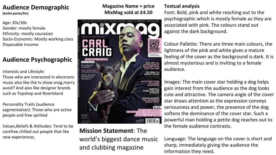
This magazine by Mixmag is focusing on electronic dance music which is a big interest for those born between 1982 and 1999, to reach out to the specific psychographic the magazine cover needs to have the correct layout and colour scheme to attract the eyes of that certain group of people. All of the aspects in this cover reach out to a female audience as the colour palette reflect femininity, the cover star being a dark man with a little dog really appeal to females as the star is conveyed to be seductive and powerful.
The element of the dog further draws females in as it gives an aspect of cuteness. The typeface is a bold font which helps gain attention along with the colour, the captions involve information that would interest females further such as deals to purchase products and special deals. Although this cover is very stereotypical of gender it is made very professionally as the producers know what reaction they want from the audience and what they want to convey with the cover, through the use of camera angles and mise en scene this magazine cover calls out to the psychographic of mostly females and draws their attention with the colour and layout of the cover.
It is vital to research the target audience so that the producers know how to design the cover of a magazine specifically aimed at a certain demographic and psychographic, this magazine cover reaches out to young to middle-aged females due to the typeface and cover star that holds a dog. By researching the specific audience the producers now know what type of client they are creating a magazine for so can focus on what that audience prefers and enjoys, they can relate the inserts and cover lines to what the audience is interested in.
KYC refers to the producers being able to know your client which is very important as the producers need to know who their target audience is to then help the magazine be as successful and as popular as it can be. They have to design the cover of the magazine to fit into the preferences of that specific audience so that the client is satisfied and happy with the product they have purchased.
This is our interpretation of a magazine cover and how each ingredient in a magazine cover helps the cover to be powerful and have meaning, aspects such as colour add to the visual attraction of the cover. The two-shot of cover stars being two men help to gain audience attention as the colour of their eyes stand out and naturally draw attention to the cover, furthermore it is a mid-shot makes the cover more intense as they are looking right at the camera. The dark background contrasts nicely with the white typeface masthead further gaining audience attention, the red typeface stands out against the black background drawing eyes towards the cover.
The pug in the magazine tells the audience of the other articles in the magazine, it is in bold as it draws more attention making the audience want to read it. The way it is set out helps catch eyes, the plugs further help this as it is the bold typeface in the centre of the cover. The many inserts included in the cover tell the audience what they are buying and what other articles are in the magazine. There is a freebie located in the bottom left-hand corner further expressing that the money the audience pay for this magazine is worth it as they receive a CD of the music within the magazine.
Overall this is a powerful magazine cover as the main cover line stands out grabbing the audience attention and making them want to know what the magazine is giving them, the freebie CD further emphasizes the audience’s interest. The camera angles and shot along with mise en scene convey as a story of the two-shot and look inviting, the layout of this magazine is very well produced.
Within other music magazines, the same ingredients can be seen that assist the cover to look intriguing and attention-grabbing to the audience and certain demographic. The cover lines are smaller and are almost always located on the left-hand side of the cover as they are clearer to see as that is the way the magazines are presented, the mastheads are always presented in a typeface that stands out and looks bold and bright. Furthermore, the cover stars trend to look into the camera to give the cover an intense feeling as almost to single out members of the audience, the inserts in the cover give the audience a taste of what other articles are in the magazine.
The pug is normally a small box or circle that contains more information about what the magazine includes, the plug in the cover promotes the magazine and makes it look more appealing to the audience helping to sell the product. The main cover line is also in a bold typeface and stands out against the background, lastly the barcode, price, and date are always in the bottom right-hand corner giving the audience the information about purchasing the magazine, it tells the audience how recent the information within the magazine is and how much they are paying for the magazine. All these aspects in a magazine cover really help to sell the product and help it be successful in the media and with the audience.
All magazine covers include certain aspects, this includes:
Pug, plug, masthead, captions, main cover star, issue/date, cover lines, inserts, price, bar code and the main cover line. All these details help to sell the magazine to the audience and help it look attractive.