Category: Component 1
CCR3-So… How did your production skills develop throughout this project?
CCR2- So…How does your product engage with audiences and how would it be distributed as a real media text?
CCR1- So… How does your product use or challenge conventions and how does it represent social groups or issues?
Adverts
Advert #1
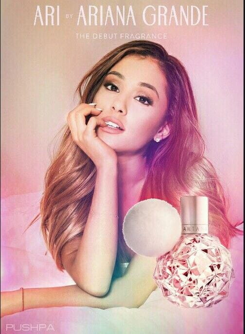
This is the first advert which I have chosen to put in my magazine is this Ariana Grande perfume one. I think this is fitting for my pop magazine as she is a pop artists, It is an advertisement of the different things which pop artists instead of just singing. It is also very conventional for my target audience as it is aimed towards teenagers and this will be products that interest them.
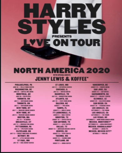
Poster number 2 is a Harry Styles tour poster. This fits in well for my magazine as it promotes an artist which I have put on my contents page as a topic. Harry Styles also creates pop music, which is the genre of magazine, therefore it ties in perfectly with its conventions. Referring back to my dating profile I got ideas for what someone would listen to and have interests in, this is generally pop. Also mentioning the title of the tour is ‘love’ so may enhance a meaning.
Collectively both of these magazines match my demographic perfectly as they both use bright colours with eye catching features, something the genre of pop uses a lot.
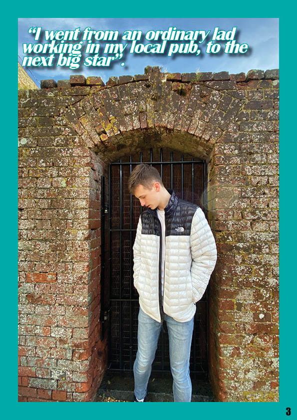
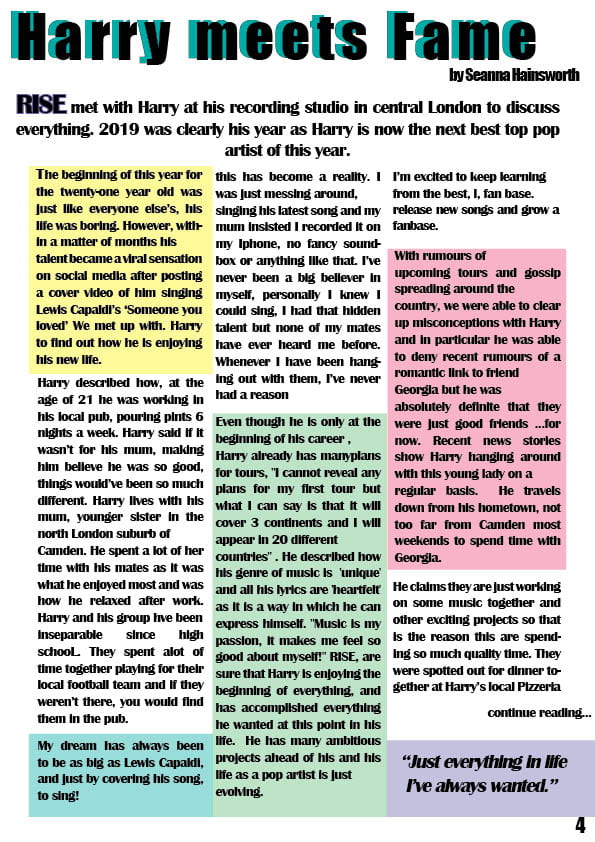
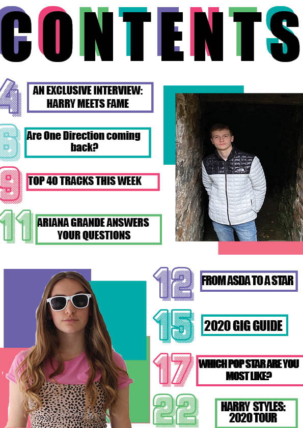
A New Improved Complete Magazine Draft
please click on image to view a clearer view
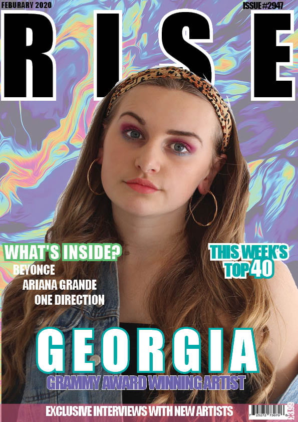
Feedback: Front Cover
- spacing between the text underneath ‘what’s inside’ to be equal
- conventional big bold text
- appropriate cover lines
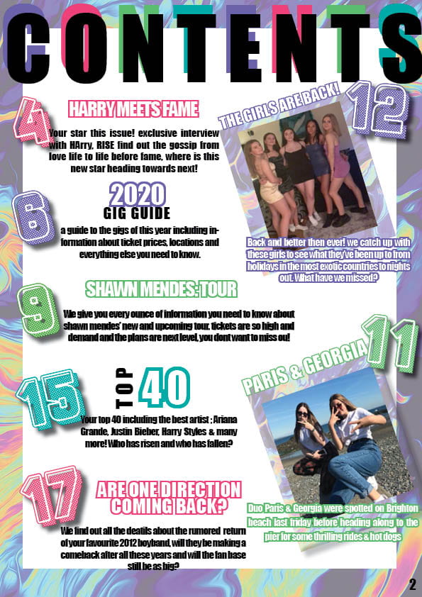
Feedback: Contents Page
- layout is conventional
- text is all the same size and font
- nice bright colours and patterning of background suits the genre
Feedback: Double Page Spread
- appropriate colour to make it look more interesting
- added detail of boxes around the words make it more creative and unique
- colourful border around main image makes it stand out
Complete Magazine Draft
Feedback
- marble background is effective
- nice masthead
- fonts on contents page
- good image on DPS
- basics are there
Targets
- make sure spacing is equal either side of masthead
- put barcode on right hand side
- move writing down, in the way of the face
- create staggered text
- unstretch the model
- make everything centered
- change background for contents page as it is overused
- page numbers
- align cover lines
- big headline for each story
- DPS room for quotes
- add standfirst in bigger and bolder fonts
- get rid of hyphens
- stand out quotes
- add paragraphs
- by lines
A New Improved Contents Page
So…How’s it going?
Throughout the course of making my magazine cover I have developed many transferable skills which include communication, time management and organisation. All these skills I will be able to use in my later life through a variety of roles and jobs.
Communication– in order to get feedback I have communicated with my classmates who I may not have usually spoken to but it has had an impact on my work as I have received more of an opinion. I have also communicated with my teacher through her comments on my work.
Time management–In order to meet deadlines it is important you know how to manage your time well. I have learnt how to hand in my work on time ready for assessment and marking. With multiple blog posts to complete per week it is important I complete them without falling behind. Sometimes I felt as if I was continuously changing the design & layout of my pages. Spending a lot of time doing this resulted in me falling behind on other tasks which were going on. In order to make my production work amazing I made sure that the tasks which I was falling behind on, I completed in my independent time.
Organisation- it is very important to know what you are doing. Being organised is very beneficial when it comes to photo shoots and production work. Before you do any of these tasks it is vital that you know every piece of information regarding what you are doing. You need to organise every detail about hair, makeup, costumes, props, the location of the shoot, what time you are doing it at and your model.

