February
13

January
31
Question 2: How does your product engage with audiences and how would it be distributed as a real media text?
January
24
Question 3: How did your production skills develop throughout this project?
Black and White Classic Professional Job Cover Letter by Alex Queripel (SFC)I have made a letter to a future A level student suggesting of what to expect:
MP3 recording of my Letter:
January
20
Question 4: How did you integrate technologies (software, hardware and online) in this project?
January
19
Draft 4 of entire magazine
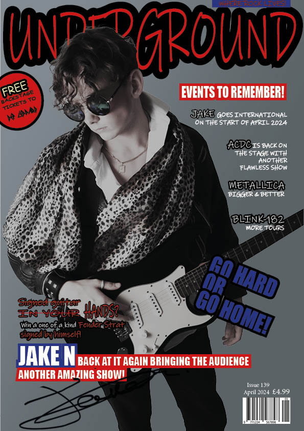
It has been a long journey, from learning all of the conventions in a magazine as well as doing photoshoots with a DSLR camera. We did practical dressing up in costumes with a specific genre to follow that has been picked in a hat randomly. Then doing a lot of research into my specific target audience to see what they would look for and like in a magazine which is what I would add in mine. Also learning a lot about the media production process such as script writing, storyboard creation, voice recording as well as editing which made me think that I have fulfilled with the brief making a double page spread as well a front cover followed by a contents page for my magazine. All of my images being original and having a maximum of 4 images produced by me. In the making of my magazine, I have faced some problems which made me resolve them in my next draft. These include not making my font stand taller which meant that it did not stand out as much as it could as well as to justifying or wrapping my text around my model which I have amended and looks a lot better.
So I had to do another one, the advice I would give myself is to make sure my layout of all of my captions as well as text all flow nicely and neatly. Also maybe experimenting with different fonts throughout to make it look more interesting to look at.
January
12
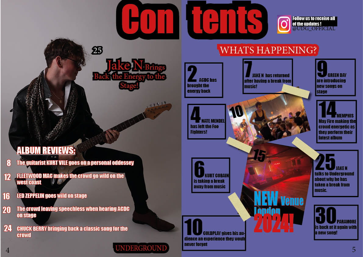
Typeface Layouts

When designing these different layouts, I needed to focus on the different layouts that would stand out to my target audience. For the first one, “GO HARD OR GO HOME” I chose Impact font for it as I think it has the genre of rock engraved in it. It is not as nice looking when looking at it as it is bold and has a aggressive looking to it which suggests the genre of rock being aggressive and heavy.
The second typeface being crossed out to give a more of a “rebellious” look to it. I was originally going to go for a guitar shaped font however I think that it looks good with it being crossed out. So by using the serif looking font, as well as being near the bottom left of the page it would grab enough attention.
For the third font, I wanted to try to get it looking as if it was handwritten by himself. Also could show his emotions when looking at it as if he was sad writing it.
The final typeface, I wanted it to be a lot more exited when looking at it, so I have added bright colours so it would stand out to my audience and made “NEW” and “2024” big and in caps to drag immediate attention to the audience.
January
9
Draft 3 entire magazine


After I have uploaded my draft 3’s for my magazine, my teacher gave me feedback:
After viewing this, I have made some observations such as:
- More use of “events to remember” font around
- “GO HARD OR GO HOME” could be experimented with different colours and different fonts
- “Jake N” having the same font throughout as if it was a logo
- Less stories and possibly include them on my double page spread
- Align the boxes of text on the second page of my contents page to make them more neat to see
- “Underground” being the same font for all of the places that say Underground as if it was a logo
- For my double page spread, having one big box saying “fans review of his new album” instead of 3 individual boxes
- Having a page number on the image on the second page of the double page spread
- Adjust the social media plug more central on my contents page
- Page number on the “new venue” image on my contents page
- Add some dashes around the corners or shapes to give it some strike
December
18
2nd Draft DPS
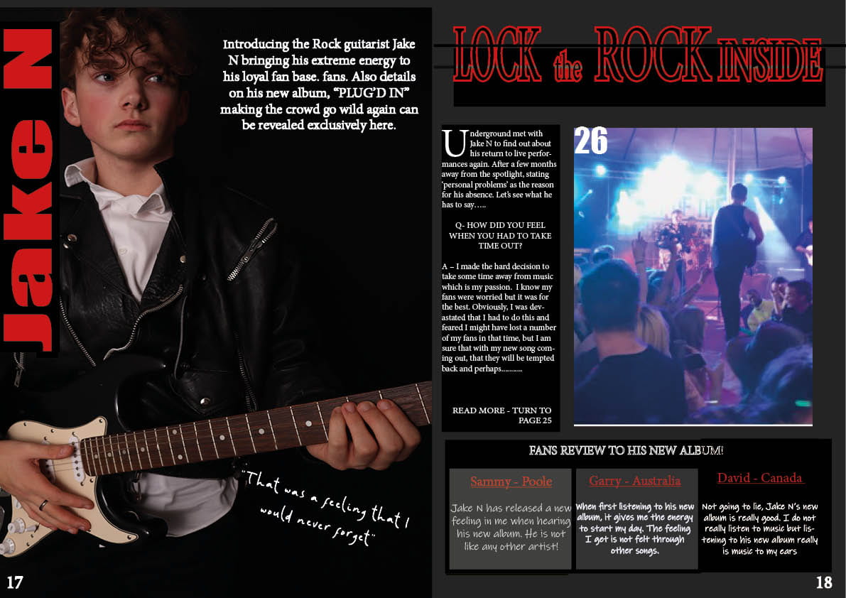
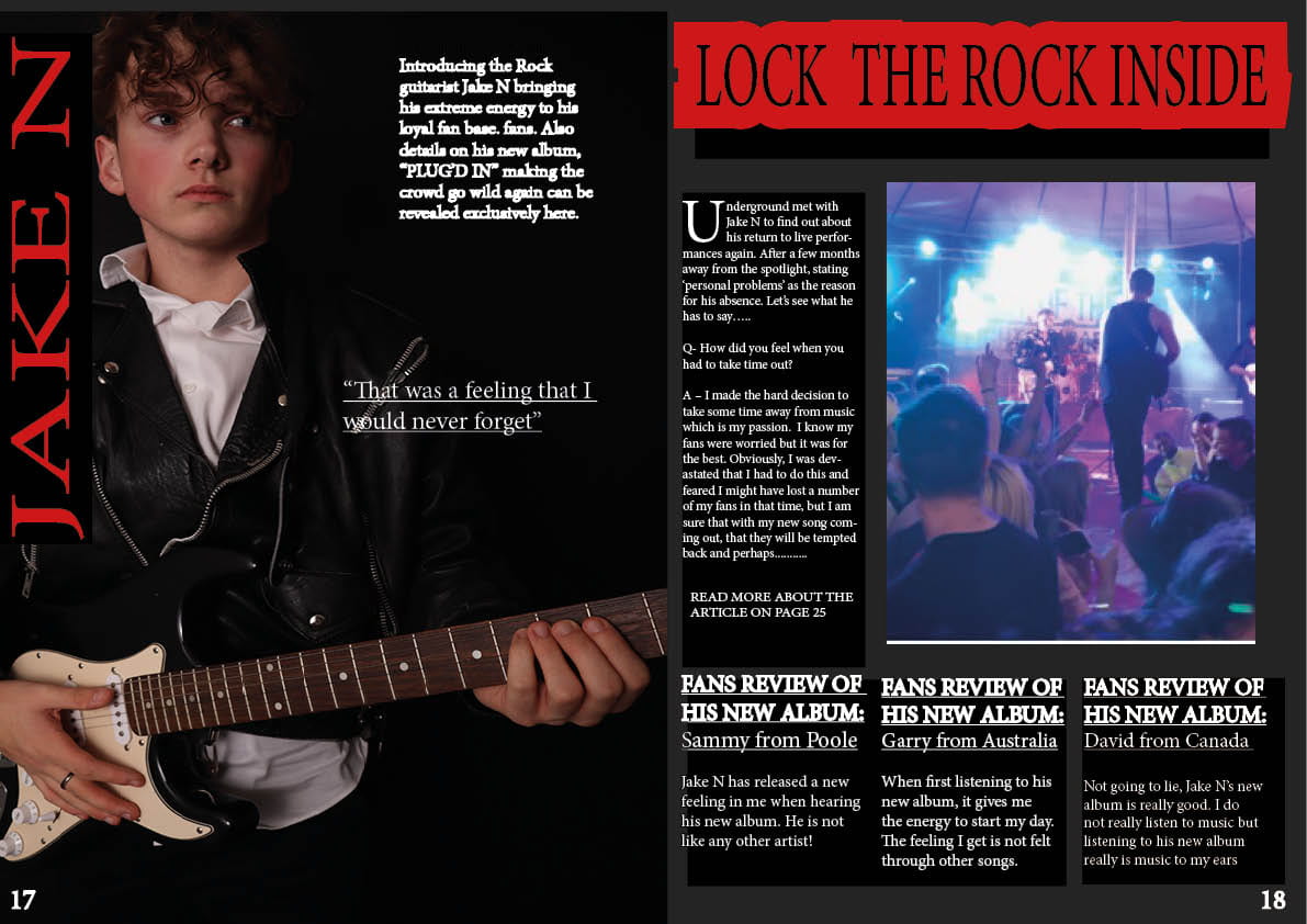
What’s new:
- Changed the Stroke on “Lock The Rock Inside”
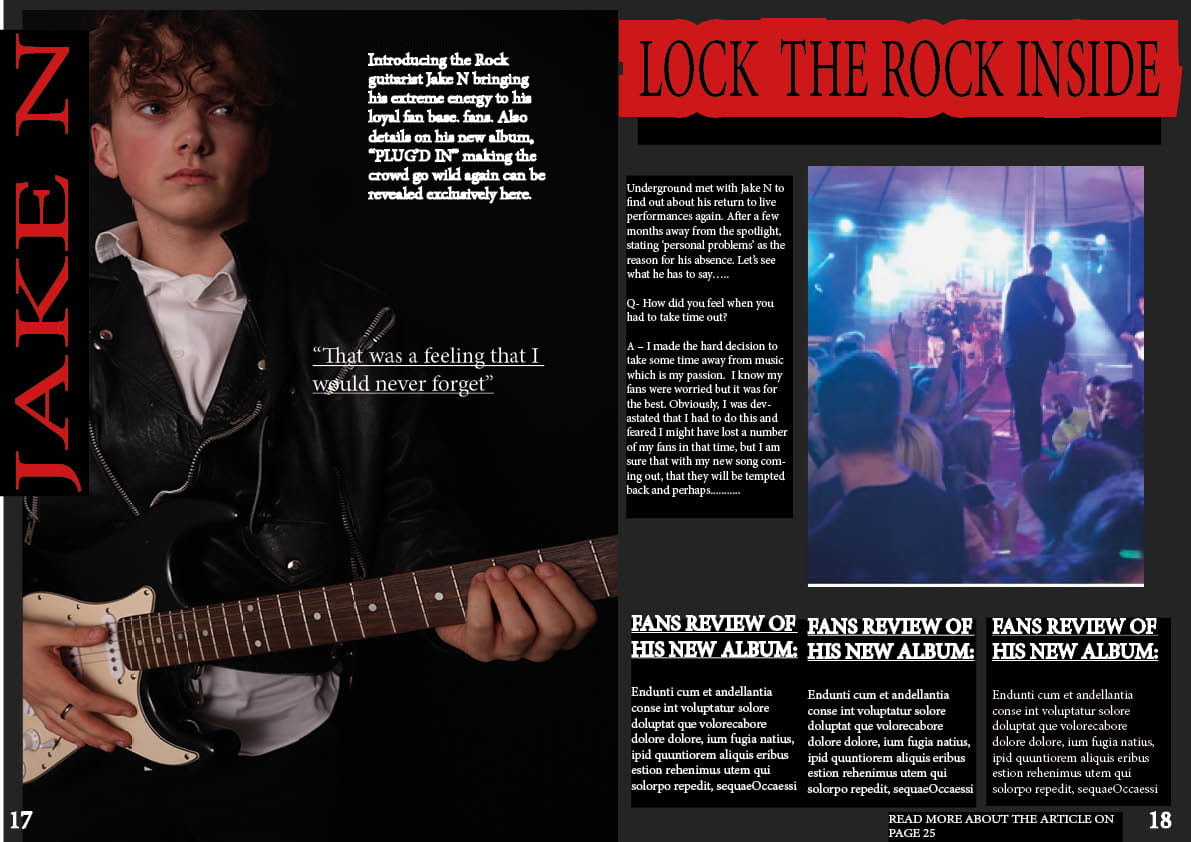
- Dragged the black box behind the text more
- Added a new image on the second page
- Added a small statement on the bottom right “read more about the article on page 25”
- Added my article on the second page
- Added page numbers
- Added a small quote of what he thought about the situation
What’s Next:
- Crop the photo on the second page
- Add the big letter at the start of the article on the second page
- Adjust the pictures so they are in frame
- Make sure all of it is in frame
December
18
2nd Draft Contents Page
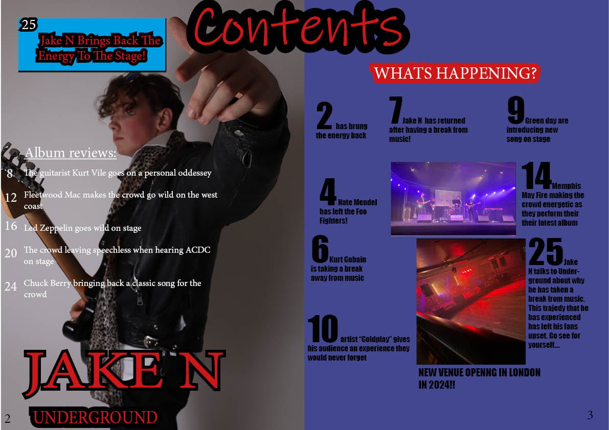
What’s New:
- Adjusted the “Jake N” to the bottom
- Moved “Underground” to the bottom as a logo of the magazine
- Added more stories to the second page
- Added a blue box at the top left of the first page to attract attention so picked a blue colour introducing about Jake N returning
- Changed the page numbers to “2 and 3” as it would be near the start of the magazine
- Added some strike to the “Jake N” and rotated it from being sideways
What’s Next:
- Possibly change the font of the album reviews as well as colour
- Think about adding a couple more stories
- Adding borders around the stories on the second page to neaten it up
- Possibly find space to add more images
- Make “Jake N” have a border and make it stand out more (so adding stroke)
December
15
1st Draft Of The Double Page Spread

When designing my first draft of my double page spread, I have added the main conventions such as the headline, standfirst, drop capital, columns. However for my 2nd draft, I am going to try to include other conventions such as line spacing, line numbers and other conventions such as by-line and others to try to engage my target audience a lot more.
What I like:
- My star image is looking at the text
- The image on the second page fits well and looks neat
- Well laid out
What I need to do:
- Include page numbers
- Add line spacings
- Drag the black box behind the text on the second page down more to make it more neat
- Possibly justify my text left or right
- Add strike and colour to “Lock The Rock Inside”