October 12

My Tour Poster

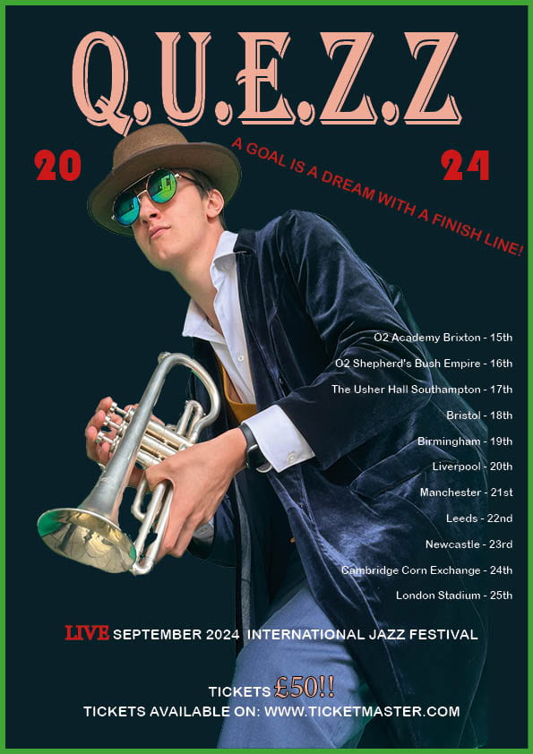
I have been given a task to find images of Jazz tour posters and put them on a google slide for inspiration for when it comes to my tour poster. I have realized that these posters all have something in common and that is the colors they used, all of them being similar to convey the image of jazz to the audience. These posters really do grab attention so if someone were to walk past this poster, the colors instantly catch their eye which would make them engage with the content that is on the poster and want to read more about it and potentially go further and buy some tickets to attend. The posters include important factors such as the dates they are in, the cost and also what time it is going to happen. They all also contain colorful fonts such as: blue, orange, white and yellow. And typefaces which grabs the audiences eye when first looking at it which would also be important for sales. Also giving a sense of desire to want to attend and want to be able to experience it for themselves, these could include things such as “you would not forget this experience” and small other quotes that would make them consider going to this concert.

Please click on the image to see the pdf


  • Does it fulfil the brief as stated in the blog?

In my opinion, I think that this does fulfil the brief as stated in the blog as it includes the AIDA as mentioned. It grabs the audiences attention when looking at it and I have included all of the appropriate fonts and colours which are mainly used in the genre of jazz.

  • Has the design used a consistent colour scheme?

In my poster, I have tried to include appropriate colours of the genre of jazz and in my opinion thinks that it flows well with the design. Also not using loads of colours and try to keep it more minimal in the colours as that is what loads of posters of jazz have.

  • Is there a relationship between the colours in the image and the colour of the graphic design?

The costume what I am wearing does connect to what I have added as the background cover and also used the same/similar colour as my glasses in the border of the whole poster so it looks more attractive when looking at it from a audiences perspective.

  • Do the colours seem typical of the genre?

In my opinion, I think that the colours I have used really connote to the genre of jazz. Making it minimalistic and also including a mix of bright and dark colours to give a better appearance.

  • Is all the text legible, is the typeface well chosen and does it suite the genre and how many typefaces?

I think that the text I have used is legible and think that this is what my client would be looking for, if not something similar to this. I have used different fonts such as the typeface being jazz looking to really give it a sense of olden times as jazz was seen as a really well known genre in America a long time ago. My opinion giving it a western vibe to it as if it was around when cowboys were around. The other font which gives the main details about where my client would e traveling and when it is, trying to leave it more simple to make it easier to read as older people might have been into this genre and are the type of people that would of watched it so doing this making it a preferred reading technique for the target audience. In my tour poster, I have included one big typeface which announces the name of my client right  in the top centre of the poster.


  • Does the text wrap around the image well and does the eyeline of the model focus attention?

The text around the image is neatly presented and I think that it is easy to read for my specific target audience and gives off all of the important details. However, the one thing that I was going to do was to try to make the model look at the dates of when my client was performing at as it would draw the audiences attention to the dates which would make them engaged into it and would also encourage them in a way to want to go to the concert. Another thing is to include a time to give them further information on when exactly my client would be on. This would of been a good idea to include in my poster but for my focus forward, this is something that I would definitely keep in mind.

  • Does the costume reflect a particular genre and is the body language of the model appropriate?

Back when the genre of jazz was really popular to listen to by people (it is today as well but not as much as back then). The style of clothing worn was in this style and think that this does connote to the genre of jazz really well, my model of my client looking forward with his instrument in his hand as if he is on his way to his next show and showing off the trumpet as it was a really important instrument in the genre of jazz. So in my opinion, I think that the style of clothing and his body language were exceptional in this poster.

  • Do the words on the page prompt a sense of desire and is there a clear call and route to action (AIDA)?

I think that the words on the page do prompt a sense of desire as when looking at this poster, not only does it show who would actually be seen on the stage which would make the audience know and have a understanding of who they are seeing but including all of the dates and instantly tells you where to get the tickets from at the bottom of the poster would make them more engaged and potentially more likely to go to the concert instead of reading it and forgetting about it. With the big typeface, the audience should be instantly attracted to what is being addressed on the poster.

  • What messages and ideas are being communicated in the text and do those messages and ideas seem appropriate to the genre and purpose to the text?

The messages and ideas that are being communicated in the text really does try to encourage the audience to check it out and makes them want to attend. With all of the details included of where to purchase the tickets from and also when my client is actually going to perform and where really does try to send a message out saying, if you live around this specific area to come to check it out, even for the people that may be new to this type of genre. The way that I have laid it out makes it easy to read and easy to find out where to get the tickets from, which I think seems appropriate in my opinion for the audience to view at first sight that would make them potentially want to attend this concert.

So overall, if there was a thing that I would change or do differently to my poster, I think that I would make my client be facing towards the dates and places he would be performing at as it would drag attention to it and also I would include the times that he would be performing as this was one point that I did miss in my poster. Another thing that I would probably do differently as well is make sure to try to experiment more with the colours to possibly drag more attention to the audience.
 

October 11

My Magazine Front Page Swede

Please click on the image to see the pdf

The real design:


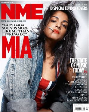
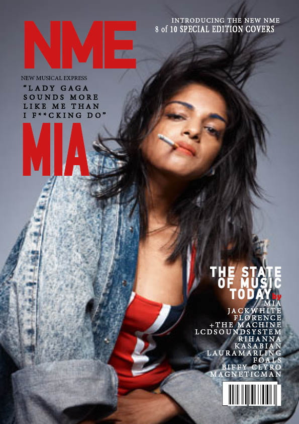
I have used technical forms and conventions in order to construct the poster by adding all of the details that are seen when first looking at the poster. When doing this, I have made sure that I have matched the fonts and typefaces by experimenting with different fonts until it looked identically similar. The colours were the most important in my opinion as this is what the audience sees when they first look at the poster. Doing this, I had to also make sure that the layout was spot on as this could be what the audience is most likely going to be used to in this type of magazine cover. So I have used desk top publishing as this was one of the main purposes of this task to practice using this software which I have done in order achieve what I needed which was to try to deconstruct this magazine poster.  Being able to use the software InDesign in order to have an idea of what settings could be used in order to construct a magazine poster. Also having the ability to experiment with different fonts and settings to get the result I am trying to get.

When I started to construct this poster, I have made sure that the main image needed to be enlarged, so I started sizing an image which was the one of Mia and placed it correctly covering the whole page. I also needed to go online to find a barcode to include on my version so placing an image from the web that are identical to the one on the real one. In the making, I needed to make it as close to the real one as possible so in the fonts, I have used extra tools in order to try to recreate it. This involves using the stroke tool which is used to “puff” out the font to make it a lot bolder (this is seen in the massive typeface in this poster).

Strengths:

  • Looks well presented and identical to the real one
  • The fonts look good on most bits
  • Including the right information and in the right space
  • Knowing how to use stroke, fill and also the drop shadow tool to make the text stand out.

Weakness: 

  • Barcode needs improving (adjusting)
  • Positioning of the typeface could be better
  • Missed out a section from the top left (really small writing)

Videos which could be used for improvement:

When it comes to my music magazine, this would help a lot as it has made me understand how important it is to include the main details in the cover as this could do a lot in what the audience sees for the first time when looking at the front cover. This possibly leading to more sales which could be involved in doing this.

September 29

The Camera Talks

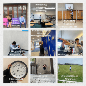
Me and my group took photos and we made sure to capture different narratives in each photo. We took a variety of photos at different distances around the school and each one has its own Media language of camera involved in them. We also focused on making the photos have the denotations which leads to the correct connotations in them as well so the audience would have an image and an idea at first glance at it. We also took a variety of different angles which could do a lot to what the audience would think about it, if it was a high angle it could give the audience a sense of having power over the person in the shot (or the camera would have power over the model) which would make them want to know what it is about even more. In wide angles, capturing a lot in the shot and having a focus point which the audience would see first (like the one my group took on the middle right) would engage the audience. The hash tags that I have included are the denotations that link to the photo. An example being the bottom left one of me in the goal, (#Footballgoalie) represents the connotation, the (#Farshot) represents the type of shot it is and the (#Outofleague) representing the denotation.


So overall by doing this, it has really helped me identify the different types of angles and what its signifier (De Saussure) is. And would benefit me in my music magazine as well by making me know what each camera angle and framing would create in the audience’s head (is it a sad photo or a more happy one) or (what type of genre it is for my music magazine). I also know about how the star image (Dyer) would help get the picture to the audience’s head of what it is about by making sure that I use the appropriate camera angle and also the type of shot it is so whether it is a long shot or a close shot could really help emit the connotations to the audience’s head on what it is about and give them a greater understanding of it.


September 26

My Image that uses Mise-en-Scene to communicate meaning

Made with Padlet
Jazz Genre:

The genre I have randomly selected was Jazz. Me and my group have chosen images that represent the meaning of Jazz, we have discovered that the trumpet has a big representation to the meaning of jazz as the trumpet has been seen in loads of jazz songs and the sound it produces has a bright and bold sound to it, also being the loudest solo instrument.

I think that this would definitely have a big impact on my music magazine as I think that fonts and images really have an impact on the audience on wanting to read more about it.  Richard (Dyer) suggests that a star image is constructed and represents certain ideologies, genres, ideologies and beliefs. The biggest star in Jazz is Louis Armstrong and has a sensitive and friendly looking picture of him on his album cover. The colour of the cover is important as it is most likely thing thing that will catch the audiences eye the most. The colour might also give the audience a sense of what sort of music they are playing as if it was dark and had large fonts to it, then it would most likely be a more of a heavy metal sort of genre and if had bright colours, then it could be something more of a happy tone to it.

Jazz has a lot of conventions involved in it which symbolises a much more of a happy vibe to it when looking at the covers. The ones that we have found and published them onto my Jazz genre board have the important characteristics to them which symbolises jazz such as:

  • Cool and warm colours
  • Bright
  • high energy
  • Being classy
  • Being black and white
  • Being set on a stage (so a performance live)


Here is the feedback from the class on post-it notes:


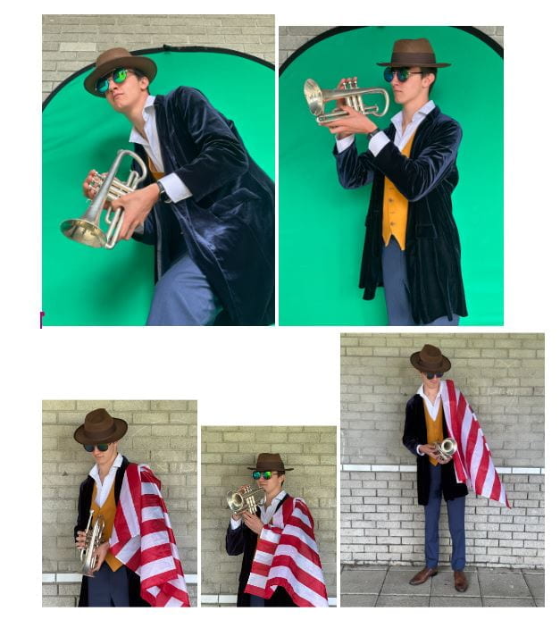
These are the notes that my class thought when they looked at me all dressed up in my theme. Some notes stating that I look sensitive which does really connote the the genre of jazz as it is seen as a genre which is more upbeat and has a relaxing vibe to it. My class has decoded me really well and chose the appropriate words to describe the model. These include:

  • Talented
  • Authentic
  • sensitive
  • relaxed

In most jazz albums, these words match the connotations for the meaning of jazz as all of them have these connections to them.


Photos of me replicating the Jazz genre:

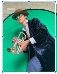
The image we chose as a group being our favourite is this one, the reason why we chose this photo is because it really does show what the genre of jazz represents. With its low angle shot, it makes it look like the model is taller which makes the audience think that the more of a higher class might of listened to this type of genre on a day to day basis. The trumpet as well involved which symbolises the instrument that has mainly been used in the genre of jazz and is well known for the type of music as well being loud and sounds really happy. The media language of MES helped represent the image the audience will look at when looking at the poster, the trumpet giving them the idea of jazz in their head and definitely the costume that I was wearing helped portray the image on Mise-en-Scene.

So by doing this shoot using Mise-en-Scene really helped me identify what is needed for the audiences benefit when looking at the poster and I also think that using Mise-en-Scene in my music magazine would really help to get sales as it would be most likely the first thing the audience would look at when looking at the magazine and would also potentially help them understand what it is all about. Me and my group also tried to use the correct signifiers (De Saussure) to help get the image across to the audience, my opinion being that I think we showed that successfully. And I definitely think that this would benefit me a lot when creating my music magazine.

September 19

Tour Poster Analysis

All types of Media have a denotations. I have decoded this tour poster and have found out that when looking at this poster, loads of feelings and thoughts could be felt through it. An example being what lighting is used which could connote a specific image and a idea in your head. Is it a relaxing genre of music, if so having brighter colours and more nice looking fonts. If not, being this case Muse it would be a lot darker to tell the audience what they are all about. So having a darker colour may represent the genre of music that they play, so in this case being a Muse poster I have deconstructed it and came up with some conclusions.

The logo looks like it has been spray painted on which does signify a rebellious image, this also linking with the lighting they used being dark so it both has connotations with the genre of music they play. This poster also has a narrative side to it as well as when I look at this poster, I have a sense of what type of music they play and what to expect when listening to their songs.

This media text really stands out to their target audience (which is most likely teenagers) so when they look at it they would know what the group are all about. This could also possibly link to their attitude/the way they perform on stage as well. So having a rebellious mood in the show would make teenagers want to see the show and experience it.

I think that this would link to my music magazine and also my tour poster which I would be creating a lot. Firstly being the fonts, colours and the images on the poster. I have to also think about the audience I am trying to target. So is it teenagers, younger people or adults? So making sure that it has the appropriate colours and images to it which would engage the audience. Also making sure that when the audience views my poster, they could indicate what I am trying to get out of it (mainly the type of genre in this case).

What I learnt is that posters can really emanate feelings and thoughts when looking at it. It could also say a lot about what they are all about as well so the audience could get a heads up of what they are all about to experience. This could really be shown through the types of colours used and also through the fonts as well.