Bayleigh Holberry (Media Blog)

A Level Media Studies Blog

Month: October 2021

Branding and Mission Statement

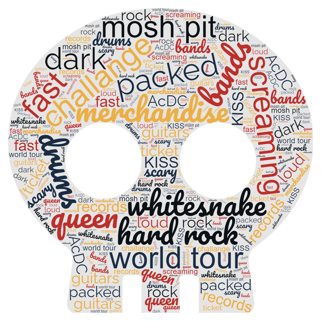
Out of these using choices I will be choosing Rock, rock is quite easy to do but very effective, its still the most popular form of music there is and is one of the older types of music, Now a name for my magazine doesn’t need to be complicated, it can be a single word or two. For my magazine it will be called “Stone Ocean” Stone Ocean will have a unique selling point because it will contain things that other rock magazine wont usually contain like behind the scenes of music videos.

My mission statement will be:

Stone Ocean is a leading brand of magazine that specializes in all forms of rock but mainly classic rock such as, Kiss, ACDC, LED Zeppelin and other classic bands, we cover all news related to rock like; New album releases and New Tours that they may be doing, and just like the ocean we are wide spread across the world, from the south pole to the north you can find us anywhere. Stone Ocean is here to keep you updated on everything.

Tour Poster

my tour poster download

My tour poster is based of the music genre of RAP, my poster is conventional because many would be able to understand just by looking at the image that its rap. The clothing is very similar to what some rap stars wear or have worn as well as the accessories and the middle finger that shows disrespect and a rebellious nature. I think this poster is unique to others because I use some photoshop skills to create these 3D neon lights that surround the model.

Overall the tour poster went well and he neon light effect was great but I wish the outline of the model was cleaner.

The skills used in this task can be used in the future when it comes to making my music magazine and possibly my music video. The tour poster was made with Photoshop and InDesign by using the photos of the model we took a while ago for the MES task.


My Magazine Front Page Swede

The top image is the original magazine cover and the bottom is my version of it.

Using Adobe InDesign we made a copy of a chosen magazine cover with only the original photo of the model, meaning that we had to find the right font, colors, barcode and text to make our image look almost identical. It was quite difficult to use a new program because I myself am only familiar with Adobe Photoshop. Overall I’m absolutely sure that the skills I have learnt in Adobe InDesign and from the added YouTube videos, can and will be used in the future when it come to making my tour poster and magazine.

My 3 Positives were:

  • text placement
  • color palette
  • inset images

My 3 negatives were:

  • font
  • image quality
  • font size

here are 2 YouTube links to help with what I struggled with, Image quality and identifying fonts.

A Front Cover Analysed – attracting ‘that’ audience

Here we have an image of famous model and singer Harry styles on the front cover of RollingStone magazine, on the sides of the image I have annotated the key features to analyse and research what makes this magazine popular to its targeted demographic and why its interesting to them. It would help to better understand the audience so I can apply these key features to my future work like my magazine and tour posters, for example I came to the conclusion that people who read RollingStone magazine love the news and the hot debates. Simply put if I research my audience I can better my understanding as to what the audience wants, enjoys and what sparks their interests.

Conventional Design Features Of A Magazine

All magazines have a cover, the cover has to be the most eye catching and interesting part of the whole magazine. The cover has to immediately grab the attention of any customers that walk past. there are several main parts to a magazine cover, these are ; Masthead, plug, inset, captions, cover lines, main star, main cover line, issue/date, price and barcode. However the connotations can make the magazine much more appealing to their targeted audience. The main cover line, cover line and main star help the audience deduce who the main star is and what they do.

here we have a magazine cover from Empire with the actor Tom Hiddleston, the cover also give info about Tom Hiddleston’s most famous roll as Loki, The God Of Mischief from the famous marvel movie series, the cover overall is very plain and doesn’t seem to have any inset’s unless you consider the photoshopped shadow one, the contrast between his royal blue suit and the gold background make him stand out, also the main cover line call him world exclusive draws more attention to him. In the future I shall use these techniques as well to further improve my work as well as make my work look more like a genuine magazine.


Powered by WordPress & Theme by Anders Norén

Skip to toolbar