Bayleigh Holberry (Media Blog)

A Level Media Studies Blog

Month: November 2021 (Page 1 of 2)

language analysis

Billboard Magazine – June 20, 2015 – “Dance Power Player”

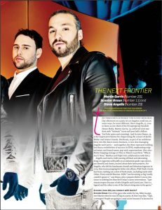
Artists – Steve Angello, Martin Garrix and Scooter Braun

The three artists above are mentioned when the article states that they showed up at a patio in los Angeles on memorial day in the afternoon, these 3 artists are some of the top EDM music artists in the world and that day on the patio will mark their partnership. The article is written as an interview because the last few sentences are written in Scooter Braun’s POV where he talks about partnering up with the other 2 and that one of them was a teenager. The rest of the article above is just the author writing an explanation on who these people are, what they do and what they’re famous for. As the author is writing this article they’re writing it in the 3rd person to make the seem more important because it is someone else talking about them and no the artists talking about themselves, the author also talks about how they act and what they wear. The way the author has constructed the article it makes it seem like there is no start or conclusion to the whole article. Other music artists are mentioned in the article like Ed Sheeran, Justin Bieber who are already massive in the media and music artists which shows the other three how important they actual are in the compared to other artists. In conclusion the author displays how important these artists are and how amazing they actually are within the gene of EDM, they are portrayed as super influential to the genre and its fans and are see as super stars. the audience will see this and be drawn into read more about them and how great they are and how they became so successful in the music industry.

In the future using this type of article will help by making the reader more curious by having vivid information and without a start or conclusion it makes the reader think that they have already read to the middle of the article and they will continue to read more as it becomes more interesting and this analysis will help me try to figure out the general language and conventions.

Draft Of Contents Page?

click to see PF

I had Andrew Guille review my content sheet for me and have had some excellent feedback from him, using his feedback on my work I will create some goals to make my future work much better.

for future work I will :

  • Use more images of my star image to add some variety
  • make headlines more interesting to draw in the readers more
  • use more dynamic images

What is a contents page?

These slides above include examples of contents pages and different layouts.

When it comes to making a magazine the two most important things are the cover and the contents, but to help the reader go through the contents page then you would need a way of directing and sorting everything to make it manageable, thus a contents page is needed. A contents page has a list of page numbers and what information is on those pages so the reader can easily go to a certain section they are interested at. I want my content page to have a good balance between images and text but to make make it too busy

Draft of Front Page and Self Assessment

The masthead is adequately placed with a Ubiquitous typeface.  It’s just about big enough to make an impression and jump out from the shelves as well as convey the classic rock genre although the background gives it a sort of color boost to help it to stand out with more color and patterns.

Staring into from camera, the cover model is satisfactorily framed using the rule of thirds well but the eye is drawn to the camera with malicious intent.  He could of done with a bit more of an angrier face to portray this aggression to  create a presence and own the front cover so this section is just about competent

Desktop publishing, InDesign, has been used well to layout the text and images so that they give more depth by over and under lapping the star image 


A bold red, black and white color palette communicates an brilliant energetic and dramatic mood that represents the rock genre, although perhaps some fiery yellow or orange could have lifted it even more to draw in that attention to the model

The font is a mixture of Ubiquitous and Century Gothic but it might be slightly too tame for its mainly older male audience target audience. The font in the plug is laid out quite well as to not cover up the whole magazine and make it cluttered

The costumes are relatively rock themed although eye and face make up might have added that edge to the relevant representation but I think more accessories like bracelets and rings could of made the costume that little bit better


In terms of the language used in the cover lines, the use of superlatives as in the “worlds 1# classic rock magazine” attracts the reader and draws a sense of importance to the magazine and its contents. The use of the word “AGAIN” creates with surprise that makes the magazine more intriguing as it displays shock that he’s done it more than once, but the lack of quotes on the front, to convey a sense of personal account, as though he will be confiding in the reader on a personal level does not help draw in the audience and falls short in creating a buzz about the contents. 

The magazine is recognizable as a magazine as it has all the conventional features like a masthead, price, issue, main cover star, main cover lines and cover lines along with pugs and plugs to entice the reader to read on.

Photoshop has been used to cut out the cover star to place on a dark and grainy background that’s just a few shades lighter than the model so that he becomes the focus but the inserts are not particularly well framed and have a bad image quality.

Contact Sheet

Here are the contact sheets I have made of my model Caleb Vinning who has the perfect star image for my magazine. The genre of the shoot was rock so I had him wear some skinny jeans, dark striped shirt and a short leather jacket, I also had him hold a guitar and hold the guitar like it was a weapon or as if he was about to smash it, it also has a really good balance of MES to covey this slight narrative the body language was used well as it gives him this form of Aerosmith look with how loose his pose is but it still holds the slight aggression that most rock stars have.  I used a school camera to take the photos but most of the images came out really blurry and had a lot of motions blur but there were a few really good ones. Overall the shoot went pretty well, I got enough photos to use and just about enough photos to choose from. Lastly the lighting was simple to do by having the flash and the main light off to the side at a slight angle to give some of the leather jacket a shine on some of the wrinkles.

As for the images I might use I didn’t have much a choose as most the images were blurry.

This image here is by far the best image as it has the highest quality and overall the pose is quite unique and fits the magazine cover perfectly, I love the way the pose frames the image almost perfectly to fit the cover size.

Masthead Design

The masthead is the second main piece to the front cover of a magazine, the masthead is the name of the brand and is what everyone looks at to find out what the brand of the magazine is thus the masthead must be memorable and appealing to the audience, a masthead with a harsh color palette wouldn’t be nice on the eyes. most mastheads have a genre that they’re trying to portray such as Vogue, Vogue magazine have a posh masthead that suits their audience’s expensive taste in clothing, where as RollingStone has a very smooth and classic font with a hot red color and thick black outline that’s  easy to remember and recognize and to every it is a convention that is seen amongst the community

Out of the few fonts I’ve chosen I have decided on “Ubiquitous” it gives a simple look that can remembered well and I’m going to have a grey to blue gradient because the overall colors are soft and can be given a warm tone.

Front Page Layouts

These are the front page layouts I have chosen, they all have the right amount of detail that makes them look appealing without be too clustered full of detail and words that blocks the main Cover model . I love the way that the title for the Vogue magazines has the models head overlaps the words and the words overlap the models less important parts like the arms. The clear images that use unique camera techniques like the wine glass in front of  the camera with the models face inside.

The color palette used in the magazines have quite warm tones that gives the image this better feeling on the eyes and overall make the images more pleasant to read. the graphics and fonts work well together, the font for the mast head is fancy and quite posh looking but the text below is this simple text that isn’t too detail and full of twists and little flicks that make the text too clustered. The cover lines don’t cover any of the model and always contain a small sentence from the latest news that gives a little bit of info but draws the reader in to know more

Using photo manipulation I can make my image more warm by using a tint effect on my final images from my cover model shoot and the layout as well is just easy to follow with the mast head.


Production Meeting Agenda Magazine

Above is the production meeting agenda for my first photo shoot for my classic rock magazine cover. Documentss like this are used to help manage photshoot by having lists and descriptions on what your model will wear in terms of accesories, clothing and hairstyles, as well as how the models will pose. Having this makes the shoot much easier to handle becasue without it then you’d have to remember what your doing and you’d also waste time trying to think of poses and what makeup is best.

In the future I will be using more production meeting agendas as they help signifigantly with getting photoshoots ready and will help as well when it comes to making the music video at the end of our course.

Star Image, Theirs and mine

My Star image should stand out the most as they are the main artist on the magazine and they must also convey the correct genre by what they are wearing

I have done reasearch on different media posts and they portray themselves and Ordinary people, they go shopping, drive cars and talk to their families as well as being Extra ordinary by posting images of their albums and many awards they’ve won at exclusive events. In one of their news articles it shows that they did an exclusive show at boston for the victims of the boston bombings which shows their generosity and care, this is emphasized even more by letting the mother of one of the victims come up and speak on stage, this action genuinely care about their fans understand their loss and pain they feel.

I chose Aerosmith as an example, they come across to others has this highly weathly rock band but infact they care deeply about their fans and the people that watch and listen to them, I want my images to Represent the same feelings and idealoigies that Aerosmith does.

I made a collection of images and photoshoots of a few different artists wearing different outfits and make up to different events these artists have clear Conotation that show what sort of music genre that they make without these Conotations it would be misleading to the readers to find out that the model on the cover does not match what they think the model would play. I need my Star image to be Extra ordinary to attract people to the magazine but I need my star to also be Ordinary so that they are relatable to the audience.

Thinking forward my images need to have the correct denotations to match the music genre because all genres have a Repitore of elements that give it the correct Conventions to the genre im doing.

So what am I up against? – The Competition?

for my music magazine I want it to have all the same conventions and standard contents such as news articles about politics or celebrities that would be in a other classic rock music magazines , but to make my magazine stand out more amongst the rest, researching these magazines have allowed me to know what makes a magazine attractive and what makes them more interesting to my target audience. By using the data gathered from surveys I can use the audiences desires against them to attract them more to my magazine and content and to take them away from the competition.

Page 1 of 2

Powered by WordPress & Theme by Anders Norén

Skip to toolbar