Bayleigh Holberry (Media Blog)

A Level Media Studies Blog

Month: January 2022

Advertisments

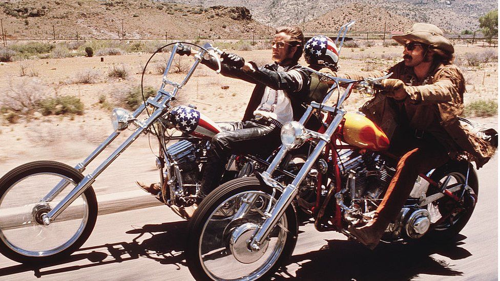
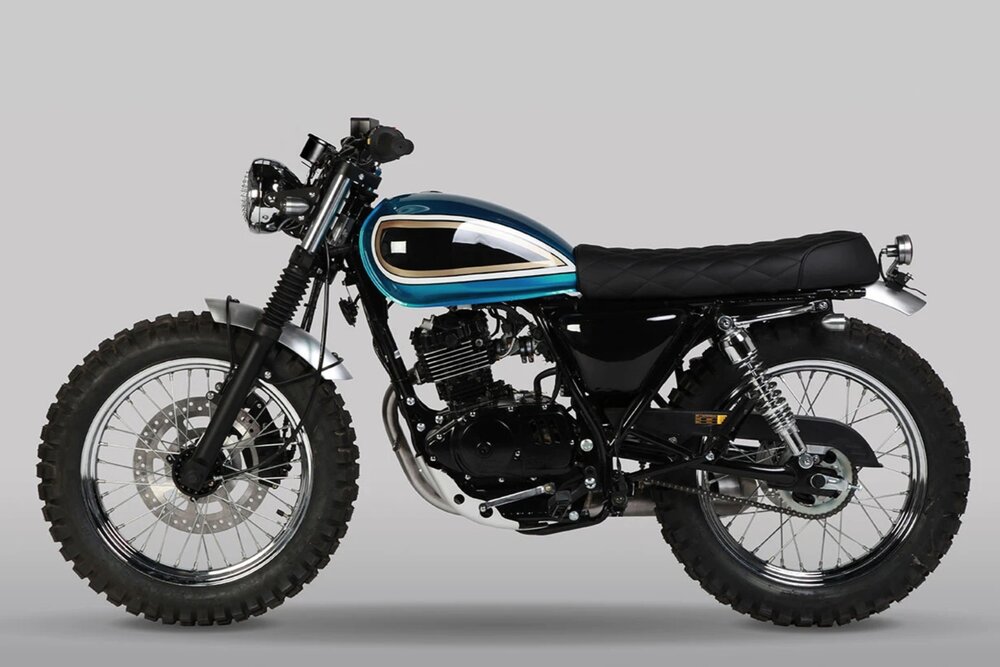
For a rock magazine, the advertisements need to be related to rock and roll, the ads need to be something that people reading the magazine would like such as motorbikes. for example in Meatloaf’s “Bat Out of Hell” album the cover has a motorcycle shooting up from the ground, but it only specific motorcycles that rockers seem to be interested in such as Harley Davidsons, Triumph, Mutt, and other classic style motorbikes that are seen at clubs and bars

My Ads

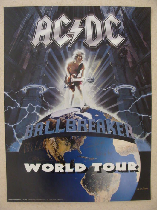
My audience would buy into these ads because they are related to the conventions of rock, most rock music lovers would of course read an ad about a famous rock band going on tour and they would also buy into motorcycle ads because most own a motorcycle.

4th Drafts

Front Cover

this is my final draft for my rock music magazine cover, as you can see I’ve added  a plug line, a price and I’ve moved the other music artists to the right side to be in line with the edge of the page.

Contents Page

for my 4th draft for contents page I have fix all the problems by adding the page number, date, the models name and I’ve also removed the sections that talks about adds because it wasn’t necessary.

Double Page Spread

in the 4th draft of my DPS I changed the photo so it wasn’t the same as the contents page, I’ve also added some page numbers and changed the layout of the article.

Completed 3rd draft

this is my 3rd and final draft of my cover for my rock magazine, overall the design isn’t very different from the second draft  apart from these small changes.

changes/additions:

  • added a pug
  • added a price

now onto my contents page, I haven’t changed anything because I feel that this draft is the best it can be, it has a good image, great background graphics, it isn’t to full or too empty

Lastly is my final draft for my double page spread I also haven’t changed much of it apart from moving the text upwards and input a question from my previous drafts

Changes/improvements

  • added question
  • moved text upwards to look more full


Here is a screen Castify listing all the problems and improvement’s that can be done to my draft 3 work.

For my front cover I will need to :

  • Add a pug line
  • move text of different bands
  • fill the whole space with the magazine cover so there is no white border
  • fix spelling mistakes

For my context page I need to:

  • remove advertisement section
  • fix writing spaces between each section
  • add page number
  • add models name above head
  • remove (-)

For my double page spread I need to:

  • change the layout of the writing
  • add a different photo
  • add the questions and change layout, add page number
  • add a small sentence to show a preview of what the article is about


This is feedback from my teacher


2nd draft DPS

For this second draft of my double page spread I added some gradient graphics to the background to make the writing and images standout more on the pages, I also used the same image of nate from the contents page to test and see if it was better in the DPS or the Contents page.

improvements:

  • needs to be filled more
  • a little bit boring
  • more text

what went well:

  • better use of colors
  • better images
  • overall better layout


2nd draft of content page

for this second draft of my contents page I also change up the design completely and have used another model for the image, I’ve used a red gradient of colors to create some graphics for the background and used neon white lights instead of red to keep it looking different that the front cover.

Improvements :

  • better quality image
  • more text
  • needs to be filled a bit more

what went well:

  • great composition and color palette
  • cool graphics (lights, background)
  • good use of font

2nd front cover draft

In this new cover I have completely changed the whole design and photograph, I’ve also change the album name and added neon light effects to add a different lighting and as well as some new graphics to make a sloping gradient. Next I need to work on my Contents page and to find better ways of improving my images and layouts.

improvements:

  • better use of text color and image color
  • better quality image
  • shake up the text placment a bit

what was great: comments from elanor sauvrin

  • great use of coposition and good use of color palatte (red and purple)
  • great use of line art for a cool visual
  • the cover is full but not too full

Draft of double page spread

This is my draft for my double page spread, I’ve used one of the photos from my second shoot with Nate on my motorcycle. I when into photoshop and cropped the background out of the image, since this is only a draft I can go back to it in the future and use it to improve upon new work that I do with the reflections that I have written below

Things that need to be improved :

  • image quality – although the image was the best there is still a bit of blur to the right side of the image that could have been fixed
  • design- overall the double page spread is pretty plain and requires more detail
  • text placement
  • text size
  • font

things that went well :

  • the image its self is amazing with the style of clothing and the style of motorbike that fits the genre well
  • colors – the colors can make any person instantly tell that this is rock themed
  • the draft article I used for the double page spread has a lot of great detail and it sounds like a believable backstory

Powered by WordPress & Theme by Anders Norén

Skip to toolbar