Front Cover

Inside left
Inside Right
Back
Front Cover
Inside left
Inside Right
Back
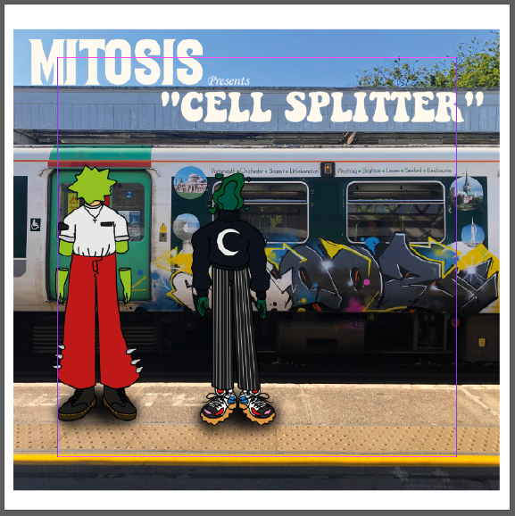
Down below is my first draft for my digipack, it features 2 digitally illustrated characters standing in front of a graffitied train with the band name (MITOSIS) and the album name (Cell Splitter).
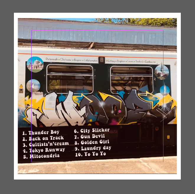
Then there is the back of my digipack, since it is a rough cut there is no barcode or copyright stuff on there but it does have the names of the 10 songs on the album.

Targets for improvements:
Here are a few slides on Social media terminology, I have taken an image of a popular social media platform and annotated the key features with the correct terminology. This is the Instagram page for the band Gorillaz as you can see it has most of the technical conventions of a social media page with it having the followers count, bio, name, and images, as well as a promotion in their bio for their new album. This social media page is mostly used as a marketing campaign as most of their post promote their music or update fans on concert times and such. Having this for the future is super useful as when it comes to making my social media account you can use this a base template or a guide to follow.
Here is a brief sum-up of the process of making the album cover
First I began finding the fonts on Dafont.com and once I decided on then I chose the spot that I thought looked best.
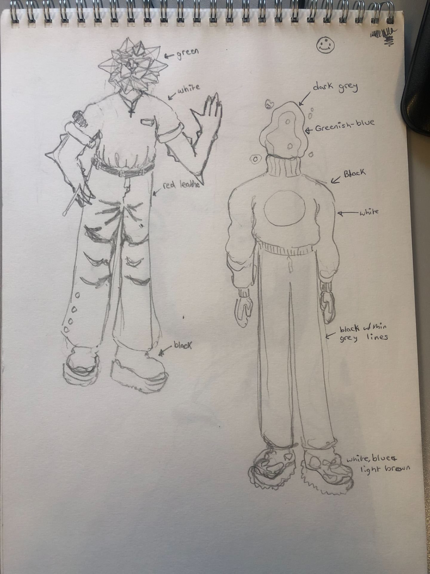
next was to implement the first character which I sketched on paper beforehand then brought the sketch onto the computer to then trace over using my drawing tablet on photoshop. after drawing the character I then chose a color palette that I like and that would fit some of the songs that my band would sing.
I repeated the same process I did for the Previous character, I just changed its color palette.

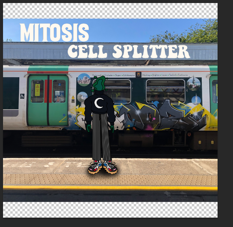
After finishing the character designs I made some slight adjustments to the exposure and vibrance of the train in the background and slightly edited the text a bit so there’s now the word “presents” and some quotation marks, I took these minor design choices from Thundercats album Drunk.

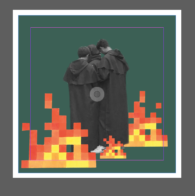
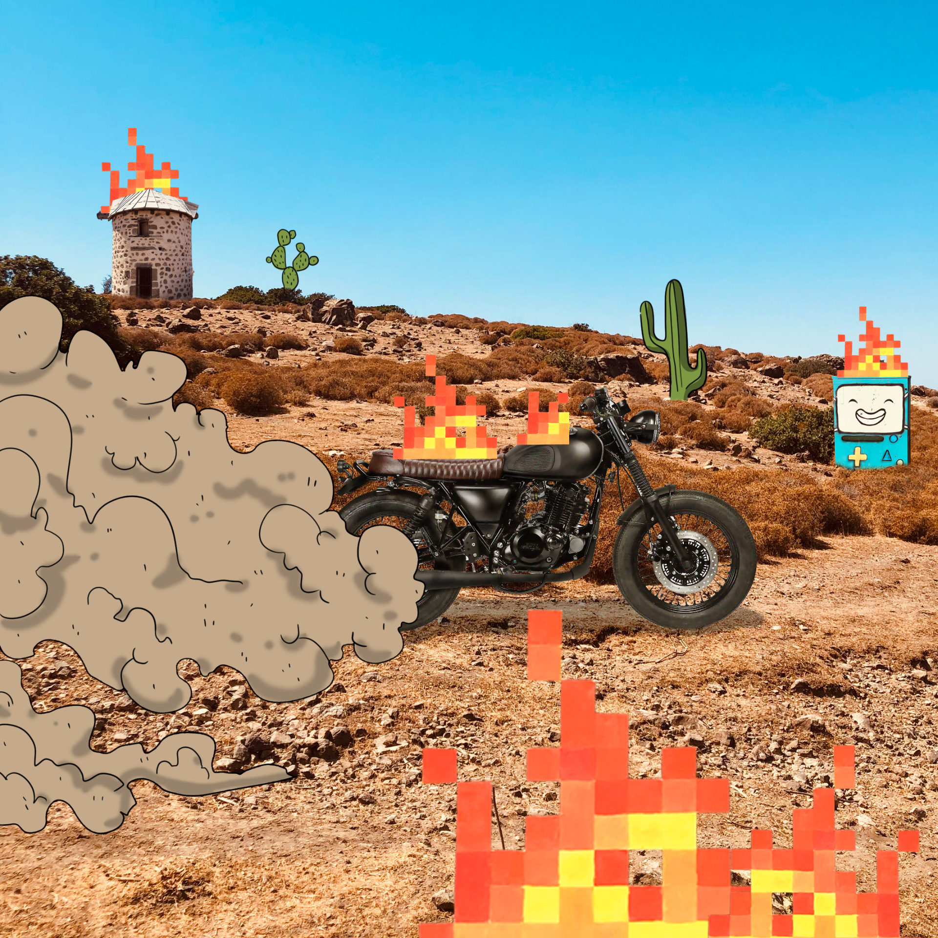
Here are some character designs that I made for the front cover of my digipack, I’m planning to use photoshop and draw these into the image to have a unique style and colorful look to my album cover.
Here is the image I took while waiting at the train station, amazingly there was a really great and aesthetic-looking piece of Graffiti on the side of it which I thought would make an amazing album cover.

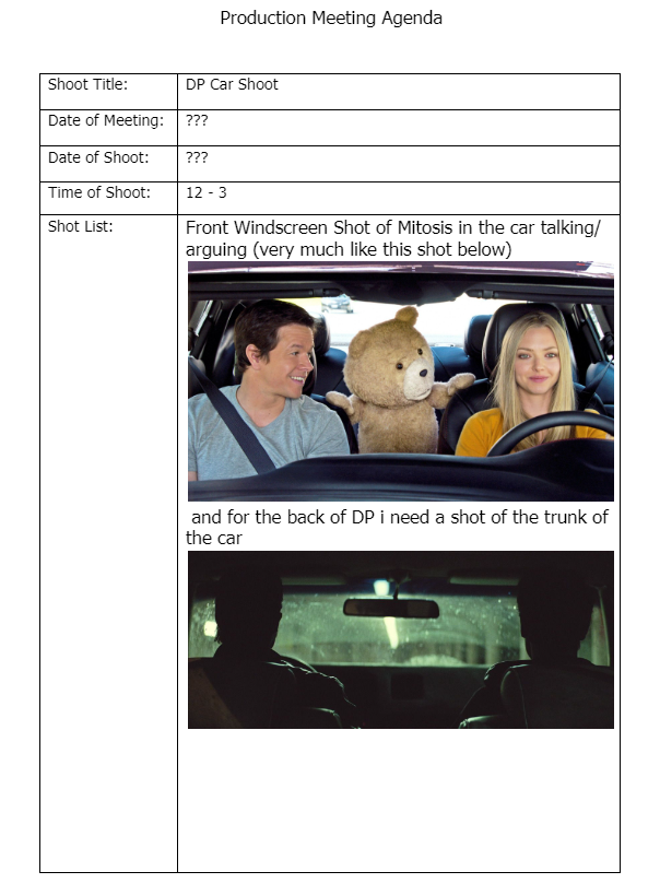
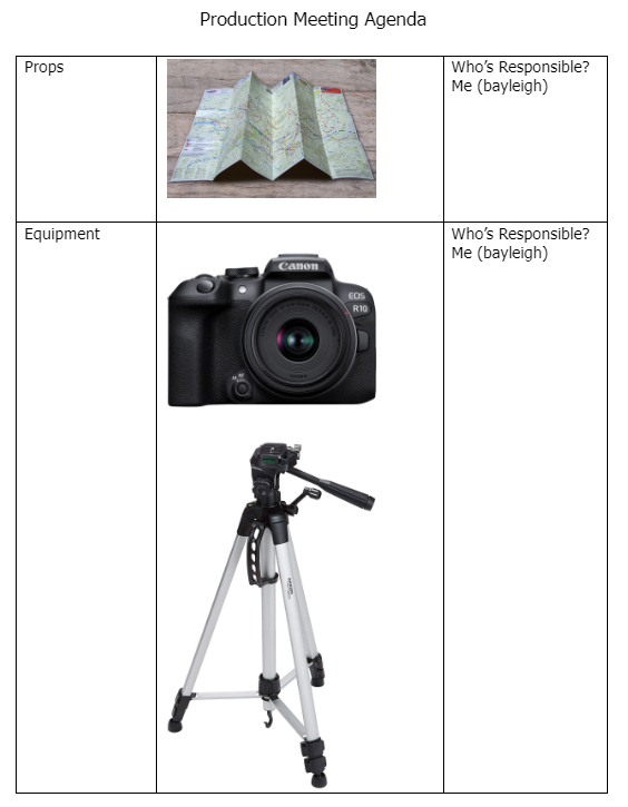
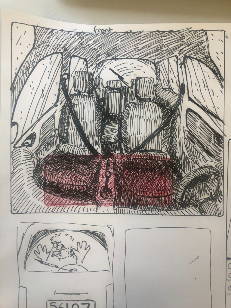
Here we have some Sketches/designs for my Digipack Mockup. This will be for the front, back, and inside of a CD case. A conventional cd/album case we studied in a previous post has to have a few conventions such as the albums title, barcode, band name, and the songs on the back

I’m not entirely sure if ill stick with this idea but ill have to see how it goes.
also here is a color palette that I was thinking of using

Here is some Feedback from another student after they watched my music video they highlighted the boxes green on the sections/elements of the music video they though was Good, ok or bad.


Overall the feedback I got was pretty good, more good than anything else, and some constructive criticism.
targets for the final music video
Here is my post on digipack conventions, I have made two slides talking about the 2020 Gorillaz album “Song Machine” in the slides I have outlined the conventions of the digipack and what makes it a good digipack, although this is for a record it should work the same.
having a slide that shows the basic conventions and what makes an album cover and back look good is incredibly helpful and can help with the digipack that we will be making later on
Powered by WordPress & Theme by Anders Norén