Bayleigh Holberry (Media Blog)

A Level Media Studies Blog

Category: Component 1 (Page 1 of 4)

Question 2: How does your product engage with audiences and how would it be distributed as a real media text?

Here is a screen castify of my magazine in flipsnack form, this is how it would look if it were made in a physical print.


My magazine is called Stone Ocean and it is a classic Rock magazine 

Stone ocean will  be both distinct and similar by having the same conventions such as clothing and the overall style but it will have its own distinct features such as the eccentric poses and color schemes and just as my mission statement says, Stone Ocean is here to spread rock from ocean to ocean and to flood the audience with the best hits. 

Our audience is a pretty broad range from it being the baby boomers and boomers to Gen Z, the obvious target audience is mainly older men 

Why would that audience buy your magazine?

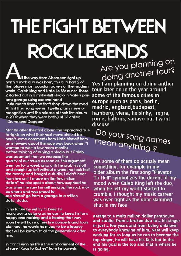
  • On the contents page there is a header and page number for “Conflict” . This conflict is between the two artists “Nate” and “Caleb King” . This story of conflict would entertain everyone and have people talking all about it.
  • In the contents page is another link to a page with “New Artists” . These new artists would have everyone talking about it on social media and with their friends, discussing who they like more.
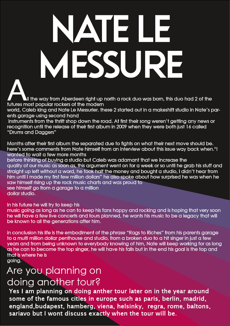
  • On the “Double page spread” is an article about how Nate started out from nothing, a life many can relate to due to how common struggles are. Nate’s backstory in this article will have many of his fans personal identity shaped by him as he is relatable.
  • On the contents page is the link to the page number f0r “Festivals and Upcoming Concerts” this is classified as information as it lets people know when, where and how much.

I would like to work with Conde Nast as they have some of the most popular and most influential magazines in the whole magazine business. Working with an already popular publisher would allow my magazine to get out there much faster and gain popularity much quicker.

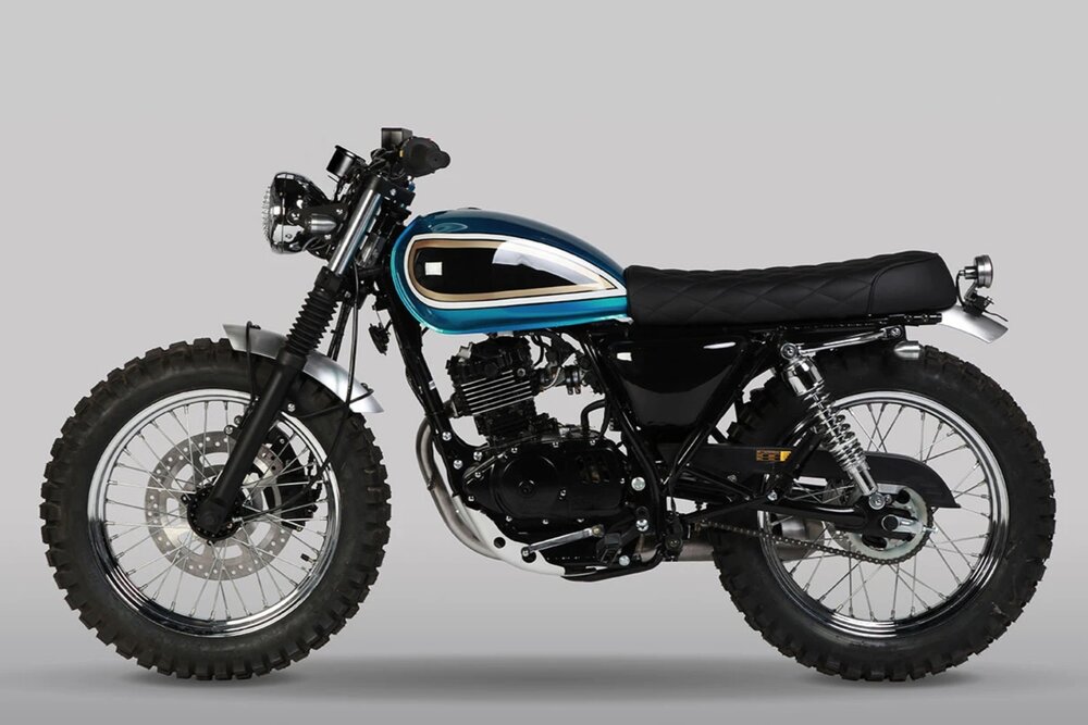
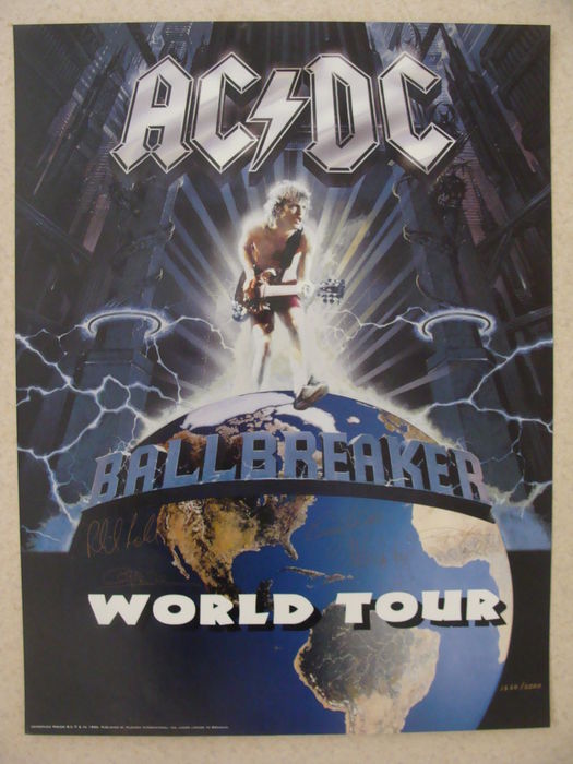
My two advertisements are for an ac/dc world tour and for a classic motorcycle brand, motorcycle brands already make quite an impact with music fans. I would hope to attract quite bold advertiser’s as a bold advertiser is easily seen and recognized and would be able to get my magazine’s name out there. Getting advertisers for Concerts, festivals and merchandise would improve the magazine’s sales more, more advertisements means more money as there is more for customers who purchase the magazine to purchase products, merchandise and concert tickets.

For distribution there has to be more than one option the most basic way to distribute a magazine it to sell it at shops and newspaper stands but other ways are; including it with other products like, buy this and get this magazine with it or sell the magazine and something come with it, another example would be a form of membership to a website where you get the newest issue every month. People are more likely to purchase the magazine if it’s worthwhile so having it be sold with something else would be beneficial as customers would see this as a bargain. Magazine sales have fallen by 65% since 2011, with some print titles have stopped publishing completely and others are going online, over half of UK adults say they still buy print magazines , although analysis suggest that small niche titles are becoming more successful.

Question 1: How does your product use or challenge conventions and how does it represent social groups or issues?

Powered by emaze

Question 4: How did you integrate technologies (software, hardware and online) in this project?

Loading...

Loading…

Question 3: How did your production skills develop throughout this project?

Advertisments

For a rock magazine, the advertisements need to be related to rock and roll, the ads need to be something that people reading the magazine would like such as motorbikes. for example in Meatloaf’s “Bat Out of Hell” album the cover has a motorcycle shooting up from the ground, but it only specific motorcycles that rockers seem to be interested in such as Harley Davidsons, Triumph, Mutt, and other classic style motorbikes that are seen at clubs and bars

My Ads

My audience would buy into these ads because they are related to the conventions of rock, most rock music lovers would of course read an ad about a famous rock band going on tour and they would also buy into motorcycle ads because most own a motorcycle.

4th Drafts

Front Cover

this is my final draft for my rock music magazine cover, as you can see I’ve added  a plug line, a price and I’ve moved the other music artists to the right side to be in line with the edge of the page.

Contents Page

for my 4th draft for contents page I have fix all the problems by adding the page number, date, the models name and I’ve also removed the sections that talks about adds because it wasn’t necessary.

Double Page Spread

in the 4th draft of my DPS I changed the photo so it wasn’t the same as the contents page, I’ve also added some page numbers and changed the layout of the article.

Completed 3rd draft

this is my 3rd and final draft of my cover for my rock magazine, overall the design isn’t very different from the second draft  apart from these small changes.

changes/additions:

  • added a pug
  • added a price

now onto my contents page, I haven’t changed anything because I feel that this draft is the best it can be, it has a good image, great background graphics, it isn’t to full or too empty

Lastly is my final draft for my double page spread I also haven’t changed much of it apart from moving the text upwards and input a question from my previous drafts

Changes/improvements

  • added question
  • moved text upwards to look more full


Here is a screen Castify listing all the problems and improvement’s that can be done to my draft 3 work.

For my front cover I will need to :

  • Add a pug line
  • move text of different bands
  • fill the whole space with the magazine cover so there is no white border
  • fix spelling mistakes

For my context page I need to:

  • remove advertisement section
  • fix writing spaces between each section
  • add page number
  • add models name above head
  • remove (-)

For my double page spread I need to:

  • change the layout of the writing
  • add a different photo
  • add the questions and change layout, add page number
  • add a small sentence to show a preview of what the article is about


This is feedback from my teacher


2nd draft DPS

For this second draft of my double page spread I added some gradient graphics to the background to make the writing and images standout more on the pages, I also used the same image of nate from the contents page to test and see if it was better in the DPS or the Contents page.

improvements:

  • needs to be filled more
  • a little bit boring
  • more text

what went well:

  • better use of colors
  • better images
  • overall better layout


2nd draft of content page

for this second draft of my contents page I also change up the design completely and have used another model for the image, I’ve used a red gradient of colors to create some graphics for the background and used neon white lights instead of red to keep it looking different that the front cover.

Improvements :

  • better quality image
  • more text
  • needs to be filled a bit more

what went well:

  • great composition and color palette
  • cool graphics (lights, background)
  • good use of font

2nd front cover draft

In this new cover I have completely changed the whole design and photograph, I’ve also change the album name and added neon light effects to add a different lighting and as well as some new graphics to make a sloping gradient. Next I need to work on my Contents page and to find better ways of improving my images and layouts.

improvements:

  • better use of text color and image color
  • better quality image
  • shake up the text placment a bit

what was great: comments from elanor sauvrin

  • great use of coposition and good use of color palatte (red and purple)
  • great use of line art for a cool visual
  • the cover is full but not too full

Page 1 of 4

Powered by WordPress & Theme by Anders Norén

Skip to toolbar