
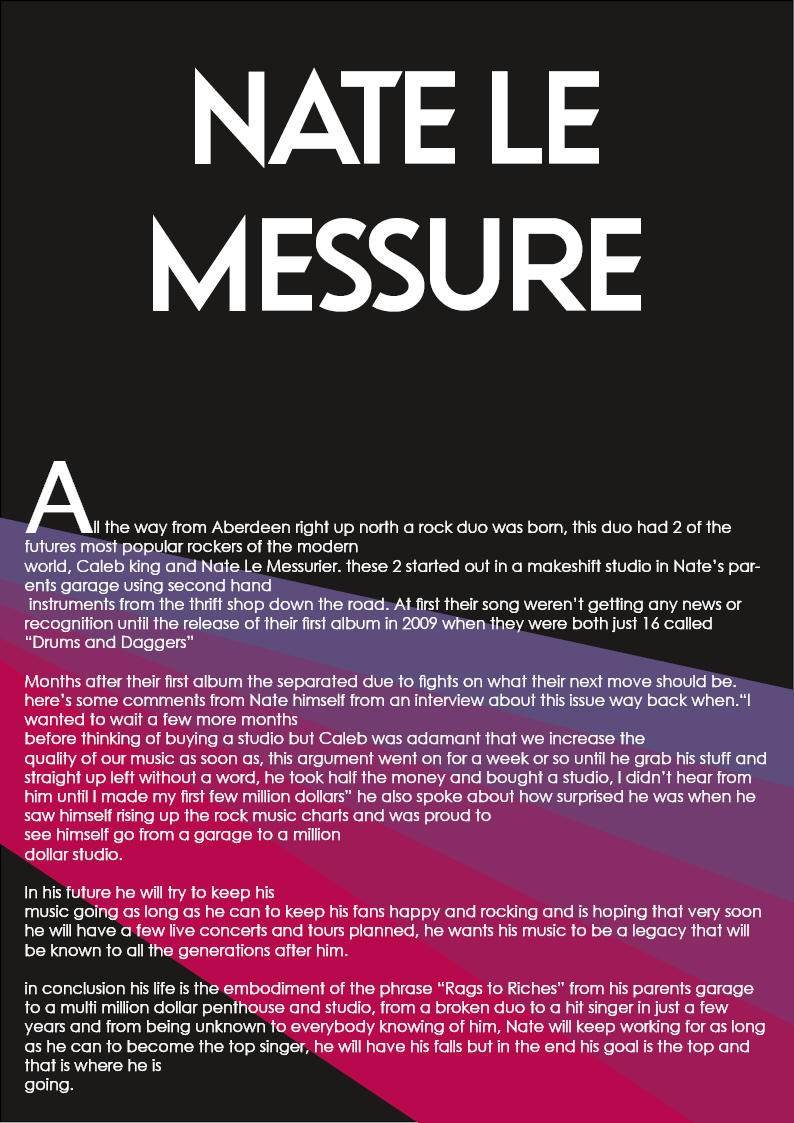
For this second draft of my double page spread I added some gradient graphics to the background to make the writing and images standout more on the pages, I also used the same image of nate from the contents page to test and see if it was better in the DPS or the Contents page.
improvements:
- needs to be filled more
- a little bit boring
- more text
what went well:
- better use of colors
- better images
- overall better layout
Leave a Reply