Second drafting, computer designing and crafting
Below is the second draft of the front page of my magazine that I feel is a major improvement. As my skills on the software I am using are advancing so are my drafts.
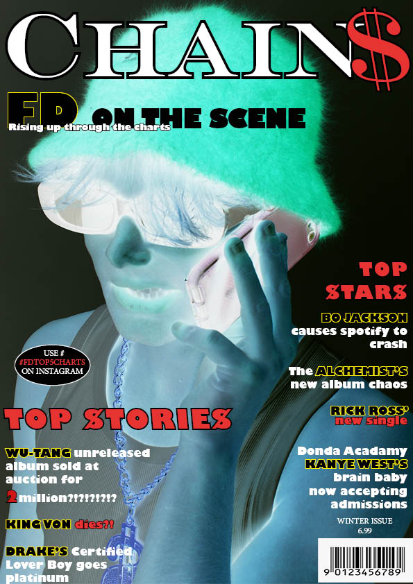
What’s new:
- The Masthead is standalone. Before it has a rectangle around it. without the rectangle the masthead fits on the page better. Although less apparent it looks more thought out
- I played with the composition of the cover lines. They now come across less bulky more spread out and easier to read.
- I outlined the stars names in a bright yellow to bring in the reader to the rappers and celebrities who will be involved in the magazine.
- I tried to use more overlapping because, if done well overlapping text can be very enticing giving the feel of modernity and expertise.
- I flipped the image of my cover model so he would be looking at the main cover lines on the left.
What’s next:
- Spacing between the cover lines, especially the 2 of 2 million.
- The oval needs to be moved as it doesn’t sit right where it currently is positioned.
- I need to look at cutting out my image and toying more with a background colour as I feel the inverted image can really pop out and be placed over the masthead to gain myself more marks.
- I might need to make use of another font or two. I have already used the same font more than I really shot have and more than is conventional to the front page of a magazine.
- Font sizes need another look at.