My final CCR Essay


Teacher screencastify on social media page:
Summerising the feedback given;
Targets for improvement:
In the next draft, we will ensure that we involve some use of cross media convergence and release more teasers for the new album. Our page we want our audience respond to our posts so we will have Annabelle feature on a podcast in our next post. This use of synergy will also be a good guerilla advertisement as whoever listens to the podcast Annabelle is featured on will now have a chance to be introduced to our music.
Here is our recorded screencastify analysing popular star La Roux’s instagram page.
The ways in which La Roux appeals to Both AIDA and Blumler and Katz’s uses and gratification theory are through her bold star image and well thought out integrated advertising . As a popular star in the industry, La Roux employs a range of colour in her well styled and outgoing outfits and some detailed computer generated graphic designs. Her posts both stand out and advertise her music causing audience to discuss what she’s wearing and where she’s wearing it, she creates a loyal and devoted fanbase through replying to her fans and teasing new music constantly in order to maintain the spotlight.
Self assessment;
Self assessing helped me to be critical of my own work. It also made it clear to me what I need to include in the next social media page draft in order for a successful social media page.
It is now clear to me that my classmate and I need to involve a charitable and or political post in order to communicate that our star is compassionate and caring to reinforce her fan’s personal identities.
We must also establish the personal life of our stat. If not, it will start to appear all promotional and business related and fans will grow annoyed and lose interest. This will add a level of authenticity to our social media page.
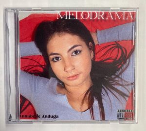
Homing in our brand and star image, our digipack reflects the mood of our artist through the deep blacks in the backgrounds and in the costume. Our descriptor “Grungy” is communicated through her jewelry and necklaces on the cover and the love story is conveyed through the symbolism of reds in the inside pages.
Our conventions are followed through our star laying down at the keyboard which is some key iconography of our genre – indie synth pop.
We stick to 3 colours with our colour pallets; Black, white and purple which is enough colour but not too much, as the more colour we add the more complication is added in that the audience will try and read into all of our colour scheming.
In terms of typeface, we involve two different fonts which again, is not too many for the audience to read into but enough so that everything doesn’t look so samey. Our font is conventional as indie synth artists tend to use more blocky and graphical fonts rather than serif.
Talking photo manipulation, the noise we added to all the images gives the digipack a timeless feel and is conventional as artists of our genre are appreciative of the those who laid the groundwork for the genre in the 80s.
PDF – front to back;
Photos inside of in the case;


This is how some of our peers interpreted our digipack;

What works;
What needs adding or changing;
Summary;
On a whole, our digipack received a preferred reading as more than half of our peers who completed the survey agreed that it looked like our genre without being told beforehand. When the audience responds to the ideas in the way the media producer wants them to, that is known as receiving a preferred reading from an active audience.
Here is the screencastify our teacher made dissecting our digipack and giving us some tips, pointers and advice for ammendments.
Ammendments to be made;
Targets I will set going foreward are to make sure any cutting out done digitally is done to standard, you can tell between well produced media and rushed media between how images are cut out. I will ensure our there is more going in in the inside double page as I we are tyrying to create appealling and eye popping media so if I just stick to two colours not much attraction will come of the final product.
Devising a strong social media marketing plan is pivotal for any product or artist to grow in popularity. Guerilla and intergrated advertising is fundamentally necassary to reach any position of influence.
This is our timeline that we will keep close refrence to when rolling out our social media posts.
The timeline helps to schedule areas of our brand like our viral promotions for instance on post five where we decided we will have our star Annabelle Anduga hold out a maybeline eyleiner whilst in her makeup chair to incorperate some promotion. An example of how we appeal to AIDA is in the very first post where will release behind the scenes photos of a shoot for our star’s new album “Melodrama”
Assembling a timeline will make the social media page posting stage endlessly easier as we can now focus on creating adept promotions and well edited posts for our page instead of it getting to posting and us not having a plan on what we will post and when.
Attatched below is our completed second draft. There is still time to perfect and ammend our digipack but for now progress is being made to produce the best possible digipack.
Working to tie our digipack in with both our genre (indie synth pop) and the the album name (Melodrama), we used draft two to be experimental as we know we have drafts to come and to finilise our creative and stylistic choices. We know the inside double page is where we want to open up about the aritsist so we decided to involve some of the artisits favourite lyrics from the whole album written across it. We know more can be done to illustrate that the artistst is opening up inside the double pages so this is something to think about in the coming drafts.
Draft 1 self assessment:
Trying our best to stick to the assessment criteria, we managed to put together a first draft from the shots of our first shoot with the goal of keeping star image and brand close in mind when creating the CD panes. Knowing that the product is a package we took into consideration that it should be cohesive and maintain the same conventions across the panes. Our pastel colour palette of reds, purples and basic whites gives the independent bedroom artist feel and gives an insight into her bubbly personality through her relaxed look and fierce facial expressions.
Our targets set for improvements are;