Category Archives: Preliminary print tasks

My Tour Poster

Having a go, and making a practice tour poster.


Heading into making a country and western tour poster I sourced some real tour posters to give myself a sense of what moods I need to achieve and what tones I need to produce. Doing research on this music genre (country & western) guided me into using the colour palettes and typography I eventually used because I wanted my poster to be conventional to the genre and follow the  brief given. Considering AIDA when composing the layout of my magazine benefitted the final product hugely. Evidently, each designer considered AIDA when making the posters on my mood-board and it shows. It shows because every image and piece of text work with each-other. The media producers blend what needs to be blended and highlight what needs to be highlighted, which is the important features, the images, the tones and the texts.

My use of colours fonts and images convey a narrative. I added the route 66 logo to carry across that I, the singer in question, am travelling up the route 66 touring. This is a classical example of what a country and western singer would tour along. My costume gives the narrative a rugged feel. I am not concentrating on if my collar is up or down i’m focused on the open road and my  music.

looking onward, I will use mood boards to nail briefs in future. In the industry, if I decide to take media through to a career I could be given a brief I have no knowledge or interest in.  Research in this instance is vital when making media. In addition I will hold AIDA close when making designing future media projects.

Please click on the image to see PDF

Working from my mood board, own knowledge and research, I had a go and made a tour poster of the country and western genre on photoshop and indesign to help me put some skills to use and learn additional magazine making methods. I’m quite happy with my result for a first go. However there is always room for improvements. For example, In my feedback I spoke about how I felt I used too many different typefaces and that It made my work look unprofessional and uncomplimentary to the genre’s conventions.


Please click on the poster to see the sheet in detail

My Magazine Front Page Swede

Becoming familiar with In design
Original source
Please click on this link to see the PDF

My work

3 positives
  • I really like the heading, it looks very professional.
  • I feel like I found very similar if not the same fonts when copying the original source’s fonts. I clearly have a good eye for fonts!
  • The colouring of the images on the left column match the schemes from the original.
3 negatives
  • The images of the left column aren’t aligned with the box and they are not all the same size I need to improve my placing in future.
  • My image is very pixelated, I need figure out how to layout my image to get it’s correct proportions.
  • Some of the fonts I picked didn’t allow a bold option. I need to try and maybe download  different fonts and typefaces so it looks right and gives the right ideas and messages in future.

At first, I struggled when  formatting my In-design pages to have a layout like a  magazine. I attached a video tutorial to help me out in future.

I also struggled with trimming and sizing my images. I added a video to help me with this very important aspect of in-design for future media projects.

Summary

I learnt how to navigate my around In design. I now know how to format a page to have a magazine layout and use most of the in application features. I treated this task as an In design crash course. We did this task of course to help us learn to use the software In design because we will use it for our actual magazine. This was useful because I feel now that I know how to work In design I can now focus on making affluent media. In a magazine, all of the text, images and colours work together to give an impression or communicate an idea or subject. Knowing what schemes text sizes and images give what ideas have been used before is knowing what works and what doesn’t having consumed this media whilst recreating it I have a sense of what professional magazine media can look like.

Having the ability to use In design effectively when making my magazine will have extensive benefit to me.  Going forward this skill, once polished will help me get more marks because the media I come to produce will be more refined and professional.

The Camera Talks

What’s in front of the lens?

In pairs we sourced images capturing different denotations, conveying different narratives. We gathered a series of different kinds of shots low, canted, mid shots etc. We then selected 9 images which held backstories worth hash-tagging.

We carried out this task to establish what stories can come from an image just by changing the position of the camera from a mid to a low angle for example. A low camera shot can make a model look strong and powerful because the camera could be conceived as the point of view of those below them.

The camera paired with mise-en-scene is a powerful partnership. When used together, endless narratives can be expressed. I now know that the whole of mise-en-scene is at my disposal going forward into media projects. In my media, I can use each aspect, (lighting, props, actions, angles etc) to communicate a moving and engaging  narrative as I please.

My Image That Uses Mise-en-scene to Communicate Meaning

Accounting for Mise-en-scene


We created this mood-board on padlet to establish which connotations and conventions are behind the mise-en-scene of country and western singers when looking at recreating it.

As a group, we decided that our conventional country and western singer would be a relaxed and laidback person. He would often look out into the distance striking  bold poses. We planned for me to wear flanneled and layered clothing and we wanted a prop so we decided on a stick which replaced the usual straw, to chew on.  We wanted bright lighting because we associated country & western music with being outside.

Made with Padlet


With our final images, I feel we succeeded in recreating the country and western music genre. The addition of the stick in the mouth gives the images that earthy feel they were needing and my rugged collar positioning is accurate because stereotypically, country & western singers have a certain jagged, hardy look.  Your usual conventions of country signers are urban farm like individuals. I felt like I achieved that look using relaxed and atypical poses, the tilted hat for example.  To make the images look more authentic, I think we could have shot in black and white because I associate old black and white cowboy photos with the genre country and western.

Looking forward,  I am now confident when dealing with mise-en-scene in my image gathering. I feel accounting for mise-en-scene will become useful when making my own magazine because I can stick with a genre extremely closely now knowing some classic conventions, light schemes, costuming and poses of multiple music genres.

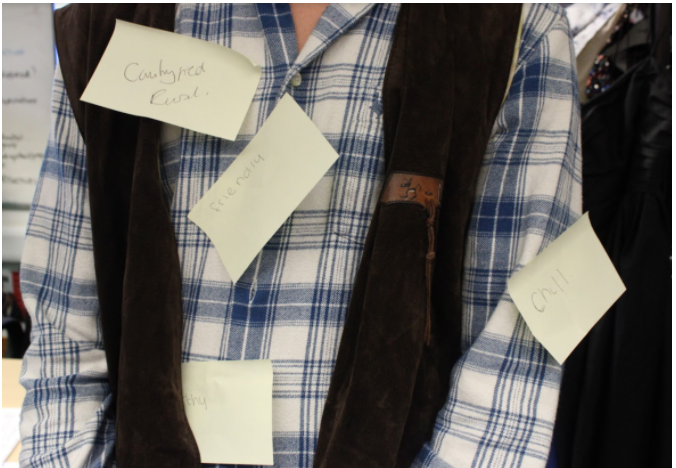
In class, after we gathered our photos of a country and western singer we conducted post-it note activity where we had to decode and deconstruct the characters in order to label the connotations given from the outfits worn by the models. This enables us to find out of we communicated the correct conventions as groups. The class noted that my outfit was “chill, rural, earthy and friendly.” As a group we were  satisfied with this class feedback as we wanted to  convey a laidback and down to earth country and western singer.

This activity showed us how audience research can help us decide how to represent a music genre– in our case, country and western. This is because knowing the conventions an audience would expect from a singer in a genre helps the media producers communicate the genre to their greatest ability.

Textual Analysis Of a Tour Poster

Analyzing other media- Tour poster

Decoding this media text (a Justin Bieber tour poster) has taught me that I need to choose a highly pin point theme for my own Magazine cover and to signify the correct ideas in tune with my theme, which is going to be rap.

Additionally, it has also taught me  not to present the wrong ideas behind my work, yet to consider how I represent my media, as I don’t want the wrong connotations being drawn form my denotations in  my work going  foreword. I did this work as almost a market research  task. Immersing myself in other media will deem itself profitable in my upcoming media magazine. Knowing the do’s and don’ts, what looks good, what doesn’t and so on.