Category Archives: Music magazine

Chosen Adverts

A4 Advert Selecting


Advert #1

I chose this Amazon Alexa advert because it is a great modern speaker mixed with robotic assistant which is very marketable. The Amazon Alexa is great for listening to music on. I know this because I have one at home and as I am part of my own demographic, I feel it will work extremely well as an advert in my magazine.

Considering my audience as youthful 15-25 year-olds this advert will be a fitting addition. It’s slick minimal style and the fact that it’s well finished and not to busy is the  exact balance my magazine needed.

Advert #2

This festival has very recently been announced and I am predicting that it will be raved about massively. Marketing this festival poster will prove that this magazine has the right contents.  Furthermore, it will directly attract my particular demographic because it has all the big names, it’s new and involves popping and eccentric colours.

Despite this task not being assessed, I still extracted some ‘worth knowing information whilst completing it. This is that magazine producer’s have to consider at length even their chosen adverts for their media. Now knowing such sought-after information, I can go forward  confident that I know how to select a conventional advert for whatever media I continue to produce.

Draft 3 All Pages

Draft three of all all three

FC3:

please click on image to see pdf

What’s new, front page edition for draft 3:

  • I included a red boarder, this is as I felt all of the features of my magazine were just floating in open space. I needed some sort of constrictions. I want a cohesive colour through each the front page, contents page and double page spread and I chose red. Currently the pages do not work well with each other and I need to do some heavy rethinking.
  • I moved the oval ad which says use #FDTOPCHARTS on Instagram. This is because over on the left it felt cluttered and covered some of my cover image.
  • Some of my cover lines covered the image too much. this being somewhat unconventional I had a play with how far the creep in to the middle of the image.
  • I overlapped the 2 of 2 million as well as upsizing it. This was to complement my earlier uses of overlapping of the $ of CHAIN$ and the rising up through the charts of FD ON THE SCENE.
  • I cut out the image of my cover model, however the non cut out looked better so I kept that. But having a play could have produced a better version so I’m glad I did that.

CP3:

please click on image to see pdf

What’s new, contents page edition for draft 3:

  • Entire colour scheme alteration in order for my contents page 3rd draft to be innkeeping with the style of the other pages in that it incorporates red somewhere.
  • I cut out the image again because it had some imperfections
  • I used drop shadow for the “CONTENTS” wording to give an increasingly expert and polished feel to my updated draft 3 contents page.
  • I included the page number for FD’s article because if I hadn’t the reader would of been clueless as to who FD was and why he was on both the front cover and contents page.
  • I had a play with the page numbering to make it stand out from the block black text.

DPS3:

please click on image to see pdf

What’s new, double page spread edition for draft 3:

  • I altered H20Slicky’s quote on the left. This is because I felt while reflecting on draft 2, I thought I could take this personal article to a further extent with a ‘real’ quote of his about his kind of manifestation to success.
  • I changed the colouring of all wording on the left. This was to ensure again, that the reader wasn’t taken to a completely different style of page each time they turned over and that my magazine had a level of coherency.
  • I brought the heading on the left hand page down so my layout would seem less blocky and more flowy.


My teacher’s screencastify for all draft 3:

My instructions FP3:

  • £ sign for price.
  • CHAN$ masthead to be taller.
  • Boxing in cover lines wording to fit in box + play around with sizing.
  • Different font for cover lines.

My instructions for CP3:

  • Font under main cover line used too much.
  • More colour.
  • Page numbers bigger.
  • Be careful with alignment.

My instructions for DPS3:

  • Move quote.
  • Add a quote.
  • Make “H2O SLICKY’S” bigger
  • Article writing give space to edge of page.

2nd Draft of DPS

Entering the second draft of my Double Page Spread
please click on image to see pdf

What’s new:

  • To make my double page spread seem more conventional I added different colours across the pages unlike before when it was just one solid gradient.
  • I added a new gradient in an egg shape to draw the eyes of the reader in for my main image.
  • I added a new image where I chose to play with it’s appearance so it looks less real and more like a comic which I love the effect of.
  • I added a quote and a drop capitol to further conventionalize my double page spread.
  • I had a play with my colour scheming.

What’s next:

  • I absolutely need to rethink the left hand side of the double page spread because I feel like it looks like a poster more of a page in a magazine.
  • I could look at taking more images as I feel I could take some mugshots of my model to spark controversy.
  • I need to come up with a more personal quote to boost emotion in my story.
  • I need more colour to my text and effects. I might try 3d looking text and colours other than white.
  • I’m not sure the blues and the greens of my backgrounds match- I think I need to rethink it and have a play for draft 3.

2nd Draft of Contents Page

Contents page second drafted


please click on image to see pdf

What’s new:

  • I have made the  text boxes fit around my image which definitely causes my contents page to seem expertly produced and professional.
  • I changed my image and did a better cut out because the last one was cut out at the head and didn’t sit right on the page.
  • I have made the page numbering, headlines and text sizing far more conventional for a contents page.
  • I have added outlines to some of my wording in order for it to pop out, catching the readers eye.
  • I rethought and added some headlines extending the maximum page number to 28.

What’s next:

  • The cutout needs to be redone as there is white spots around the hand and the gun.
  • The repeated images need to be lined up, the pdf shows them to be out of line and unprofessional.
  • The gap at the bottom needs to be filled with either some images some catchy text or a cool graphic.
  • I need to rethink the image or my choice of colour as the brown on my models coat doesn’t look that great.
  • I would like to adjust my image possibly changing it to black and white to show that I can do it and to help my colour scheme appear more flowy.

2nd Draft of Front Page

Second drafting, computer designing and crafting

Below is the second draft of the front page of my magazine that I feel is a major improvement. As my skills on the software I am using are advancing so are my drafts.

please click on image to see pdf

What’s new:

  • The Masthead is standalone. Before it has a rectangle around it. without the rectangle the masthead fits on the page better. Although less apparent it looks more thought out
  • I played with the composition of the cover lines. They now come across less bulky more spread out and easier to read.
  • I outlined the stars names in a bright yellow to bring in the reader to the rappers and celebrities who will be involved in the magazine.
  • I tried to use more overlapping because, if done well overlapping text can be very enticing giving the feel of modernity and expertise.
  • I flipped the image of my cover model so he would be looking at the main cover lines on the left.

What’s next:

  • Spacing between the cover lines, especially the 2 of 2 million.
  • The oval needs to be moved as it doesn’t sit right where it currently is positioned.
  • I need to look at cutting out my image and toying more with a background colour as I feel the inverted image can really pop out and be placed over the masthead to gain myself more marks.
  • I might need to make use of another font or two. I have already used the same font more than I really shot have and more than is conventional to the front page of a magazine.
  • Font sizes need another look at.

DPS Draft 1

Double page spread creating


Below is a first draft of my double page spread containing my article for my magazine

please click on the image to see the pdf

Likes:

  • I like the colour scheme, my colours are flowy and modern, especially the night vision effect on the image of my model.
  • The overlapping of the “LIFE IZ PRESHIOUS” wording.
  • The font, I think the font for the Album name is enticing and striking.
  • I really enjoy how the paragraphs morph around the image, it looks professional and has appeal.
  • The overall composition I feel is very flowy. All that needs to be changed is the more intricate details.

Dislikes:

  • My paragraphing is off, for my 2nd draft I will ensure it is both grammatically correct and looking polished.
  • My image needs to be retaken, the shoulders are cut off on the cut out because I wasn’t further enough back from my model.
  • The cut out itself of the image needs to be done again as it is rough and there is white spots.
  • I need to incorporate more fonts as well as more font cover in order for the text to exceedingly pop out against the gradient background.
  • The cut out needs adjusting in that the green doesn’t match the green of my background I need to rethink my editing.


Production Meeting Agenda for Phunky Photoshoot

Production meeting agenda-ring


I devised I production meeting agenda for my double page spread phunky photo shoot. The reasoning behind a need for a production meeting agenda is to ensure that each member of the production team are kept accountable for the projects and tasks they have agreed to.

please click on image to see pdf

Making a production meeting agenda is a necessity for the planning stages of a shoot because you can always go back to it, using it as a form of checklist in a sense.

In the shoot I need to remember my article is about album reviewing. So I need profile shots of my hip hop star because I will be reviewing a made up album of theirs. I must capture the success and greatness of their album in my images through my model’s demeanor, facial expression and, gestures.

Draft of Feature Article

Review do’s and review don’ts


Knowing I would come to the double page spread soon I started thinking of ideas for a captivating article. I chose to do an album review and I really wanted to contain  anecdote’s from the rapper and an In depth analysis of the track-list- All assisting my first double page spread in a magazine to be highly personal.

My articles structure & plan:

Rough first DPS draft:

“THE REVIEW- H20 SliCKY’S Lif£ is Pre$hiou$”

Written by Henry Gray

Esteemed review of H2O SLiCKY’S 3rd studio album that is rocketing up the global charts. 

The album, diverse in it’s melodies, has great potential to go gold and maybe even platinum. The rapper- H20 SliCKY spent 7 months in the alps perfecting his 3rd studio album- Lif£ is Pre$hiou$. The album itself has its fair share of catchy money grabbing hits and its fair share of expertly produced songs that will be played 50+ years to come. Bringing in producers such as Pierre Bourne and Tay Keith, Slicky has set himself up to be on stage at this year’s The Grammys. When listening to the album it felt as if I was taken to an alternate dimension. My mind became lost in the melodious low tempo pace of voice but high temp pace of beat on my favourite track on the album- WAITING WANTIN. The flowy beat switches and bumpy rhythms bringing in instruments like the french horn I feel SLiCKY has put his own twist on the rap genre which is exactly what the genre was after. My reasoning for 4 mic ratings out of 5 is that although the album has it’s hits it has some (1 or 2) songs that he clearly just dropped in to fill the track list. But interestingly some that I personally feel should have been released as singles instead of being on an album tracklist because of their ripe and alternate  exuberant dexterity and pitch. For example the song WORTH it WITHOUT it feels to me like more of a breakup in his feelings song which shoulnt of gained a place on the album. 

In summary SLiCKY has got his unique flow on lockdown but is lacking in the narrative department as albums should convey a narrative and not just contain random songs such as WORTH it WITHOUT it. 

When reading up on SLiCKY, an artist of recent times, I found his backstory a story worth telling. H20 SLiCKY- originally Harvey Ogier or Combine was a troubled youth who battled addiction to drugs and gang violence actually being a member of park lane a london gang before he got his big break. SLiCKY served 20 months in prison back in 2014 for snorting a line of cocaine off his finger in front of a police officer stating coming out recently with his statement that- “it was being homeless or being in prison, I only saw positives of being in prison and negatives of being homeless. Free food, bed and a chance to make friends. I snorted that line of cocaine to get arrested on purpose. Those events kind of marked the end of an era for me and I started writing meaningful songs in prison detailing my dark past of addiction and homelessness.”


MP3  Amended first draft:

Self targets for audio:

  • To be more rhetorical in my language to spark interest and interaction.
  • Add who wrote the article (myself).
  • Use enticing adjectives which make the album stand out further.
  • More quotes.
  • Go further in depth with the rappers struggled past.

Written amended draft article for DPS:

“THE REVIEW- H20 SliCKY’S Lif£ is Pre$hiou$”

Written by Henry Gray

Exclusive review of H2O SLiCKY’S 3rd studio album that is rocketing up the global charts. 

The album, diverse in its melodies, has great potential to go gold and maybe even platinum. The rapper – H20 SliCKY spent 7 months in the Alps perfecting his 3rd studio album – ‘Lif£ is Pre$hiou$’. The album itself has its fair share of catchy money grabbing hits and its fair share of expertly produced songs that will be played 50+ years to come. Bringing in producers such as Pierre Bourne and Tay Keith, Slicky has set himself up to be on stage at this year’s The Grammys. When listening to the album it felt as if I was taken to an alternate dimension. My mind became lost in the melodious low tempo pace of voice but high temp pace of beat on my favourite track on the album – WAITING WANTIN. The flowy beat switches and bumpy rhythms bringing in instruments like the French horn, I feel SLiCKY has put his own twist on the rap genre which is exactly what the genre was after. My reasoning for 4 mic ratings out of 5 is that although the album has its hits, it has some (1 or 2) songs that he clearly just dropped in to fill the track list. And interestingly, some that I personally feel should have been released as singles instead of being on an album tracklist because of their ripe and alternate  exuberant dexterity and pitch. For example, the song ‘WORTH it WITHOUT it’, feels to me like more of a breakup in his feelings song which shouldn’t have gained a place on the album. 

In summary, SLiCKY has got his unique flow on lockdown but is lacking in the narrative department as albums should convey a narrative and not just contain random songs such as ‘WORTH it WITHOUT it’. 

When reading up on SLiCKY, an artist of recent times, I found his backstory – and it’s a story worth telling. H20 SLiCKY – originally Harvey Ogier or Combine, was a troubled youth who battled addiction to drugs and gang violence and was actually a member of Park Lane,  a London gang before he got his big break. SLiCKY served 20 months in prison back in 2014 for snorting a line of cocaine off his finger in front of a police officer.  He recently revealed, “It was being homeless or being in prison, I only saw positives of being in prison and negatives of being homeless. Free food, bed and a chance to make friends. I snorted that line of cocaine to get arrested on purpose. Those events kind of marked the end of an era for me and I started writing meaningful songs in prison detailing my dark past of addiction and homelessness.”


Language Analysis

‘Articools’ and Articles


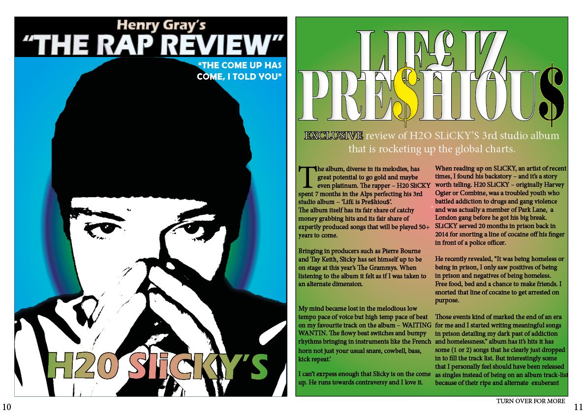
I chose to analyze this article from the magazine “Record Report”. I chose this style of article because for my own double page I wanted to write an album review/s.


Structure, how does it look? what is it about? 

This article as an album review on both an album by Dr. Dre- The Chronic and an album by Heavy D & The Boyz- Blue Funk.  The album which gained the better review (Dr. Dre’s album) has a more detailed and context based review as it collected a 4.5/5 where Heavy D & The Boy’z album on scored a 3.5. Moreover, The image of Dr. Dre is far larger than the Image of a Heavy D & The Boyz member. This is all important, as it wouldn’t make sense for things to be the other way around.

The article is laid out in quite a basic, formal and informative manor which has its ups and downs. The real hook behind the two reviews is which did better than the other and why? As the artists no matter what time period see it as a competition even if they don’t show it.

The author of this article  creates intrigue through their use of a bold black and white image and catchy enticing key words at the bottom. People are reading this magazine to find another view on an album they like or to research the artist and of course just for entertainment. The formal layout of the article, although basic still has a huge more-factor because it is still encouraging social interaction in that their reviews could be perceived as controversial. 

This article is written in 3rd person. This structure is used because stories are being told about things that have already happened- these albums have already been released so it makes sense to write in the 3rd person tense.

The introduction is clear and stylish and for the first album review there is a clear conclusion that reads, “Overall….”.  This is a vital feature of any article as without it, it will appear unprofessional and just seem like an uncoordinated block of writing.

Are you aware of the presence of the journalist?

Yes, I feel like the journalist has indeed made his mark on the article. This is through his analogy based description to open the article comparing making an album to making a good movie like “Scarface” for example. As well as the fact that if the directors aren’t going stop making brilliant films that the music artists in the gangsta rap industry won’t stop making brilliant gangsta rap. What is notable about this analogy is that the journalist must have some interest in film if he uses a film oriented analogy to open his article.

Such style of journalistic writing has a widespread impact. This impact is that the journalist has a certain flare as a writer if he is bringing in other topics reflecting on his own personal identity in his journalism. Furthermore, it shows that this journalist is bold in comparing Dr. Dre’s – “The Chronic” to classic movies like Scarface and Goodfellas.  But this bold aptitude is exactly what a writer needs to obtain to be successful, controversial, entertaining and to create a hook to their writing.

What is your sense of the location / event / person that the journalist is writing about? How is this achieved?

Quite a satisfactory tone is used with the second review of Heavy D & The Boyz – Blue Funk. Whereas, a largely high spirited tone is used whilst the writer reviews Dr. Dre’s- The Chronic. Each being shown by the contrasting openings and terminology.  Dre’s review opens with a bold analogy and Heavy D’s review opens with a satisfactory tone.

In summary, the journalist clearly favours one of the rappers to the other shown in a number of ways; The image sizing, overall rating, word count for each review and tone in description. Dr. Dre is represented as one of the greats shown by the writer’s use of highly complementary description through nouns and adjectives such as, “Wizardry” “Innovative” and “Progressive”. and Heavy D is represented averagely by the writers use of an opening which reads “pretty much…”.