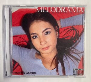
Progressing through drafts of the digipack
PDF – front to back;
Photos inside of in the case;
This is how some of our peers interpreted our digipack;

What works;
- I feel as if we gave a valid and conventional representation of the star and encoded a typical star image in this digipack draft through her moody facial expression and the use of lyrics in the inside double page (Dyer). We also represent that the narrative of the album follows a love story with our use of the cultural code (Barthes) In the colour red.
- The digipack doesn’t variate in font or colour scheme too much which helps it to appear as more of a single product instead of four different and contrasting panes.
What needs adding or changing;
- The bottom left of the front page where it says “Annabelle Anduga” needs sprucing up to appear more conventional instead of plain text. We will experiment using bevlin emboss and a glow over our typfaces for the next draft.
- To ensure our final product receives a preferred reading we will also incorporate a photo of our star at the keyboard to further represent our genre and – indie synth pop.
- On the inside double page, we want to show how our introverted indie synth pop star can open open up especially to her fans representing her star image and the kind of relationship our star has with her fans (Dyer), (Barthes).
Summary;
On a whole, our digipack received a preferred reading as more than half of our peers who completed the survey agreed that it looked like our genre without being told beforehand. When the audience responds to the ideas in the way the media producer wants them to, that is known as receiving a preferred reading from an active audience.


