Category Archives: Digipack

Final DP Draft

Last go at the digipack

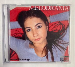
Homing in our brand and star image, our digipack reflects the mood of our artist through the deep blacks in the backgrounds and in the costume. Our descriptor “Grungy” is communicated through her jewelry and necklaces on the cover and the love story is conveyed through the symbolism of reds in the inside pages.

Our conventions are followed through our star laying down at the keyboard which is some key iconography of our genre – indie synth pop.

We stick to 3 colours with our colour pallets; Black, white and purple which is enough colour but not too much, as the more colour we add the more complication is added in that the audience will try and read into all of our colour scheming.

In terms of typeface, we involve two different fonts which again, is not too many for the audience to read into but enough so that everything doesn’t look so samey.  Our font is conventional as indie synth artists tend to use more blocky and graphical fonts rather than serif.

Talking photo manipulation, the noise we added to all the images gives the digipack a timeless feel and is conventional as artists of our genre are appreciative of the those who laid the groundwork for the genre in the 80s.

Digipack Draft 3

Progressing through drafts of the digipack

PDF – front to back;

Photos inside of in the case;

This is how some of our peers interpreted our digipack;

What works;

  • I feel as if we gave a valid and conventional representation of the star and encoded a typical star image in this digipack draft through her  moody facial expression and the use of lyrics in the inside double page (Dyer). We also represent that the narrative of the album follows a love story with our use of the cultural code (Barthes) In the colour red.
  • The digipack doesn’t variate in font or colour scheme too much which helps it to appear as more of a single product instead of four different and contrasting panes.

What needs adding or changing;

  • The bottom left of the front page where it says “Annabelle Anduga” needs sprucing up to appear more conventional instead of plain text. We will experiment using bevlin emboss and a glow over our typfaces for the next draft.
  • To ensure our final product receives a preferred reading we will also incorporate a photo of our star at the keyboard to further represent our genre and – indie synth pop.
  • On the inside double page, we want to show how our introverted indie synth pop star can open open up especially to her fans representing her star image and the kind of relationship our star has with her fans (Dyer), (Barthes).

Summary;

On a whole, our digipack received a preferred reading as more than half of our peers who completed the survey agreed that it looked like our genre without being told beforehand. When the audience responds to the ideas in the way the media producer wants them to, that is known as receiving a preferred reading from an active audience.


Teacher Feedback On Draft 2

Valuble teacher comments

Here is the screencastify our teacher made dissecting our digipack and giving us some tips, pointers and advice for ammendments.

Ammendments to be made;

  • Inside double page – the cutout is on the fold – it won’t look good printed.
  • Font to be ammended for “Annabelle Anduga” on cover.
  • More use of shaping and layering for the inside double page.
  • Add in the title “Melodrama” for a track on the back cover.
  • More use of colour on the inside double page.

Targets I will set going foreward are to make sure any cutting out done digitally is done to standard, you can tell between well produced media and rushed media between how images are cut out. I will ensure our there is more going in in the inside double page as I we are tyrying to create appealling and eye popping media so if  I just stick to two colours not much attraction will come of the final product.

Digipack Draft 2

Second draft of Melodrama

Attatched below is our completed second draft. There is still time to perfect and ammend our digipack but for now progress is being made to produce the best possible digipack.

Working to tie our digipack in with both our genre (indie synth pop) and the the album name (Melodrama), we used draft two to be experimental as we know we have drafts to come and to finilise our creative and stylistic choices. We know the inside double page is where we want to open up about the aritsist so we decided to involve some of the artisits favourite lyrics from the whole album written across it. We know more can be done to illustrate that the artistst is opening up inside the double pages so this is something to think about in the coming drafts.

Digipack Draft 1

Assembling a Digipack first draft self assessment

Draft 1 self assessment:

Trying our best to stick to the assessment criteria, we managed to put together a first draft from the shots of our first shoot with the goal of keeping star image and brand close in mind when creating the CD panes. Knowing that the product is a package we took into consideration that it should be cohesive and maintain the same conventions across the panes. Our pastel colour palette of reds, purples and basic whites gives the independent bedroom artist feel and gives an insight into her bubbly personality through her relaxed look and fierce facial expressions.

Our targets set for improvements are;

  • Reshoot front cover photo with jewlery.
  • Touch up retaken front cover photo in photoshop.
  • Artist name on front cover.
  • Possible glow effect.


Contact Sheets – Front Page Shoot

Contact sheets and shoot evaluation

Post shoot we had to choose a few shots from over 150. The working album title we have is “Melodrama” but we want to give the idea through our digpack that Annabelle Anduga, our star wants nothing to do with all of the drama going on.

The shots I especially like, are those we shot on a longer exposure so her body is in motion and the colours bleed into one another .

This is what I mean and is probably one of my favourites from the shoot. I particularly like how its sending the message “I’m not looking at you but I can see you”, and I feel as if it would definitely be used somewhere on our digipack.

Thinking ahead to future shoots, I feel as if we absolutely need to have our star dressed in more jewelry to reinforce the idea of her recent entry into great wealth and to further express our star has great freedom of expression through her fashion statements.

Dp Mockup

Sketching out mockups of our digipack

We thought we would use our previously touched on knowledge of photoshop for our digipack. We want to cut out three different shots of Annabelle Anduga and place them in the corners and centre of the digipack front page. This use of repetition reaffirms the sense that this is and independent indie synth pop artist – encoding that it is all her, the producing singing,  engineering – the lot.

The way this front page is linked to our genre, indie synth pop, is that the usual digipack covers of the genre like I researched are minimal. Not much is going on in terms of writing but what are usually noted as conventions  of the front cover consist of popping colour, bold makeup and outgoing costume. We need a recognisable star image, appropriate props to convey our narrative of our young birthing star Annabelle Anduga and to not keep things too complicated in order to allow our brand to be decoded shared and talked about by our young audiences.

Digipack Conventions Analysis

What artists of our genre are doing with their digipacks

A digipack is essentially a CD case with covers front and back. The music industry has sort of evolved to digital streaming and sharing but the digipack would still have the same album cover in most cases as a digital version or even a vinyl version.

The conventions that should be followed on the digipack are the barcode on the back, so the item can be sold. The track-list on the back, in order for the buyer to see what exactly they are buying, (the content). And the copyright owner. This is to avoid unlawful plagiarism.

more conventions on the digipacks are, Artist name and the Album name but in recent times both can be left out and a digipack will still sell. As the age of the independent artist is upon us, who are we too know who is good and who isn’t anymore so the artist name has kind of lost it’s value.

What I learnt from this digipack, is that to convey our genre indie rock/ synth pop we must throw the normal convention out of the window and approach the digipack with an experimental mindset. The pioneering genre highlights the postmodern age we live in, we see this through 3D renderings of our favourite artists on their digipacks on FKA Twigs’ LP1 and commonly we see they represent themselves as stars as supernatural and otherworldly creating appeal and intrigue as to what sent them in this artistic direction. Kaytranada’s digipack “BUBBA” for example.


The Look Book – The Package

Refining our star’s image

We assembled a Padlet to start gathering together some of our early inspiration and generate the mood of our star image. This will help us going forward because we are closing in on a brand image, and theme as media producers. The digipack will require us to understand our genre and audience deeply and using this using this Padlet an almost blueprint for our style of work will help enormously.

Made with Padlet


Looking into the near future when we will be building our social media page, we want our integrated advertising to maintain a repertoire of elements, may that be something as random as our independent indie synth artists carries a keyboard in her car at all times in case she is ever in the mood to play or has an idea for a song. Things like this about our artist need to be written down in order to best communicate a convincing star to a niche audience.