Second Draft of Front Page

Second Draft of Front Page

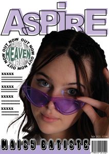
Here is the second draft of my magazine front cover:

What’s New?

  • I completely changed the name of the magazine to ‘ASPIRE’ as I feel a one-word name would be more effective and it reflects the aim of the magazine perfectly.
  • As well as changing the name, I also swapped font types which then led to modifying the design layout to make it more quirky and fit the genre better.
  • I made my Main Cover Star Image overlap my Masthead.
  • Since I wasn’t happy with my first draft, I decided to spend time at home playing around on Adobe Illustrator, identifying unique designs that could make my magazine visually appealing to the target audience. I was able to spice up my original plain pug by cleverly using my Adobe software skills to incorporate the album name into the circular shape and have the words ‘OUT NOW’ spiral around the outside.
  • I also changed the colour of the word ‘HEAVEN’ from yellow to green so that it fits better with the colour scheme I have throughout my magazine.

What’s Next?

  • I’m still not happy with the placing of the Main Cover Star’s name. I might try it going down the side of her instead of at the bottom, this could then potentially leave room to mention other star’s within the Indie Pop genre.
  • Make the colours a lot bolder.
  • I’m thinking of moving my model to the right a bit, to leave more room for the coverlines.
  • Finally, I need to come up with coverlines as that is what my front cover is lacking.

Draft of the Double Page Spread

Draft of the Double Page Spread

Here is the first draft of my magazine double-page spread:

Reflection

What I Like:
  • I like the colour scheme as it is simple and uncomplicated. I took the green from my model’s jumper and used it as an accent colour for the page. The green also works well as a transition colour from my contents to the double-page as there is a hint of green on the wheels of the pennyboard featured in the contents image.
  • I like the positioning of my model, I enlargened the image so that your eyes are immediately drawn to her. She also overlaps onto the next page which I think is very effective as it allows the article to be wrapped around the image, making the text flow and outline her leg.
  • The layout is very basic, with the name of the star written down the side of the image and a bold title for the article. It isn’t overwhelming for the readers.
What I need to do:
  • I think I need to fill the space next to my model whether that be a quote pulled from the article, stating where the outfit is from as my target audience is into fashion or simply moving my model more to the right.
  • I need to make my headline a tad bigger as I feel the placeholder text is overpowering it. The placeholder text also gives me a rough idea of how much I need to write as at the moment I feel like it’s too much.
  • As the text looks a bit chunky, I’m thinking of adding a pull quote into the middle of my article just to break it up.
  • I need to add in a standfirst to expand on the headline and further tempt the reader to read on, this may result in re-arranging the layout.
  • I may change the colour of my star’s name as I feel the shades of the green clash, making it difficult to read. A complementary colour may be good to use.
  • I might change the headline to ‘MIND AND MATTER’ as the article should be about what really matters to the star.

Second Shoot Contact Sheet(s)

Second Shoot Contact Sheet(s)

Here are my contact sheets for my second photo shoot with my model:

CLICK HERE for the full contact sheets

Short List of Images

These are the photos I have chosen to be on my shortlist of images:

I chose these images to be shortlisted because they are my favorite and had good lighting as well as being in focus. My Mise-En-Scene captured my genre perfectly. I went for a more casual costume with my Indie Pop model, a very vintage but grungey look. The poses I directed my model to do would be well suited for a double-page spread as they can be manipulated to cross over onto the other page and the lighting complements my model flawlessly.

As it was meant to be a location shoot I attempted to take photos in and around the school however, the lighting became very dark making it difficult for the camera to focus on my model. In the end, I made good use of my limited time slot in the white studio and thankfully had the images I envisioned for my double-page spread.

When choosing a final image for my double-page spread, I decided to use image 1 as I feel it encapsulates the mood I wanted to express throughout the page. I’m really happy that I incorporated the stool as it gives off the chill vibe and the way my model is positioned on it has a sense of playfulness. With her leg stretched out aswell, it provides me with the opportunity to wrap my text around the image so the article can outline her leg. This would work exceptionally well for my double-page spread.

Shoot Evaluation

Overall, I believe this photo shoot was successful. Having everything planned and organised thoroughly, with the use of my Production Meeting Agenda, help massively as it meant we could get straight into the production without rushing. My model came fully prepared with the costume on and hair/makeup done, this was handy as we didn’t waste any time in the white studio due to the location shoot not going to plan for us. Unlike my first shoot, I was finally able to sync the camera and flash together and as a result of that, the photos came out admirably.

Production Meeting Agenda for Second Photo Shoot

Production Meeting Agenda for Second Photo Shoot

In order for me to be completely organized and feel prepared for my second photo shoot, I made a Production Meeting Agenda so that my shoot would be successful.

Reflection

This helped me to visualize my model and create a suitable costume that would fit my chosen genre, Indie Pop, perfectly. It allowed me to plan a really productive shoot, providing me with clear ideas of what I would like to happen, the different poses on the stool that I’d like my model to potentially replicate, and hopefully, it’ll have a promising outcome.

Language Analysis

Language Analysis

In preparation for writing our own article for the double-page spread, we analyzed the text and language of a published article. I chose to unpick the magazine “Q-MAVERICK” ‘s biography written about James Lavelle.

‘Q-MAVERICK (September 2017) James Lavelle – The Author is unknown.’

Structure of Article

This is a biography written about James Lavelle’s life stories based on his struggles “emotionally and financially”, and how he’s overcoming them. The title takes up half the page, leaving room at the bottom for the article which is laid out in 3 columns with a drop cap at the beginning. There is also a clear introductory paragraph in bold beneath the title.

Presence of the Journalist

The presence of the journalist is made aware by addressing James by his name, and it is written in the third person. Since the journalist does not share or relate to the same experiences mentioned within the biography of James, it allows the attention to be purely with James and keep him as the main focus. This makes the text become more personal and lets the reader feel more connected and empathize with James. Quotes said by James have been incorporated to support the stories in the article as it’s written in the third person. There is a clear introductory paragraph encapsulating James’ life, before going into the main feature article. At the end of the article, there isn’t a typical conclusion – instead, it ends on a question directed to the audience followed by a short answer from James.

Language & Aim

A few examples of language techniques used within a biography are hyperbole, quotes, adjectives, personification, and metaphors.

Strong Adjectives have been used to create a greater sense of importance with James’ life-changing stories and allow the readers to gain more empathy for him. I.e. Amazing, Impeccably, Beautiful, Long, Intense, Powerful, Tough, Extreme.

Metaphors, similes, and personification were used to help describe his troubled experience with fame, for example; “His star had plunged” and “He proved himself to be a visionary lightning rod”. This article reflects to the audience the undesirable effects that drugs can have on people and the harm/threat it can cause to a person’s life.

The hyperbole, ‘Everest of Cocaine’, exaggerates the amount of drug he uses by comparing it to the tallest mountain.

The tone of the article is informal, with the use of swear words like ‘Fucking’, providing a sense of realism and a casual relationship with the audience.

Quotes

“Noel Gallagher, Richard Ashcroft, Ian Brown, Carl Craig, Alexander McQueen and an Everest of Cocaine.” – Mentioning famous celebrities within the article allows the audience to recognize other big stars and hopefully aid them to read further. There is also an acknowledgment of his troubles of addiction to Cocaine, this may intrigue the reader to carry on reading.

“The last 13 years have been fucking tough financially” and “I’ve put myself through quite extreme situations, both financially and emotionally. But then I got used to that very young.” – The use of foul language and strong adjectives emphasizes the difficulties of being in debt and how he’s struggled alone, demonstrating that fame doesn’t always bring happiness.

Other interesting quotes that feature in the article are; “In one way I’m probably insane to keep doing what I do. Anybody rational would have stopped trying to do UNKLE years ago.”, “It was beautiful,” he says wistfully, “While I had it.”, “It was, he says happily, ‘A fucking amazing night’.”.

Representation of the Star

The journalist portrays the star as reflective of his disrupted life and shown to be strong, resilient. The star is also represented as bad and doing illegal things but this is, in some way, seen as a positive thing. An affirmative of a star as a rebel.


Draft of Contents Page

Draft of Contents Page

Here is my first draft of my contents page:


Click to see full screen

Peer Assessment From Archie;

What type of shots have been used to create a variety of shot distances and how has the camera been used to communicate meaning?

A mid shot has been used in the photo within the contents page, the photo successfully shows the colours and the makeup to fit the genre and the star has been fitted into the image effectively.

What choice of MISE-EN-SCENE is appropriate for the star image and genre?

The outfit and makeup chosen for the model suit the genre of indie pop very well. The bright purple makeup and clothes create the loose feel of indie pop and shows a high understanding of MISE-EN-SCENE. The skateboard prop also communicates the playfulness of the indie pop genre.

How far is the font used readable and reflects the genre?

They have used a sans-serif font which is easy to read. The purple colour used for the shadow of the font is effective as it matches the models makeup as well as the genre.

What technical conventions of a contents page are present and used effectively?

The headlines have currently been filled with placeholder text and there are no page numbers present. However the layout of which is appealing and effective.

How has Indesign been used to layout the page to convey a brand?

Indesign has been used to layout the page almost as a window with the model peering through. Within the box of the window, there are cover lines and at the top of the page is the title text in which it has been manipulated to form an oval shape above.

How well have the text and visuals been integrated together?

The colour palette of the model and the text have been used together extremely effectively. This allows them both to highlight the models and masthead.

Where has photoshop been used to manipulate the photos to enhance the star image or genre?

Photoshop has been used to cut out the model from the original image accurately and place her on a plain white background.

How is the language used appropriate for the genre and target audience?

At the moment, the cover lines are just placeholder text so I imagine this will be adjusted in later drafts.

My Reflection and Focus Forward

This peer assessment has made me realise what I’ve done well and clarified the bits I need to improve. Receiving feedback from another person was very helpful as it was good to get a different perspective from someone who hasn’t necessarily seen much of my magazine.

In my upcoming drafts, I shall focus on improving my contents page by using my targets:

  • Remove placeholder text and add cover lines (mention artists related to my genre to engage the audience)
  • Add page numbers
  • Make the colours bolder as at the moment it is very muted.

What is a Content’s Page?

What is a Content’s Page?

A contents page is perhaps the most important page in a magazine. It attentively informs the reader on what various pages contain and provides the audience with a wider knowledge of what to expect within the magazine. In the contents, pages are indicated by numbers along with a catchy headline and a short description of the article, this allows the readers to detect certain articles easily without flicking through the whole magazine unnecessarily.

The conventions of a contents page include;

  • Page Numbers
  • Hyperbole and Superlatives in headlines
  • Image/s
  • Graphic illustrations and Designs
  • Editors Note

Here are 7 content page’s from which I found inspiration:

I wish to integrate particular design elements into my own content page, such as incorporating my image in with the information and making the colors bolder.

Rough Sketches of Contents Page Layouts

I also hand-drawn 4 rough sketches of various different ideas that I could use as a guide for my contents page layout.

5 Catchy Headlines

Headlines are used to attract an audience and engage their attention with your magazine. Successful headlines need to be conspicuous so they can create interest and appeal to the desired target audience. They tend to include imperatives, superlatives, hyperboles, and alliteration.

Here are some ideas of headlines I could use on my contents page:

I feel as though these informative headlines really sell the contents to my ideal target audience. They mention well-known artists within the Indie Pop genre as well as young rising stars that are finding their way through the industry.

Focus Forward

This research has given me the opportunity to plan my contents page and provide me with a wider understanding of the elements in which I shall include in my first draft. I’ll ensure the page numbers and headlines are positioned clearly so that they are easily navigated by the reader. From the inspiration accumulated, I am now at a stage in which I feel ready to start designing and playing around with different approaches for my contents page.

Draft of Front Page and Self-Assessment

Draft of Front Page and Self-Assessment

Here is the first draft of my magazine front cover:

Click to see full screen

Self-Assessment

Focus Forward

This self-assessment has enabled me to reflect on my work thoroughly and identify what I need to improve so that I can achieve my highest possible grade. This draft has given me an insight into what works well to attract my target audience and allow them to express their personal identities.

As this is my first draft of my magazine front cover, I have compiled a couple of things that I’d like to add/change, these include:

  • Adding a Price and Issue Date.
  • Potentially changing the design layout of my masthead.
  • Adding a punching Main Cover Line to compliment my Main Cover Star Image, along with proper cover lines along the left-hand side.
  • Work on my different typefaces to make them more striking towards my target audience and possibly create a new Masthead as I feel mine isn’t as powerful as it should be as Mastheads are a fundamental feature of a magazine front cover.

Nonetheless, the elements of my front cover that I am happy with are:

  • The placement of my Cover Star Image.
  • How the cover lines are positioned down the left-hand side so that they are easily visible when stacked on the shelf.

First Shoot Contact Sheet(s)

First Shoot Contact Sheet

Here are my contact sheets for my first studio shoot with my model:

CLICK HERE for the full contact sheets

Short List of Images

These are the photos I have chosen to be on my shortlist of images:

I chose these images to be shortlisted because they are my favorite and have a variety of different shots and poses. I thought thoroughly about my MISE-EN-SCENE and was really happy with how the costume, lighting, action, makeup, and props looked together, it fit my aesthetic perfectly. After taking these photos I realized that they had come out a lot darker than expected; as when shooting they appeared brighter and well lit on the camera. Nonetheless, I will make use of my skills in photoshop to edit the brightness and manipulate other features on the image to produce a final product that I am happy with.

When deciding on a final image for my front cover, I analyzed each one carefully to ensure I was making a good choice. I realized it was a bad idea to cover the face of my model (Image 2) as their face is hiding, making them unrecognizable, and won’t be attractive towards the desired audience. As a result of the bad lighting, I decided that I wasn’t going to use image 4 because the dark shadowing masks my model’s face. I felt that images 1 and 8 would be more suited to the contents page or a double-page spread as they are long shots and might look better along the bottom of the pages. Image 5 is too grungy for my indie pop genre and images 3 and 6 would be more appropriate for just the Pop genre due to the bubbly expression upon my Cover Star’s face.

For my Indie Pop genre, I wanted to give off the sense of quirkiness but yet grungy feel for my magazine front cover so I came to a final conclusion that I would use image 7 as my Main Cover Star photo. This is because the vintage glasses and the way my model’s hand is holding them makes the photo seem quirky, however, the minimal facial expression and the serious look in her eyes provide the image with a grungy feel.

Shoot Evaluation

Overall, I believe that my first studio shoot was a success. I had a clear organized plan which I stuck to in order for our time slot to be used effectively. My model came prepared with her costume and makeup done in advance so that we didn’t waste time at the beginning which was very helpful. There were no difficulties other than I had issues with the flash and the camera syncing up. This shoot allowed me to become more confident with studio setups, it also gave me a better understanding of how to work the camera, the studio lights, and the constant lights for upcoming shoots.

Masthead Designs

Masthead Designs

Here is a selection of possible Masthead designs that I may use for my Magazine Front Cover:

Reflection

The Masthead is a key component of a magazine, it provides the title/name of a publication. It is important to ensure that you make the Masthead big and bold because it’s one of the first things that would attract an audience member to look at it, so needs to stand out from the other conventions featured on a magazine front cover.

To begin designing, I searched for different font types on a website called ‘Da Font’ which held a wide variety of fonts for various categories. After researching other Indie Pop magazines, I discovered that they mostly used a sans-serif font which is very basic. I found 4 fonts which I liked, these were: ‘Keep on Truckin’, ‘Distortion Dos Analogue’, ‘Prisma’ and ‘a Abstract Groovy’. For my masthead, I liked the style of the ‘Keep on Truckin’ font so decided to play around on InDesign with different layouts and variations of ‘Cloud Nine’. I referred back to my last blog post on front page layouts as inspiration and wanted to borrow the idea of the ‘MOEVIR’ design of MADE IN HEAVEN. I wish to incorporate a similar style into my masthead.

Final Choice?

Furthermore, I prefer any of the top 3 masthead layouts shown above. I like the design of the one word block-coloured and the other outlined. I probably won’t use the top one as it is too monotoned for my genre and quite boring. The second one, I like the pop of the purple accent colour through the outlined word. I love the layout of the third one but I feel that it would be quite difficult to read due to the pastel accent colour and the overlap of the outlined word on top. However, these all fit my genre of Indie Pop perfectly so when I start producing my magazine front cover, I will test to see which one compliments my Main Cover Star image the most.

Focus Forward

This task has allowed me to refine my skills in InDesign and undertake the planning of a first draft layout for my magazine front cover.