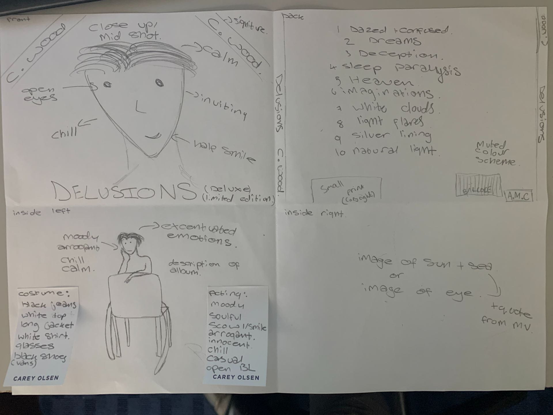
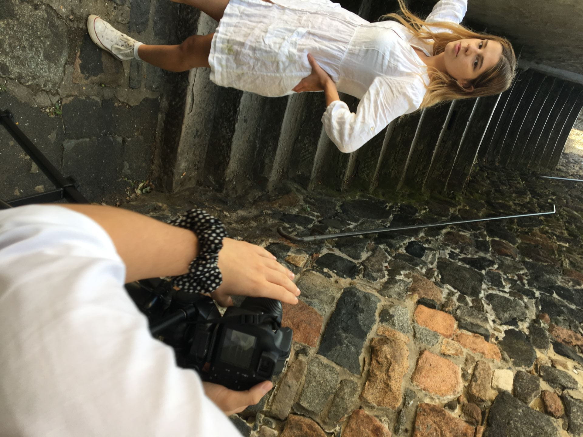
The aims for this shoot is to get the specific emotions and tones from the model for our artist to make an effective digipak. We want to get a range of different shots both close ups and long shots so that we have a range to choose from when it comes to designing the digipak. We want our model to give relaxed and chill vibes to the buyer and target audience, allowing him to connect to the audience. The simplicity of the shots we will use will effectively get our star image across to the audience in a powerful manner, we will have some shots of the model looking away from the camera and and the camera with some shots with eyes closed to connote the relaxed and causal vibes.
The conventions seen in our digipak will be similar but unique from other albums like the artist we have chosen, the designs of this digipak will help to encode the star image to the audience along with the meta narrative of the performer. Some aspects of what is included in our digipak include:
a typewriter font and a more handwritten effect font to give it personalisation
the colours of this album will be muted and soft to reflect the star image
our design will include a close up shot and long shot with a chair for a simple star image
use of graphics will further show his simple star image and soulfulness to the audience
framing of the artist will show his soulful star image and casual attitudes
close up images and long shots will imply simplicity and connection
font colours will be either black or white to keep it simple and straight forward
we will include a company name that we have created and a small print
Some variety of shots, full body, mid shots, as well as shots that aren’t looking straight into the camera
More tranquil, give a reflective feel the didipack maybe have model look downwards
Aim
From designing our digipak mock up we have decided that our aim will be to portray a calm, muted and soulful star image to the target audience, it will really highlight the connection the artist has to the audience as a young teenage artist. Our shots will be simple but effective to reflect the music the artist creates, everything in the digipak will be straight forward and simple to show the star image of the artist to be casual.
This slideshow below shows the typical conventions of a digipak from the artist Harry Styles, I chose to analyse his album cover as he is a similar artist to Ruel, this album cover and back is very effective and displays the artist in a specific way similar to what we want to do with our own digipak.
Below is a slideshow of my groups marketing strategy and mission statement to continue the music video project that includes a digipak and social media page.
This is the final draft of the music video, I think that throughout the developing stages of the video it has improved significantly from the first draft as it is cleaner and more effective.
What has changed?
Many aspects of this music video have changed in order to make it cleaner, sharper and more understandable to a target audience, from getting feedback from peers and teachers we removed many of the transitions from shots and brought it down to using two specific transitions to make the shots less confusing and overwhelming. Ultimately making the video more powerful and giving it significance as it is simple and easy to understand for audiences.
We edited more shots to give a greater impact and allow stronger interest in the video from the audience, we changed some shots to make them less repeated throughout the video and fixed the continuity error in the video. A very important part that needed changing was the beginning and ending quote, for this we changed the font and added stroke to it making the words much more impactful.
I have extremely proud and happy with how the final result has turned out as i think it powerfully conveys the narrative and message that we wanted to give to a teenage audience, the music video should be something that teenagers can understand and relate too possibly. By creating and designing a full narrative video we have understood the importance of a story that is understandable, and the creative ideas needed to make the shots and editing work together to give one message. Although the music video is completed for now we could want to change some aspects in the video as time goes along if we think that some changes should be made to improve our music video.
Video of comments on video
Comments from peers
Quote needs to be cited and last longer for audience to absorb the meaning, shaky movements is in contrast to pace of song it is effective. Eye shows how the audience sees the video through characters’ eyes, some shots linger for too long and could be cut shorter, good editing and choices of effects, using editing to create sense of confusion. Stairs are metaphorical and seemingly endless, not sure of direction. Use a few more effects to show dazed nature, focus effects on specific lyrics to have more of an impact. Good use of odd angles and effective cinematography to create confusion, have more an effective arrival to the place of significance, need more time to absorb event. Very well designed shots and angles and significance of events, maybe place quote at the end of the video. Tempo matching of song needs to be used and diversify the energy levels in the video to give more importance to specific moments.
Targets:
Create tempo matching
Create different energy levels
Cut out quote at the beginning and leave it at the end
From getting feedback from the teacher, we made multiple changes to this third draft of the music video, we made the narrative clearer to understand and toned down on the editing techniques so that it was less confusing and intense. We then effectively separated the stairs and naturalistic scenes by linking the stairs with her mind and the tension in her head, by doing this we made it clearer to what was going on in her head to what was happening outside and in her life.
By having the beach shots at the beginning and the end of the music video it gave a cyclical structure to the video showing that she got to the place of serenity she wanted to get too at the start of the video. We made the stair shots more effective by including more interesting angles and sharper shots that were clear, we sorted out the continuity error in the video so that it all made narrative sense. Overall I think this third draft is a major improvement from the second draft of the music video as it is easier to understand and watch.
5 Comments from Peers/Audience
Getting feedback from peers and the audience is very important to know what to change and alter for a better draft, it is important for a music video producer to get feedback so that they can improve the video for the target audience. With this personal opinions we can do another edit on the music video and do major improvements on the narrative and editing for the final draft.
Peer one:
good variety of angles used in the video
effective shot composition
good variety of interesting effects
video is visually appealing
maybe slightly less transitions
video can look too busy at times
title text could be centred
use a more artistic font e.g typewriter style
Peer two:
good overall story
plot line is clear
more possibilities of match shots
interesting angles
good overlays with sunset
many shots are repeated
some transitions are disorientating
Targets for improvement
use a more interesting font for introduction and ending
Some shots are not clear so maybe look at export settings for the next draft, perhaps overusing the shots of the sea and the sun as it is used so much. Create the sense of a beautiful serene place for only the starting and ending, the quote at the start is effective and links to the themes. Effective graphic match at the beginning, booking ending sequences, introduce the character in the narrative earlier so the narrative is more understandable.
Confusion with the wall and sea shot, why is it significant? Some shots are over edited, some shots perhaps need to be slowed down with dissolves. Use technique of going into her eye and her mind, her point of view, make the stairs more prominent that they are in her head. Have more shots of her working and her running, effective cutting feet on stairs. Look at continuity shots, make the story link together and make sense, make sure the shots are in focus. Look at the shots of reverse running, and lovely shots of the stairs.
The music video is over produced, the beach and sun really connote the idea of safety and haven but the over layering is too much, running works alone without the overlay of the beach. Add it more into the start and beginning of the video, cut between running and school life keep the beach more separate. Keep the beach shots still and clean, no movement in those shots, trying to do too much metaphorically. Separate the beach and stairs, shot of sun to eye then the stairs to reflect what is in her head, have an internal logic of the video. Tell the story in phrases not all at once, get some other people to review the music video, get other opinions.
Targets
use cleaner shots
keep beach shots separate
do not over edit shots
keep it simple
make the shots link together
add the idea of in the mind and in the point of view of the girl
On Thursday the 17th and Friday the 18th of September we had two visitors who were Specsavers creatives, come in and give us advice about how to improve on our music video, as one of these visitors watched our first draft he gave many points that could improve the quality and emotional tone of the narrative.
The feedback they gave was that the first draft cut was very effective and used interesting shots of the girl and portrayed the themes of failures, he stated that we needed to focus on making the stairs look even more abstract to juxtapose the naturalism of the school scenes. With improvements on what we are trying to portray to an audience and a clearer narrative in the video we can make it look extremely effective.
This advice that one of the creatives gave us matched with what our teacher stated about making the difference between the beach to the stairs and school clear to the audience so that nothing is confusing, they both said to use interesting shots to get the narrative across but do not overcomplicate the editing, keep it simple and effective.
Targets
think about angles and composition
use more interesting angles
emotions within shots
make it confusing
remove the context
make it feel like just stairs
be selective with stairs
keep it graphical
edit shots
no blindfold
make shots seem confusing
pick a barrier and a door
List of new technical and creative ideas
use barriers to compose shots
use doors to give context
overlap shots in editing
edit the shots in effective ways
make it abstract
make the shots very graphical
smoothly edit together shots for flow
make the transitions smoother
YouTube tutorials
Here are two youtube videos that would help with the second draft of our music video due to the effects and visual techniques they mention:
Here are a few shots from the second shot of the stairs in town, we got many more better shots with improved angles to clearly display the narrative of the music video.
Self assessment
Looking back on the first draft of our music video, I can see a clear significant improvement with tones and emotions within shots. There are many more interesting angles and camera shots that effectively link together to create an effective narrative video. I definitely feel that the narrative and story in the music video is more distinctly portrayed to the audience, with the different scenes of the abstract stairs and naturalistic shots within school really give the idea of stress and anxiety as the angles work well in conjunction to the shots. The editing effects on the shots are very effective as they portray the feeling of chaos and stress to the audience, the contrast with the stair movement and stillness of the school scenes create a balance of tension and emotion.
I think that the editing for this second draft is much more effective than the first one, we worked harder to achieve a sense of confusion and loss to the audience getting them to understand the anxiety and stress through the angles and shots. It helped that the second stair shoot was much more successful than the first as we knew what we wanted to get out of the shots, the dynamic of stairs, school and sea blend together well to create a sense of ambience that contrasts well with the jarred movement of the stairs and running.
In the next draft of the music video I wish to include a better sense of the narrative as I still think that the narrative is not as clearly shown to the audience as it could be, so that will include adding in more school shots mixed in with the stairs and sea.
Targets for improvement
Include more shots in the school
create more interesting shots with editing
use a wider range of shots
play around with editing and effects in premier pro