SO WHAT AM I UP AGAINST? THE COMPETITION

Loading...

Loading…

This is my finished piktochart regarding the competition I will face when releasing my music magazine to my target audience. I have spoken about personal identity of my magazine, social interaction between the readers and creators t o establish a sense of community. Also I referenced information on the USP of my magazine, this is the fact that that private details on EDM raves and festivals are provided as well as exclusive, large competitions are held, bigger than any other magazine. I also made sure to speak about including entertainment for readers to keep them engage, for exaple a quiz/game page and i referenced AIDA

Attention

Interest

Desire

Action

This research task will allowed me to create a unique magazine that perfectly fits into the design conventions of an EDM music magazine. Meaning it will meet my target audiences expectations whilst offering them more opportunity and entertainment than other magazines they have read/subscribed to before. I can draw from ideas found in other magazines as well as creating new and better ideas to make mine stand out. I will make sure to use all aspects of AIDA because this will confirm I meet all necessary criteria when releasing a successful music magaizne.


BRANDING IDEAS/MARKETING STRATEGY AND MISSION STATEMENT

INSPIRATION:

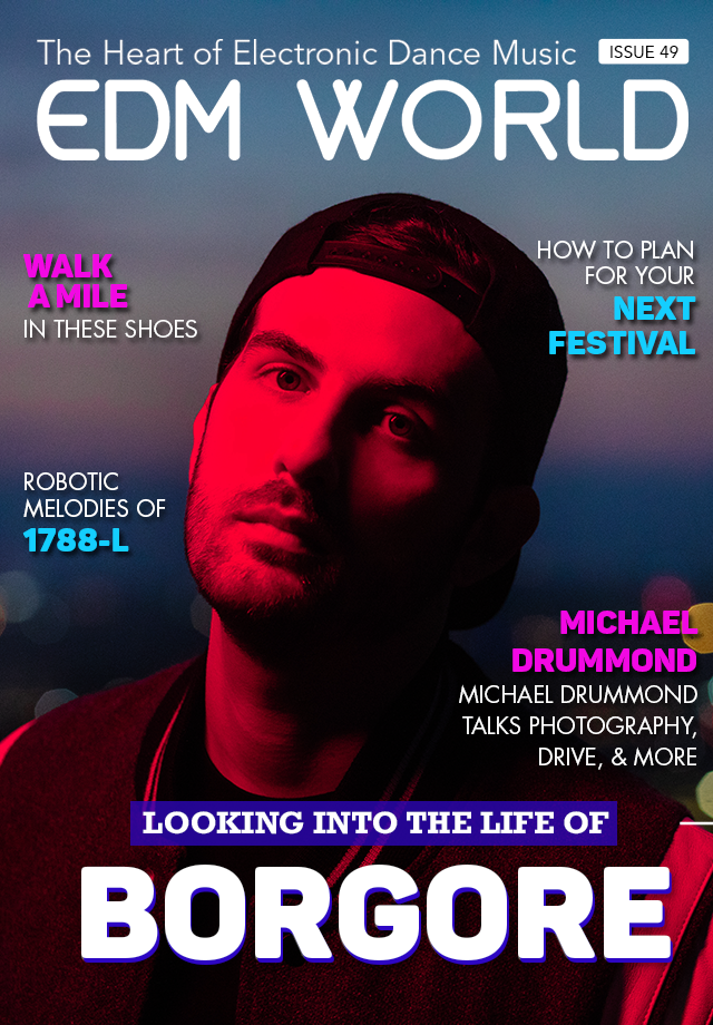
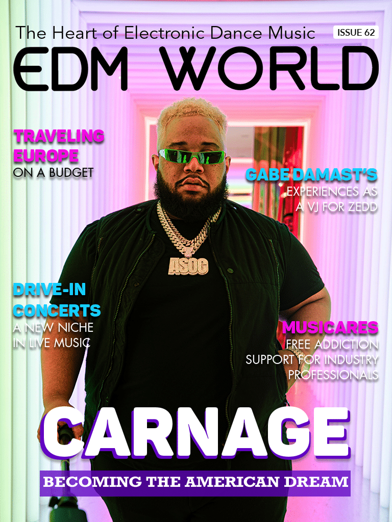
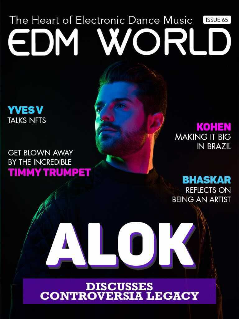
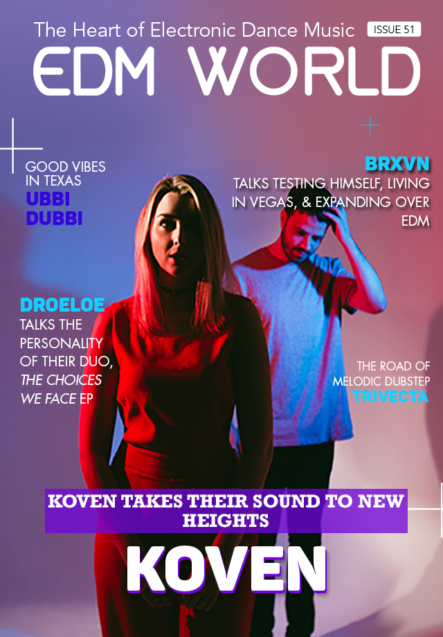
Borgore EDM World Magazine CoverIssue62coverIssue65Cover768by1024Koven

I have chosen EDM as a music genre for my magazine. EDM was originally made in the 1970s/1980s and became extremely popular in underground raves, discos, nightclubs and later on festivals. The genre emerged from the UK music genre ‘Garage’ as well as many others that became popular at the time e.g. jungle, 2-step, broken beat and grime. EDM uses drum machines, electronic instruments and synthesized rhythms to produce upbeat, unique, live music. EDM gained a neon, fun and colourful reputation because it was played at underground raves/discos with strobe lighting and special effects.  These conventions of EDM music then translate into music magazines as displayed above, there are neutral backgrounds with neon colours featured around it.

POSSIBLE MUSIC MAGAZINE NAMES:

  • RAVEDM (Rave EDM)
  • EDMIX (EDM Mix)
  • BLACKOUT
  • UNDERGROUND
  • CITYEDM

I have chosen the name ‘BLACKOUT’ for my music magazine because I feel it accurately represents how EDM music originally surfaced in underground raves and often EDM festivals are blacked out apart from strobe lights and special effects etc.

BRANDING IDEAS AND MISSION STATEMENT:

The brand of my magazine will be known as promoting upcoming and thriving artists in the EDM world, my unique selling point will be providing details on every festival, rave or disco in the UK that my audience can attend, after having done some research I have discovered that many other electronic dance music magazines don’t provide this service. This will encourage my audience to keep buying the magazine. I can use the Blumler and Katz uses and gratification theory (entertainment, information, personal identity, social interaction) to ensure I create a magazine that fits all the design conventions and audience’s expectations. My magazine will be entertaining because I will feature the latest EDM music artists, I will provide information on the artist through exclusive interviews and will also do a snippet on which EDM festivals are taking part around the UK in the upcoming weeks. The magazine will obtain its own unique personal identity because of our original mission statement and design features. Finally the magazine will have a successful amount of social interaction because the EDM music artists will draw in the audience and this will cause social interaction in real life as well as social interaction through exclusive interviews featured in the magazine.

Mission Statement: “Blackout is the best selling electronic dance music magazine in the UK, we strive to maintain the powerful connection from society to the EDM community whilst keeping you updated with the latest artists in the industry with every issue. We spread love and appreciation for the electronic dance music world with every exclusive interview and make sure to keep you in the loop on every EDM festival, disco or rave in your area!”

WORD CLOUD:

MY TOUR POSTER

MY RESEARCH OF OTHER HEAVY METAL TOUR POSTERS:

Researching for my tour poster and learning about the conventions of tour posters for the music genre, heavy metal, was very helpful. Investigating the use of different colour palettes, fonts and composition/layout of emblems, images and information has allowed me to create a tour poster that accurately represents a real heavy metal tour poster. My work becomes more realistic and could be used in the real media industry.

From my research I have discovered that the brief of a heavy metal tour poster is most commonly:

  • The use of a red, black, grey and white colour palette
  • A range of aggressive, bold and harsh fonts in the typography that all have a different unique design
  • The use of emblems and images/graphics with connotations of death and gore e.g. skulls, blood
  • If there is a model they will be somewhat distorted and often holds an instrument
  • A rustic/vintage and rough overall finish to the poster

My research has also helped me understand what aspects of AIDA mean in the heavy metal music genre and how I will relate these when making my tour poster. AIDA represents the words: attraction, interest, desire and call to action. When I make my tour poster I will follow the red, black, grey and white colour palette to ensure I attract my target audience and the genre of my tour poster is made clear. This will provoke interest and when using graphics and images throughout my poster I will heighten the interest. The desire to attend the tour will come from the information and tour dates I display on the poster and this further links to call to action.

MY HEAVY METAL TOUR POSTER:

PLEASE CLICK ON THE IMAGE TO SEE THE PDF

This is my heavy metal tour poster, my reflection and focus forward can be by clicking on the image below, I evaluated my magazine according to heavy metal conventions and connotations.

MY MAGAZINE SWEDE

MY MAGAZINE COVER COPY

please click on the image to see the PDF

THE ORIGINAL MAGAZINE COVER

Adobe indesign was a new type of software to me before this task, when I created a magazine cover as close to the original as I could, I learnt new techniques and got to grips with the functions of the software. I believe I was successful when in making the designs very similar and grasped the overall conventions and aspects of the MOJO magazine front cover.

THREE POSITIVE ASPECTS OF MY MAGAZINE SWEDE WERE:

  • Colour matching perfectly and making the whole magazine look the same when not paying attention to small details.
  • Adding specific tools like ‘stroke’ and shadows on text when necessary to embody the original.
  • Learning my way around adobe software and being comfortable with the tools and skills we have been taught.

THREE NEGATIVE ASPECTS OF MY MAGAZINE SWEDE WERE:

  • Not finding the perfect sans serif font to match the original MOJO masthead most importantly as well as the other fonts in captions etc.
  • Spacing and letter size not being fully accurate.
  • I couldn’t create the full effect of a direct copy because my pictures obviously weren’t the same.

YOUTUBE TUTORIALS THAT WILL HELP ME IN THE FUTURE:

REFLECT AND FOCUS FORWARD:

In this task on indesign I was able to completely understand the use of all tools on a new software and I now know how to create all the design conventions and necessary features of a magazine cover e.g. masthead, cover lines, captions, plug etc. I can meet my target audience’s expectations by using different colour palettes, fonts and images whilst making sure to apply the specific genre of music to my magazine design conventions too.