
Month: January 2022
FINAL DRAFT- DRAFT 4
FRONT COVER FINAL DRAFT:

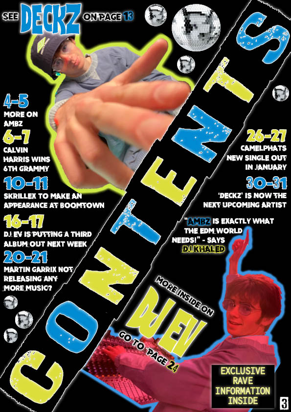
CONTENTS PAGE FINAL DRAFT:
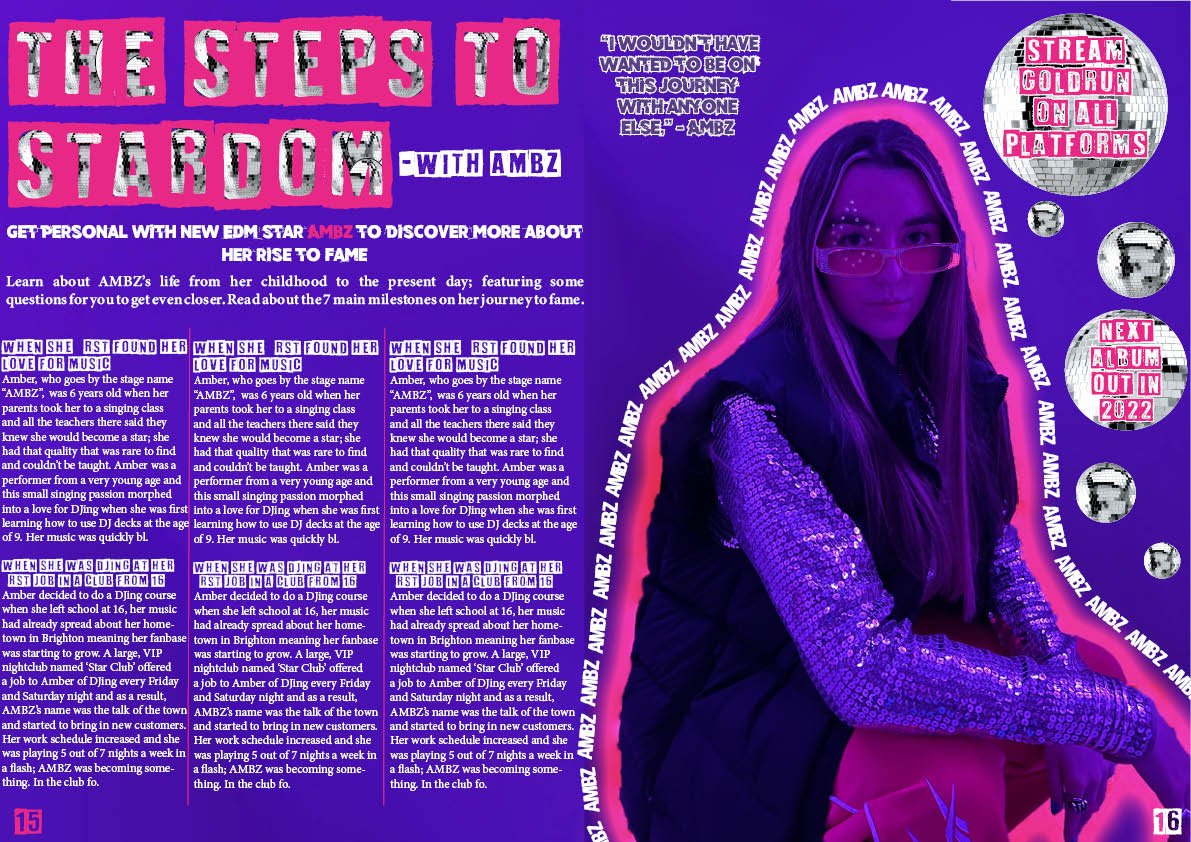
DPS FINAL DRAFT:

EVERYTHING THAT’S CHANGED:
- Added boomtown logo in blue to front cover
- Changed fonts from serif on some parts of front cover
- Respaced the date of issue and changed the font on front cover
- Moved the captions away from the edge on contents page
- Removed some disco balls so it’s less cluttered
- Inserted my article into the DPS (some isn’t in there it’s just what fits)
- Respaced my byline in DPS
- Changed fonts of text in DPS from the default to one that fits my theme
- Changed the colour of my quote to fit theme better on DPS
- Removed some disco balls on DPS too
MY FLIPSNACK:
CHOSEN ADVERTS
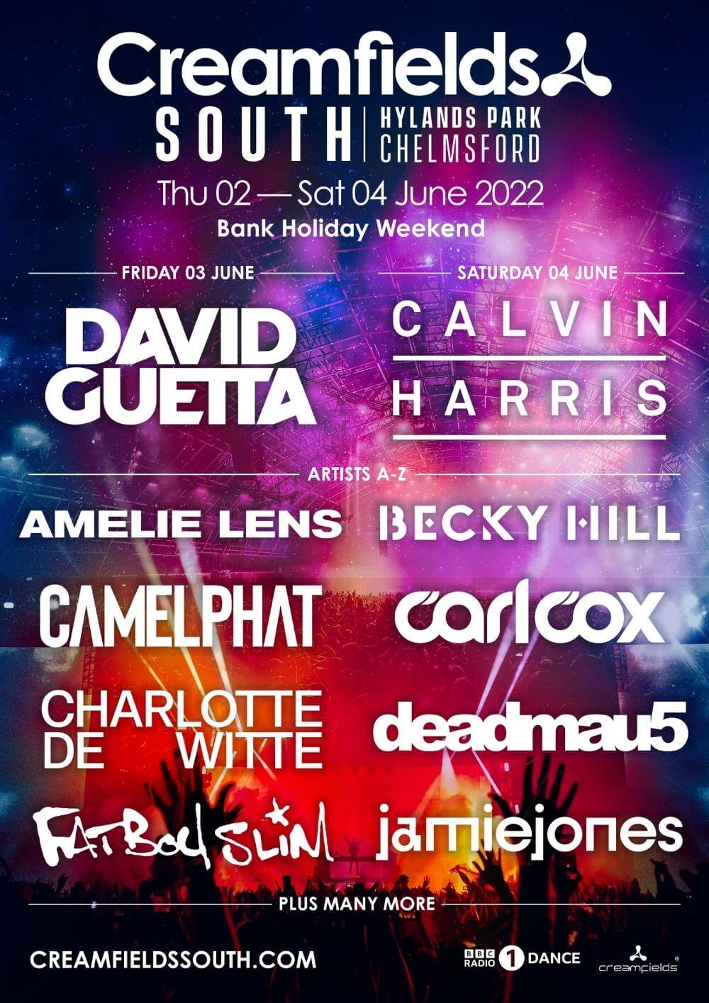
THE TWO ADVERTS FOR MY MAGAZINE:

WHY ARE THESE ADVERTS APPROPRIATE?
My music magazine genre is EDM, meaning my demographic will be people interested in this music genre and festivals from the genZ and millennial generations. These two adverts are for two music festivals that mainly feature EDM music. They are in the UK which is where my magazine is solely based; this makes it even more appealing to my target audience. In the creamfields festival advert, four artists I have referenced in my magazine are advertised in this: david guetta, camelphat, fatboy slim and calvin harris. This highlights my magazine being realistic and continues to emphasise the EDM genre through my magazine. These advertisers will pay me to put these adverts in my magazine because they slot perfectly into the style and subject of my magazine, my magazine speaks about festivals/raves so this will create an appropriate environment for these adverts to be in.
COMPLETE MAGAZINE DRAFT 3
FRONT COVER DRAFT 3:

CONTENTS PAGE DRAFT 3:

DPS DRAFT 3:

WHAT’S NEW IN FRONT COVER:
- I made the ‘EDM’ bigger in my byline
- Added drop shadow on my barcode
WHAT’S NEW IN CONTENTS PAGE:
- Changed the neon purple and pink to neon green and blue, this adds differentiation to my magazine and makes it more realistic as no magazine has the same colours throughout the whole thing
- I changed the neon lines around my model to match the new neon text colours
- I respaced disco balls to ensure nothing is touching text or images
- I added a page number
WHAT’S NEW IN DPS:
- Very slightly respaced some of the AMBZ border parts to make it flow perfectly
- Made sure my page numbers were in line
MRS COB’S SCREEN CASTIFY WITH A SUMMARY OF WHAT TO CHANGE:
- Move model over completely on front cover
- Add another colour into front cover
- Respace the hook on front cover so it isn’t on the model
- Add a price
- Change colour or font of ‘EXCLUSIVE INTERVIEW’
- New font on coverlines
- Less disco balls on contents page
- Caption the model photos on contents page
- Change the text on pug ‘MORE RAVE INFORMATION INSIDE’
- Page number on other side of contents page and it will be a 3
- Recolour some parts to make it easier to read
- Get rid of some disco balls on DPS
- Move one disco balls onto the model’s jacket
- Add in a byline
- Title change to just ‘STEPS TO STARDOM’
- Add in another font for ‘AMBZ’
- Play around with special effects now that we have fixed how adobe works on my computer
- Make the page numbers bigger
2ND DRAFT OF DOUBLE PAGE SPREAD
MY SECOND DRAFT OF DPS:

WHAT’S NEW:
- The background colour is now black
- I changed the colours of the subheadings in my article to match the theme and incorporate the colour palettes from the contents page and front cover
- I edited the spacing of my model and her text border so it doesn’t invade the article text
- I made sure my page numbers were in line
- I changed the font of the hook and this fits the theme more and ties in to the fonts all over the DPS
- I took the borders of the disco balls behind the ‘STEPS TO STARDOM’ and respaced so that they all line up well and uniform
- I also changed the font of the quote to tie everything together
WHAT’S NEXT:
- There is a small gap in the neon border of my model so I need to fill this in
- Make sure all the ‘AMBZ’ border is evenly spaced away from the neon border, they need to curve to the shape of the image so maybe make the slightly smaller too
2ND DRAFT OF CONTENTS PAGE
MY SECOND DRAFT OF CONTENTS PAGE:

WHAT’S NEW:
- I restarted my contents page from scratch because before I don’t think it blended and flowed well, I used some new parts as well as copy and pasting old parts from my first draft over
- The background is now black
- The ‘CONTENTS’ banner is inverted
- I have added neon lines around the photos to increase the EDM vibe and show photoshop skills
- I have rotated my photos to blend into the banner seamlessly
- I have moved my pug and added the effect ‘outer glow’ which makes it more noticeable
- I have added my photo of a disco ball around the page to carry on the theme from my DPS
- I have changed the font of ‘DJ EV’ to be more in-keeping with my theme and this resembles the original fonts used in rave posters
- I have changed the colours of page numbers to include purple too
- The caption lines and page numbers have been re-spaced to fill out the entire page more effectively
- I have featured the quote from DJ KHALED more effectively
- I have put a slight blur effect on my photos to carry on the EDM disco/rave style and show some more photoshop skills
WHAT’S NEXT:
- I need to make sure my page numbers and captions are spaced evenly from the edge of the page
- I might experiment with giving some of the disco balls a coloured border
- I need to add a page number onto the left corner
- I also need to very slightly move some of the disco balls to ensure they aren’t touching any of the text or photos
SECOND DRAFT OF THE FRONT COVER
MY SECOND DRAFT OF FRONT COVER:

WHAT’S NEW:
- I have added a neon outline to the image
- I have made the overall image much brighter and more vibrant
- I added outer glow on some titles, lines and the PUG
- I added a byline underneath my title
- I changed the font in my PUG to be more in line with the fonts used on original posters for raves
- I have changed the shades of pink and purple to match better
- The background is now fully black
- I have morphed together both my ‘sequin’ and ‘neon’ drafts to make one, better magazine cover
WHAT’S NEXT:
- I need to play around with font sizes and heights in my byline
- I could add outer glow to my barcode
- I need to check my coverlines are evenly spaced
- Maybe add some disco balls?
1ST DRAFT OF THE DOUBLE PAGE SPREAD
MY FIRST DRAFT:
WHAT I LIKE:
- I really like the neon line and continuous name around my model I, I think it shows good photoshop skills and reflects the EDM genre well
- I like the disco balls incorporated, these are based off of the disco vibe of original raves and links back to where EDM began
- I think the graffiti like, urban fonts- they all work well and highlight the modern vibe of the magazine
WHAT I NEED TO DO:
- I might change the background colour to black so all the colours stand out and pop, this would also suit the rave EDM culture
- I need to make sure spacing is even and correct especially on the quote
- Clean up the disco ball background of ‘STEPS TO STARDOM’ so there are no borders
- Brighten up the sunglasses to ensure the rhinestones are clearly visible
- Play around with the page number size, whether they should be bigger or smaller