A FRONT COVER ANALYSED- ATTRACTING ‘THAT’ AUDIENCE


Everyone in the world has different interest, beliefs, ages, genders and personality traits meaning we will all reach for different magazines with alternative messages and celebrities. These magazines will also have been made to attract these certain people, this is audience segmentation. When creating a magazine, every publisher will have a target audience with specific demographics and psychographics. A demographic is the things about a person that technically cannot be changed e.g. gender, age; whereas the psychographic are things about a person that might be more fluid e.g. interests, personality, values, beliefs. In my detailed analysis of a magazine cover above I have chosen a person I know who might read this magazine and thought about what their demographic and psychographic is whilst also taking connotations from the magazine cover itself to understand what the readers’ beliefs and values might be. Each technical design convention is specific to the message being sent by the magazine cover, in this case the message is acceptance and equality regarding the LGBTQ+ and BLM community. This message is implied by the rainbow colour theme and raised fist along with the powerful and bold graffiti which represents the powerful individuals who have had to and will continue to fight for decades to gain equality.

When I analysed the front cover of this billboard magazine I learnt how everything from the colour scheme to the words and phrases used in cover lines are crucial when targeting a certain audience. The design features are always manipulated to catch a certain type of person’s eye. When I create my music magazine I will choose one specific demographic and psychographic then influence every detail to engage this target audience. I will carefully choose a colour scheme and fonts with the correct connotations to keep my readers engaged and interested.

CONVENTIONAL DESIGN FEATURES OF A MAGAZINE


All magazine covers and contents follow the same technical/formal conventions, annotating a cover was very helpful to understand what each convention’s purpose was. Every design feature on a magazine cover needs to meet audience expectations by creating an engaging, capturing cover with a very famous cover star. Listed below are all the main conventions of a music magazine and the purposes they hold:

  • MASTHEAD– the masthead is almost always at the top of the cover, it is the title/name of the magazine.
  • COVER LINES– cover lines are headlines on the front cover of a magazine, put on to advertise an enticing story/feature inside.
  • MAIN COVER LINE– the main cover line will always relate to the main cover star on the cover of the magazine, this will often be displayed in the double page spread as the most engaging story/feature.
  • MAIN COVER STAR– the main cover star is always very famous and crucial for the magazine to sell, this star is what draws in the audience.
  • PLUG– a plug is usually located above the masthead, it relates to the magazine and has the aim of making the audience buy/read more.
  • PUG– the pugs are quotations from inside the magazine, they catch the reader’s eye.
  • BARCODE– the barcode is always located in the bottom right corner, this is logical when scanning and buying the magazine.
  • PRICE– the price is usually located alongside the barcode and issue date, it is necessary for a magazine cover to be complete.
  • ISSUE/DATE– the issue number or date is helpful for the audience to know how old, new the stories/features in the magazine are.
  • INSETS– the inset is a small picture/image in front of the cover, giving some insight to features/stories in the magazine.
  • CAPTIONS– the captions are small chunks of informations about stories/features inside the magazine, there are usually a few down the side of a magazine cover.

When I create my own music magazine I will use all these technical/formal conventions of a front cover to ensure I meet my audience’s expectations and produce an accurate representation of a music magazine in the real world. I will use captivating plugs, pugs, insets and captions and make sure to make my model look famous and well known to meet the criteria of a main cover star.


THE CAMERA TALKS

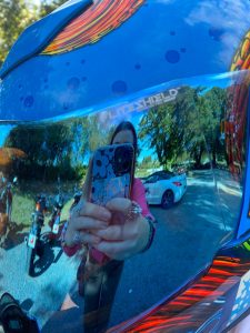
I was able to capture a clear, storytelling photo using each angle and the framing necessary. I used canva to create the collage above, this displays a connotation and the denotation of each photo I took. The 9 photos represent my understanding of: midshots, longshots, close ups, extreme close ups, canted angles, two shots, high angles and low angles.

The distance between the camera and subject of the photo is extremely important, long shots typically show you the setting and explain the mood of a photo through weather/building colour etc. Whereas close ups focus in on the character and they grasp the emotion that the character is personally feeling. Both distances reach the same result but in very different ways. During our shoot we used this to our advantage, the narrative we created in each image is enhanced by the distance of the camera.

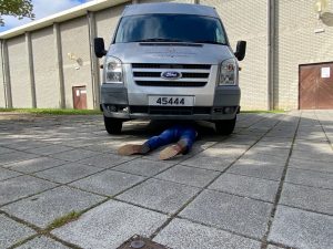
For example, in my two shot photo I made sure to include the trees, plants and sunlight because this connotes a feeling of happiness; the feeling of happiness I created by using a long distance technique was helpful to express the vibe of friendliness between the two people in the center. However a feeling of worry and danger was created when I used a close up technique in a photo of a boy under a car- inferring he had been hit by the vehicle. If this was taken as a long shot the boy who had been hit wouldn’t be a main focus point, meaning the severity of the situation would be lost and less exaggerated.

Mise-en-scene is even more powerful when combined with the use of camera angles, framing, proxemics and composition. When taking these photos we took an image and an idea then used MES to make the idea come to life through body language and scenery. When I wanted a happy photo I aimed to include sunlight, positive facial expressions and warmth whereas an when taking an uncomfortable or sad photo I would aim to use cool tones, negative facial expressions and dingy settings. I accomplished these aims.

Now knowing all camera angles and framing, the importance of proxemics and composition and the use of body language and facial expressions, I believe when I do photoshoots in the future I will be more successful in creating the correct denotations and connotations from each photo.

Photos I didn’t include in my collage:


MY IMAGE THAT USES MISE-EN-SCENE TO COMMUNICATE MEANING

Made with Padlet

Made with Padlet


MOODBOARD

All genres of music have different connotations, these connotations are taken from the MES created in concerts, photoshoots and advertising. The mood board above is made up of connotations of the music genre, pop. When looking at this mood board it becomes clear that pop as a genre is generally very colourful, bright and dramatic. Pop stars have a target audience of teenagers and children so I believe this is why the costume, shows and advertising is typically flashy and glittery because it captivates young people easily. Colour swatches for pop music contain a rainbow of colours, reinforcing the idea of pop being fun and childish. Pop artists can come across as somewhat self centered however they still appear to be quite normal, making it easier for young supporters to relate to them and follow their music.

Pop artists carry a star image by wearing extravagant, bold outfits/costumes when performing on stage. The mood board I created above displays glittery and shiny clothes with bold fabrics like velvet and leather. Pop artists typically just use vocals when on stage but some will play instruments like piano or guitar; the MES created in concerts consists of neon colours and vibrant decorations reinforcing the energetic vibe of the pop genre. The fonts used on posters and advertising for pop music will be strong and bold, this is enticing and captures young followers who will usually be pop stars’ target audience.

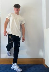
SOME PHOTOS WE DIDN’T CHOOSE


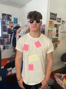
POST IT NOTE PHOTO

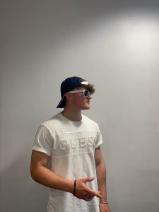
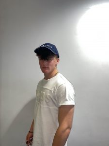
We took an unconventional, yet affective, approach to the pop genre photoshoot. Our model was somewhat arrogant and definitely conveyed a young, urban, edgy aura. The MES we created followed the vibe of more basic, simple posters e.g. Justin Bieber. He often dresses in common streetwear and this is the vibe we aimed to create.

The post it notes added by the class did match some of the pop genre criteria I stated above, this means that I as a media producer used many of the pop genre conventions effectively. Two post it notes stated ‘young’ and ‘normal’, this reiterates the point that pop stars focus on a young target audience who need to be able to relate to them. Being perceived as normal is important for pop stars to grow and become liked by the public. If we had used a conventional approach by using neon clothes, glitter and sequins we would have achieved some connotations along the lines of fun and bold which would have added to the MES of the genre, pop.

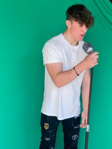
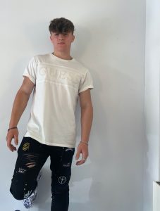
FINAL PHOTOS

I chose these two photos because I feel it displays the genre of pop most effectively. We aimed to have connotations of arrogance and fun when using the accessories (sunglasses and cap), this was successful. We focussed on props and lighting during this shoot and used bright, flash photos to convey the light and happy side of pop music. The pose in the photo on the right is a typical pose used by male pop stars in magazines and posters when advertising. The long shot in the photo on the right allows the jeans our model was wearing to be seen, these patchwork, ripped jeans represent the urban, up to date vibe that pop stars carry.

REFLECT AND FOCUS FORWARD

I now hold a greater understanding to the detail and necessity for MES to be accurate having executed this photoshoot. When I conduct photoshoots in the future I will think about all the connotations that could be taken from each background, costume, lighting angle and accessory. The denotations in images will be specific to a genre and this will make it easier for media to sell and be distributed to the correct target audience.

A TEXTUAL ANALYSIS OF A TOUR POSTER


Tour posters may look like they are just a photograph with some information, however each small detail is vital in representing the message and brand the artist wants to create. In this case I looked at the Harry Styles 2021 tour poster and I wrote about and expanded on 6 different connotations I gathered from the denotations on the poster. I found that many of the choices Harry Styles made when creating this poster signified the same message: acceptance and being who you are.

A massive part of Harry’s brand is normalising different sexualities and genders without being ashamed as well as going against societal norms, he cleverly displayed this narrative throughout the poster. By wearing typically feminine clothes he is combating toxic masculinity. Also by using blue and pink in the background (the two colours associated with each gender) he is implying it’s okay to be gender fluid and express aspects of both genders when being yourself. Overall the poster is bright, vibrant and happy; each small detail contributes to this feeling.

Deconstructing the poster in depth was very useful, it proves that all media text is produced with the intent of sending a message and every detail is extremely important. When I produce media in the future I will focus on one main message and make sure everything down to the background colours relate to it- like Harry Styles’ tour poster above- considering what thoughts each detail will connote. If I were to design a tour poster aimed towards teenagers I would use big, bold text and small snippets of information (similar to the poster above) to ensure my target audience isn’t overwhelmed by large bulks of writing. I will think carefully about mise-en-scene and how each of the 6 elements play a crucial roll in portraying the desired theme and reaching the target audience.


Media Ecology

Media ecology is the study of media, technology and communication and how they affect human environments. It presents media through eight elements that are crucial for media to be successful and one element cannot work without the seven others, making them interdependent. These eight interconnected elements are:

  • MONEY
  • GOVERNMENT
  • SOCIAL MEDIA
  • TECHNOLOGY
  • AUDIENCE
  • DISTRIBUTION
  • INSTITUTIONS
  • CREATORS

My poster shows how distribution is affected by these eight elements. I believe that the government, creators and money are the most important elements for distribution to go ahead. Our government determines what will and will not be distributed, creators make the content and media to be distributed and money is the driving factor for all elements of media. The government can heavily influence our society’s perception on media and creators are responsible for society’s opinions and feelings on current media.

Media impacts on society’s understanding of all issues, events and stories circulated through the media that our society consumes everyday. It is down to the distributors to decide if something will be negative or positive before distributing it for the world to see. We most probably read, hear and watch bias, false or incorrect information everyday.

This research will be very beneficial when I’m making my music magazine, I will make sure to use catchy headlines and interesting stories about the creators in my magazine to engage my audience and make distribution easier on social media platforms. This will ensure I make a good amount of money to grow my music magazine and distribute it again.

MY MEDIA DIET

The collage above includes media texts, social media apps I use, TV shows/movies I enjoy, shops I buy from and music artists I listen to. This gives an insight into my interests and the media I consume and might produce on a daily basis; making me a prosumer. All these different types of media fit into 4 categories:

  • ENTERTAINMENT
  • PERSONAL IDENTITY
  • SOCIAL INTERACTION
  • EDUCATION AND INFORMATION

I have represented all 4 sections in my media prosumption collage, all the different types of media displayed will fit into several different sections of the Uses and Gratification theory from Blumler and Katz. The Uses and Gratification theory was made to explore why people use and make media and what we gain from it. All the categories give us a separate reason to contribute and use media so Blumler and Katz created this theory to help us understand how media satisfies us.

For example, the series Greys Anatomy could be put into 3 categories: entertainment, education and information and social interaction. Most social media apps e.g. instagram and snapchat could be put into all 4 sections, which explains why such a huge amount of the population use social media and helps us to understand why we are all prosumers on these apps so often. My media blog exhibits what I mainly use media for and this is entertainment because I feel this is what satisfies me most. Sometimes I will use media that fits into the other 3 categories but my prosumption is heavily based around entertainment.

I think my media diet collage and the Blumler and Katz theory will help me in the future when it comes to understanding all media is different and has different uses for all types of people. I now know what type of media interests me and other people most meaning when I am working on projects I can have a direct target audience depending on what types of media I present. For example when I produce a music magazine I will aim to include all 4 types of uses and gratification to engage as wide of an audience as possible.