MY FIRST DRAFT:
WHAT I LIKE:
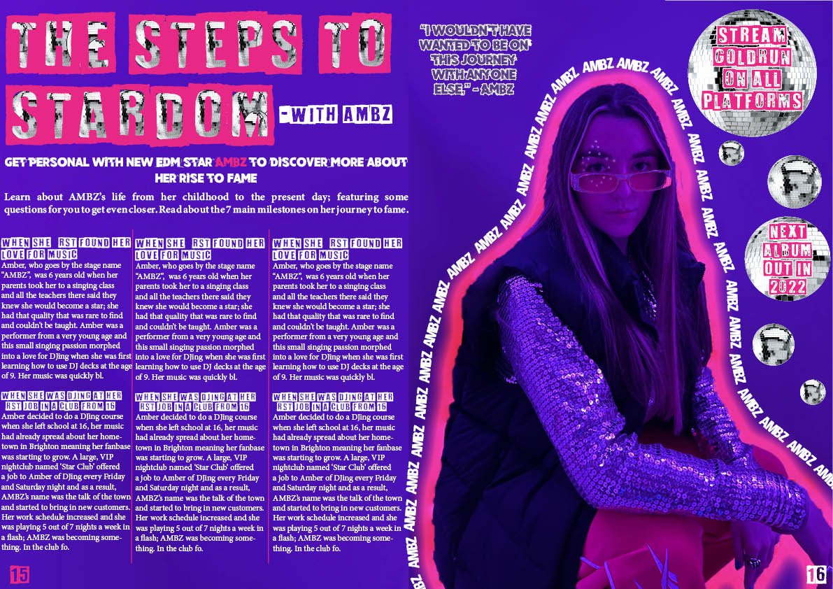
- I really like the neon line and continuous name around my model I, I think it shows good photoshop skills and reflects the EDM genre well
- I like the disco balls incorporated, these are based off of the disco vibe of original raves and links back to where EDM began
- I think the graffiti like, urban fonts- they all work well and highlight the modern vibe of the magazine
WHAT I NEED TO DO:
- I might change the background colour to black so all the colours stand out and pop, this would also suit the rave EDM culture
- I need to make sure spacing is even and correct especially on the quote
- Clean up the disco ball background of ‘STEPS TO STARDOM’ so there are no borders
- Brighten up the sunglasses to ensure the rhinestones are clearly visible
- Play around with the page number size, whether they should be bigger or smaller