BELOW IS OUR DRAFT 1:

WHAT WENT WELL:
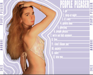
- The colour scheme seems cohesive and is flattering on our model.
- The graphic design features are interesting and add dimension.
- The font is bold and representative of the RnB genre.
- The outer glow is effective.
TARGETS FOR IMPROVEMENT:
- The three images on the front cover need to be enlarged.
- The title on the front cover needs to be enlarged so it touches both edges.
- The barcode and copyright symbols need to be added.
- The spines are boring and need some graphic design.
- The lines coming off each song title need to be more precise in placement.
- The backgrounds need something exciting included.
REFLECTION IN REGARDS TO MARKING CRITERIA:
Our use of editing with opcaity, layering and graphic design is well executed and inkeeping with the pop genre, this variety of design features keeps the digipak interesting and unique. Photoshop has been used in an excellent mannor and the subject is extremely well cut out, tools to refine hair and patch and clone certain parts of the body finished off the cutout effectively. The variety of shot distances is poor as on both covers there are mid shots, on the inside panes we will need to include a variety of shot distances to fix this issue. The colour scheme is adequate but completely conventional, the soft yet bright tones are reprasentative of the genre but as of right now I feel the digipak wouldn’t draw an audience member in, colour palette and more variety can help to change this. The fonts are somewhat unclear with the glow feature and aren’t conventional within the pop genre, the text would need to be more delicate or unique to be truly inkeeping with our genre. The three images on the front cover are arranged well and present an interesting idea, I feel they could be larger and layered more carefully – the middle image should be larger than the rest as a focus. The holographic costume, light makeup and messy hair work extremely well to convey the traditional elements found within the pop genre.