OUR DRAFT 2 OF DIGIPAK WITH PDFS ATTACHED:

SCREEN CASTIFY FROM OUR TEACHER:
WHAT WENT WELL:
- Experimenting with these moodier, darker backgrounds are much more in line with RnB design conventions.
- Visually this draft meets an RnB audiences’ expectations better but don’t fit in with our star and the image we have created as effectively.
- The graphic lines on the inside left cover work well to highlight the model’s face.
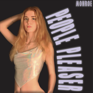
- The placement of the text on the front cover is atypical and unique – fitting in well to the RnB genre.
WHAT NEEDS TO BE CHANGED:
- The inside right cover could add one more layer.
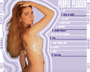
- The back cover seems too much based on 2012 eras of RnB and pop, we need to make this.
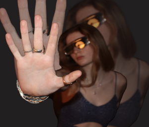
- The inside left cover is too crowded, need to take away two images and switch one out for a different pose.
- The model looks pale against the black background, not as flattering on her skin tone as the purple was.
- Model looks like she isn’t wearing any trousers (she is) but she needs to be moved down on the page slightly to fix this assumption.