How do the elements of your production work together to create a sense of ‘branding’?
How did your research inform your products and the way they use or challenge conventions?
How do your products represent social groups of issues?
How do your products engage with the audience?
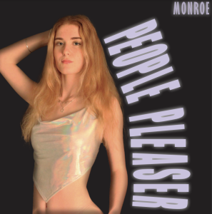
A mission statement conveys a brand’s narratives and intentions, it outlines the aims of the brand and ties all the star’s projects together. “Monroe, a name you will remember. She is on her way to be the face of pop music in the upcoming generation; her innovative, unique style is heavily influenced by latter R’n’B music which ensures her pop style is like no others. ‘GO’, the new hit single, is Grammy nominated, throwing this rising star into the deep end of fame. Listening to the inventive rhythms, one of a kind riffs and distinctive lyric writing will leave you wanting more.” This statement leaves a person curious and the brand is left seeming cohesive and professional. The reference ofpop and RnBboth playing a large role in Monroe’s music, lays out a clear blueprint (Altman) and is explanatory for the common misconceptions presented regarding which genre Monroe represents. The music video, social media page and digipak both include definite elements of each genre and this proves all elements of our  production work were executed with intention and meaning. When establishing our star’s image, we chose key descriptors to describe her personality and help with creating her image, these were: confident, empowering, desirable, striking and innovative. Posing and natural, soft makeup in photoshoots leads to our star being seen as confident and desirable, these shoots are then used for posts on the social media page and digipak. The underlying message of our music video and lyrics communicate that a person is enough on their own and doesn’t need a significant other to be happy, this enforces the narrative of our star being empowering. Moreover, the holographic, eccentric clothing choices displayed through the social
  media page, digipak and music video convey our star as striking and confident in herself. The innovative aspect of our star is found through captions of social media page posts and merchandise, the star communicates to her fans that she edits her own music videos and solely designs her merchandise; this promotes a self-sufficient, practical image. On our social media page (Instagram), there is a rough colour scheme of cool tones that build up our star’s image, this palette is carried subtly through the main feed and highlights which then links to our merchandise, digipak and music video, to once again portray a united brand across all projects.
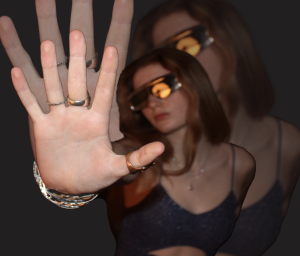
When researching many artists of the pop genre, we analysed the typical design, production and editing conventions used in music videos by well known artists of the genre e.g. Olivia Rodrigo and Rihanna. We ensured to use these artists as a blueprint (Altman) for planning the production stages, because we wanted our music video to meet audience’s expectations, reducing chances of our media text being rejected (Hall). Vibrant colours and a performance focussed music video, rather than narrative, is what we noticed to be conventional in the pop genre. Olivia Rodrigo’s music video for her hit single – Driver’s Licence – gave us  great inspiration for graphic design elements and outlined a typical MES convention of having a strong colour scheme throughout setting, costume and makeup to create a cohesive look; in our video we chose a purple/blue cool toned colour palette to, once again, align with the conventions of our genre. To establish an extraordinary star image (Dyer) for the model in our music video, we found that camera angles like: aerial shots, pans and close ups were common in the pop genre so aimed to feature close ups, pans and establishing shots as often as possible throughout. When experimenting with lighting in the post production/editing stages of our music video, we aspired to use fun, strobe techniques that are commonly associated with the pop genre, but matched these to our cool colour palette in efforts to still link with the sombre tone and emotion of our chosen song. These strobe lighting techniques and lighting adjustments with simple controls e.g. brightness, contrast, shadows and exposure were really useful to create a cohesive, professional finish on the video. We could accentuate our model’s features and compliment her hair colour and skin tone with the chosen colour palette and lighting adjustments.
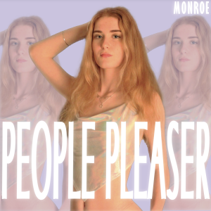
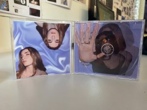
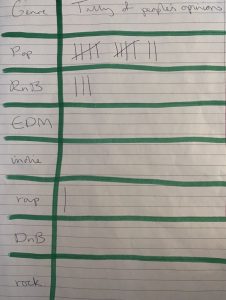
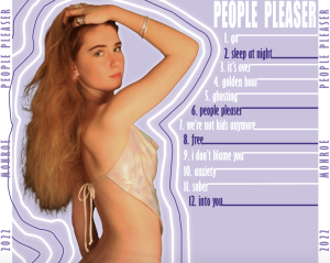
 The social group I will be referencing is the audience of the pop genre, this social group makes up the largest audience of any music genre across the world and is often described as fun, young, outgoing and upbeat. In our digipak, the mise en scene created by the scandalous poses, the soft and glowy makeup, the energetic colour palette and the sans serif font all amalgamate to connote the pop music genre and represent their audience as a result. We aimed to represent the typical dress sense and style of a pop audience member by using a bright staple colour (in our case purple) and mixing nudes, white and holographics to act as complementary tones with bursts of ‘fun’ throughout. When researching pop artists’ audiences and crowd members as a social group, we found the
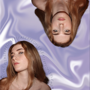
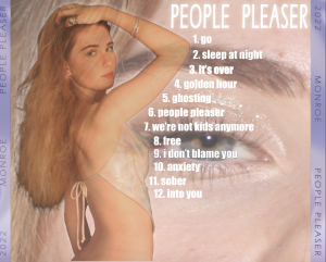
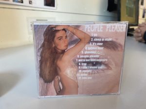
  outfits were full of different colours, metallics elements, sequins and unique textures or accessories. We aimed to represent the social group by enforcing this idea through sunglasses, holographic materials and glitter. Confidence and strength are two traits that are heavily associated with the pop genre – in particular with female pop artists. We represented this motive with the self-assured, poised body language communicated through the poses on the front and back covers, highlighting the model’s body and natural beauty. These two poses tie in with the three photographs found on the inside covers of the digipak, the image on the right hand side conveys the extraordinary star image, providing a sense of wealth and fame, whilst the two images on the left hand side portray the ordinary image with deeper emotion that’s often felt in the pop genre, in regards to heartbreak and self worth, this relates to the theory of a star being both extraordinary and
  ordinary (Dyer). The basic, sans serif font allows the focus to revolve around the star and cover art, rather than the audience’s eyes being focused on the text. Pop albums are known to be innovative and are always evolving so allowing the social group to solely focus on the star, rather than the secondary information is important. Providing personal insights into our star’s life and updates about daily activities conveys our star as open and accepting, this represents many of the social group’s personalities and identities; also highlighting the semic code (Barthes) by giving the audience a chance to learn about our star, who somewhat presents as a ‘character’ when seen as extraordinary. This social group follows the pop genre so fiercely because they see these artists as role models, as well as people to look up to and learn from; this narrative can be continued by using the star as the main focus of imagery throughout the digipak. The enigma code (Barthes) was used to entice the target social group when a billboard finding competition was displayed on our star’s social media page, this idea of a puzzle needing to be solved creates an aspect of entertainment and social interaction between the audience and followers.
 When discussing how our products engage with our typically young demographic, I feel that the Uses and Gratification theory by Blumler and Katz is necessary, so we aimed to meet the 4 criteria points when developing our star’s social media page, which are: entertainment, information, personal identity and social interaction. Entertainment is key, this keeps an audience engaged and ensures you have repeat subscribers, followers and listeners. To do this, we created competitions and giveaways which also bring in an element of social interaction. For example, we photoshopped our digipak onto billboards across major cities and created a competition of, ‘Find the Billboard’, sending in a picture of these billboards would result in the audience member being entered in a giveaway; this entertainment and excitement is what keeps a person interested. Additionally, information allows our target audience to become invested and feel like a member of a group; updates about tours, merch, meet and greets and
  an artist’s daily life keep communication lines open and feed into the idea of an ordinary, relatable star image. We provided information through regular stories and posts of up and coming events or releases. I believe that the personal identity element of the theory is what opens up a gateway for social interaction between an artist and their audience. By providing insights to life, an artist can become personable and respected as a regular human being like the rest of us, rather than being extraordinary and ‘above us’ as an audience all the time. We felt that this needed to be prioritised, so the ‘Behind The Scenes’ highlight reel on our instagram page was crucial in conveying our message. Also, interactive features like polls and Q and A’s allow direct contact and social interaction from the audience members, this blurs the line between audience and star (Shirky) and presents an idea that one is not above the other. Blumler and Katz’s theory seamlessly links into AIDA. Attraction is found through the artist’s image and constant entertainment through the social media page, interest is sparked through daily life updates and information, desire is created with the attractive, powerful star image whilst finally, a call to action is made with invitations to get merch, attend performances and find out more about tour venues.
*PDF OF ESSAY LINKED TO EACH PHOTO AND THIS LINE OF TEXT*